PHOTO-MONTAGE
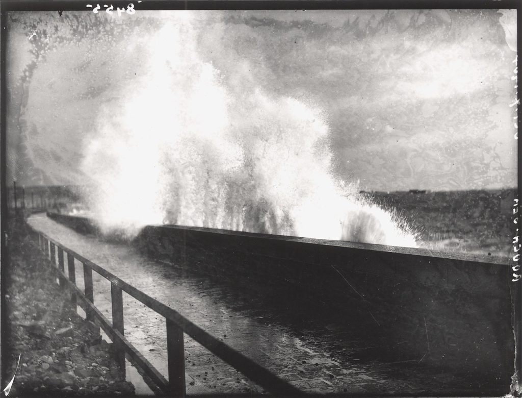
What is photo-montage? A photo- montage is a constructed form a series of photographic images that can be over- lapped and usually set out in a way that forms some sort of narrative.
We had looked at various examples of photo-montage a few months ago but had only experimented with it on Photoshop, this time we used pencils and paper and scissors. What I found difficult when creating these montages was the story I was trying to portray within this montage but after having thought about it I liked the way it could be interpreted within different peoples minds.
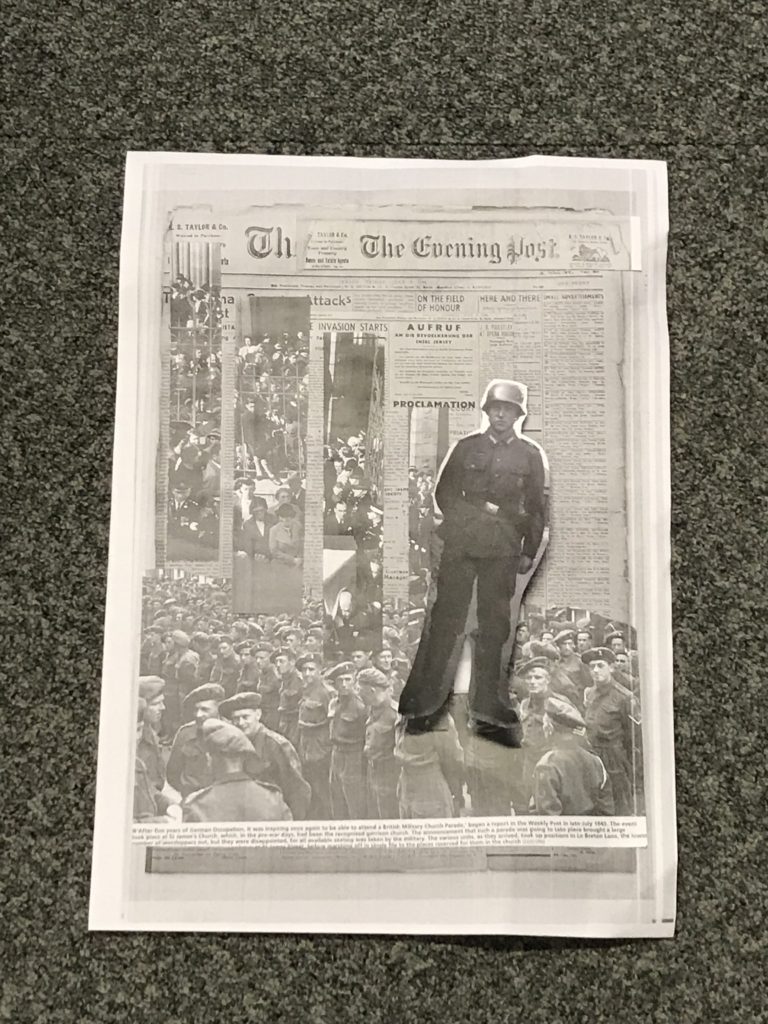
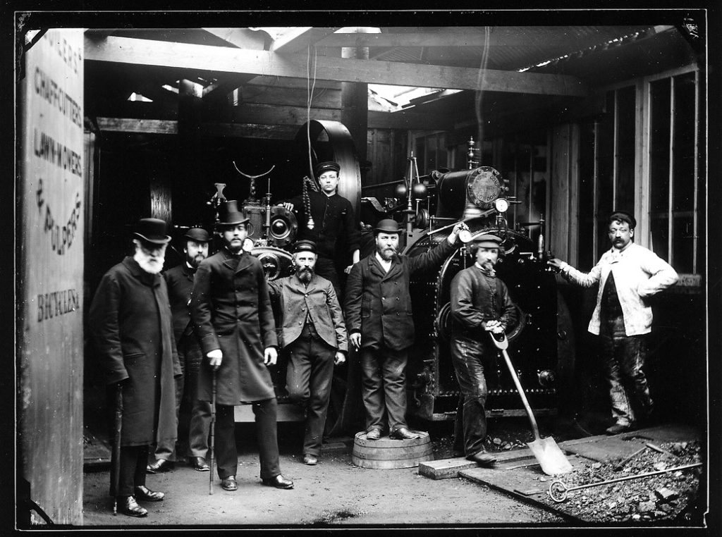
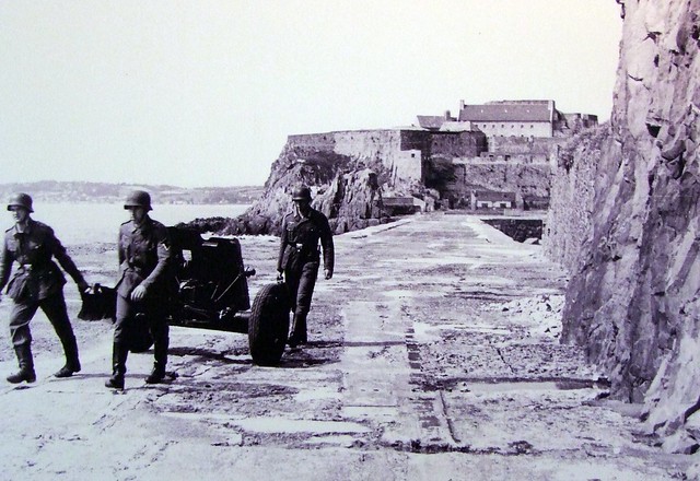
My idea behind the top image as it was my very first go with these sort of photographs I decided to cut out a superior officer as in those times no matter what class, race or gender there was always going to be someone who’s more superior to you. Therefore I chose a uniformed officer which clearly presents authority. Futhermore I placed the army behind him which therefore indicates that this is could be set in a conflicted area. Finally I decided I did not want to leave it on just a plain background then saw the old JEP which adds elements that what’s going on is important highlighting the story of the occupation times even more.
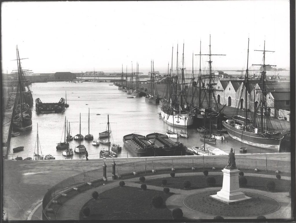
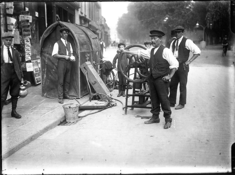
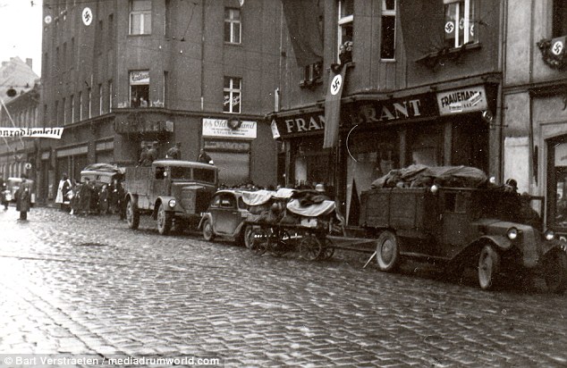
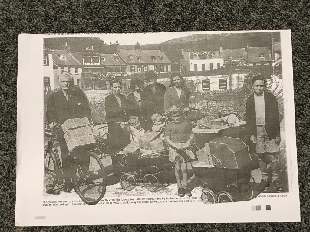
The image I created below is more a less the polar opposite of the top one. Here I chose a more peaceful and calm setting which seemingly looks a village, all the people dressed also seem fairly well off which made me view a narrative that indicates it may have been after the war. I decided upon this idea as there is no dad like figure but yet this is lots of children and again there’s a couple of woman in the image. However the Montage isn’t all sadness as people seem to be relatively happy.
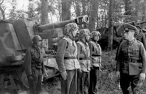
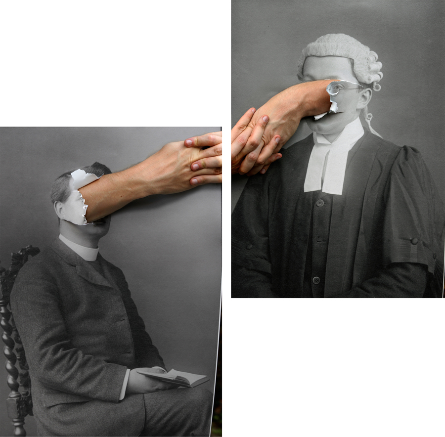
Below are various examples of photo-montages:
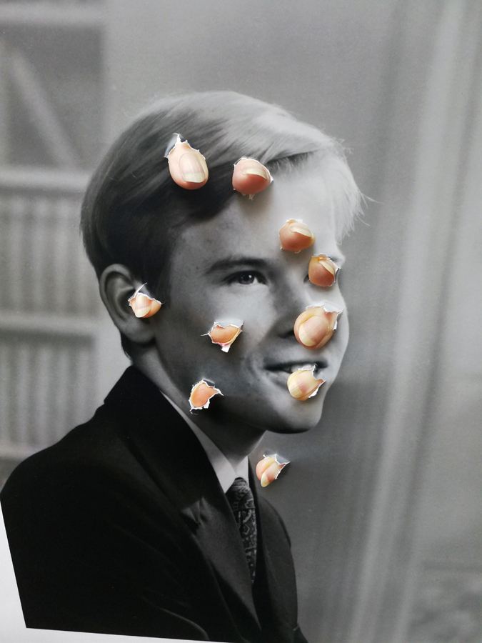
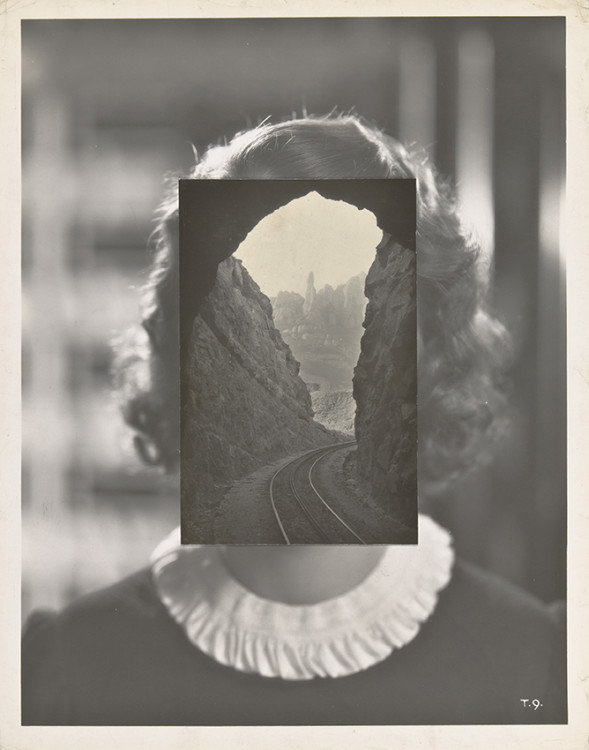
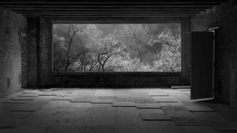
NOEMIE GOUDAL
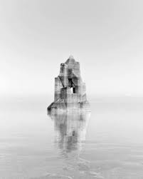
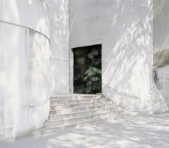
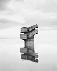
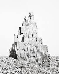
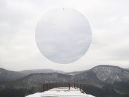
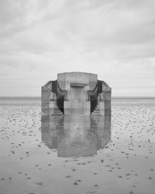
The photographer I have chosen to look at that experiments well with photo montage is Noemie Goudal. Below are some examples of her work:
Noemie Goudal is a French artist who graduated from the Royal collage of Art in 2010 with an MA in photography and now lives and works in Paris. Goudal’s practice is in an investigation into images and films as dialectical images, wherein close proximities of truth and fiction, real and imagined offer new perspectives into the photographic canvas. She questions the potential image as a whole than reconstructing its layers and possibilities of other extensions through the landscape she chooses. Goudal is represented by Edel Assanti London and Galerie Les Filles Du Calvaire ( Paris).
https://www.parisphoto.com/en/interviews/Noemie-Goudal/
I liked her work because after having watched the video I seemed to understand what sort of ideas she was trying to present. She made an example in the video of a picture of a simple forest nothing to crazy just see trees and some greenery then she added a picture of a bed sheet on what seemed like a washing line then by placing that object over the forest picture the outcome actually surprised me as it looked like a water fall.

Here was her example. This genuinely confused me because having saw the image before and the object serrate I would never have put two and two together I think this really highlights what she is going for ,the idea she’s trying to achieve for us as the viewers. I like the idea that she uses materials like card board and fabrics to create this contrast between man made and organic which she heavily captures by going outside and finding landscapes that best suit whatever material she’s preparing to best suit it.
Visually, its a nice picture to look at. At first glance I would not have straightway been able to figure out it wasn’t water which essentially is good for a photo- motage but after having looked at it for a while then watched the video on her work I discovered she likes the use of fabrics in raw nature to present these opposite perspectives.
The lighting she uses seems to be natural as she creates these obejects, elements and places them into natural scenery considering the lightness she has got out of the images it makes me only think it could have been done road the morning when its at its brightest points. What I also visually like about her work is that its layered. What I mean by this is that its got structure its not just a flat image of a rock places on sand its been made bigger, higher, generally more elevated than you probably would see these objects in day to day life. I like the fact that she also leaves a small amount of white space so we can clearly focus on the object that’s placed In the centre not only that but the images she’s got from the beach I like how its been reflected in the sand although its not even a real object just a simple piece of card with a material or fabric which ultimately creates a contrast as Goudal said it “man made vs organic.”

