
Aaron Siskind
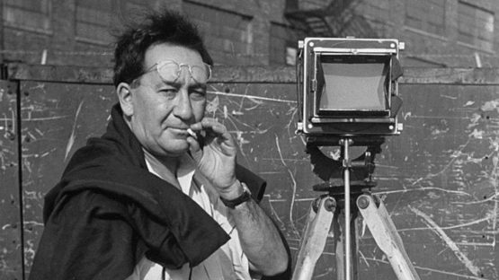
Aaron Siskind (December 4, 1903 – February 8, 1991) was an American photographer. He is considered to be closely involved with, if not a part of, the abstract expressionist movement.
Siskind’s work focuses on the details of nature and architecture. He presents them as flat surfaces to create a new image which stands independent of the original subject. For some his work has been described as crossing the line between photography and painting, his photographs are works unique to photography.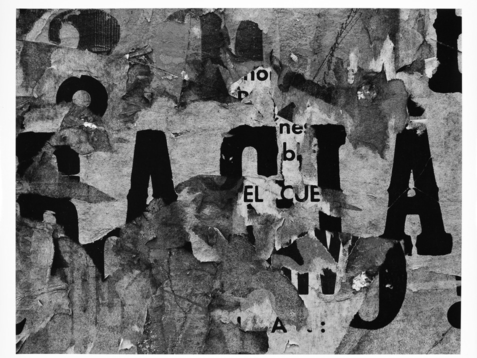 Crusted and peeling paper/newspaper texture is often seen through Siskind’s work.
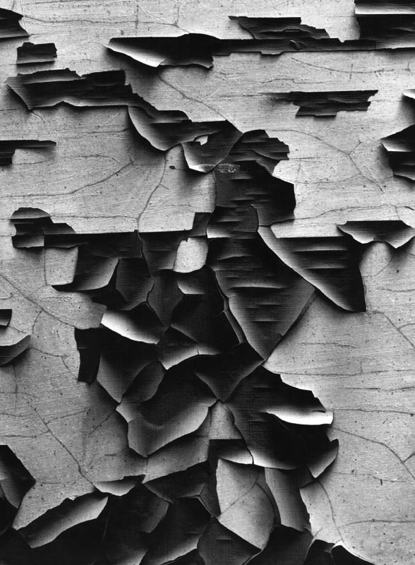
Response
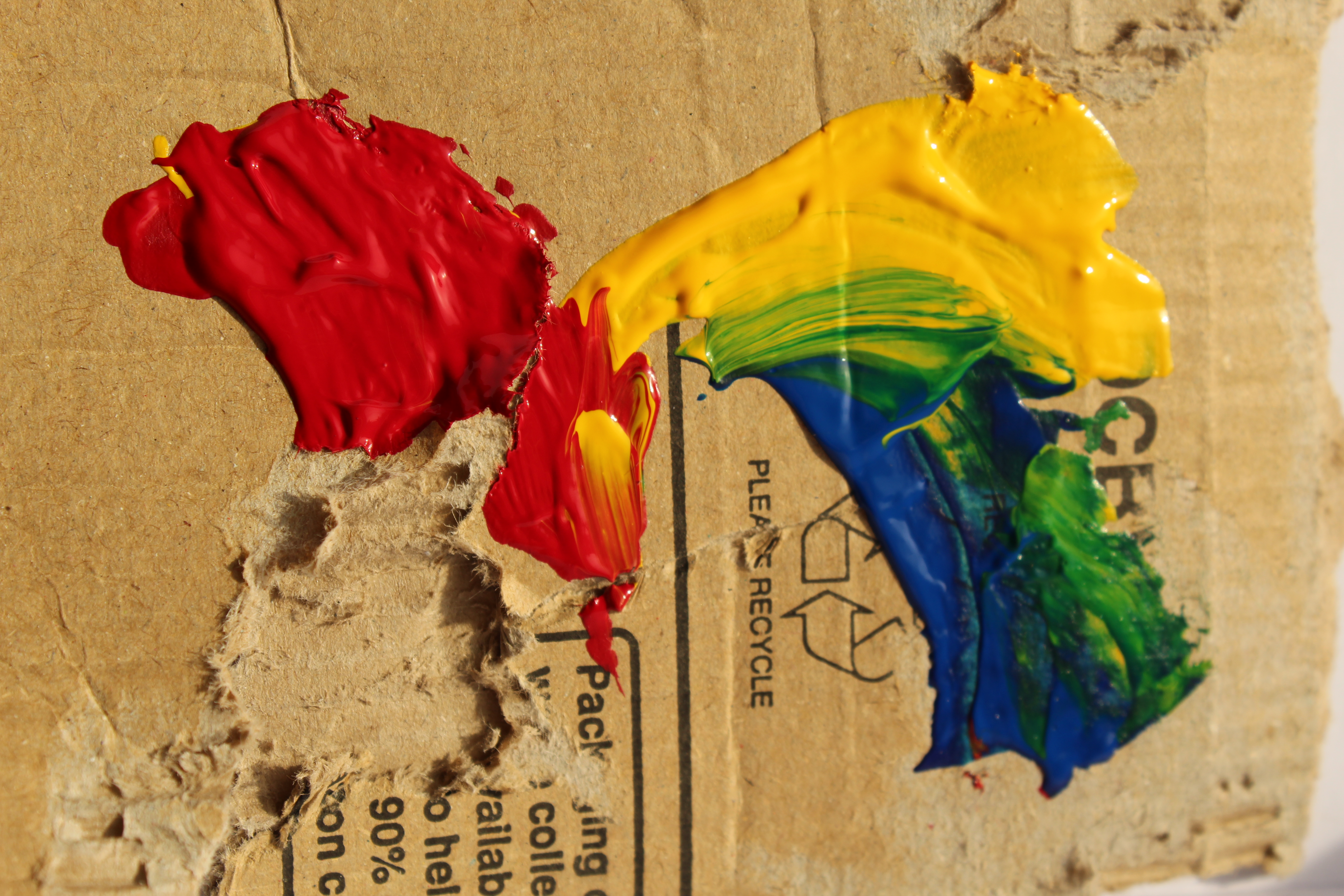
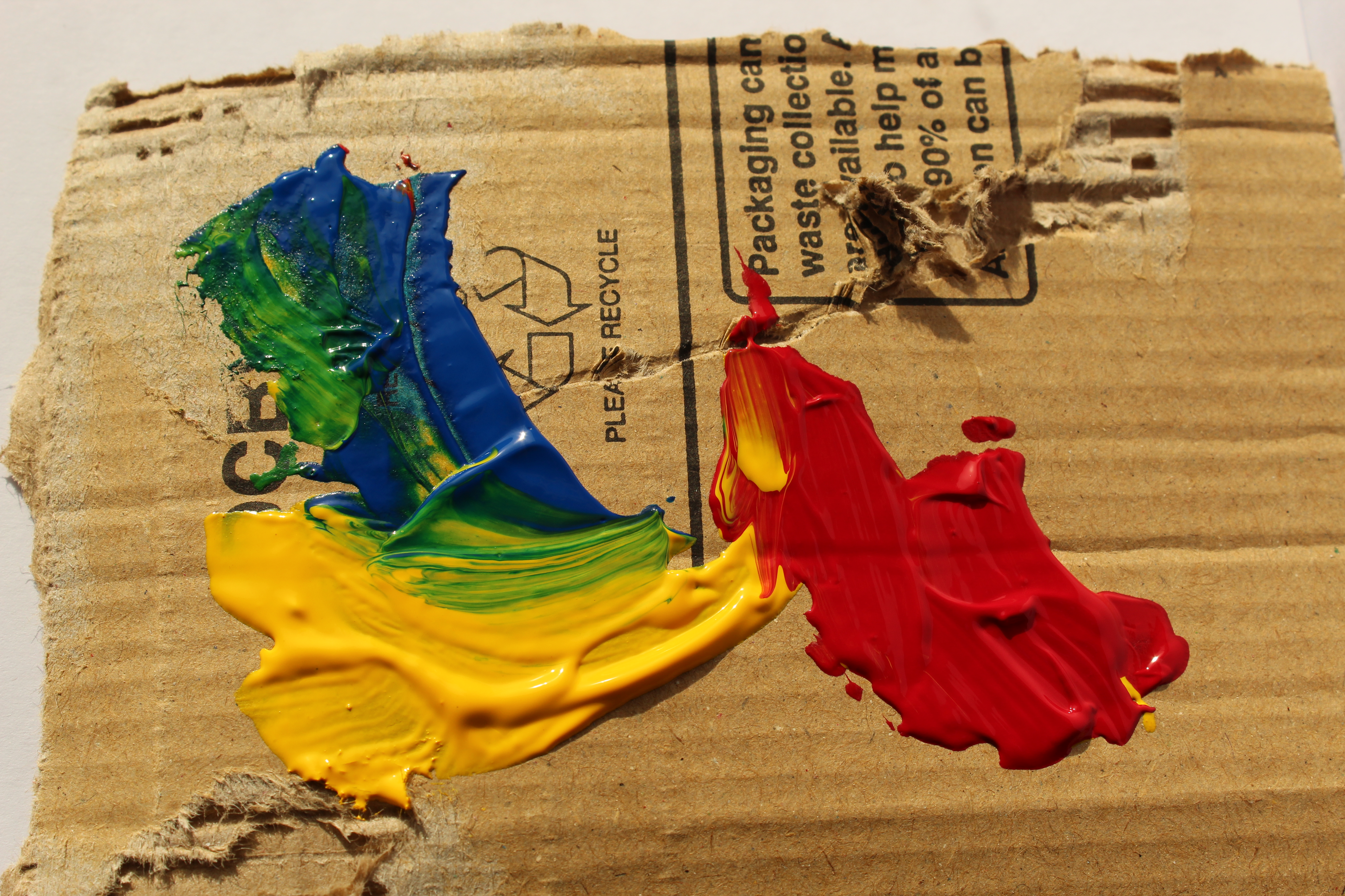
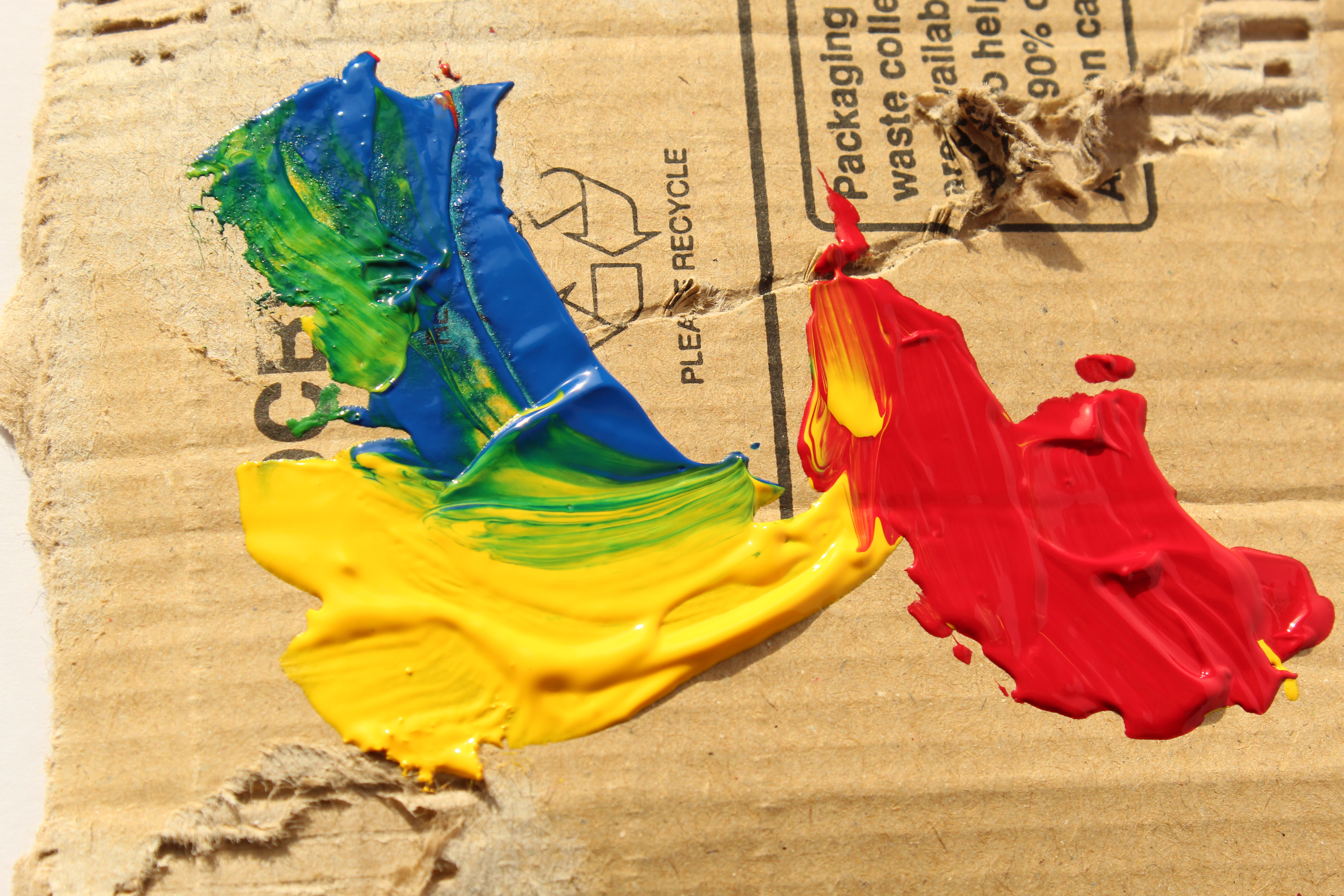
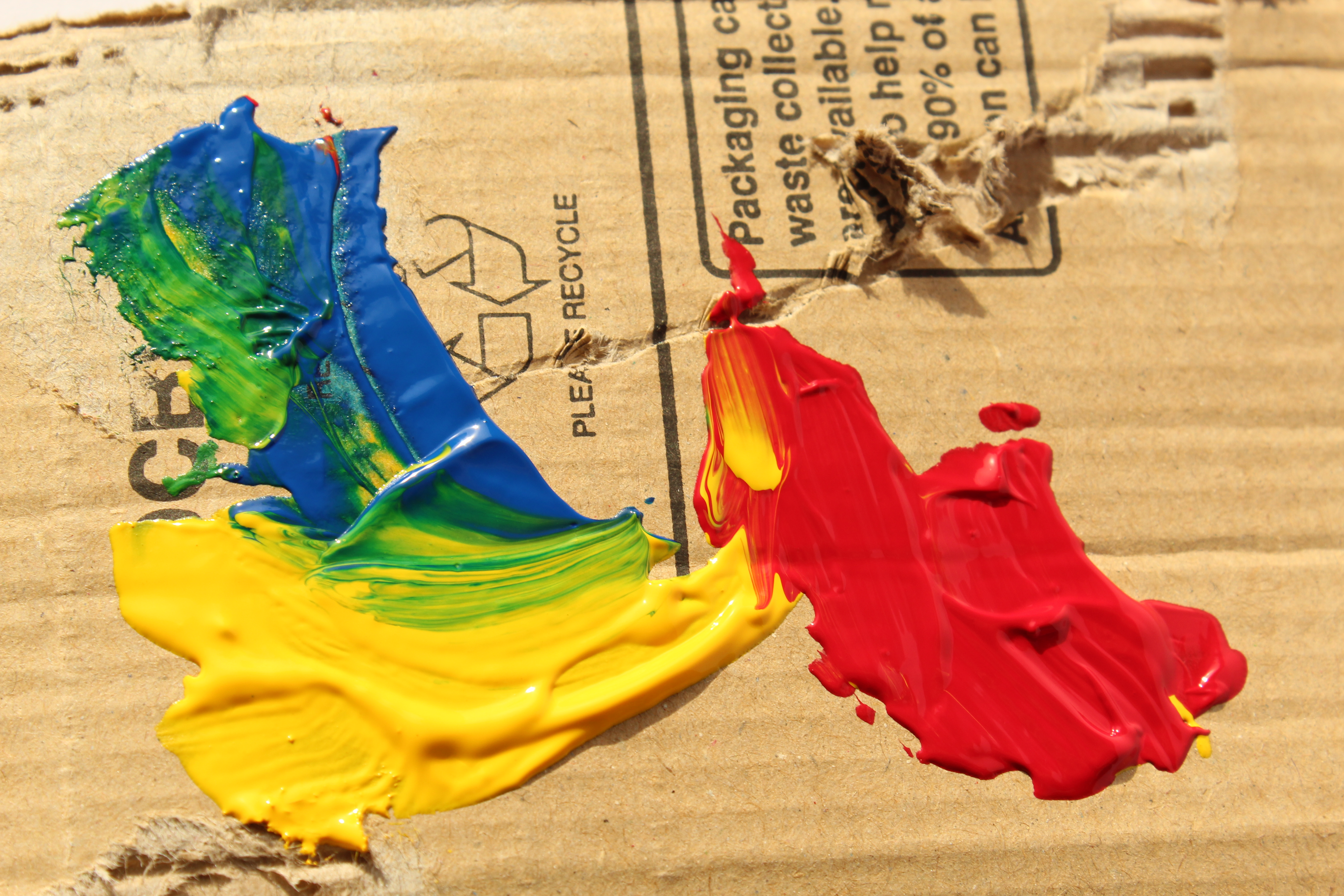
As a response to Aaron Siskind’s work, I wanted to produce something that included both his peeling texture but also some elements of colour as well. I decided I wanted to use the very brash/rough texture of ripped cardboard with smooth and thick paint layered over the top so that the two would juxtapose eachother.
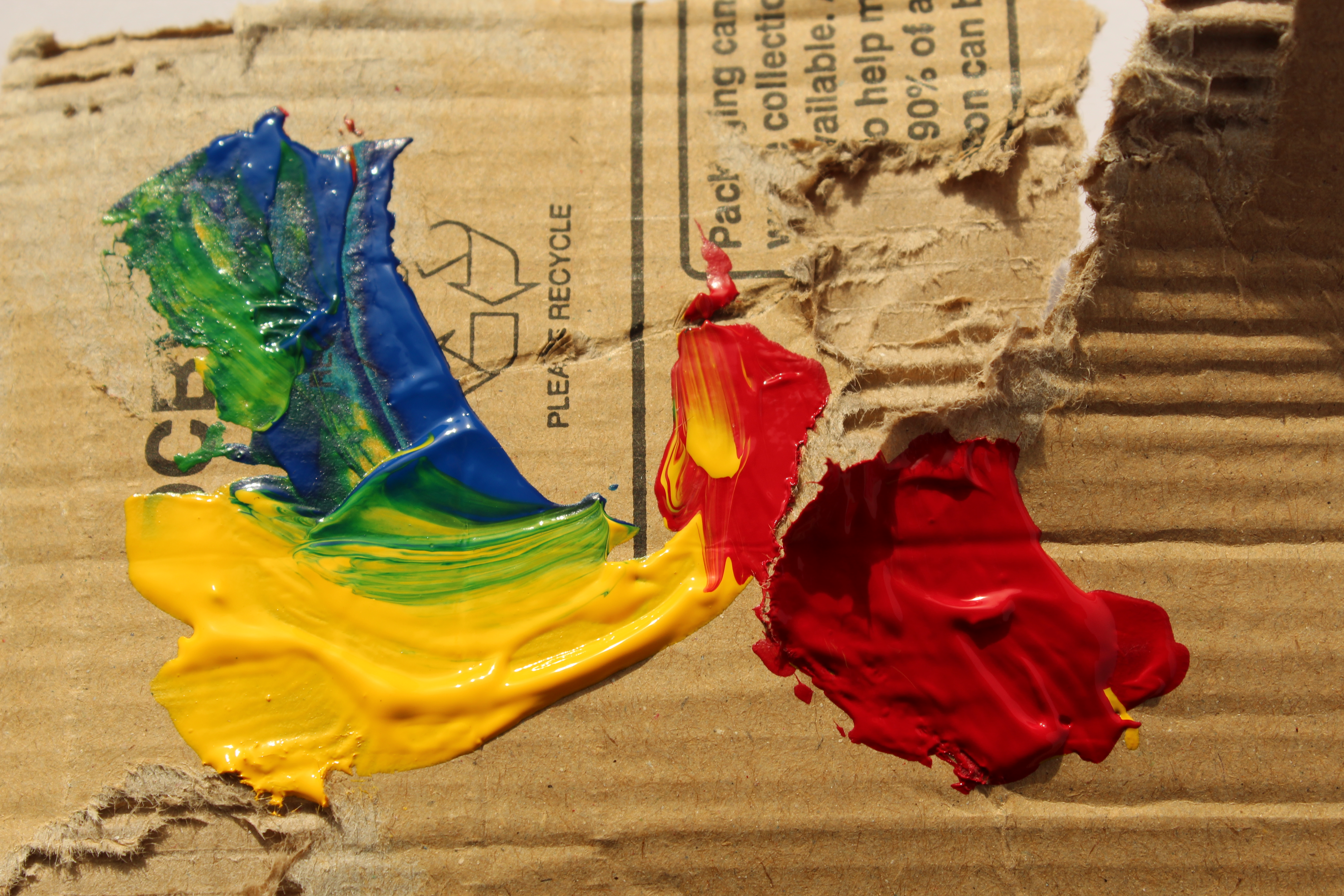
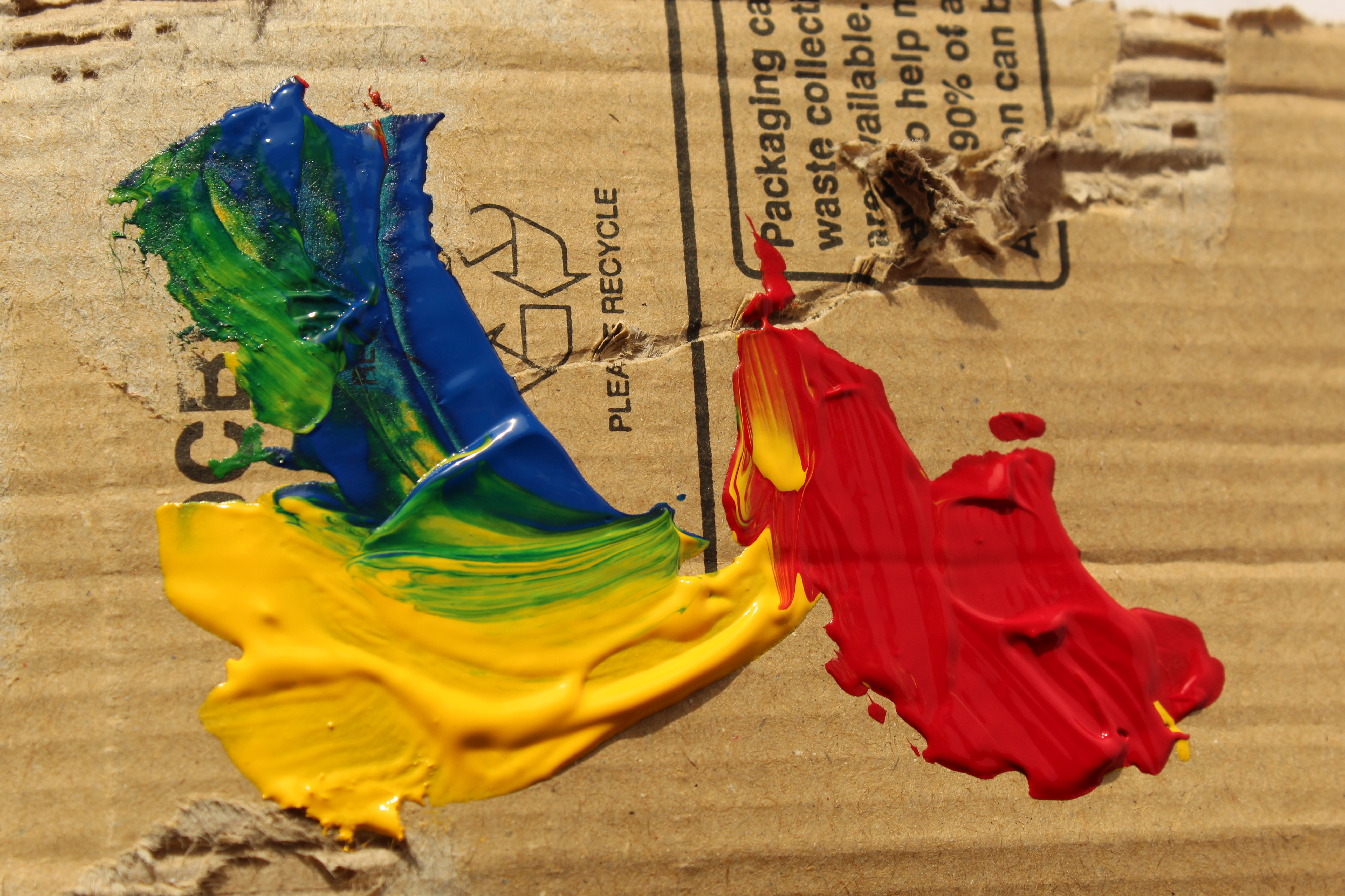
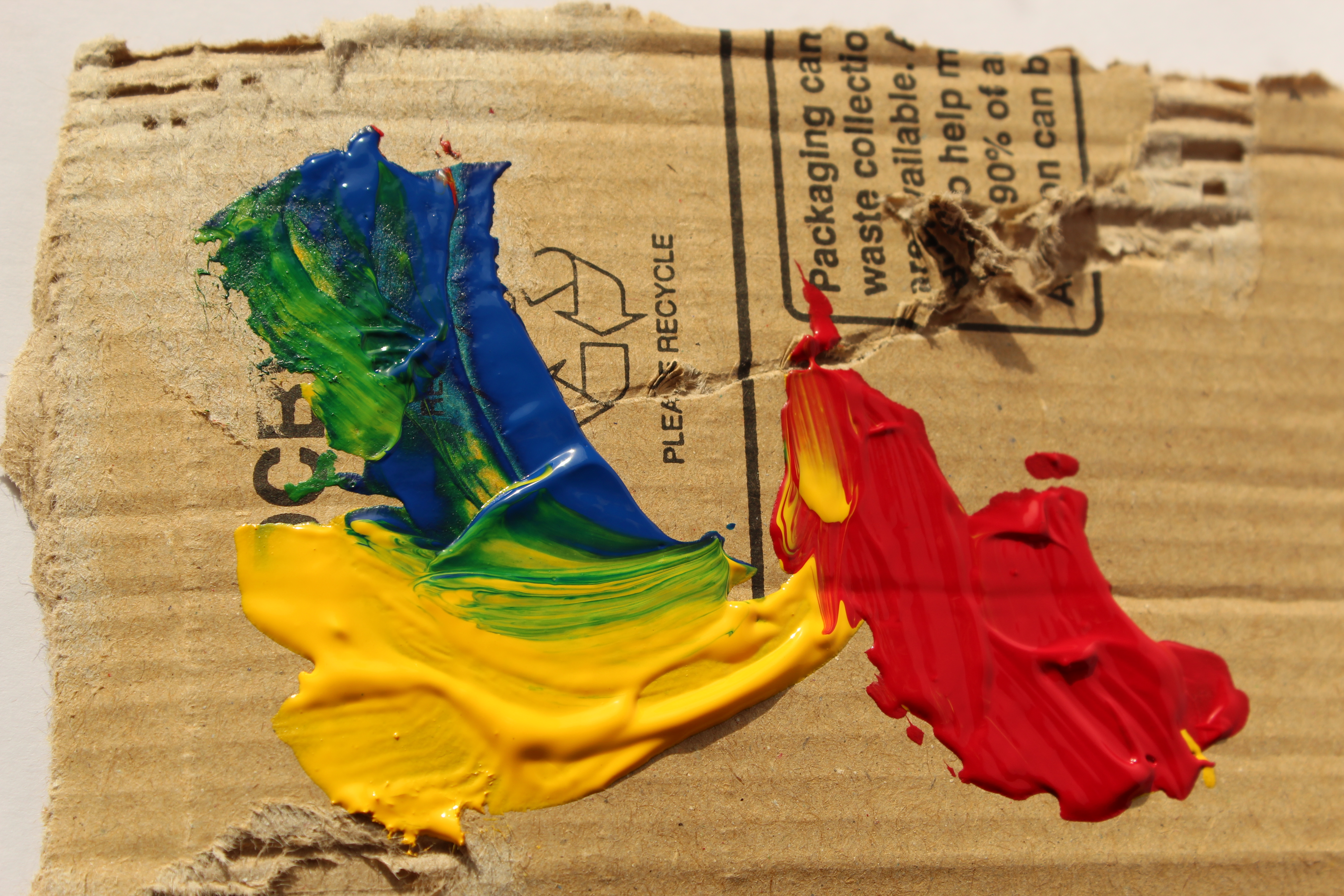
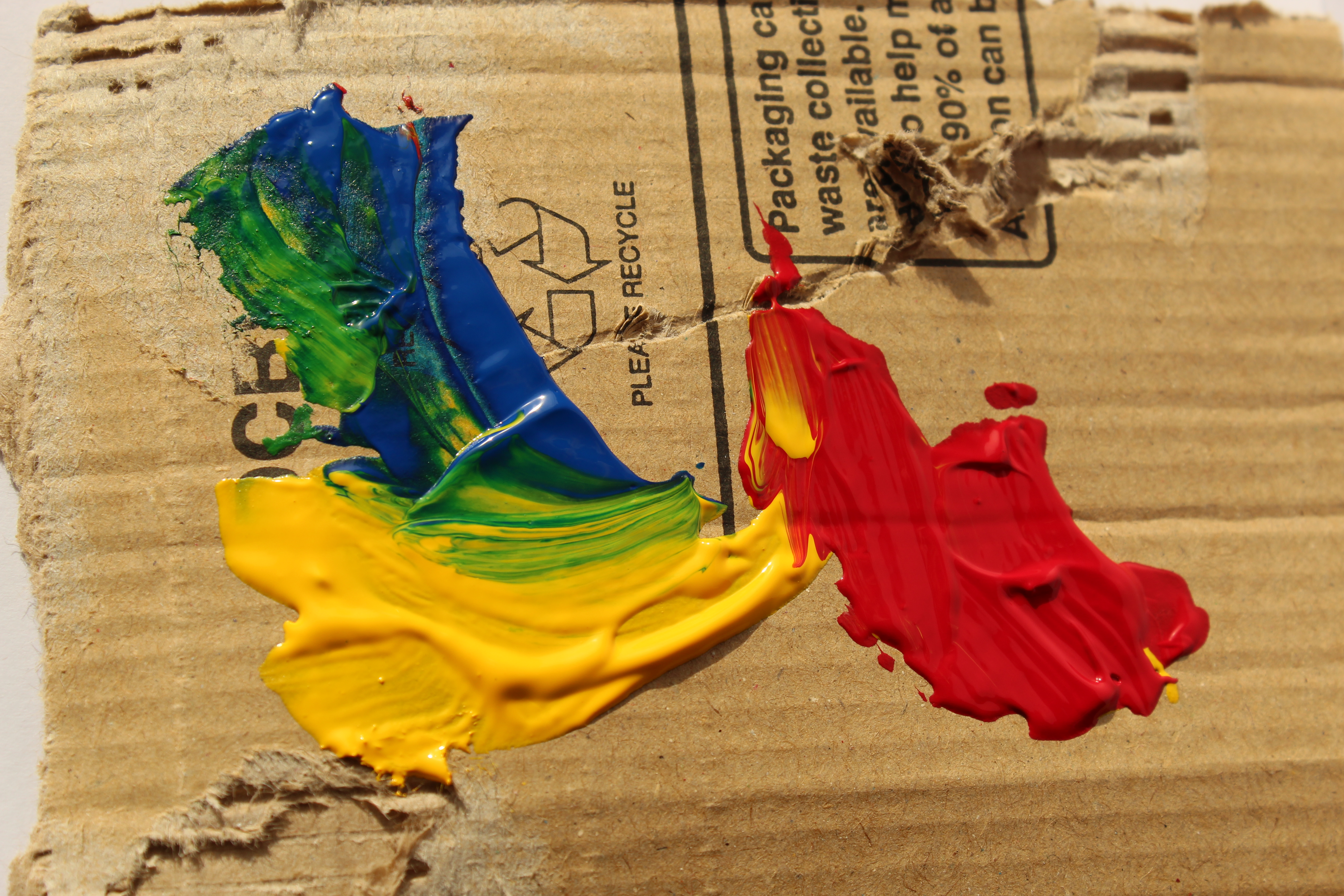
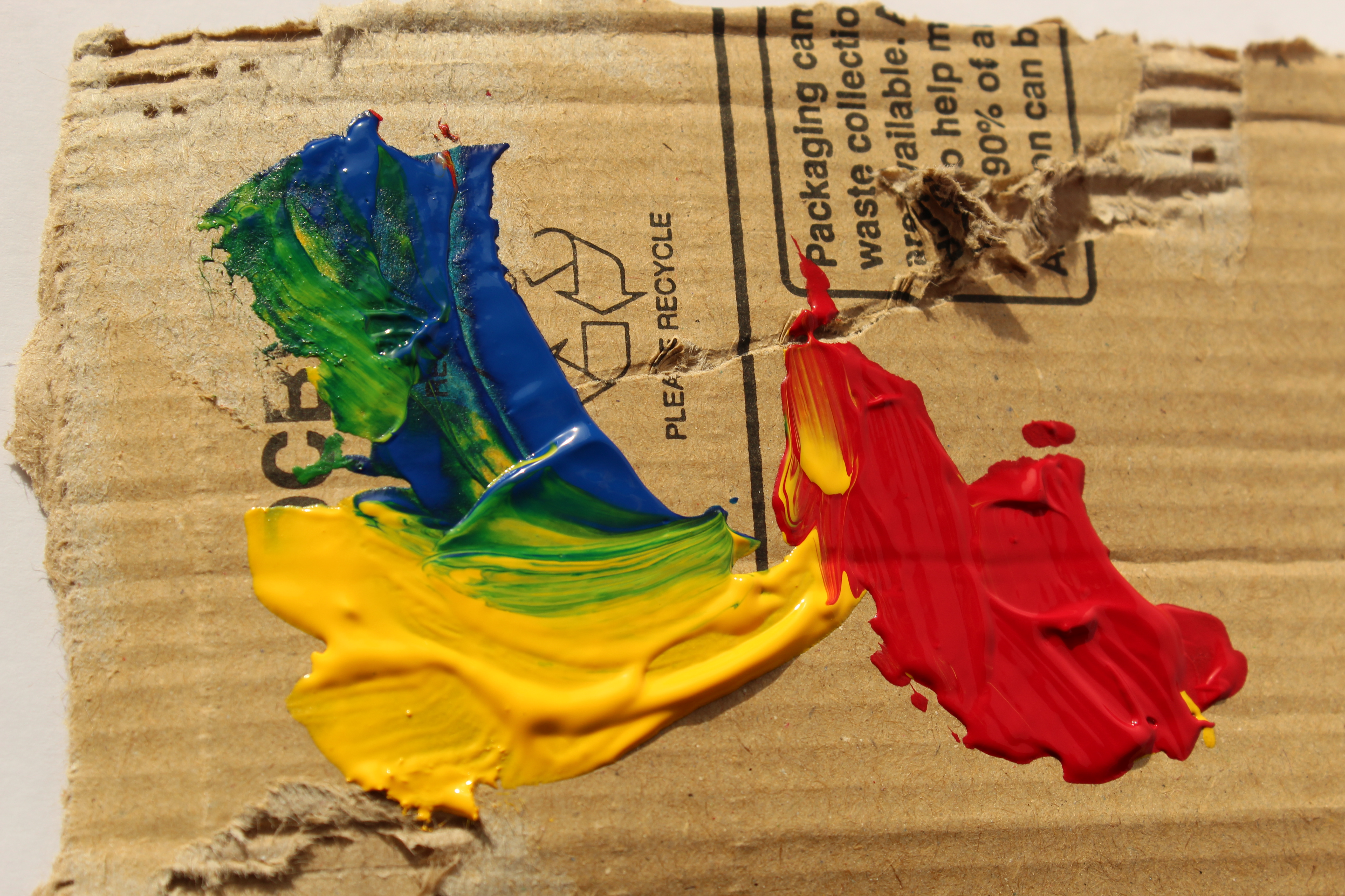
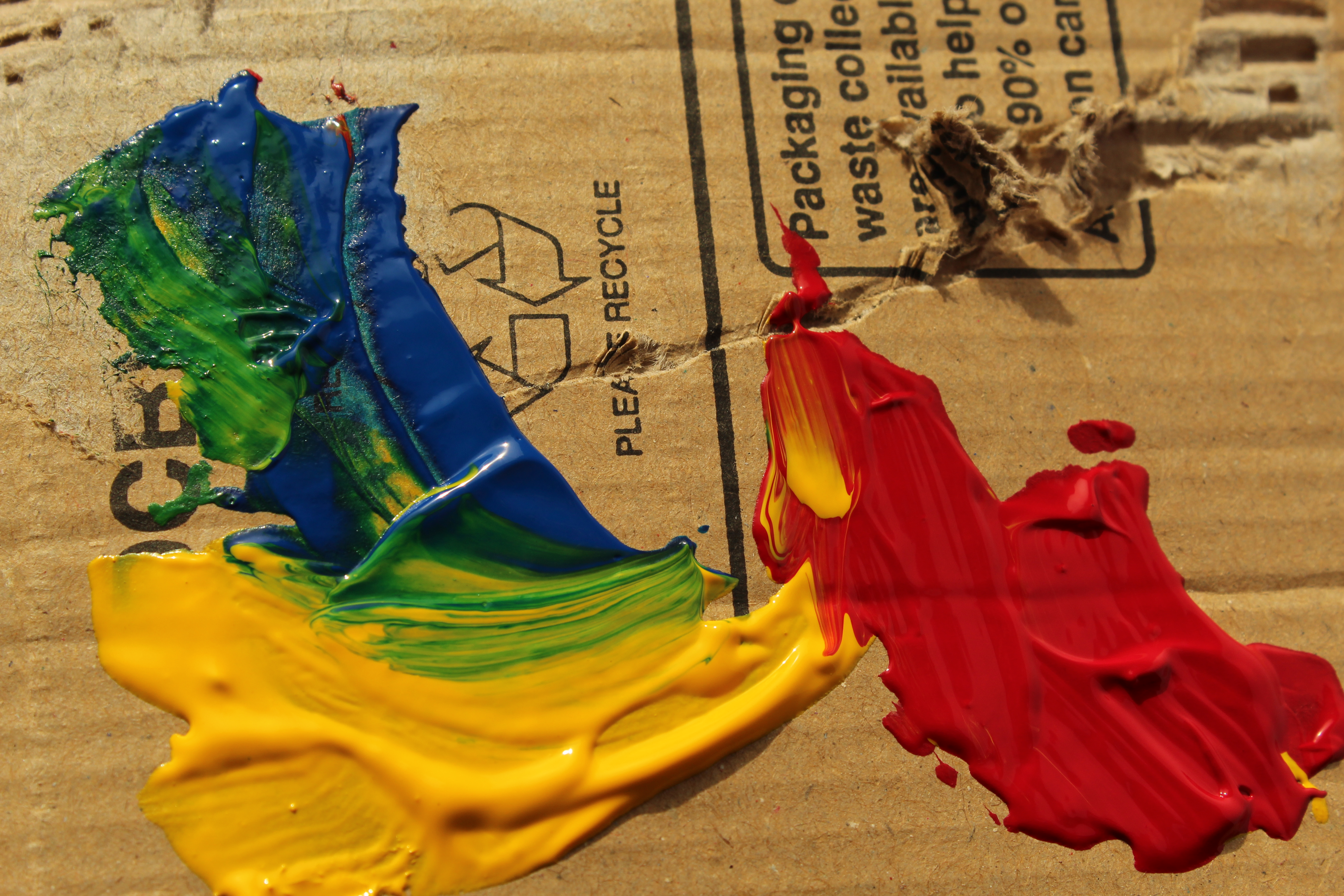
I noticed that most (if not all) of Siskind’s work is in black and white, therefore I edited some of my photos to be this way. However the task was also to include some elements of colour also so I edited the cardboard to be in black and white and the paint to stay mostly with its original colour. I did this using Photoshop to create a ‘splash’ effect. This can be seen in the video below.
Create An Easy Photoshop Color Splash Effect With No Selections Needed
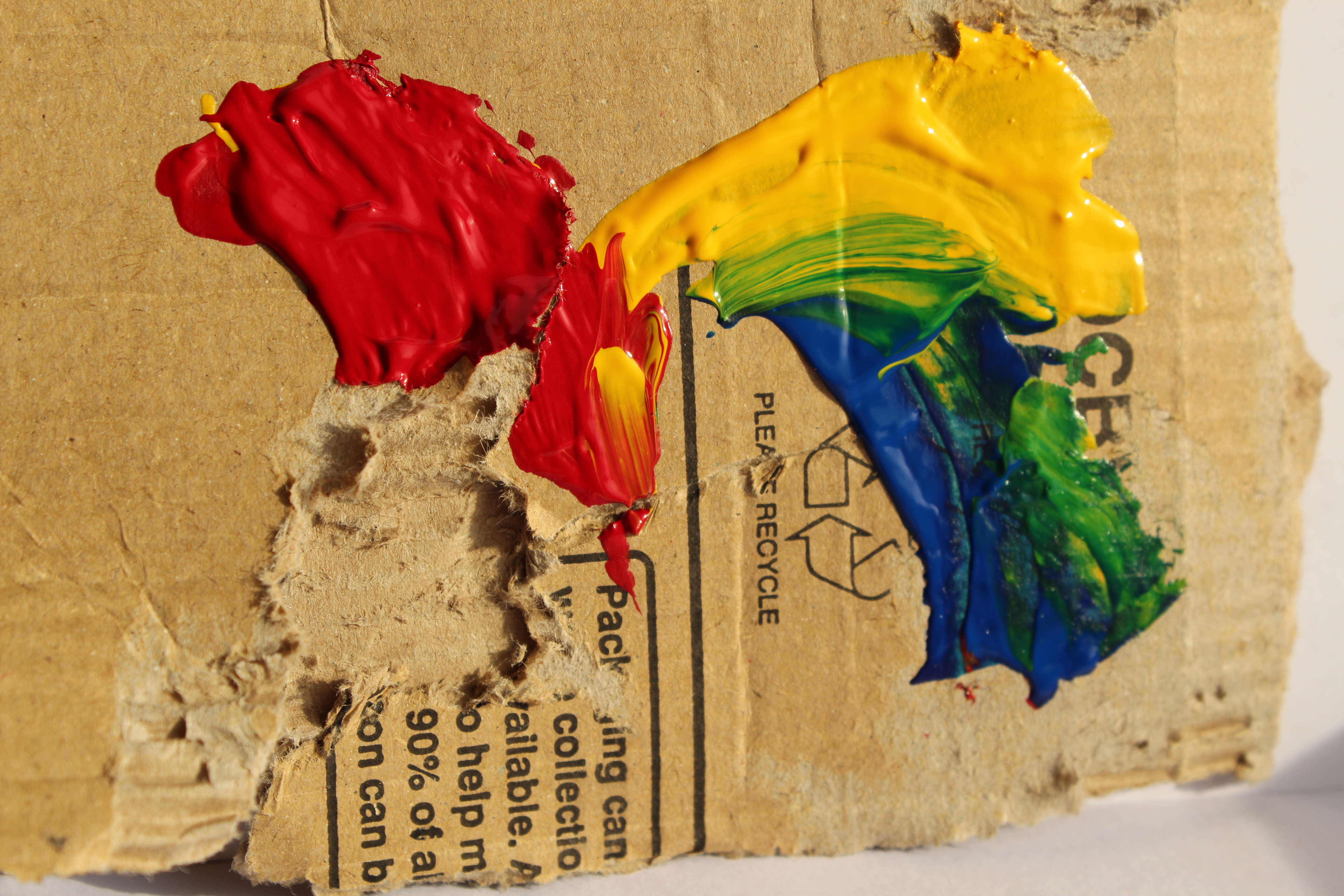


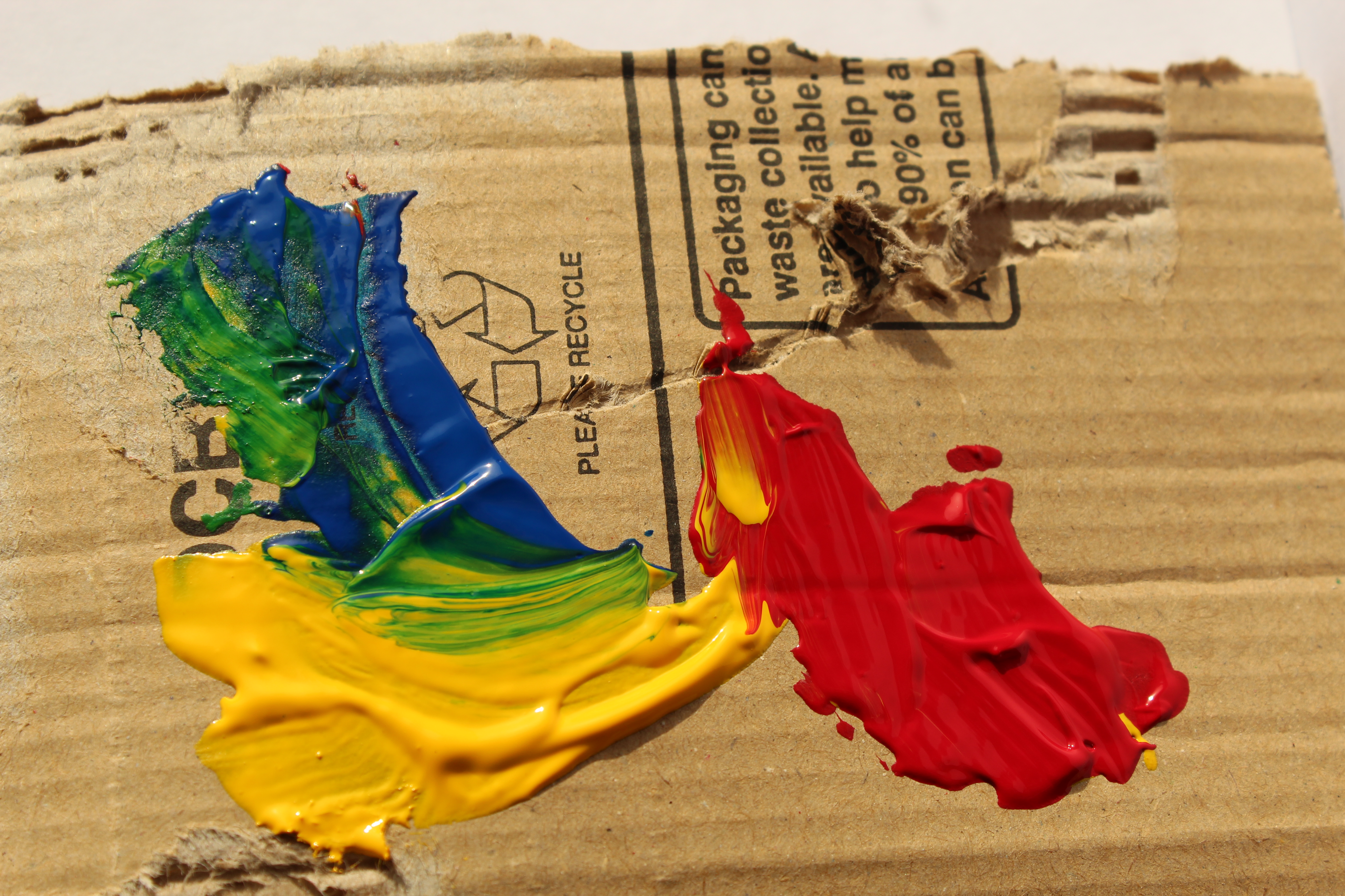


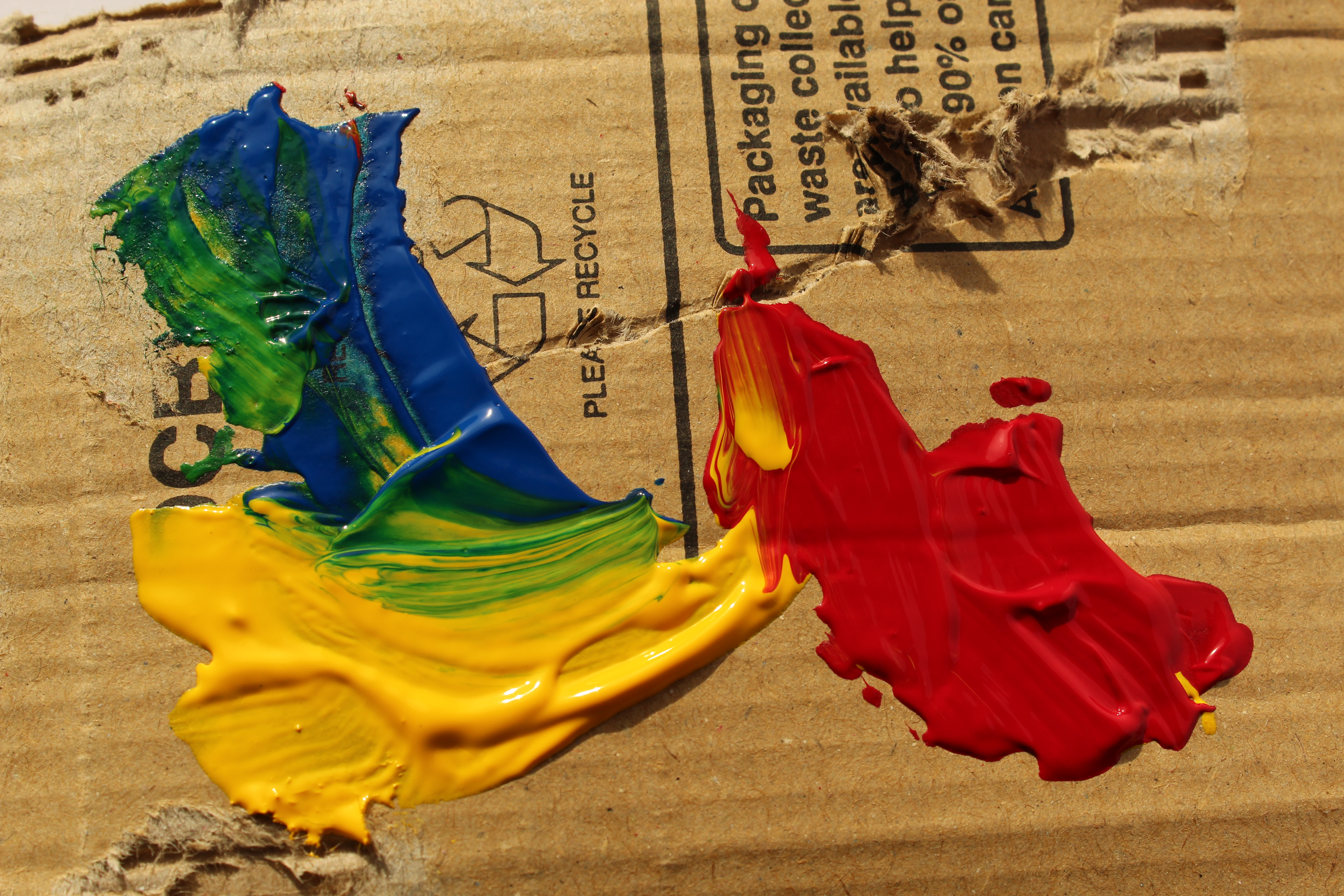
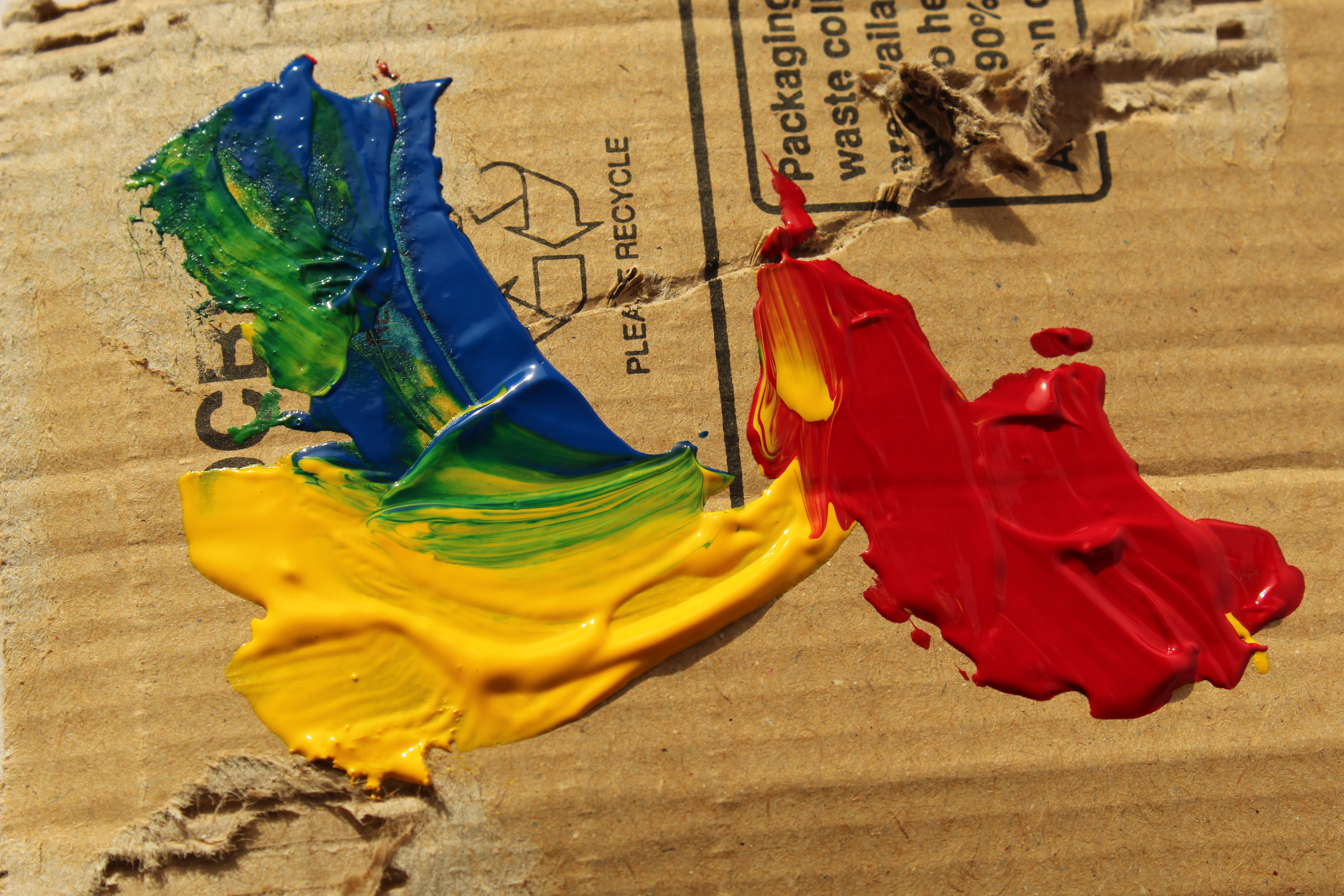
This is a small contact sheet/gallery of my first photo shoot.
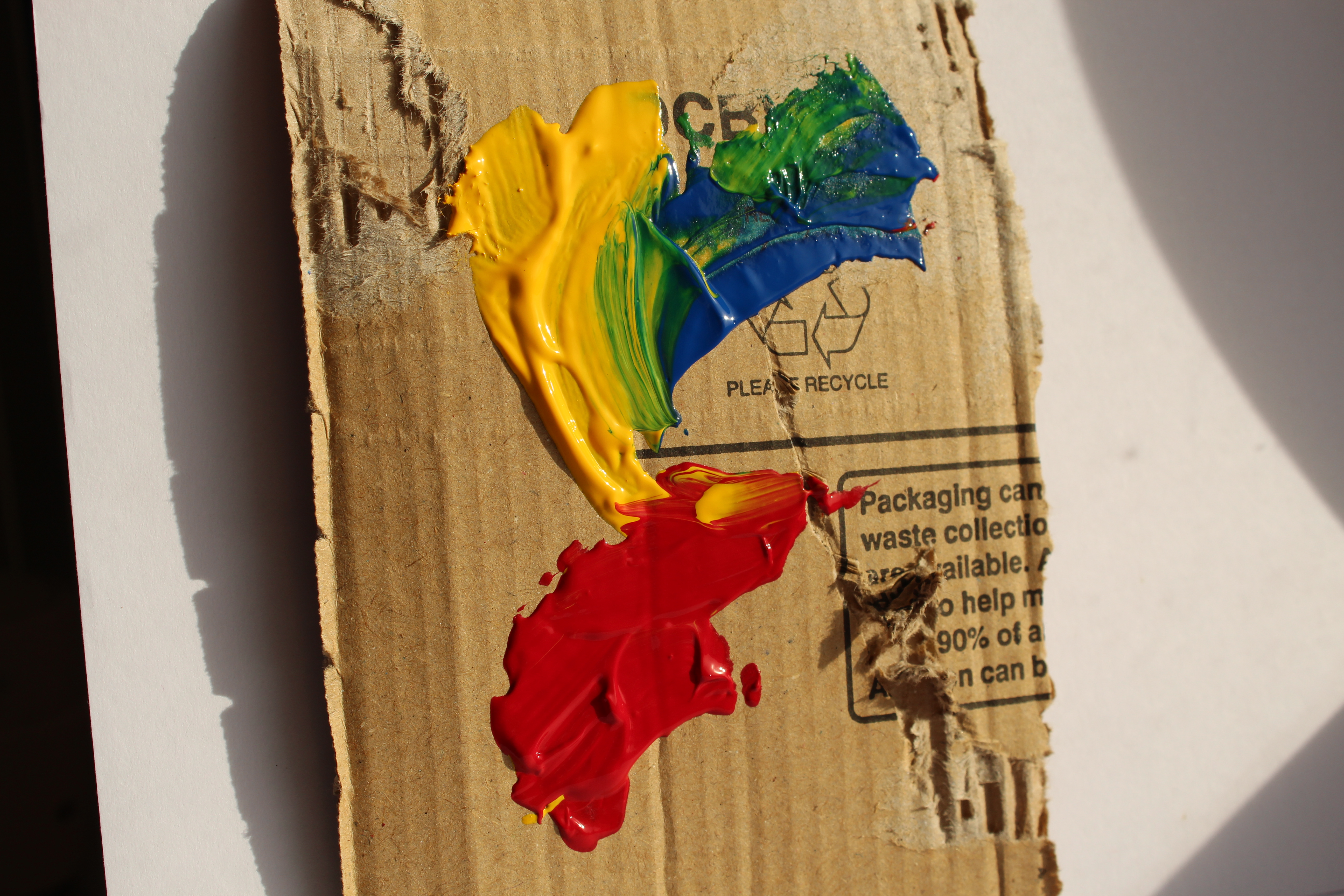
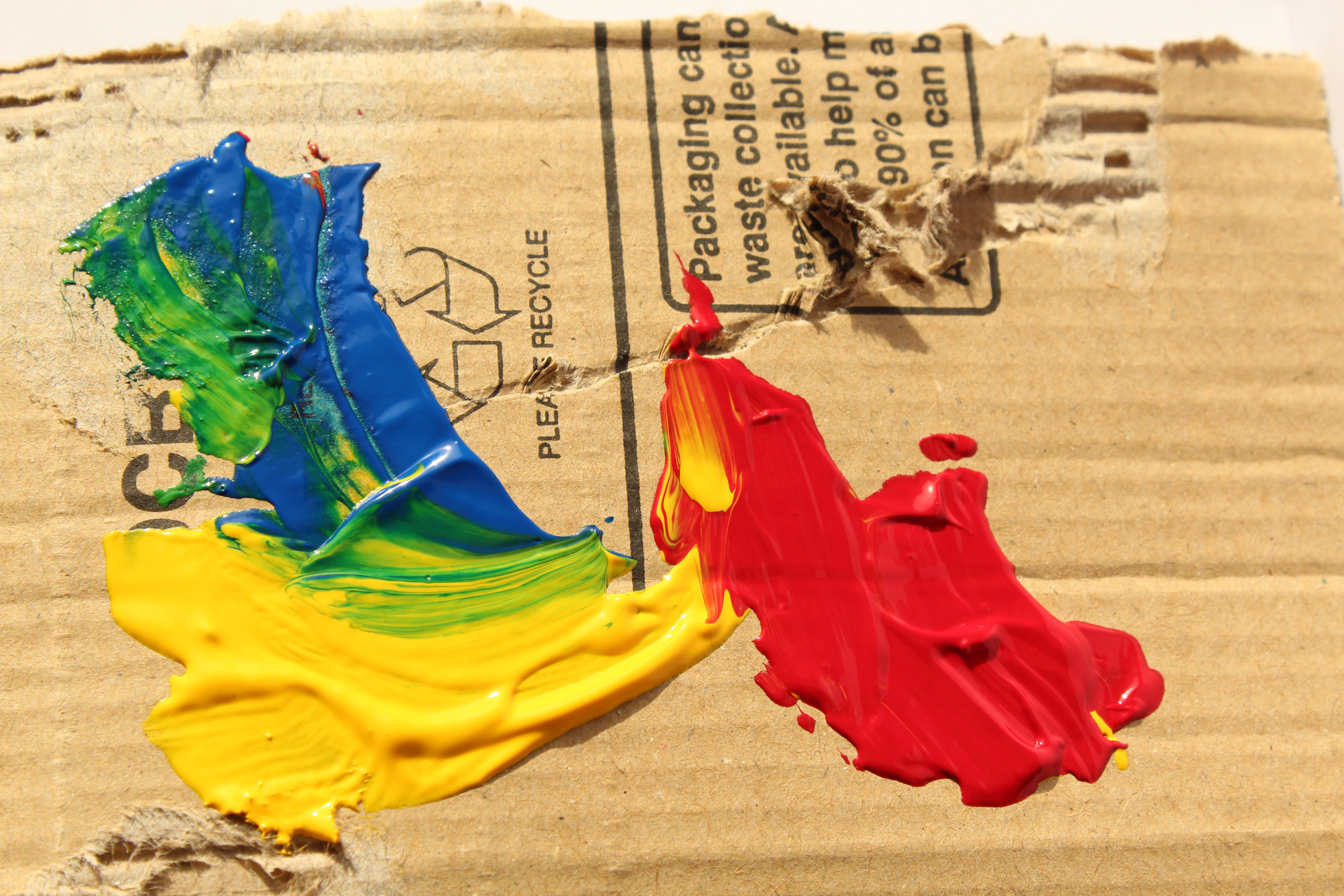
Here are the edited photos for this photoshoot.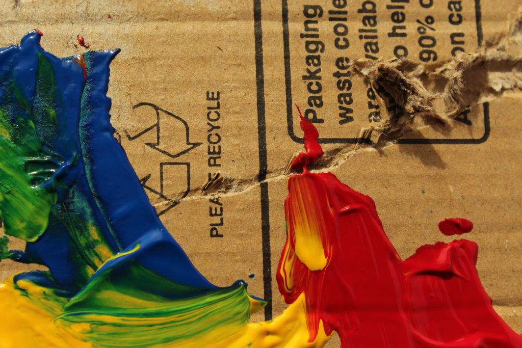
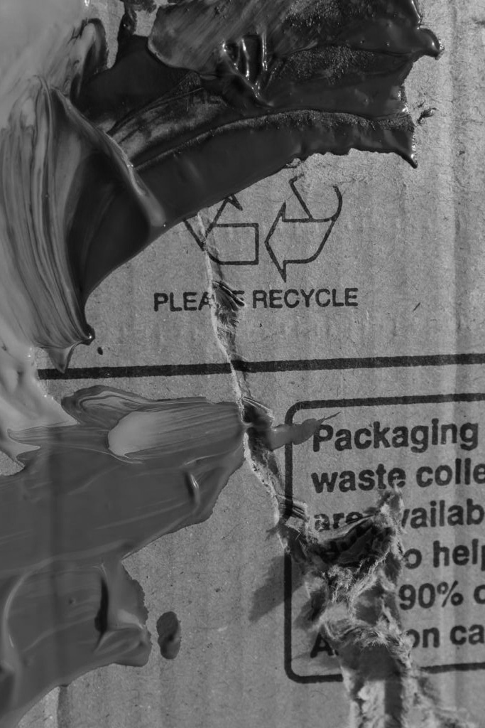
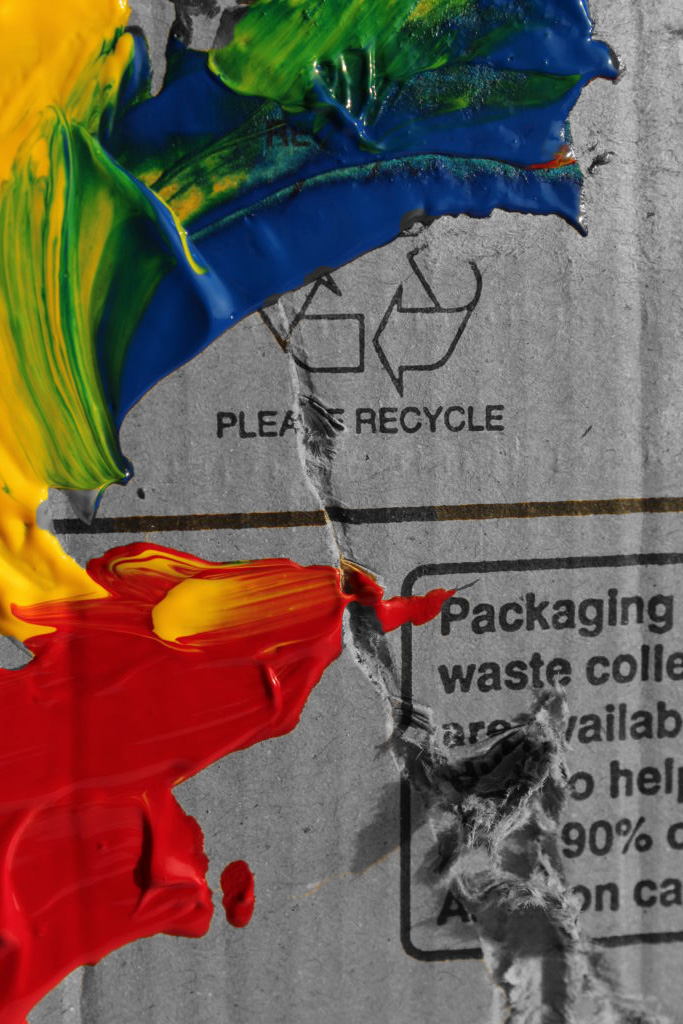
There are a couple missed parts which I couldn’t get with the Magic Wand/ Quick Selection tool. However, I still enjoy the constrast between the bright colours and black and white.
2nd Photoshoot
I also did a second photoshoot that wasn’t inspired by Siskind. This is the gallery/contact sheet for this.
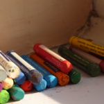
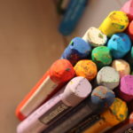
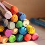
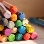

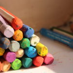
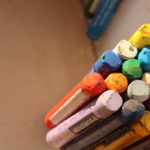
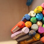
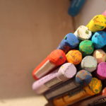
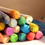
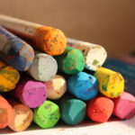
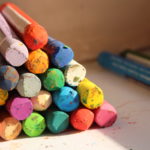

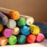
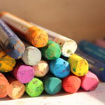
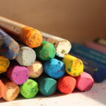
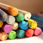
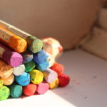

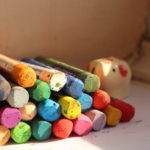
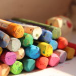
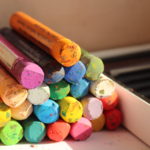
I wanted to capture the vivid colours in the oil pastels so I arranged them to all be leaning on one another. The ‘broken’ texture of the ends is rough and shows depth. I also cropped parts of some images to make it look more abstract and that you couldn’t tell exactly what is was. This is the edited close up version.

These are my final images on Colour+Texture.