Image Analysis of my interpretations of keld helmer petersen
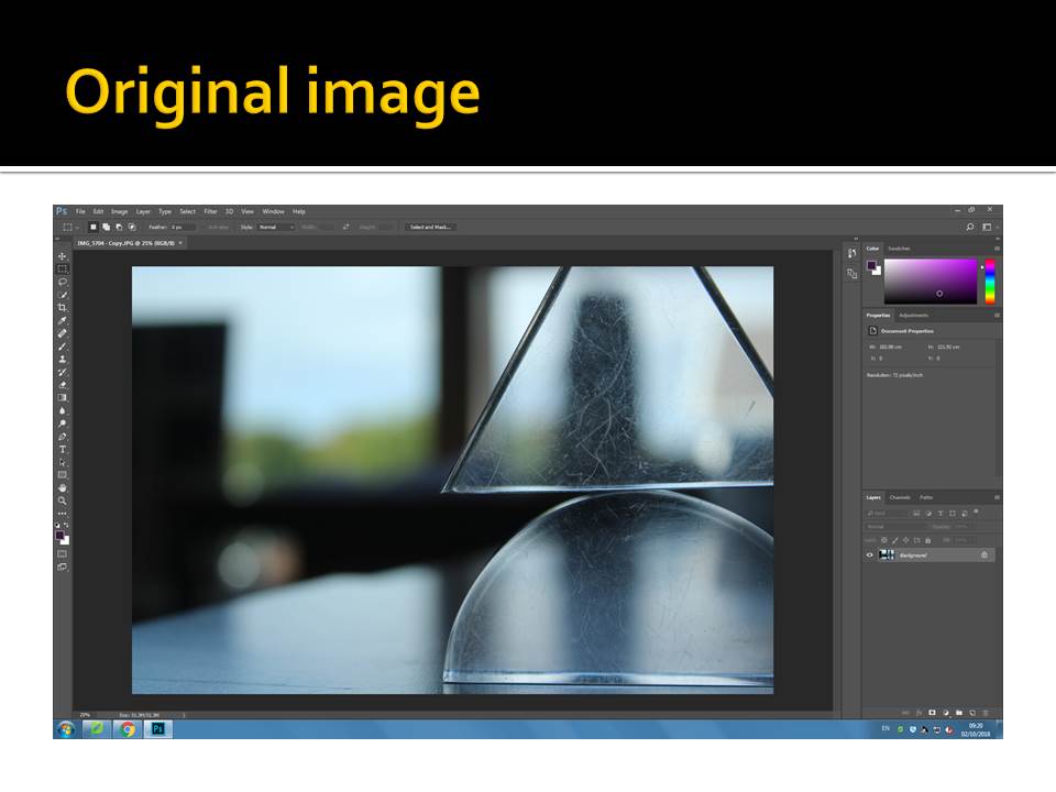
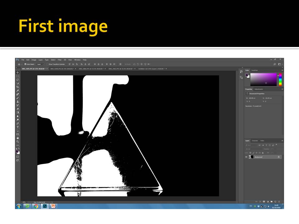
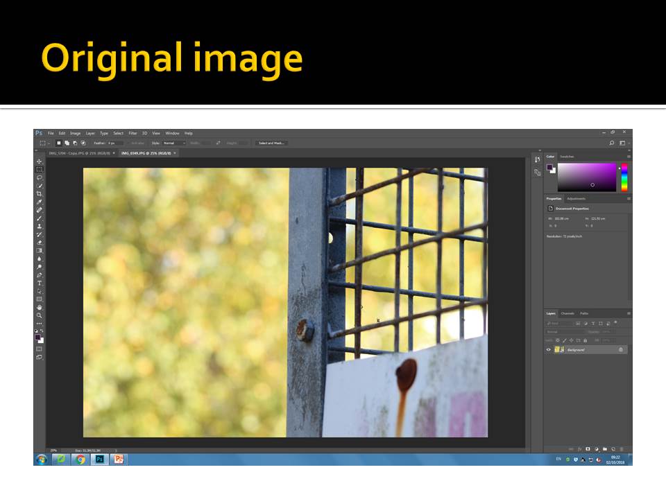
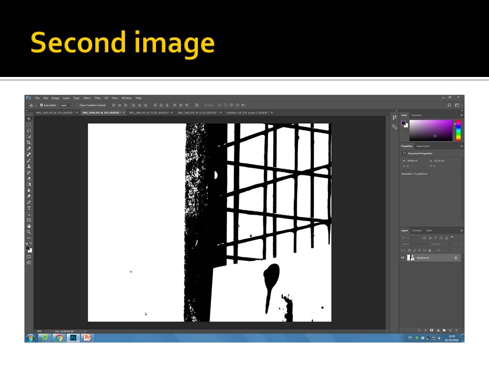
These are my two favorite images from my edits because i feel the the back ground being light creates a focal point on the main dark section of the of the image and the object. The negative space being white created contrast much like in Helmers work because that was his main intentions to create images with negative space that is white, so your main attention if drawn to the the object that is portrayed in dark/black. Using the threshold on Photoshop i managed to discard all of the mid tones within my images creating a contrast on depth and light, dark. The image with the triangle, i really like how the refection is portrayed as a section with a triangle and therefore shows the little scratches and details on the triangle which to me makes the triangle look more in focus and the background blur our much like the camera technique of depth of field. This was unintentional but i feel like it brings more depth and technical value the the image. In the second image, the background being light contrasts the metal cage and it stands out and all most pop out from the back ground much like a 3D IMAGE. The light and dark detailing of the rust on the cage adds the aspects of photograph technique and getting an images correctly in focus and creating a focal point that the audience is instantly drawn to.


