
The Cover:
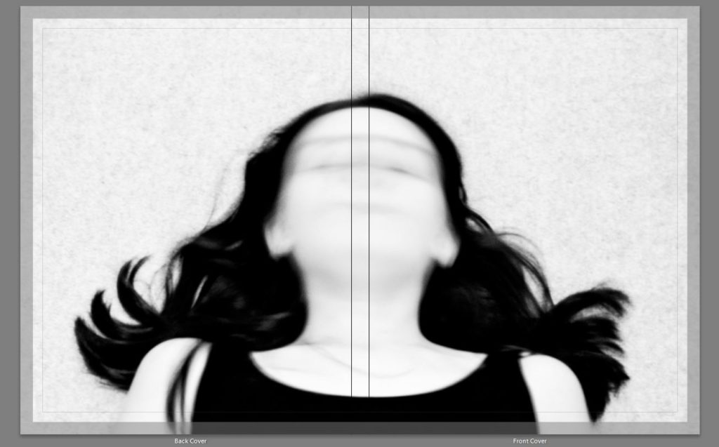
The cover image was the first thing a chose for my book. This image had been a favourite of mine since I’d taken it. The image wraps around the book perfectly and shows a nice symmetry on the front and back covers. I also think it gives a nice first impression on what the book is about. The striking black in the image indicates that the book has a darker tone to it and blur of my face suggests the invisibility felt by the book’s subject. The book is definitely about a low period in someone’s life.
First Layout:
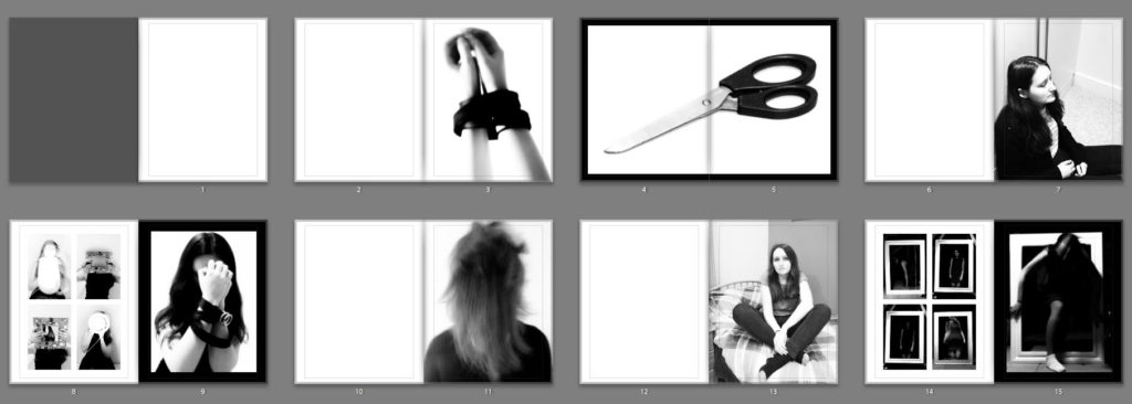
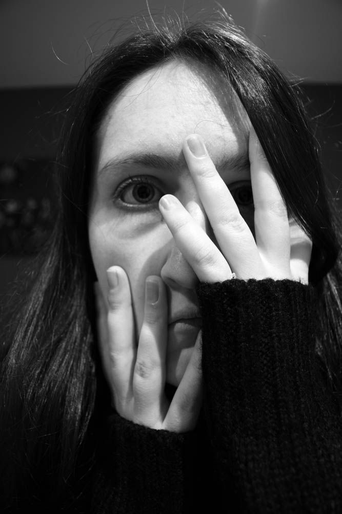
The First layout I had was close to the final thing. However there was one image that I wasn’t happy with. The image that shows a close up of my face and my hands covering most of it leaving only my eyes visible through my fingers was a very strong image and I wanted it to be a double page spread to really show it off. The problem was that it didn’t fit in within my image pattern. So combat this I decided that the image should go in the middle of my book as I already had other double page spreads at either ends of my book. This first layout failed to successfully do this without throwing off parts of my book that I was already happy with.
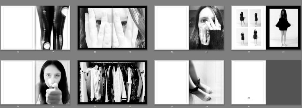
Second Layout:
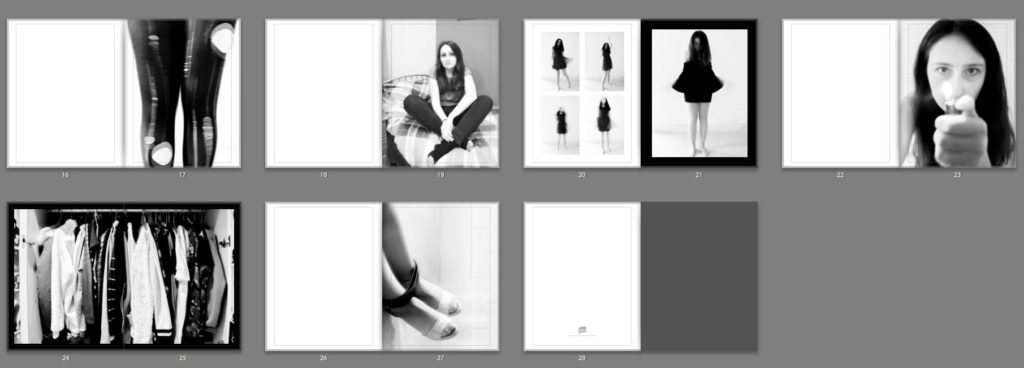
There is one major change between the first layout to the second. This is the removal of one of the images.
The above image was removed as I already had a similar image in the book. This image was weaker and I felt that it didn’t add as much to the book.