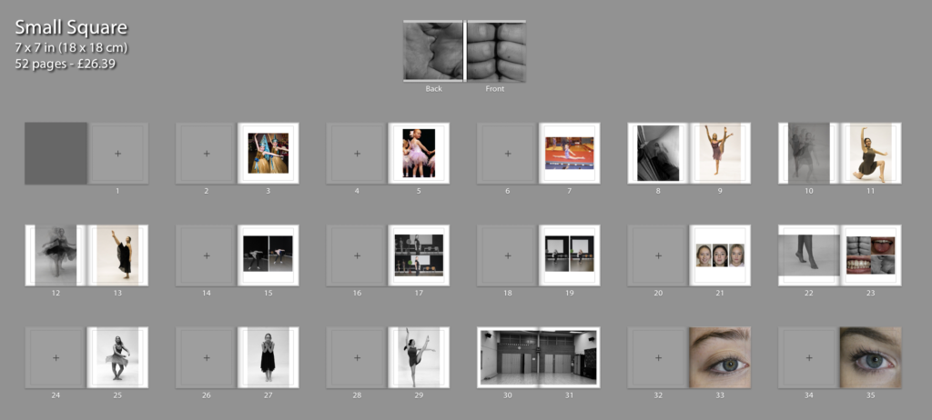
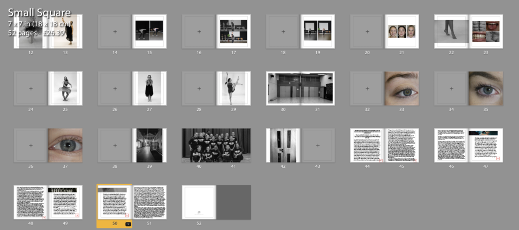
Below is the final layout of book called ‘le grande jete’ which in translation to English means ‘the big throw’ which highlights the deeper meaning of the book and highlight the emphasis of what an individual goes through as a dancing the idea of throwing yourself in the deep end with the representation of the struggles of dancing contrasting with the overall positive outcomes and the final results that come of this. The photograph on the dust sheets is a fist and on the back a palm which creates the Beijing of the narrative; the fist representing a more tense and struggle some feeling compared to the back on the dust sheet which is the palm of the hand in a stretched out format which helps aid the end of the booking being the opening and release of the fence beginning aiding the overall narrative of the book.


The name of book is called ‘La Grande Jete’ which as previously mentioned translates as ‘the big throw’ which adds deeper meaning of the experiences of being a dancer. Through out my book I have a variety of images that a presented through the book for example, I have images from childhood, to portraits of the three models, as well as close ups of the models. To me these initials images help being the narrative of the book going on to images of the models dancing using different filters to show the different types of emotions that I am trying to project through the sport of dancing. This to me was an essential part of book as it was important to me to highlight the realism of the book. When talking about the movement images I created these through the inspiration of images produced by Gjon Mili who use specific camera skills to create the feeling of movement in an image. Furthermore I have used images of the environment where the model dance as I feel that to be an essential part of their life as it is a place they spend a lot of their time and therefore will help demonstrate my narrative of book and aid the overall feeling of the book. On the last page I used a black and white image of studio doors closed to reflect the idea of the end of the book/ narrative- which to me help creates a nice crisp ending to the story then followed by my essay reflecting artists of interest. For the actual layout of my book I have used both a mixture of one sided pages with double sided images, mostly using one image per page with a few differences such as having more than one, these to me went well as they almost came as a pair. I have also used two full pages to add emphasis of those particular images for example; there is a full page of the dance studio in a black and white filter, to me this was an important feature and idea to consider as it really supports the significance of the studio reflecting the idea of almost the studio being the dancer second home as they spend so much time there- leading to the idea of the time and dedication it takes to commit to being a dancer. The photo book itself is a small square with side lengths of 18cm by 18cm which is the smallest option. I wanted to keep the book of small idea to represent the deeper meaning of the idea that I am trying to reflect the realism of a dancer compared to what is being represented in the media; the small truth that is being shown, therefore using a small book to represent that idea and point. As previously mention I will being using a dust sheet therefore the true design of the book will be covered, I did this as I wanted to use images I had taken to begin and end my narrative and create a more interesting front and overall appearance to the book. Finally at the end of the book is my essay which is exploring artist Gjon Mili and exploration into whether movement can be captures and truly represented through dancer movement as well as also reflecting the emotions being portrayed. For this final result of my book I have gone through multiple experimentations and developments that would overall aid my final outcome of my phonebook.
