In this post, I will be looking at the layout of my photo book and describing the way I have presented each image. I have made decisions regarding the order of the book and the size of the photographs, paying close attention to how they occupy the pages in relation to one another. The book features a number of different layouts for the images, as I wanted to present an array of different arrangements to enforce variety. The way that the images are presented is very important as it dictates the way in which the story is being told to the viewer.
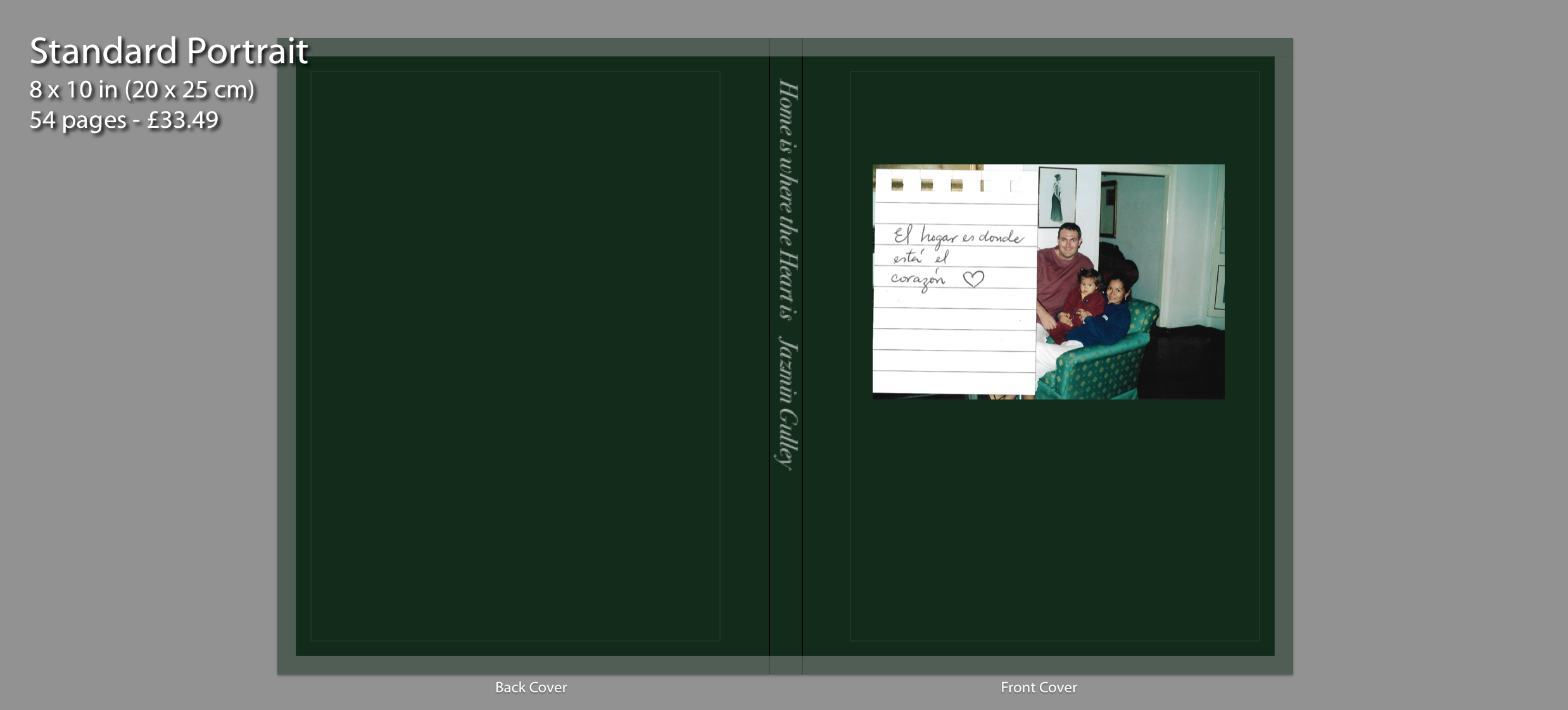
The cover of my photo book displays an image of my family sat on the sofa in our house located in Peru. This is where our family journey started. Alongside the archival image is a handwritten note on lined paper saying “El hogar es donde está el corazón” which translates to “Home is where the Heart is”. Writing the title as a note was a good idea because it gives the book a personal touch. I chose the colour dark green for the background because for me this colour represents memories, nostalgia and importance. Although it is a simple cover, I think it’s effective as it conveys to the viewer that within the book I will include archival images where I explore my family and the past.
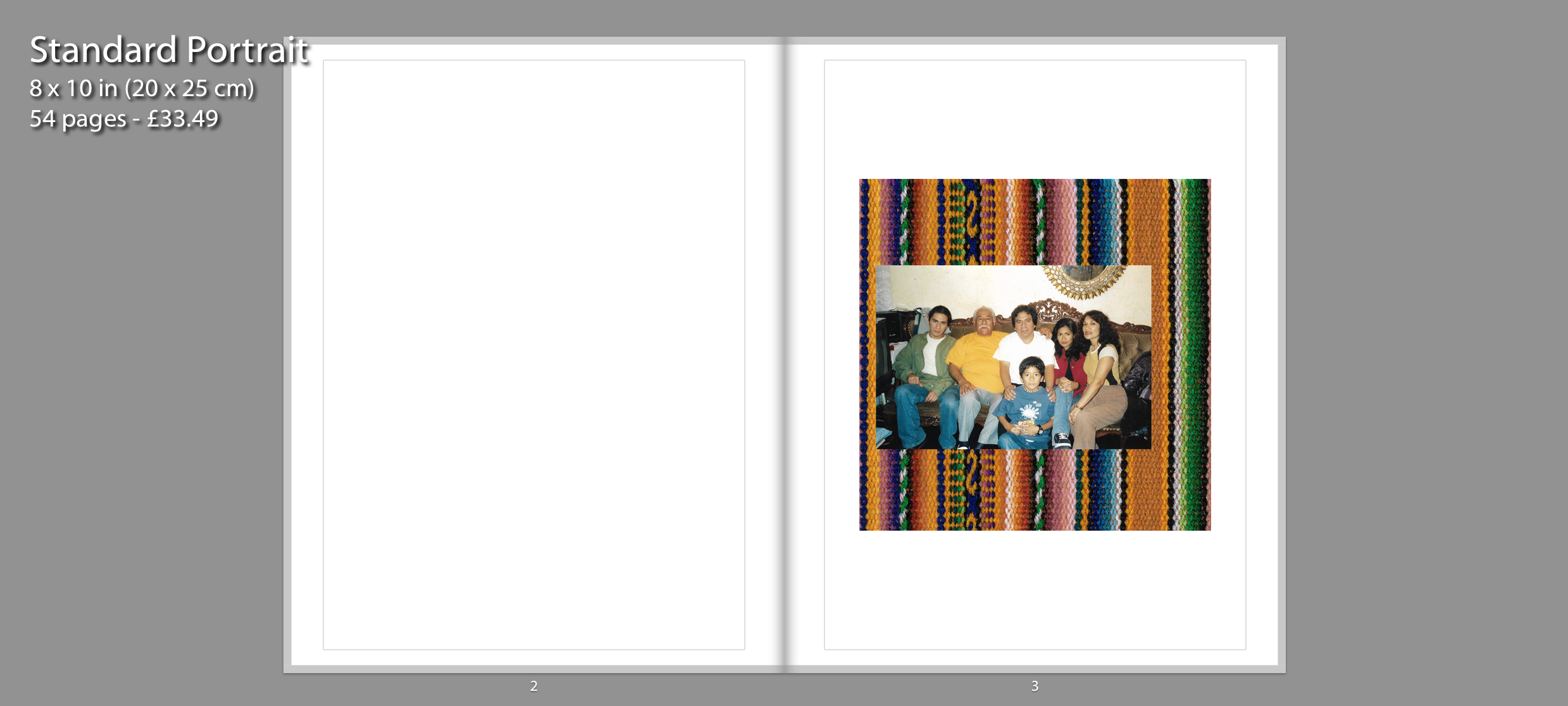
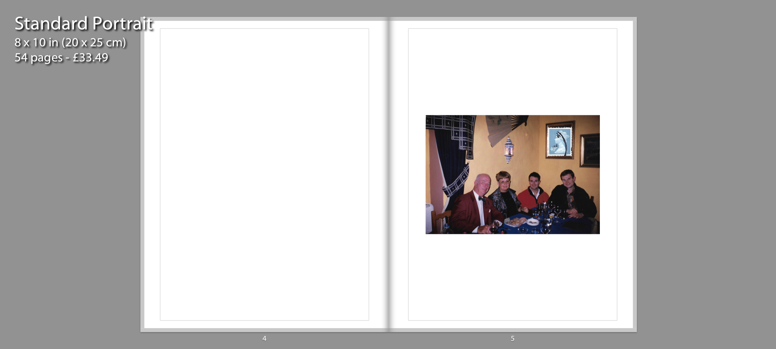
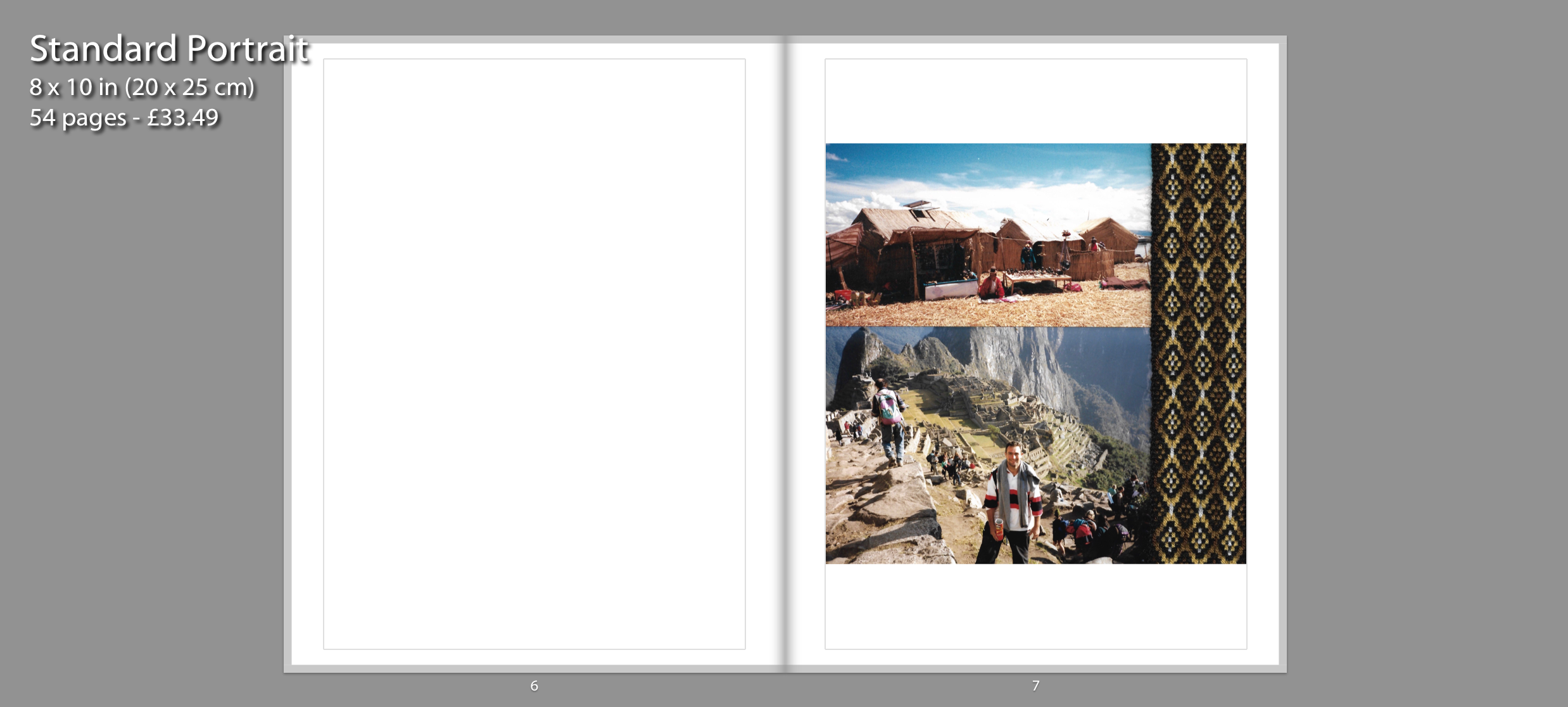
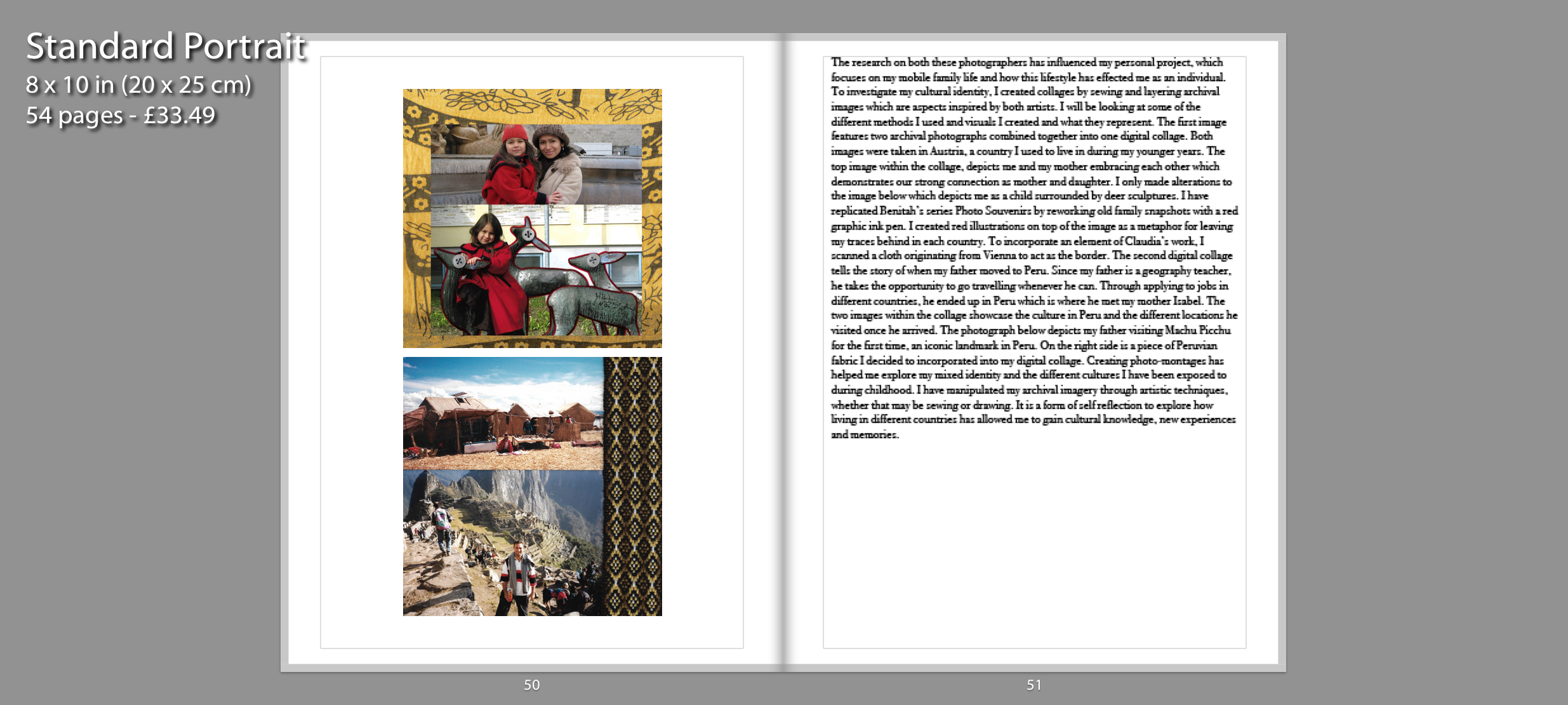
My photo book is mostly in chronological order and only breaks this pattern when reflecting on the past with present photographs such as souvenir images. This order will make the reader feel like they are going on a personal journey as they experience my childhood through archival images. I start the narrative of the book before I was even born, focusing on my mother and my father and their first encounters together. All these images are accompanied with a blank page on the left side to ensure focus on the singular images. The first page depicts a family portrait from my mother’s side in a collage combined with Peruvian textile. On the second page I have incorporated another image that depicts a family, however this time it showcases my father’s side. Finally, the third page depicts a third digital collage which tells the story of when my father moved to Peru. Through applying to jobs in different countries, he ended up in Peru which is where he met my mother Isabel. The two images showcase the culture in Peru and the different locations he visited once he arrived. One of the photographs depicts my father visiting Machu Picchu for the first time, an iconic landmark in Peru. On the right side is another piece of Peruvian fabric I decided to incorporate into my digital collages.
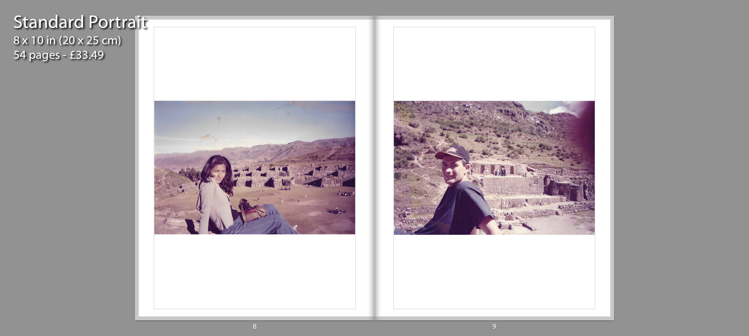
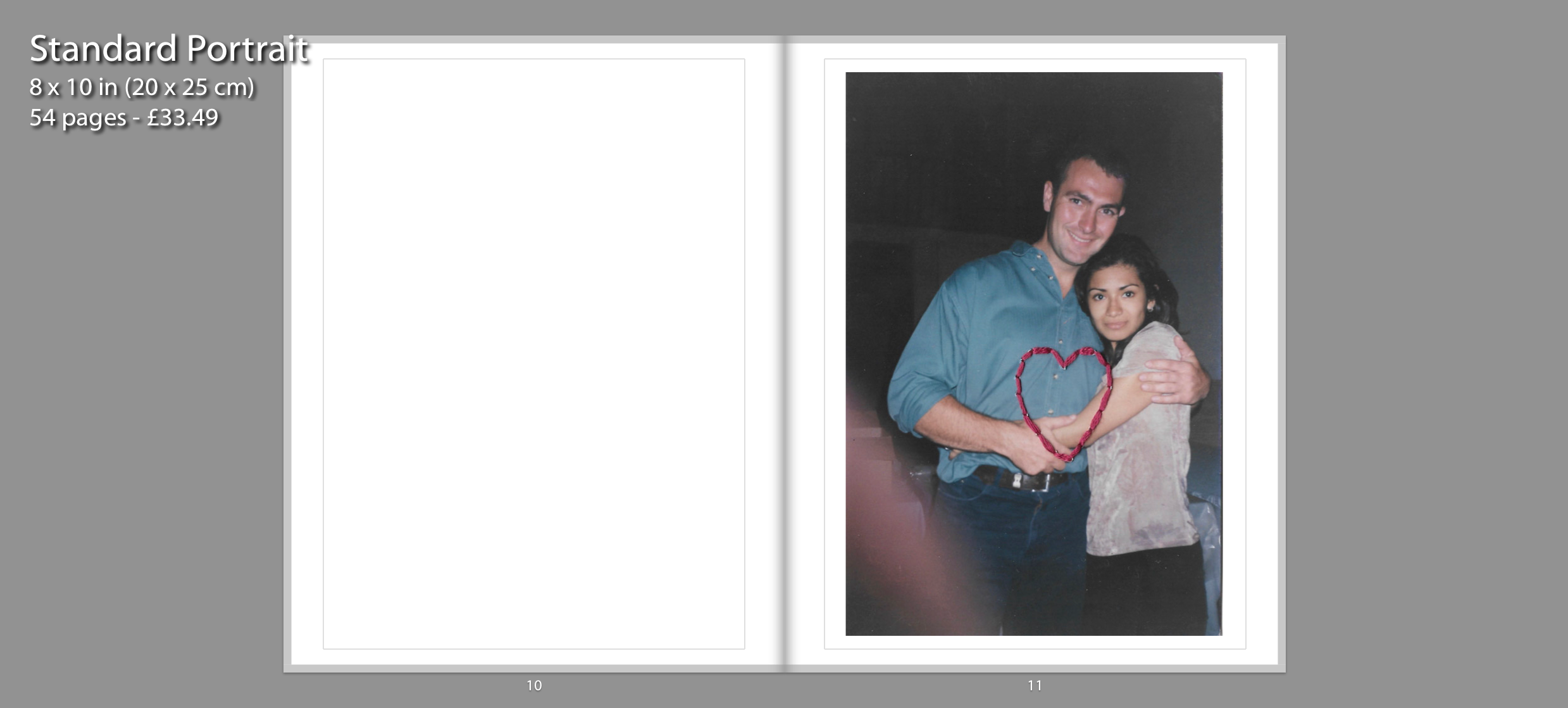
The sense of chronological order is continued with the following pages shown above, which displays my parents first encounters together. On page 8 and 9, I have displayed two archival images depicting my mother and father on a trip around Peru. I chose to pair these two images together in a double page spread because the composition of both images are similar to one another. Page 11 displays an image of my parents relationship blossoming. I chose to stitch a heart using pink thread to represent their strong connection.
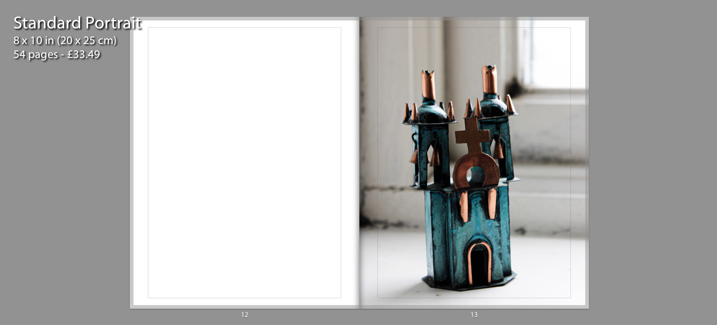
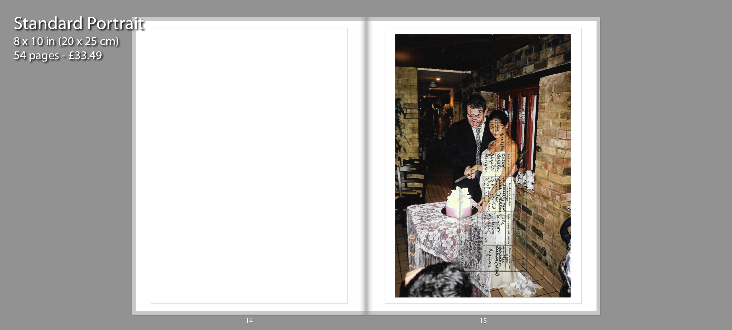
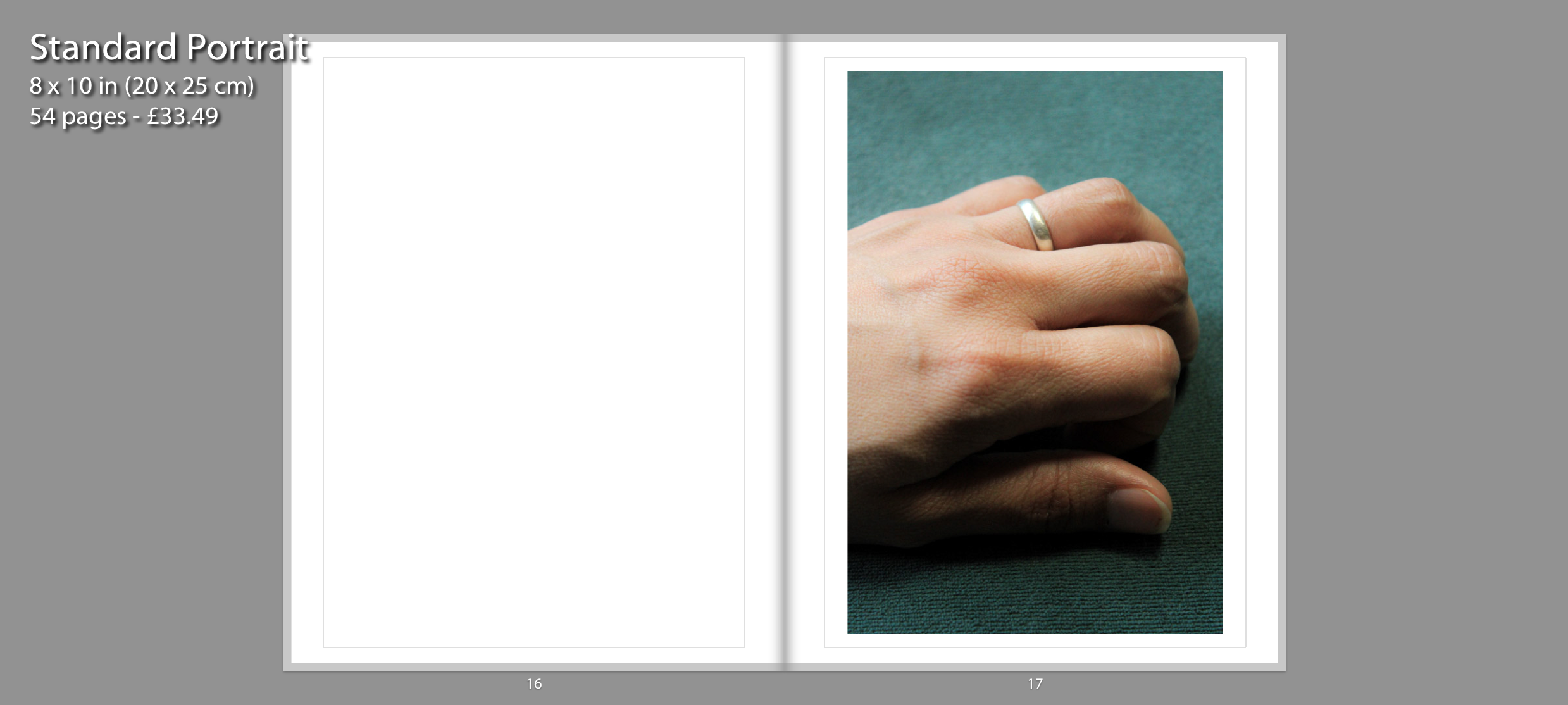
These following three images showcase the marriage between my parents. The image on page 13 depicts a handmade copper and bronze Ayacucho Church sculpture. I decided to photograph this sculpture because my mother’s family side are Christians and they regularly attend church. It is also displayed as a metaphor “hearing the wedding bells ring” as a sign of the upcoming marriage between my parents. I experimented with the layout by having it full bleed on one page. I chose to present the image in this composition because it’s a small souvenir, so I decided display the photograph in a large scale. The image on page 15 depicts a snapshot of my parent’s wedding and layered on top is their marriage certificate. Page 17 features a current photograph of my mother’s hand wearing her wedding ring. This is presented after the archival image of the wedding to showcase that the marriage between my parents is still going strong.
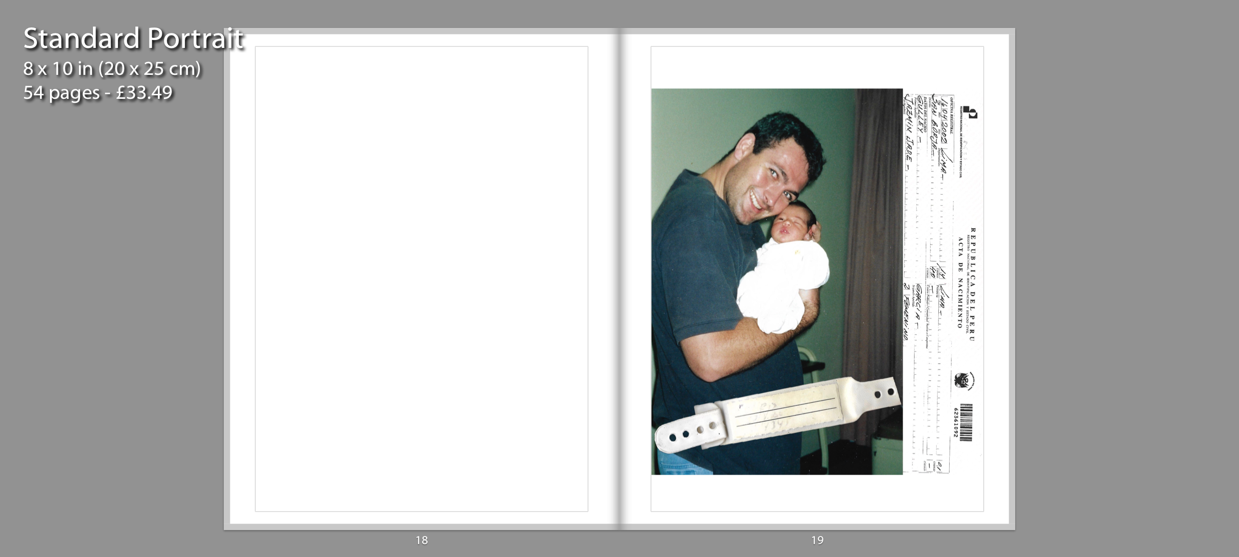
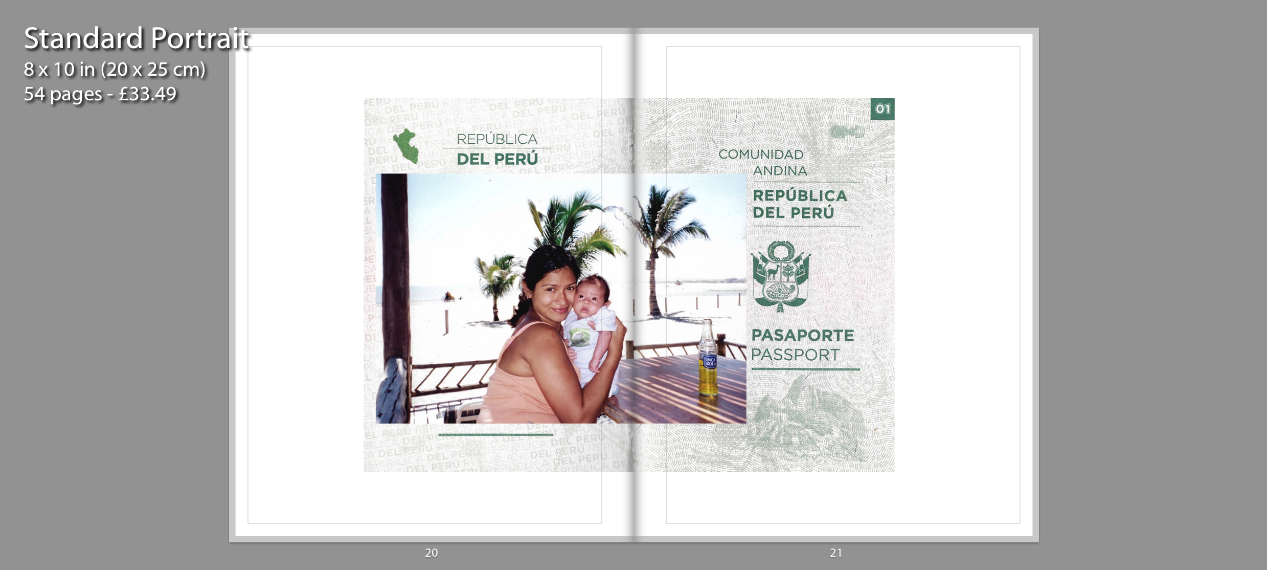
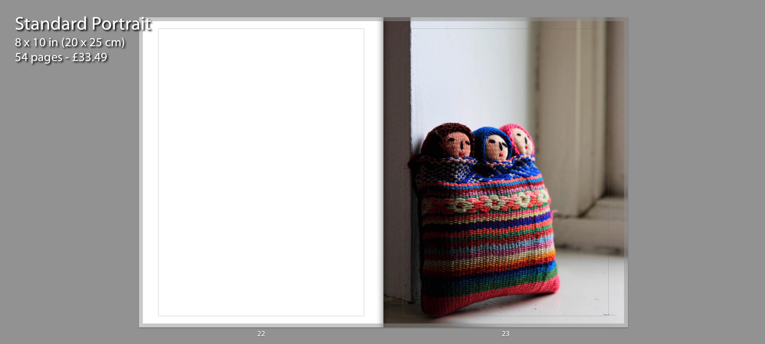
The following outcomes are inspired by Claudia Ruiz Gustafson. I have created digital compositions which incorporate archival documents. The images on page 19 and 20, 21 display the events that followed after I was born. The right side on the first image contains my birth certificate and layered on top is the band I had around my wrist in the hospital. The next double page spread also incorporates an important document which is my mother’s Peruvian passport. This is the first image within my photo book that goes across two pages. The fold on the passport is directly on the fold of the book. Layered on top of the document is an archival image which depicts the first few months we spent in Peru before we shifted countries. Similar to the first souvenir image, I made the photo on page 23 full bleed for the same intention. This depicts three people closely bonded through textile. This represents me and my parents strong connection together as well as our connection to Peru since its where my mother and I were born and where my mother and father met.
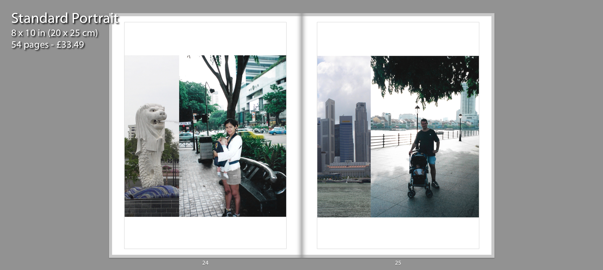
The two digital collages are also inspired by Claudia and depict the time when my family decided to move over to Singapore. I scanned two separate images and decided to combine them together through Photoshop. The archival images on the right display my mother and father looking after me as a baby. On the left side of each collage, I decided to combine the photographs with an iconic landmark from Singapore. I paired them together in a double page spread because they display the same country and have a similar collage composition. they occupy the space well because both are presented in a square frame.
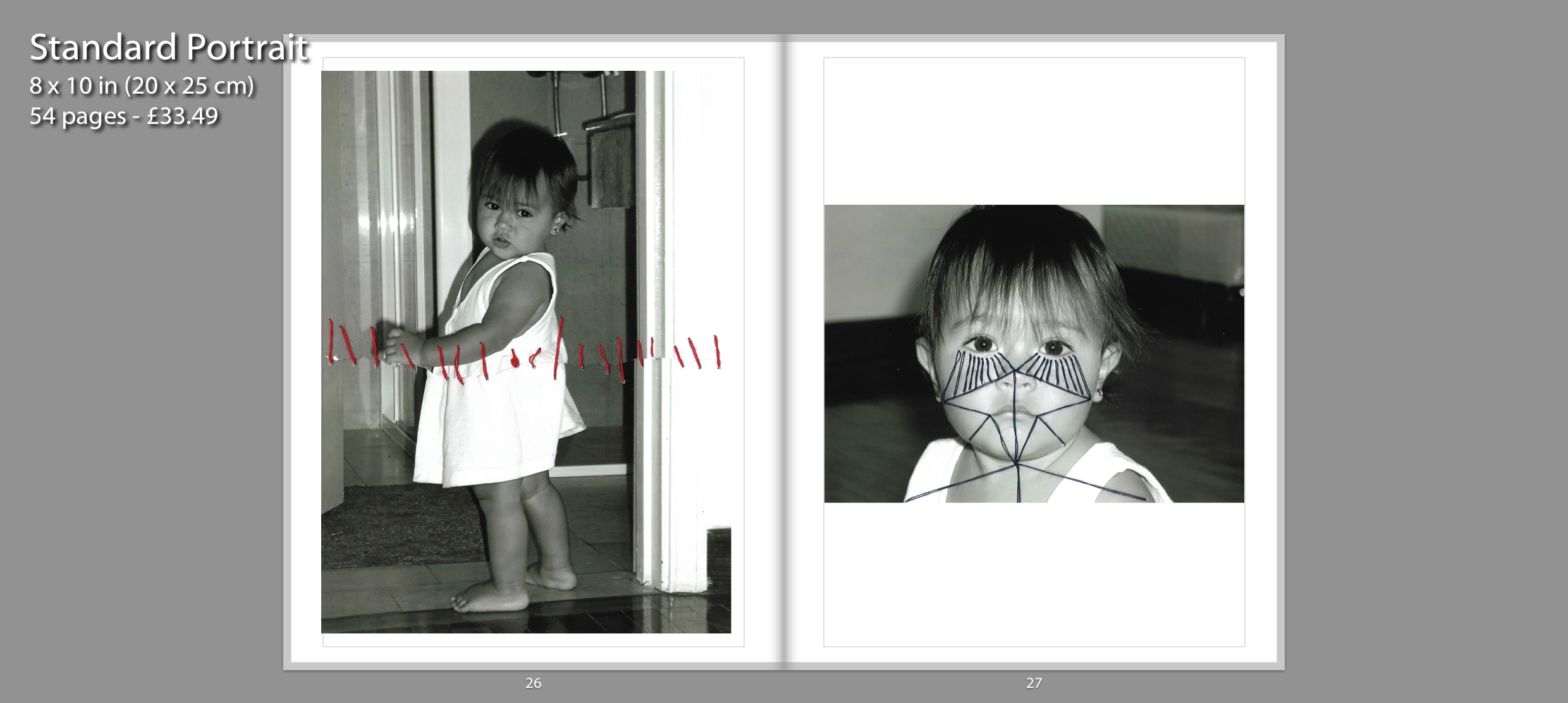
For these photo-manipulations, I used thread for my archival images to be sewn over with geometric patterns. I recreated the abstract aspect of Annegret Soltau’s work by joining facial features together with thread. I specifically chose a photograph which had a close up of my face in order to see the patterns through line. I think these photo manipulations were a success as I managed to recreate Annegret Soltau photomontages with my own archival images. I think this photo manipulation portrays the idea of identity, specifically questioning personal identity on an abstract scale. I liked the symbolism behind her work and wanted to incorporate that into my own work. I wanted the thread to act as a metaphor for the displacement in my life. the thread showcases that movement doesn’t necessarily mean freedom. Although constant movement can be exciting it doesn’t allow you to settle down in one place. It’s restricting in the way that you feel out of place, a sense of not feeling like you belong at “home”. I paired these two images together because they present artistic manipulation using thread.
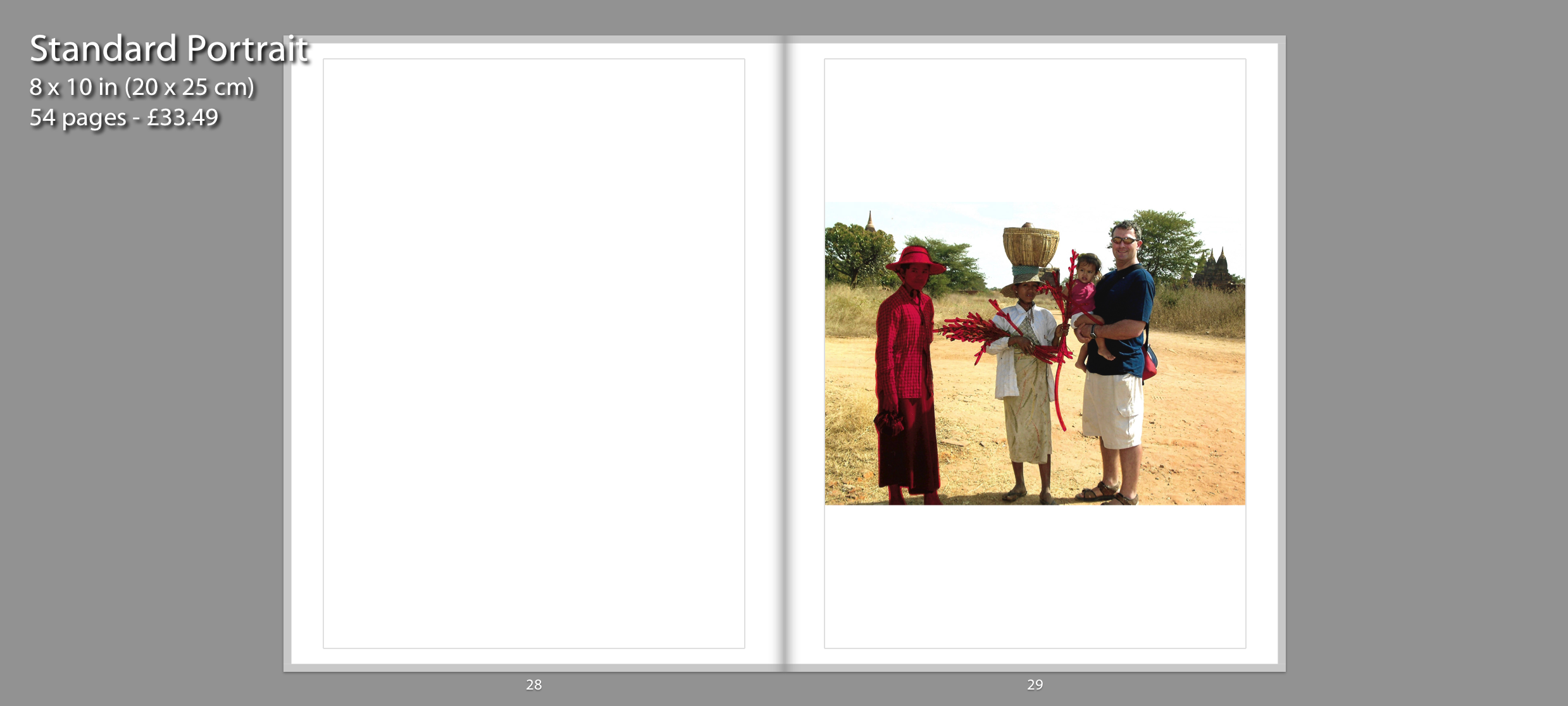
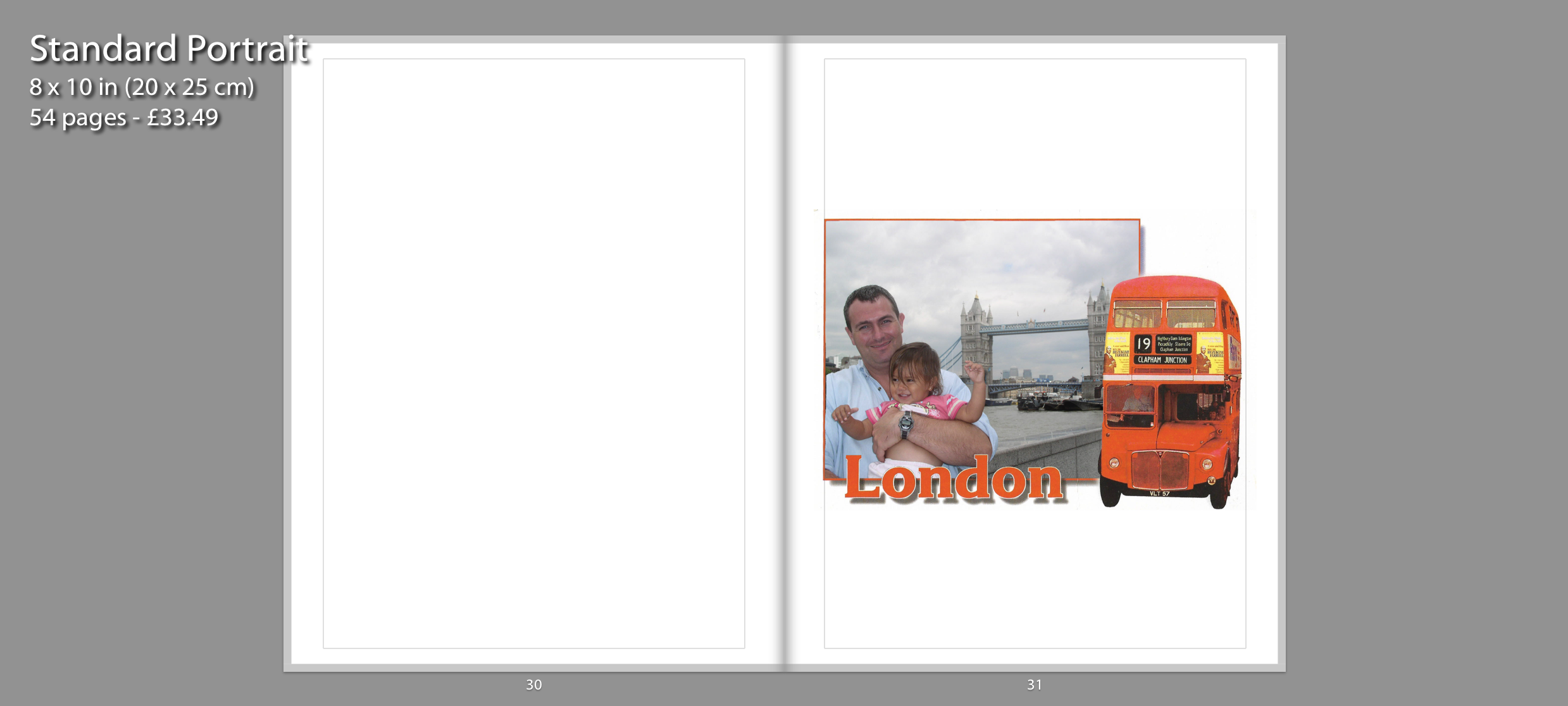
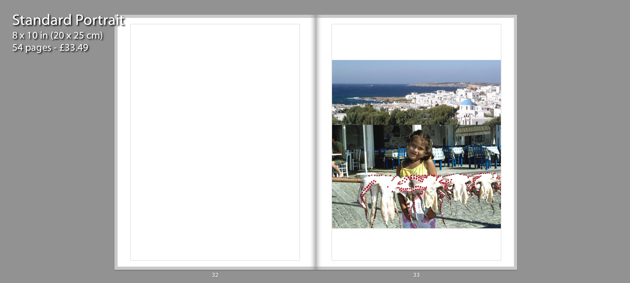
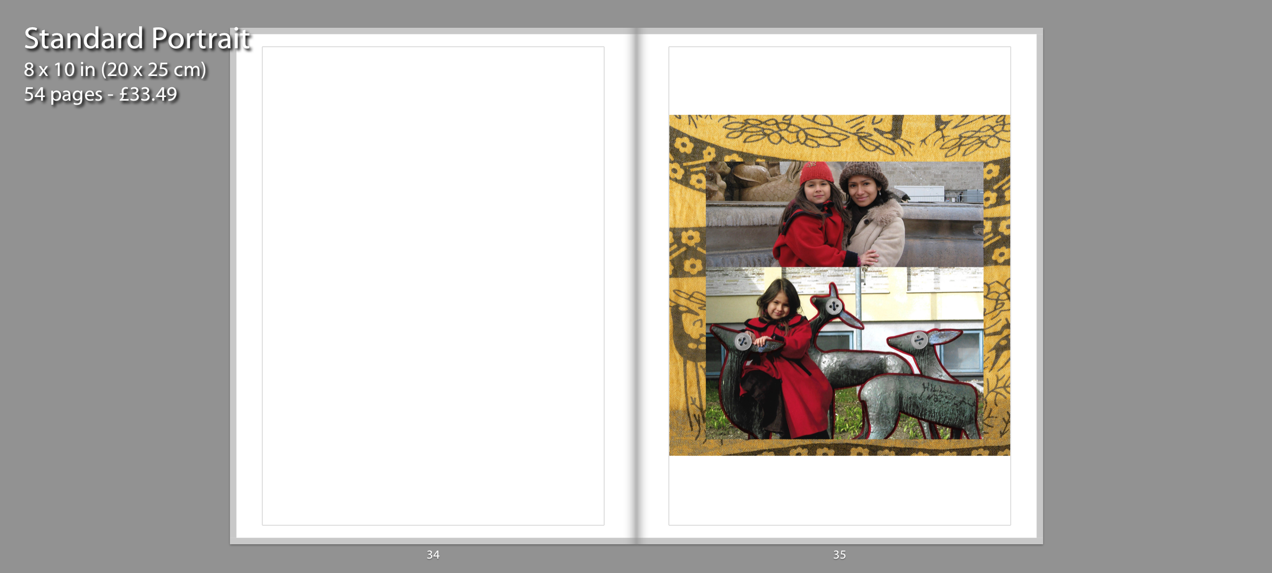
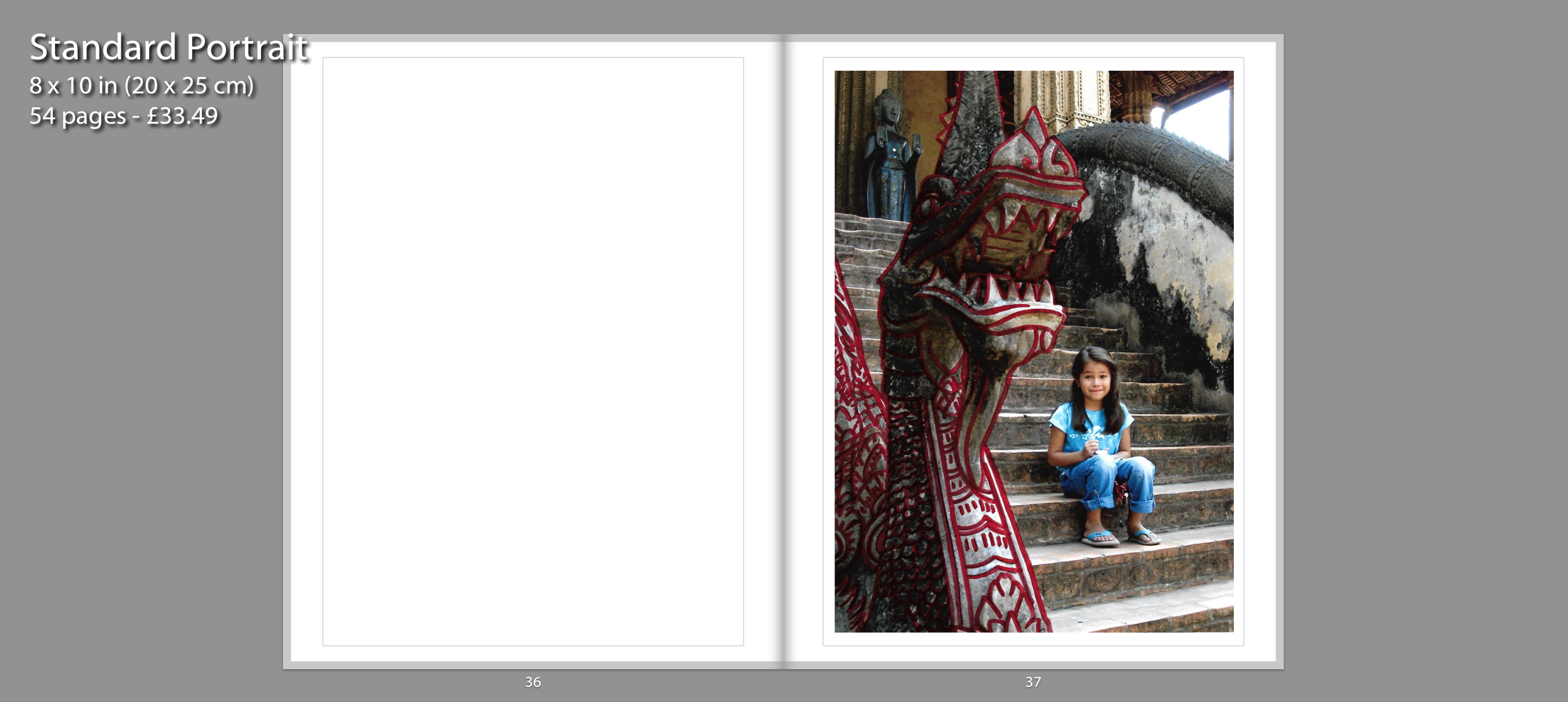
These collages are influenced by Carolle Benitah as well as Claudia Ruiz Gustafson. They depict countries where I used to live or places where I have visited during childhood. I have replicated Benitah’s series Photo Souvenirs by reworking old family snapshots. I have mainly used red graphic ink pen in order to draw illustrations on top of the images. I created these red marks as a metaphor for leaving my traces behind in each country. I decided to present these collages by themselves so the viewers understand that each place I go to is a new chapter in my childhood journey. They have a larger impact when presented on a singular page since the viewers only focus on that image.
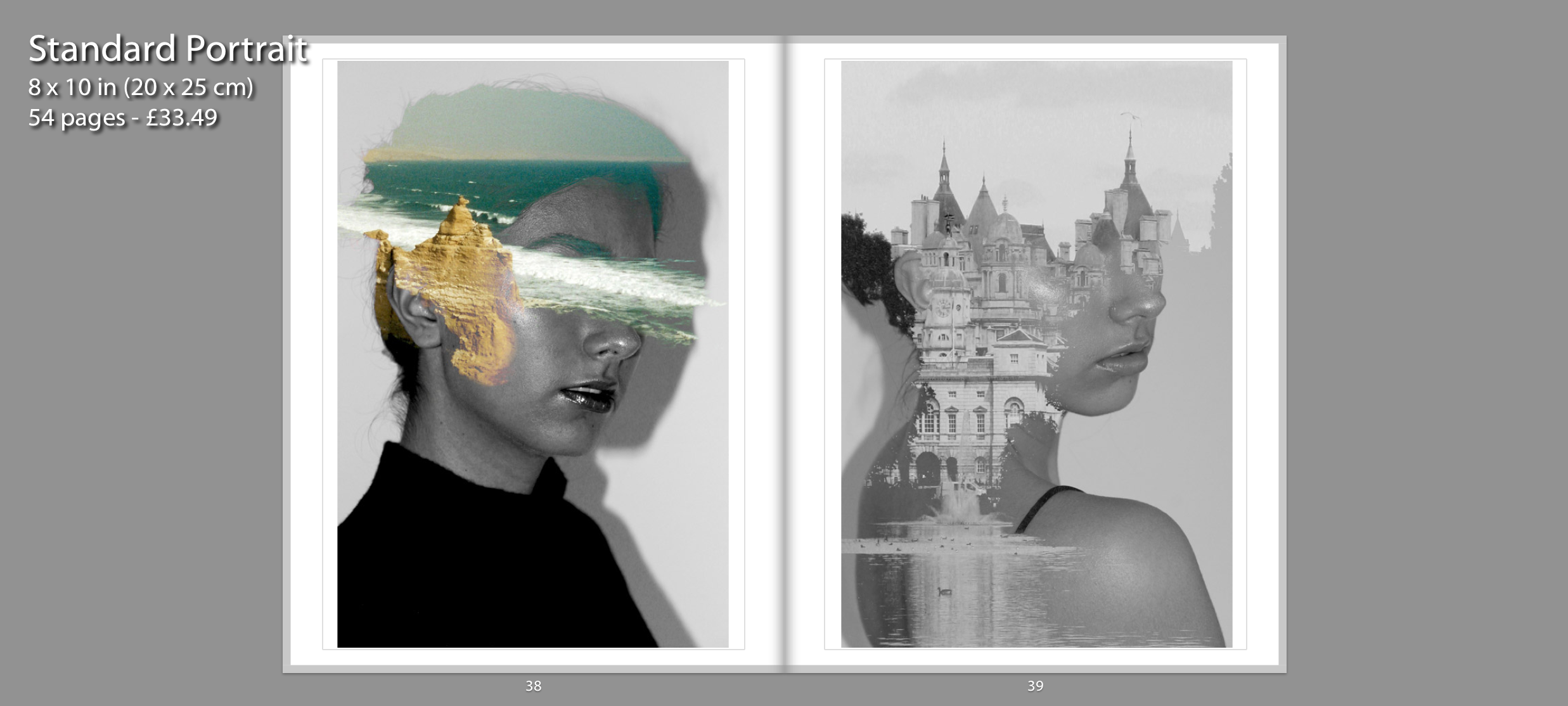
Similar to Claudia Ruiz Gustafson, I have continued my exploration of my cultural identity by creating photomontages which merges self portraits from present time with archival images to exhibit how my cultural identity has shaped me as an individual. I created these double exposures on Photoshop to be able to blend my self portraits with archival images that my parents have captured from Peru and England. I presented these together on a double page spread because both are inspired by Antonio Mora. They pair together well since I am facing in the same direction and because I wanted to present the contrast between Peru and England and how my mixed identity has shaped me. These images are displayed after the montage of memories to show my current self to the viewers.
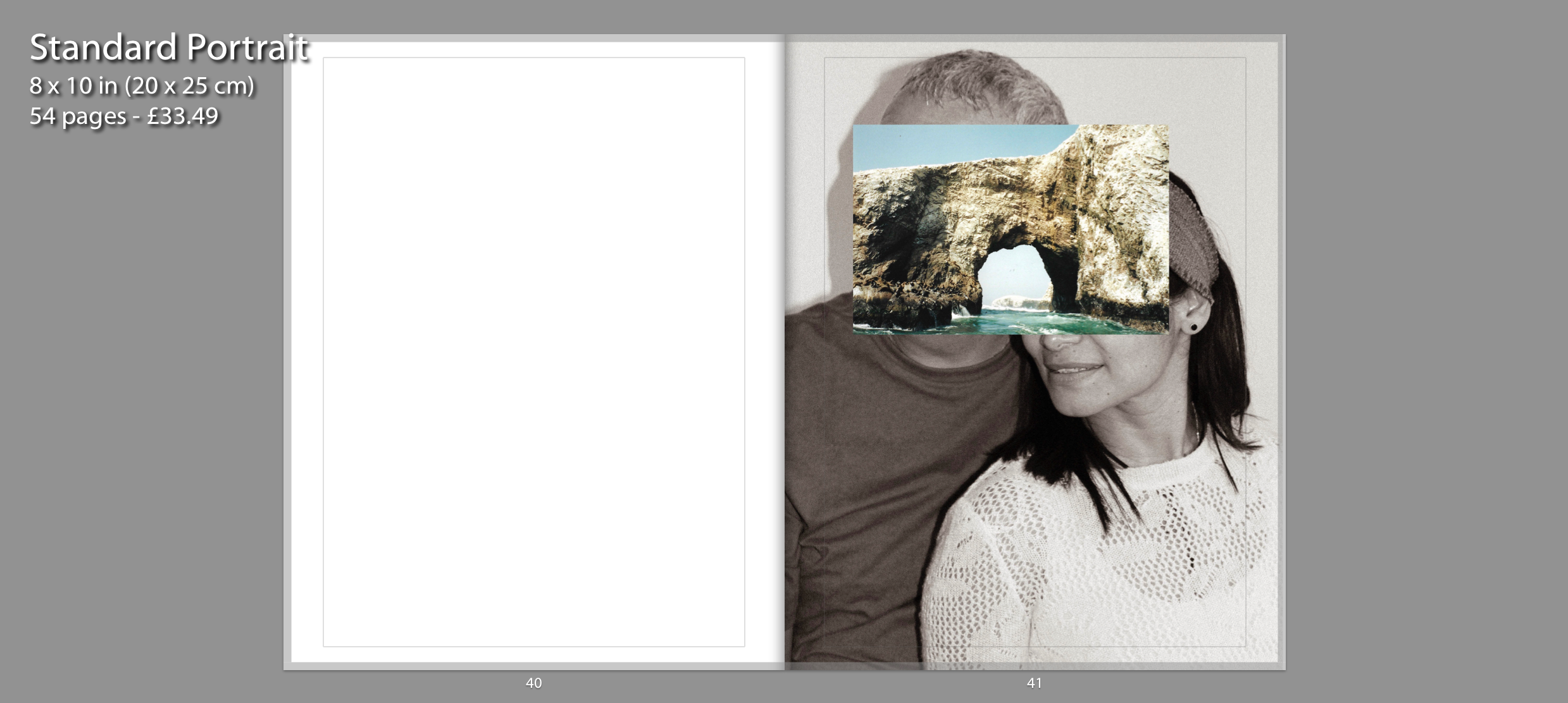
This photo montage of my parents presented on page 41 is inspired by John Stezaker who overlays images. I have recreated Stezaker famous series called Mask where he fuses sitters with natural landscapes or architecture in order to create a new outcome. I photographed my parents together and used an archival image from Peru to layer on top of their faces. I have presented a portrait of my parents together since when I think of “home” I associate it with them since I haven’t had a long term house or place I have lived at. I chose to have the portraits in black and white in order to contrast with the colourful archival image concealing their faces. The image is in full bleed on a singular page because I wanted the final photograph within my photo book to have a strong impact on the viewer. I chose to have current portraits of me and my parents as the final images to show how these memories have shaped us. It ends with a portrait of my parents together because they started this journey together and are still happily married after 17 years.
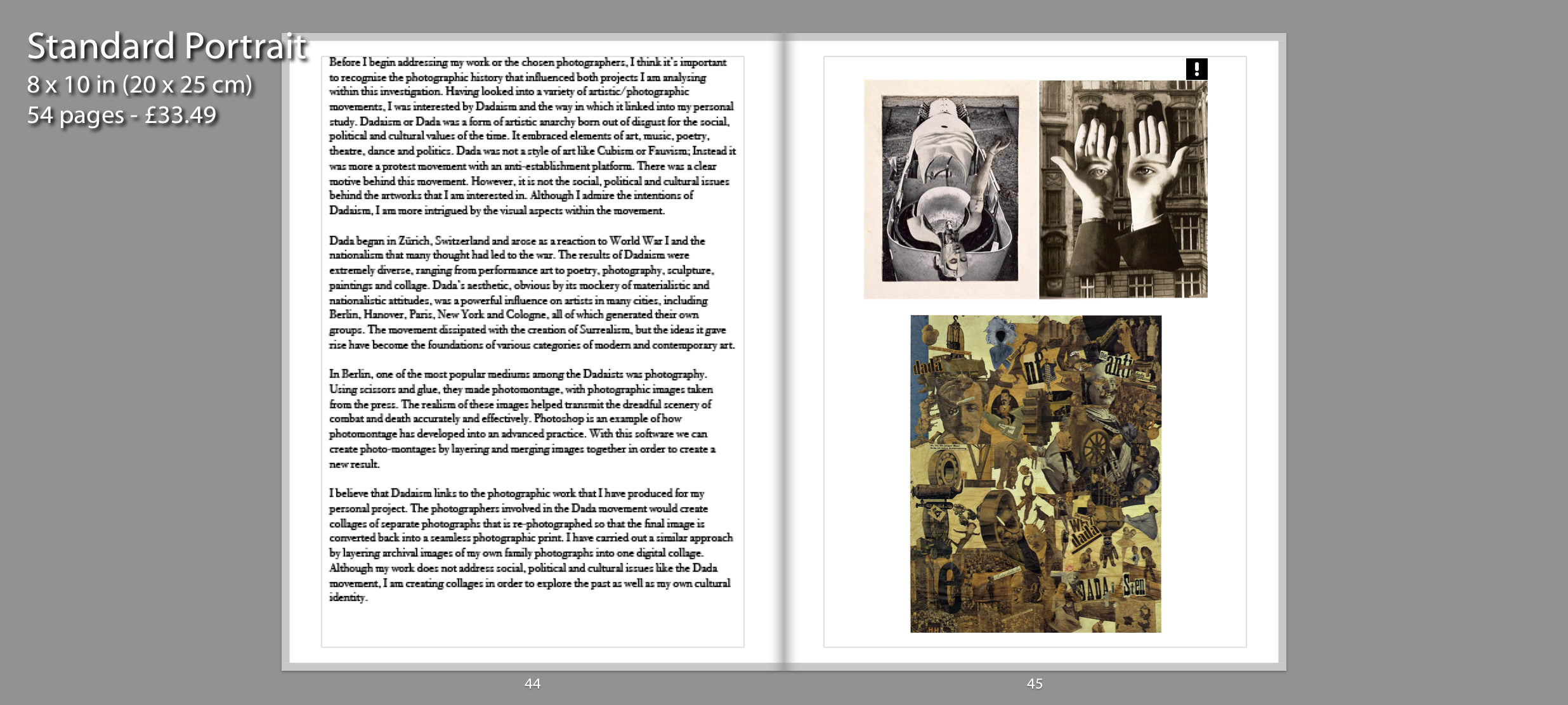
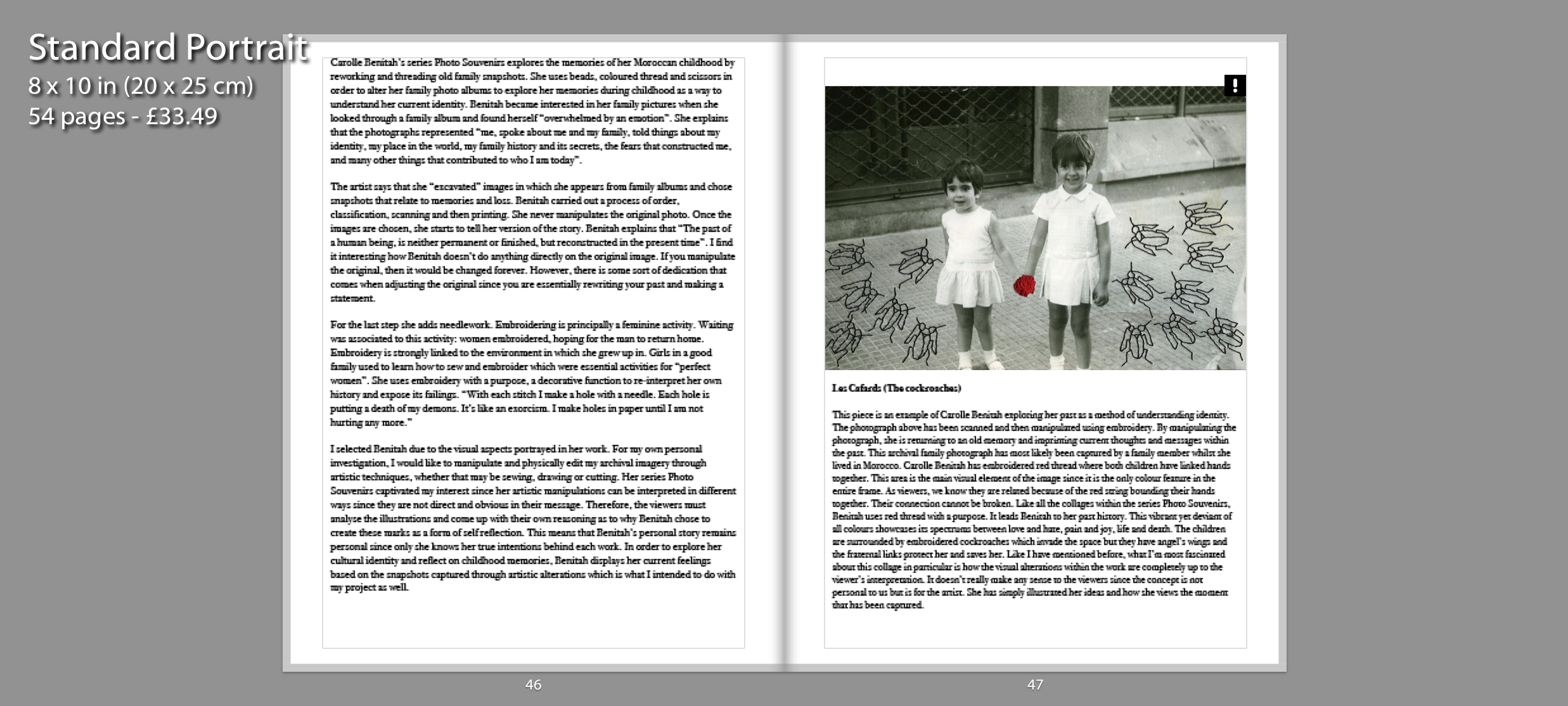
For the following pages, I needed to incorporate my essay at the end of my book so viewers can understand the influences behind my personal project.
