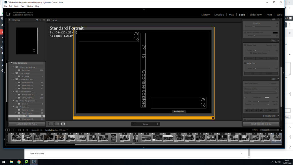


This was me experimenting with the layout of the title and spine. At first I liked the quirky font as it reminded me of my idea of the 70s which is when my parents got married, however, I ended up preferring something more simple and minimalist, almost like what you’d see on the order of service at a funeral; a memorial for my parents marriage. I also didn’t know if the white would be too bright so I tried a grey colour but ended up with going back to the white.

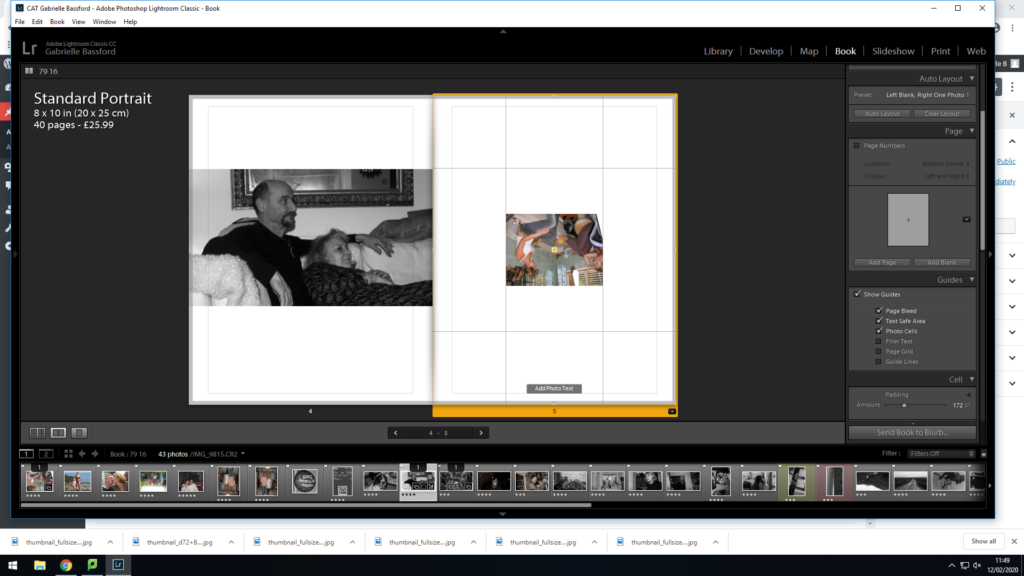
This was me trying to decide where I would leave pages blank to add in the images once the book arrived.


I again, at first I like the dramatic full bleed page, however, then I decided to make it more minimal, resembling a negative. I will therefore also be adding a negative over the centre of the image going diagonally.


I was trying to decide which image I thought fitted better. I decided to go with the one of me as a baby with my dad as it would be on my dads side which made more sense. I also think that the colours and shadows in the image fitted with the rest of the book better than the other image.


Again, here I was trying to decide which image I preferred. Although I preferred the first image, the second one made more sense and was more poignant juxtaposed against the dead flowers on the right. The second photo is also just my parents with no one else in the background.
