
I needed to find a way to incorporate my essay in a visually appropriate and practical way, while not taking away from the main purpose of the book (the photos). In order to do this, I pasted the essay into Light-room, and from there I experimented with the placement of text, titles and photos that I would use to layout my essay and present it at the back of my book. My first draft of organizing and layout of the essay in my book was as below:


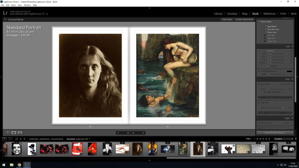
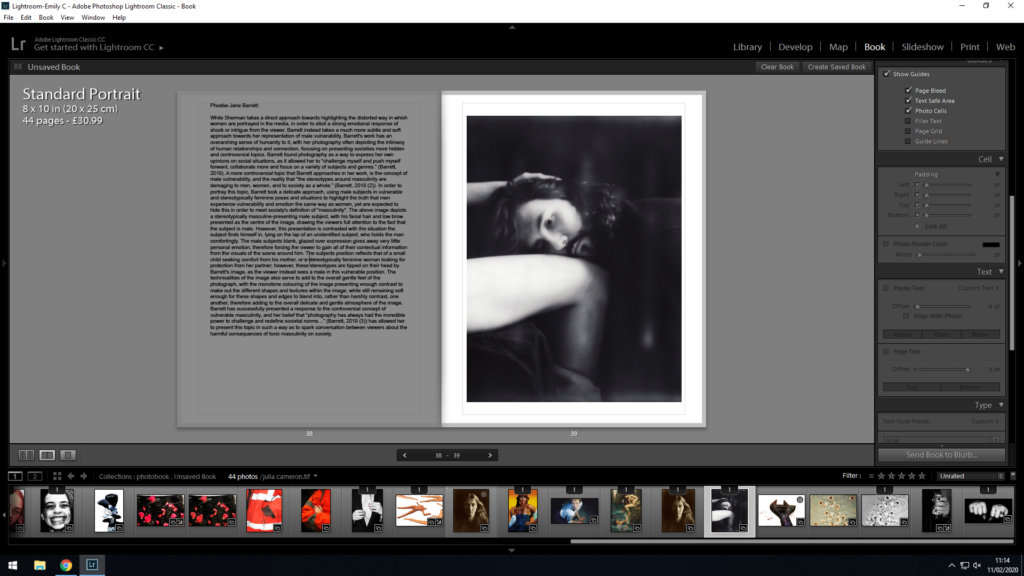
With this initial layout, I placed the essay in paragraphs, and tried to make sure each paragraph was written with a corresponding image on the page next to it, this way I could maintain the viewers attention, and give examples of the concepts and works that I was referencing in the essay. As my historical context paragraph was longer than the others, I gave that section of my essay a double page spread, and decided to include 2 images over the following 2 pages to present examples for the viewer to better understand the contents of the historical context portion of the essay. This double page of images also allows for a split in the essay after the 2 whole pages of text, therefore I find it important to add in order to split the essay into manageable chunks.
After placing my essay using the initial layout, I decided to restructure the layout so that it fit more flush with the pages, and the size was small enough to fit and work on the page, but large enough to be read without issue.

Firstly, I decided to keep the title at 12 pt, and move it into the middle of the page. I felt like this allowed for the title to stand out against the essay, and gave the reader a clear beginning to start reading. I differentiated from the title by placing the essay in 11 pt (a size large enough to read but small enough to fit on the page). Furthermore, I increased the padding from the left and right sides of the page to 26 pt, as I did not want the text to spill out into the gutter of the book (where the paper begins to bend over) as I felt that this would make it difficult to read.
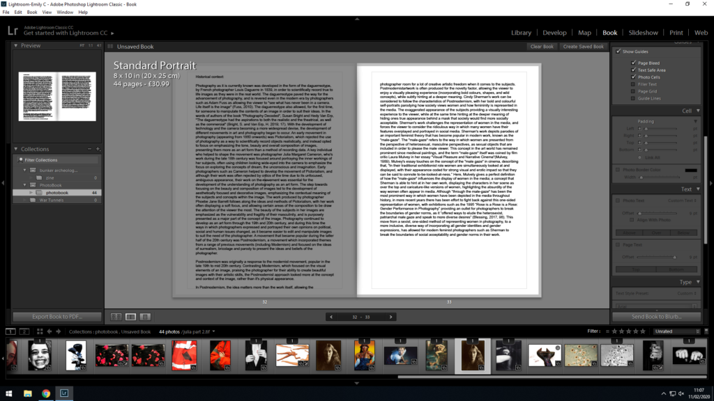
I used the same 11 pt font and 26 pt padding across all of the pages with my essay on (to ensure continuity). I feel like this layout gives the essay pages more structure, and I am happy that the text does not come too close to the edges of the paper, or the gutter of the book.
Below is the final layout for the essay portion of my book:


When comparing between my first and second draft, I fee like my second layout has a lot more structure to it, and allows the reader to navigate the essay much more easily.