
Below is the contact sheet for my 5th photo-shoot:
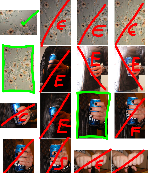
RED: line = rejected image, E = over/under exposed, F = poor focus, C = poor camera angle
I will be using the first image of the dress as a possible front cover for my book, and so the editing process for this image can be found in my Book layout experimentation blog-post.
RED: line = rejected image, E = over/under exposed, F = poor focus, C = poor camera angle, S = subject in wrong position
RED: line = rejected image, E = over/under exposed, F = poor focus, C = poor camera angle, S = subject in wrong position
After selecting the images I wanted to edit, I uploaded the images onto Photo-shop and began the editing experimentation:
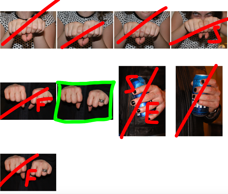
For the first image, I increased the contrast of the image (causing the background to disappear, which was also the desired effect). I also changed the colour to monotone in order to draw attention to the overall texture and shapes, rather than the colours of the image.
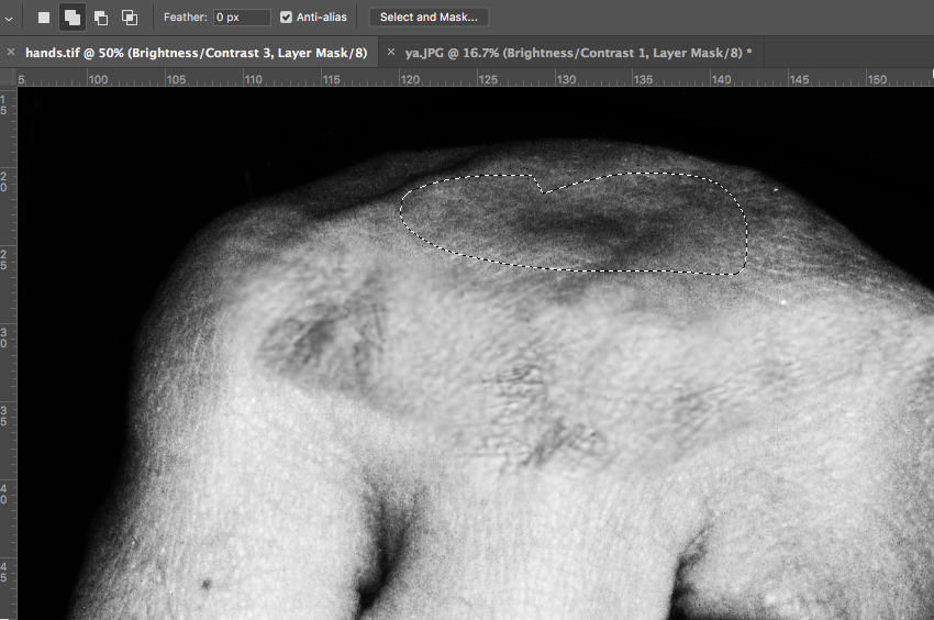
I further increased the contrast of the image, and used the lasso tool to cut certain areas of rougher skin, placing them on the knuckles and using the eraser tool to soften the edges, to give the knuckles a slightly bruised effect.
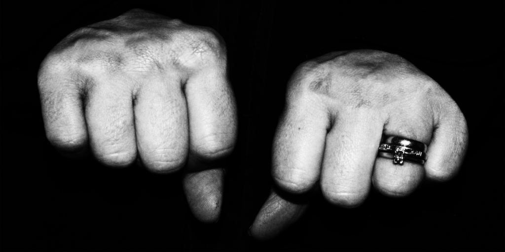
Above is the final image. I feel like the bruising represents a tougher, more masculine approach, whereas the rings on the finger indicate that the subject is female. These 2 contrasting concepts, along with the hostile position of the hands, represent a move from traditional femininity towards masculinity, with the bruised hands representing defence of ones self.
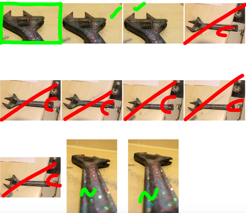
For my second image, I decided to make a statement about a merge between femininity and masculinity, focusing on the delicacy of masculinity (taking inspiration from Phoebe Jane Barrett’s work)
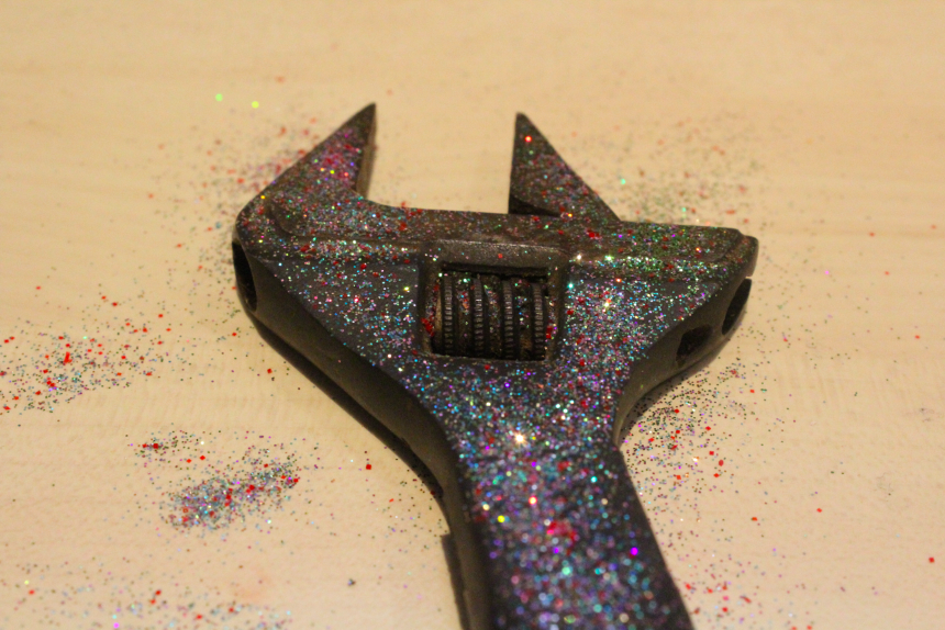
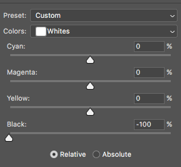
For this image, I used the selective colour tool to increase the brightness of the white in the background. After several attempts I was able to present the background as completely white, which was the desired outcome for the image. I also increased the contrast of the image to show the contrast between the different colours of glitter, and the harshness of the metal on the spanner.
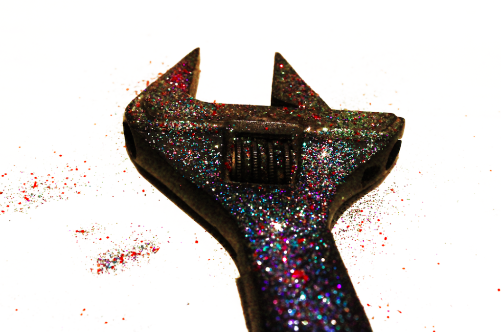
I feel like this final image gives an obvert example of the merge between feminine and masculine qualities, with the simplicity of the glitter providing such a contrast to the masculinity of the tool. I feel like this is a good example of just how strict society can be when it comes to the presentation of gender, as even a change as small as glitter creates a completely different opinion within the viewer when judging the object.
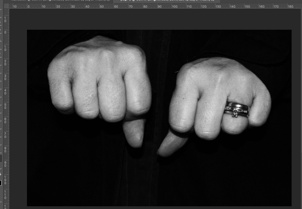
For my final image, I used the same process as the image above, increasing the contrast of the image, anodising the selective colour tool to reduce the pinkness in the hands of the subject (to keep the continuity of the colour scheme). Below is the final image:
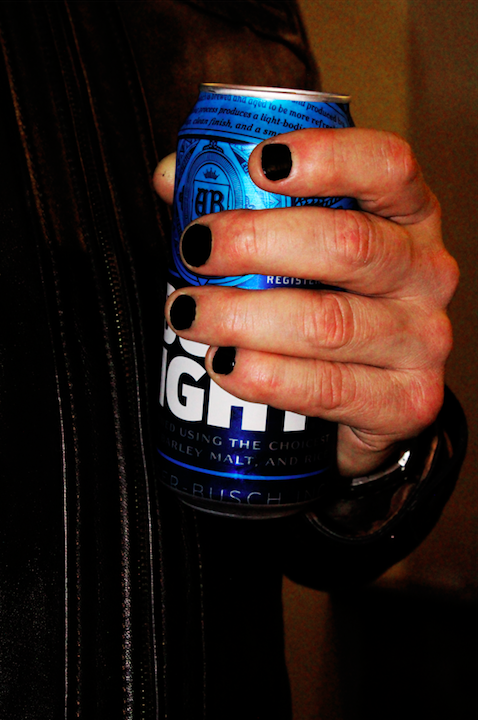
I feel like this image is a simple yet effective rebellion against gender norms, as the masculinity of the subject is shown through his jacket and can of beer, and yet the inclusion of painted fingernails warps the view of the viewer when looking at the image, and they judge the subject based on this one small break from their understanding of gender and masculinity.