In order to come up with the final layout of my photo-book, I experimented with different sequences, arrangement, sizes and shapes of the images within the book in order to create a layout which reflected the concept and theme of the images. I started with arranging the images into a sequence that I felt best fit the narrative that I was trying to achieve, and the process involved the following.
In order to begin the process of editing my book together, I uploaded my final images into Light-room. I then used the Book template in order to layout my images in the series I wanted.
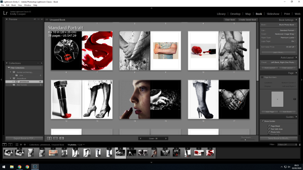
In order to layout the pages in a series that presented an appropriate narrative, I experimented with a series of layouts and narratives in order to best present the images. I decided on my narrative, which would use the images to present a story of both liberation and rejection/judgement/denial. I would use the images in order to show a story/progression of internal conflicts within someone struggling to express their true gender identity (which goes against the stereotypical gender norms of modern time). I wanted to use the images to present an internal conflict, and in doing so would use a narrative that jumps backwards and forwards from suppression and negativity, to positivity and liberation, while constantly presenting an overall theme of how gender identity is influenced by, and how it influences, the world around the individual, as well as all aspects of their life.
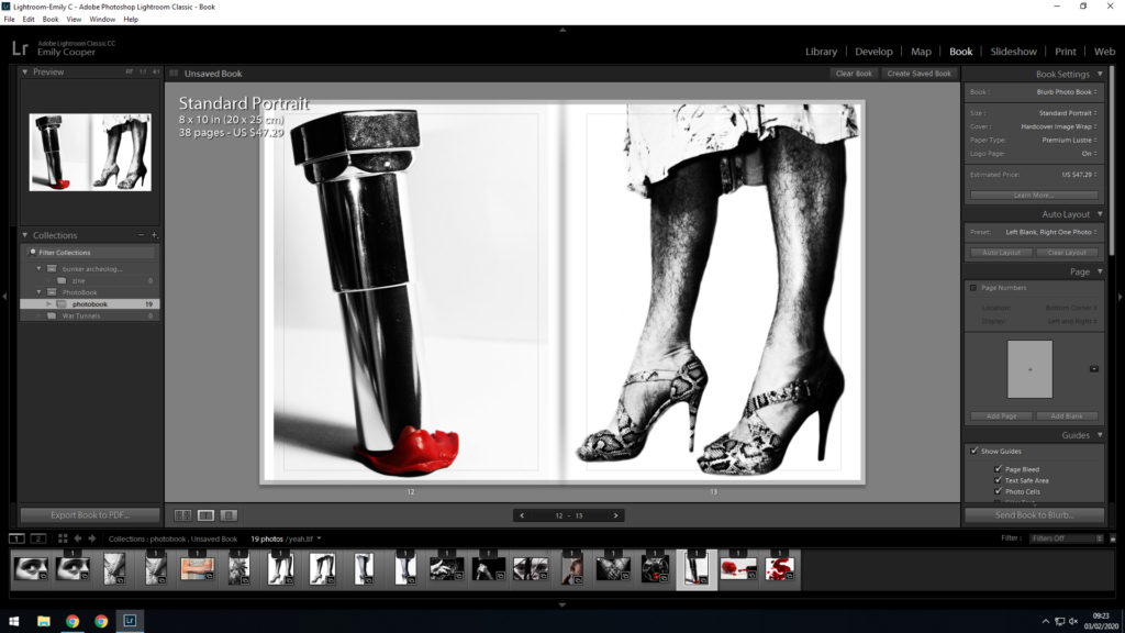
The above spread includes 2 images which work together ti give an example of the liberation of gender identity. It makes use of confident rebellion against gender roles, and the rejection of traditional gendered objects (makeup). This spread is used as an example of the positive things that can come from being ones self, and expressing ones self and ones gender in a way that feels comfortable, regardless of how uncomfortable it makes society.
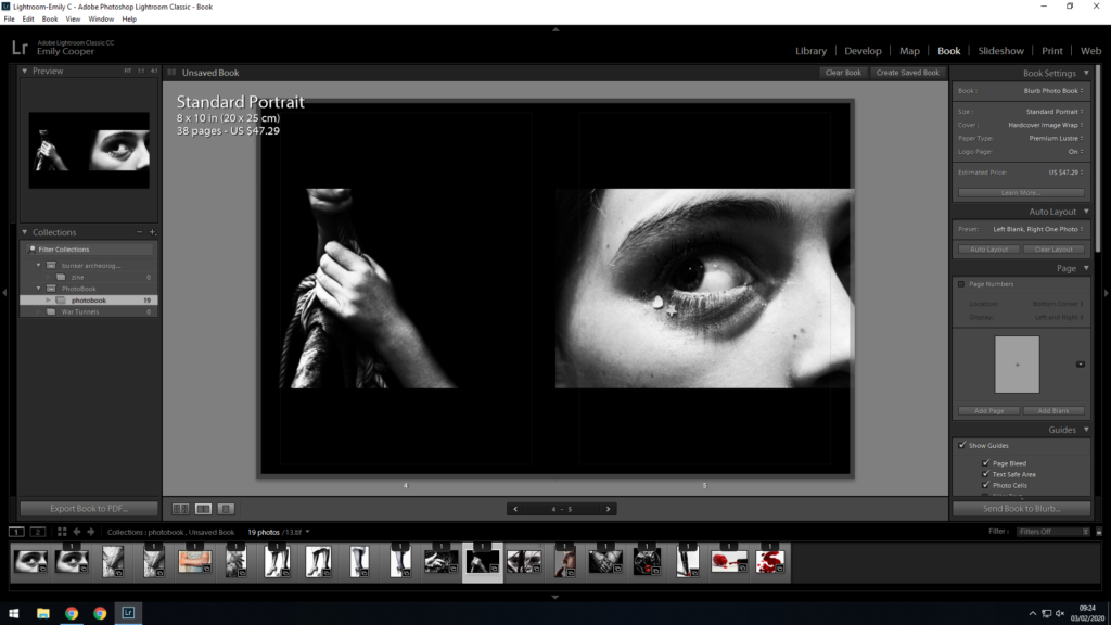
The above spread contrasts the first example, as here, the images are used to show the struggles of gender expression, and how rejection, fear, and judgement is part of the daily lives of those who decide to express themselves openly with their gender (which perhaps opposes society’s requirements for gender expression). With these, I have used a black background, as I feel is compliments the images the most, but it can also be used to represent the oppression and “darkness” that the subject in the image suffers as a result of the conflict they feel due to their gender expression.
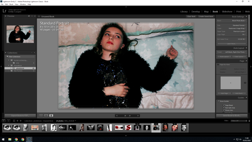
I also used double page spreads in order to draw maximum attention to the image. I decided which images to use on double page spreads based on the detail within the image, the concept of the image, and took into account whether the image was initially taken in portrait or landscape. I decided that I would use landscape images for double page spreads (in order to cover the page fully), and would use images that evoked emotion and had enough detail to allow the viewer to occupy themselves with the visual aesthetics, along with the concept of the image.
I soon found that my book was following a narrative of 2 types of stories; one following a rebellion against gender norms, and the other following the suppression and repression of individuals forced to follow these norms. I felt that these two concepts contrasted and complimented each other perfectly, and my narrative allowed for the viewer to be led through each of the stories, processing information as if they were directly involved in the mental and physical stresses, pressures and liberations of the subjects in the book.
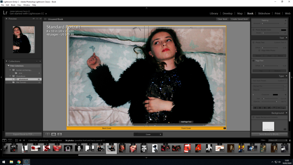
I experimented with different possible images for the front cover. Although I felt like the above image was appropriate for the front cover and would work to draw the attention of the viewer, I realized that the image did not work as a cover, as the subject would be folded over the left side of the book onto the back cover, and I found this to retract from the shape and presence of the image as a whole (I felt that the image did not sit right on the front cover due to 1/2 of it being folded onto the back cover).
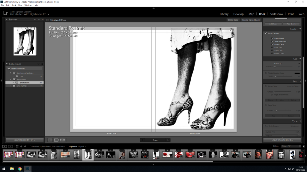
For the above image, I experimented with using this image as the front cover. Although I like the way the starkness of this image looks as a front cover, I feel like using a single image to wrap around both the front and back would allow for continuity across the 2 pages, and would allow the covers to flow better.
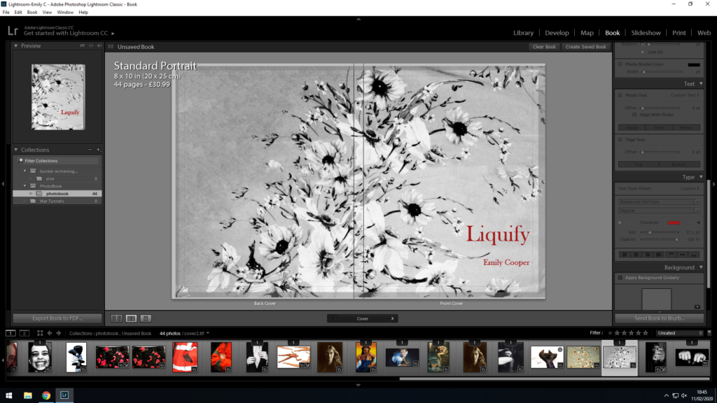
I then found that I needed to create an image for the front cover that was separate from the rest of the book. I looked to find a simple image that related to the theme of the book, and decided on photographing the dress that reoccurs through the images within the book:
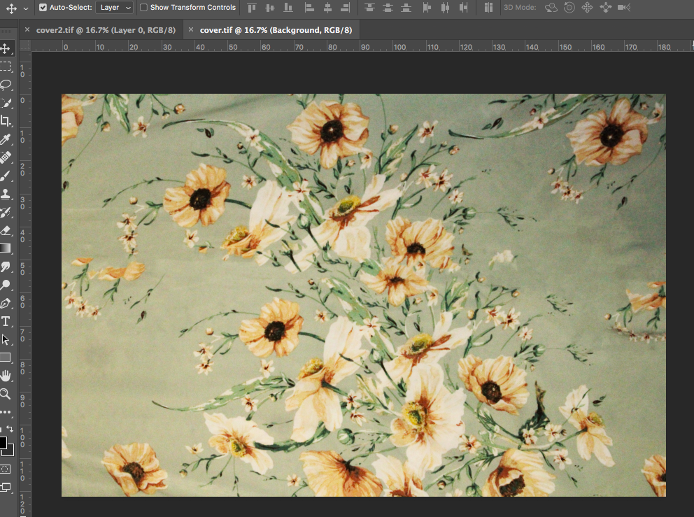
The above image is the result of the photo I took of the dress. I took the photo from a birds eye view in order to show the dress as flat, which would fit as the front cover as a book well.
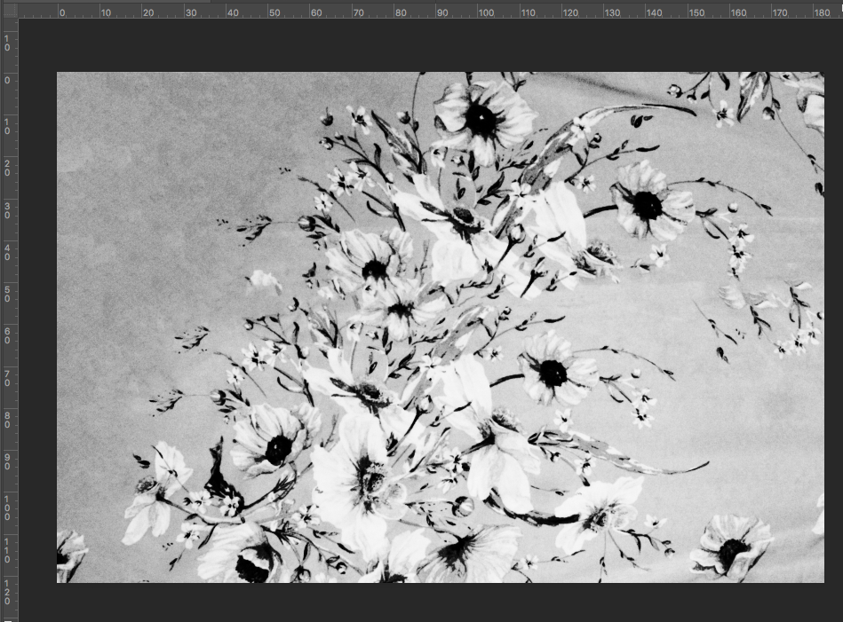
I then decided to put the front cover in monotone, as I felt like this provided a more passive, simple cover that would not draw attention from the title.
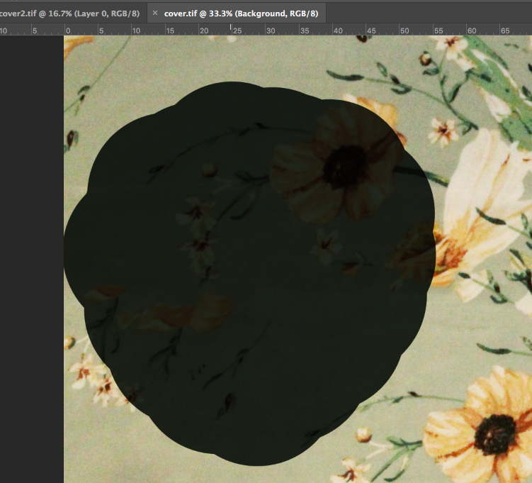
I also used the spot healing brush tool to remove the dark shadow in the left top corner of the image. I did this to keep the cover flat, as I was able to remove the depth from the image.
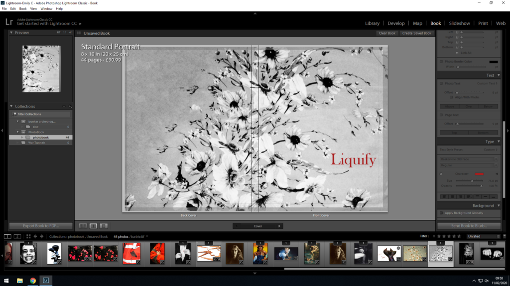
I decided on the above as a final cover image, which was a separate image not included in the book itself, but taken from the same dress material as the dress that reoccurs within the book. I feel like this added a layer of continuity to the book, as although the front cover is more simple and less detailed than many of the images (which allows for space for the title), it follows the same theme as the rest of the book, and is a representation of a reoccurring pattern that can be found in multiple images within the book.
I then moved on to the title of the book. I had decided to use the title I had experimented with in an earlier blog post “Liquify”, as I feel that this is a simple analogy for liquifying the boundaries between gender norms, and mixing the 2 together to create a personal identity. I placed this title in a well placed gap within the pattern of the image, and experimented with fonts and colours to find one that best matched the theme of the book. I decided on a red for the colour, as a reoccurring bright colour within the book is a deep red, and I felt like adding this to the title would allow for continuity through the book.
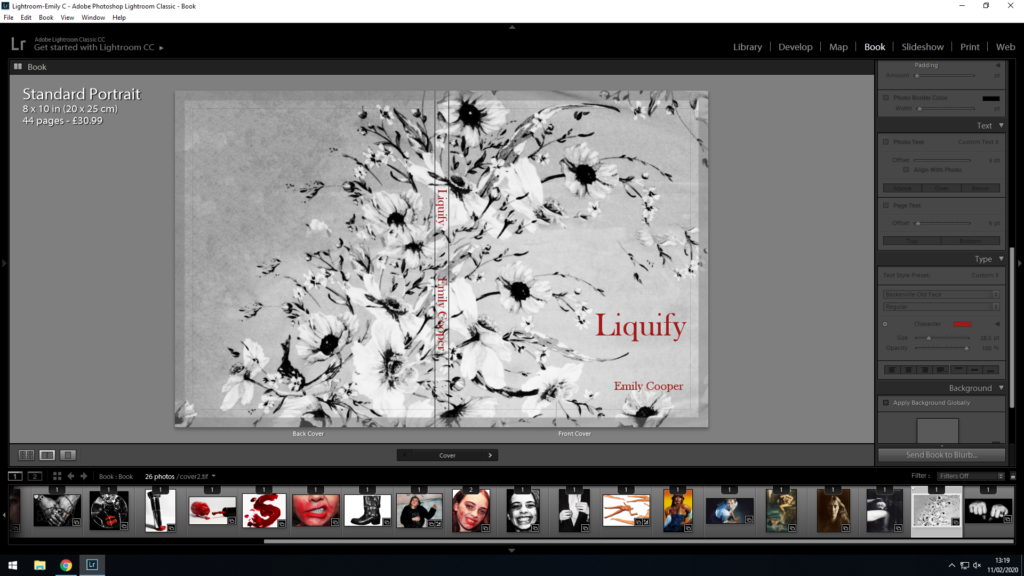
I decided on using “Baskerville Old Face” font, as I felt that it gave a serious yet delicate appearance to the text, which I felt encapsulated both the masculine and feminine aspects of the book. I also located the deep red that I found was to be reoccurring throughout the book, and made sure that the title was coloured with the same red.
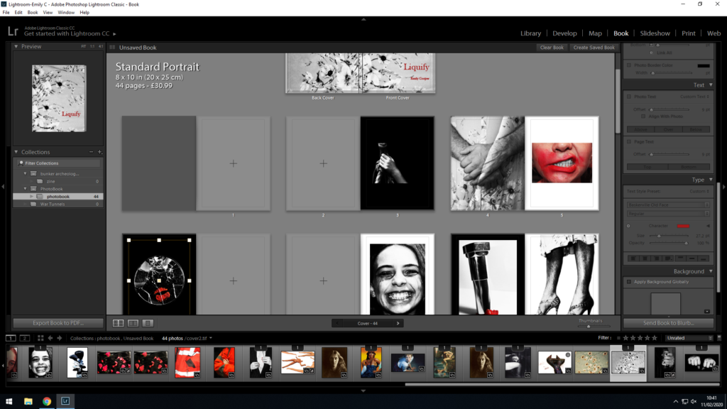
After finalizing the front and back cover of the book, I spent more time finalizing the sequencing and layout of my images. I decided that some of the images had been packed together, and I felt that by including more space between the images, breathing room would be freed up in order for the viewer to take in each image individually without feeling overcrowded. I also began focusing more on the sequencing of my images, with the reoccurring theme of applying, wearing and smudging lipstick and makeup presenting a theme throughout the book. I left some pages before and after bold images blank, as I felt some of my images were strong enough to work on their own with their own page. Below was the final result of my experimentation:
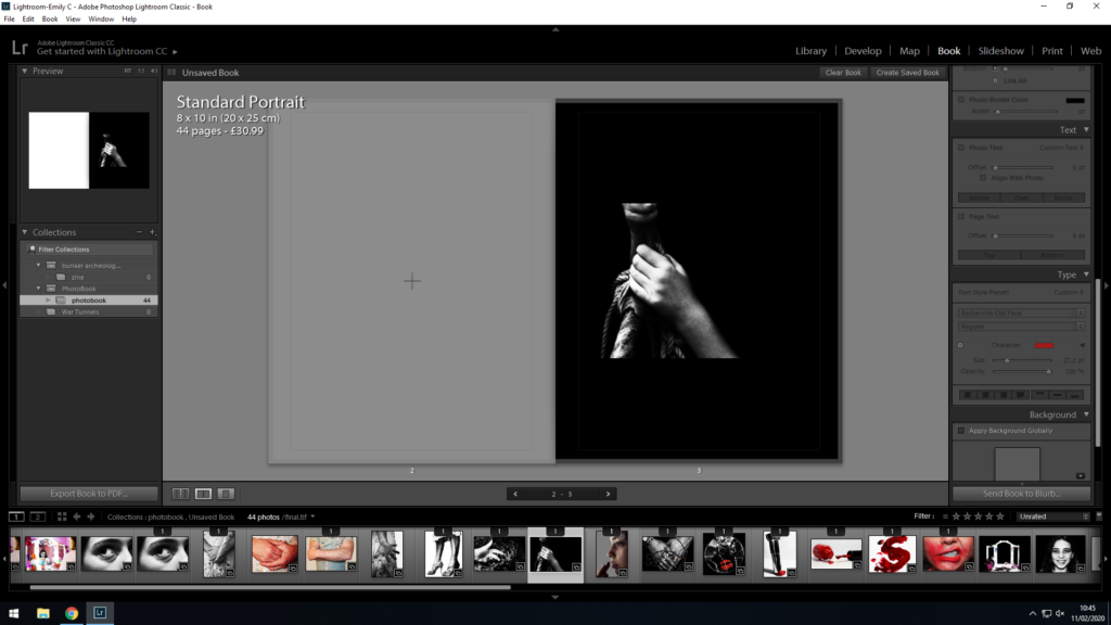
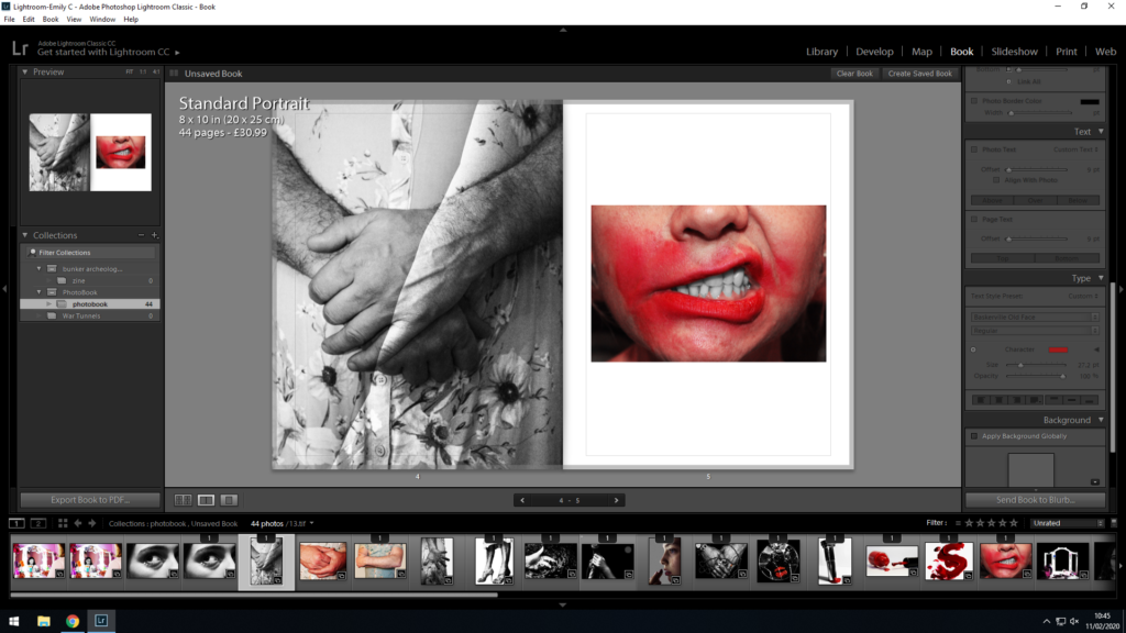
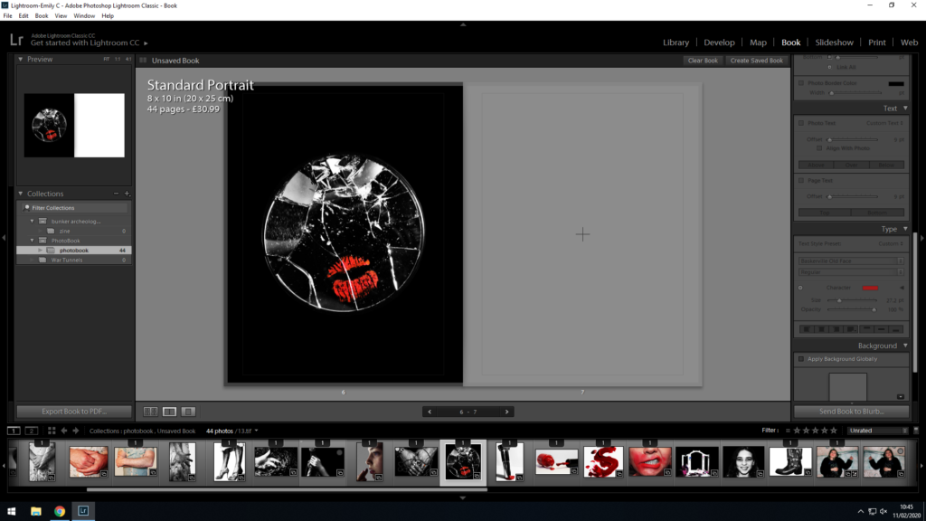
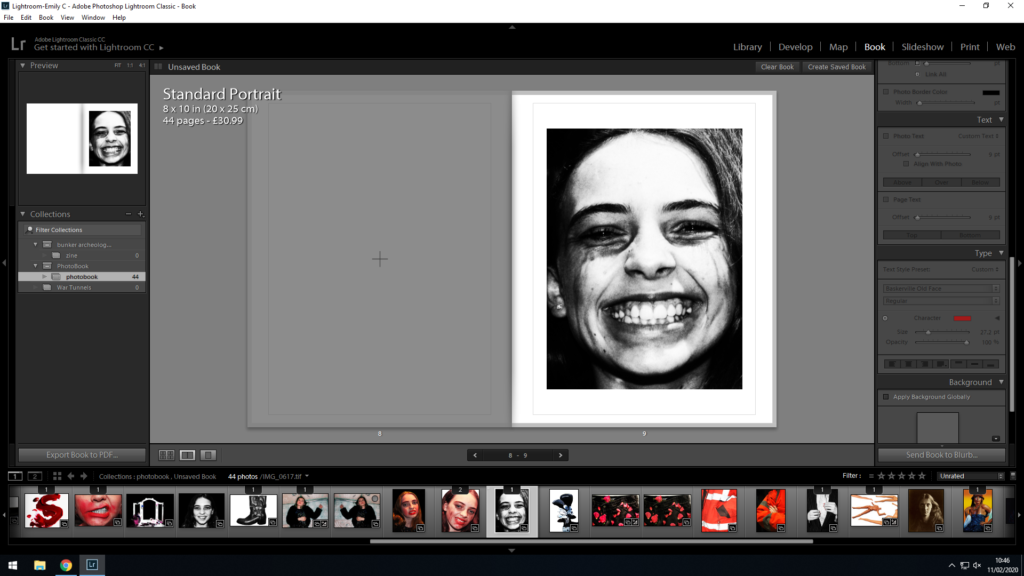
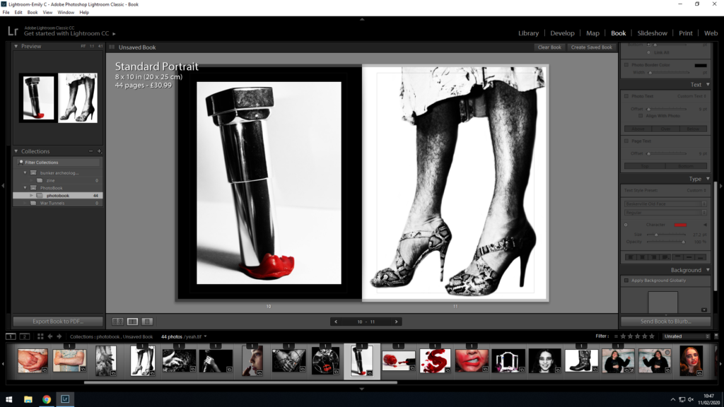
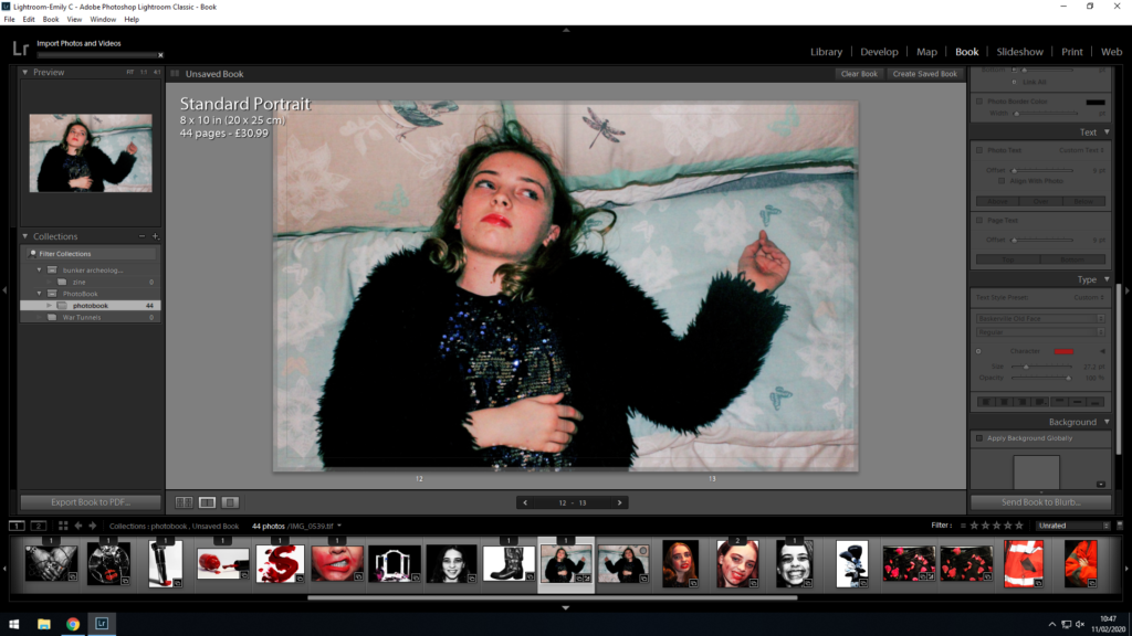
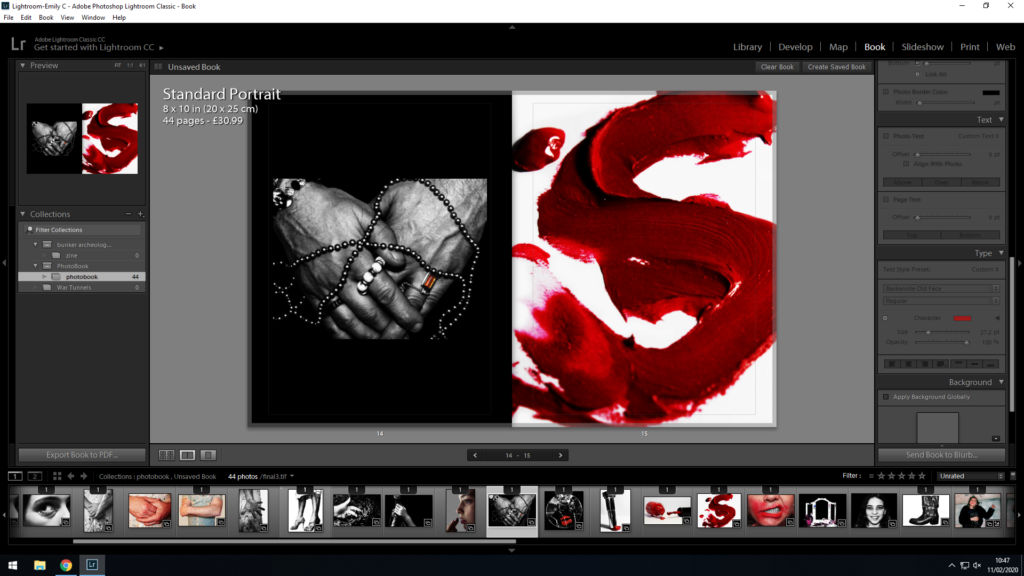
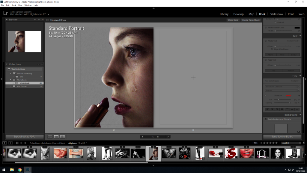
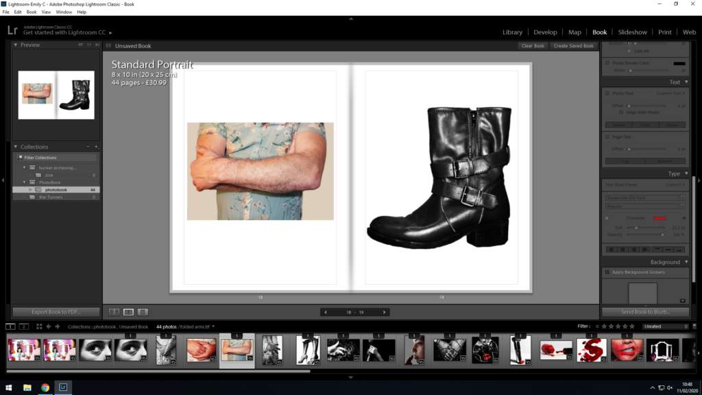
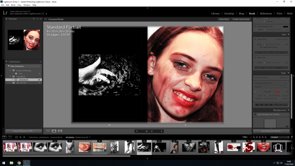
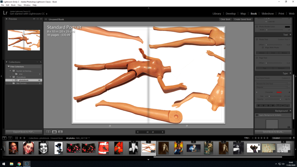
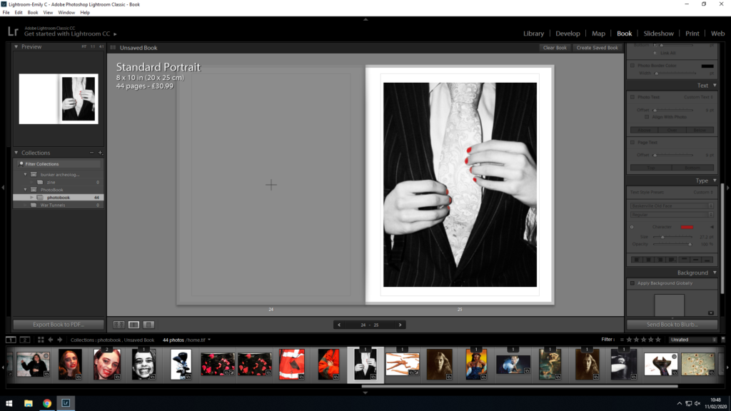
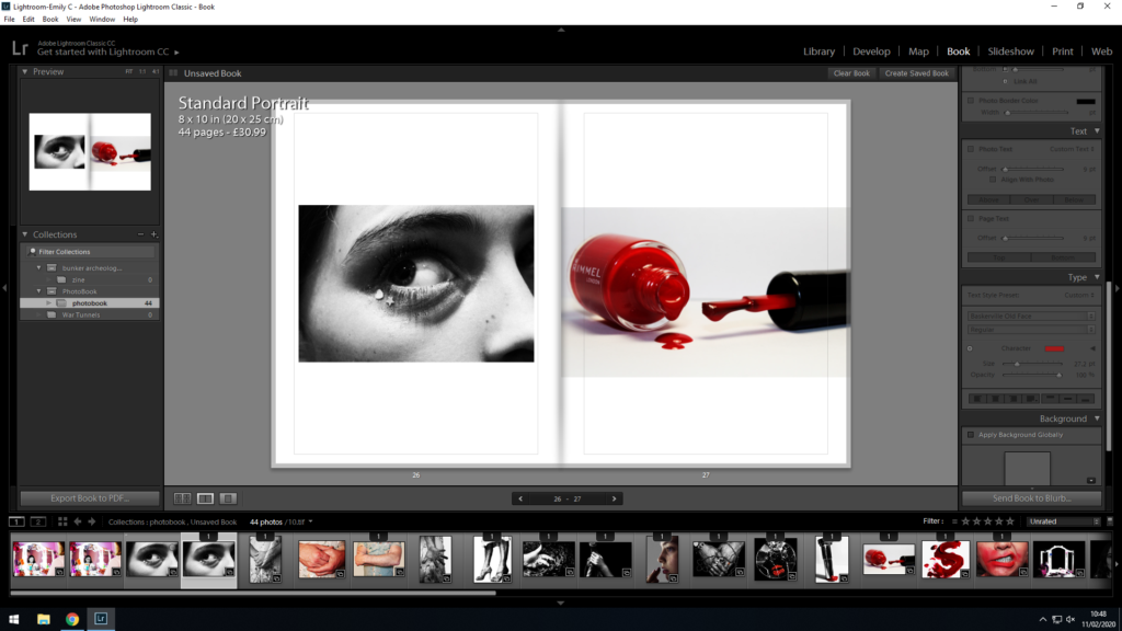
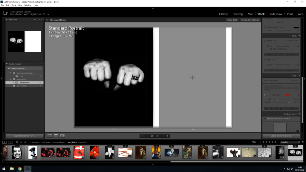
I decided to begin the book using an image of hands, and end the book on an image of hands to show continuity. I included blank spaces and pages in order to show clear breaks between the images, and to make sure the viewer was not bombarded with pages of images without time to consider them individually. I showed the progress from fear to liberation and carelessness when it came to expressing individual gender identity and going against society’s gender norms, and I feel like my final layout represents this effectively.
