
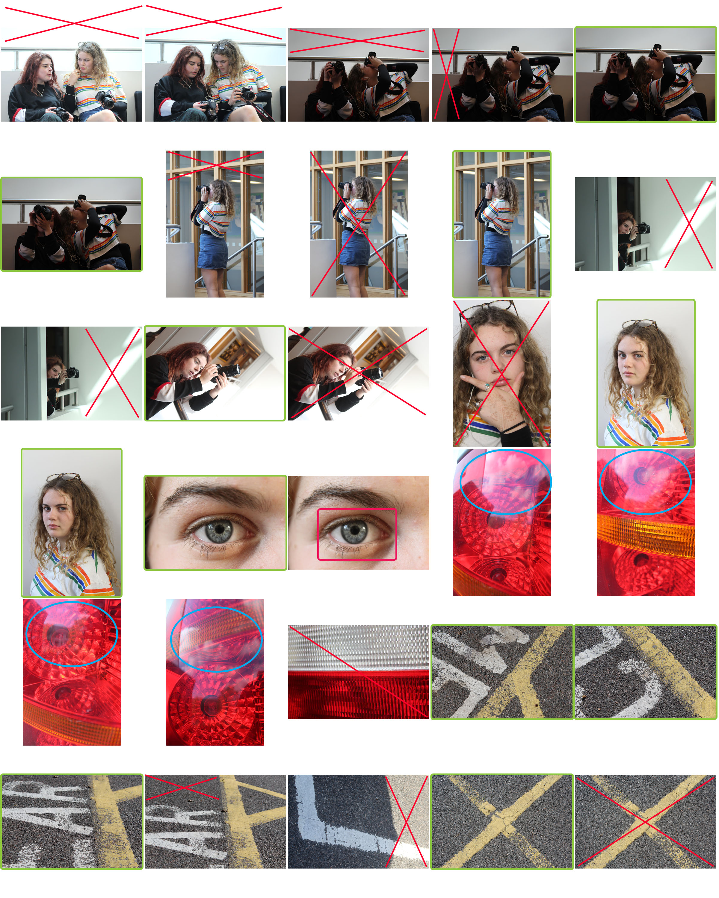
The meaning of each colour is:
Red: Indicates a photo or area I dislike. I would either discard the photo or crop the red areas to enhance the focal points of each frame.
Green: Indicates a composition that I am pleased with and would go on to edit to further improve the image.
Blue: Shows an area where there is an area of overexposure in the frame.
Pink: Shows an area that is out of focus where this was not my aim.