
The title of the book will be “Generation-Z”.
My book specification is going to follow along the lines of a story about my subject – Max my Polish friend – and in a nutshell, about the life he lives. The narrative behind it will be following him along on his ventures through everyday life and how this differs from the stereotype of polish immigrants in Jersey. The sequencing will be a photo on each page, with each double page spread having two similarly linked images of Max going about his life.
Narrative: What is your story?
Describe it in:
3 Words: Luxury, Travel, Affluence
A sentence: About my friend Max and how his affluence affects his life journey.
A paragraph: The story of this book is to explore multiple avenues in which my affluent migrant friend Max can be viewed as out of the ordinary and contrary to the stereotype most people have about his polish nationality and what he should be acting like and doing.
Design:
I want my book to look fairly minimalistic and effective. So that is easy to interpret and the images are distinct in showing what I want them too. I want it to feel smooth and solid so that it is versatile and gives off a professional, well put together feeling to those who read it.
Paper and ink: I have chosen for the paper colour to be black because this gives the book a more finished feeling than just leaving it as the plain white page colour. It also allows for the images to stand out due to the contrast in the bright image colours to the black surrounding. It also means that the book isn as harsh on the eyes as white may be, meaning it is nicer to read. The paper type is Standard 80.
The ink colour I have therefore chosen the text in the book to be is white. I have chosen this because this colour contrasts the black background directly and stands out more than any other colour would whilst also looking aesthetically pleasing.
Format, size and orientation: I have chosen my book to consist of a standard portrait 8 by 10 inches format.
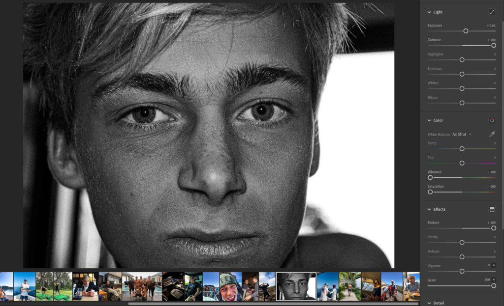
Binding and cover: My book will be a hardcover with and image wrap around it. The image will be from one of the photoshoot I have carried out and will not be included within the book due to it being on the covers. The reason I chose the image I have done to wrap around the covers is because it fits the black and white aesthetics of inside the book whilst also showing a detailed, close-up and personal image of the main subject that is being viewed. It also gives viewers the opportunity to come up with ideas or pre-existing concepts before they read the book after looking at the picture of the subjects face and the facial expression they are showing.
Design and layout: The design and layout of my book was all done spur of the moment due to the fact that I thought it would be best to experiment with different image layouts and page designs whilst creating my book in order to really find out which ones were most effective rather than plan it ahead and find out it does not look as good after having invested time and effort working on it.
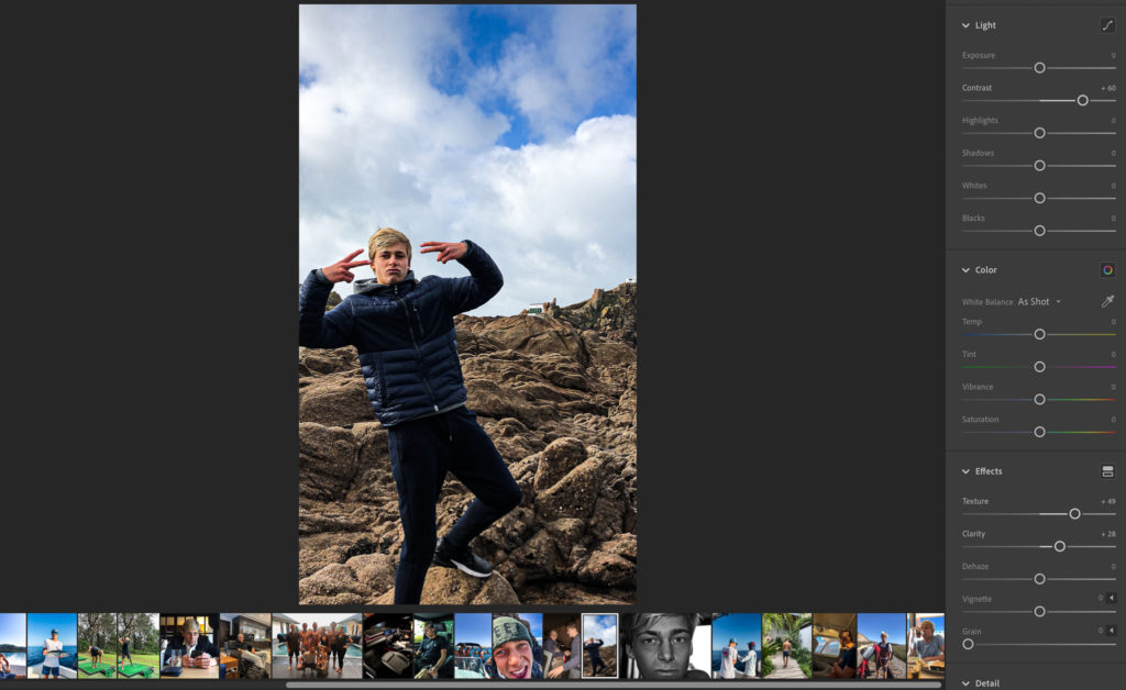
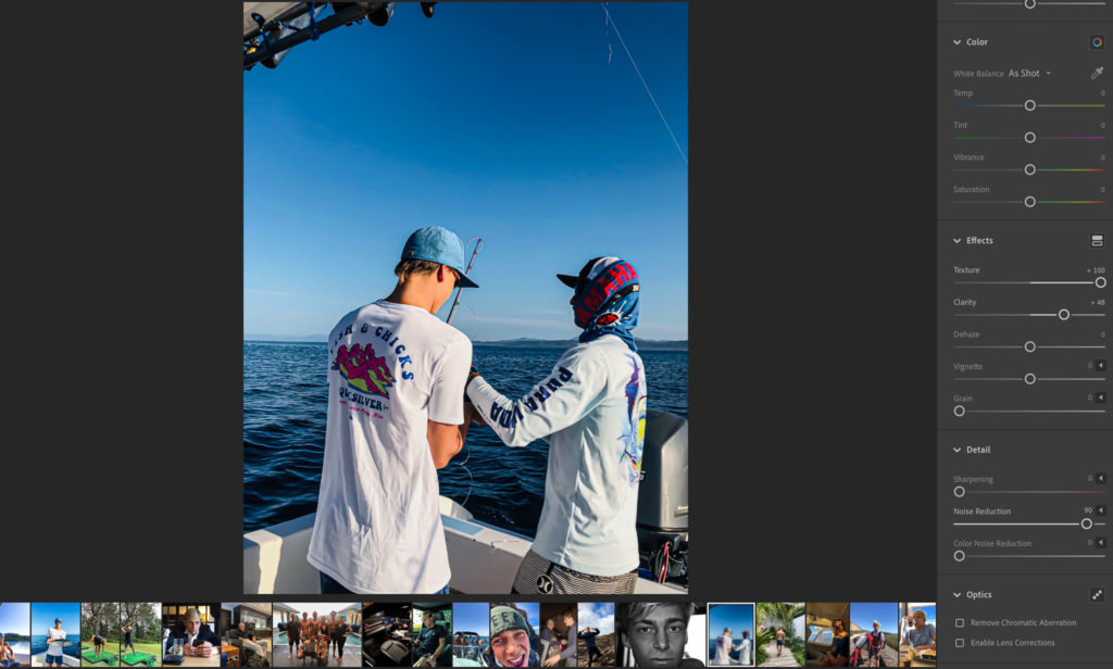
Editing and sequencing: All images have been enhanced through light-room to emphasise things such as colour contrast, the main focus of the image and in some images the actual make up of them and what they contain (by this I mean methods of cropping in order to remove unwanted distractions or areas that would not look right or effective in the final image presentation.
Some examples of editing I have done are visible below:
Images and text: The text I have added into my book is in the form of quotes from the movie “The Wolf of Wall Street”. These fit very well alongside the images I have taken due to relation the movie has with extravagance and wealth and the how those directly link to the life that my subject is living and that im trying to portray.