
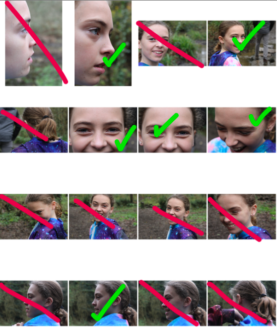
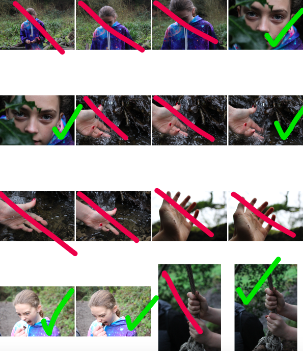
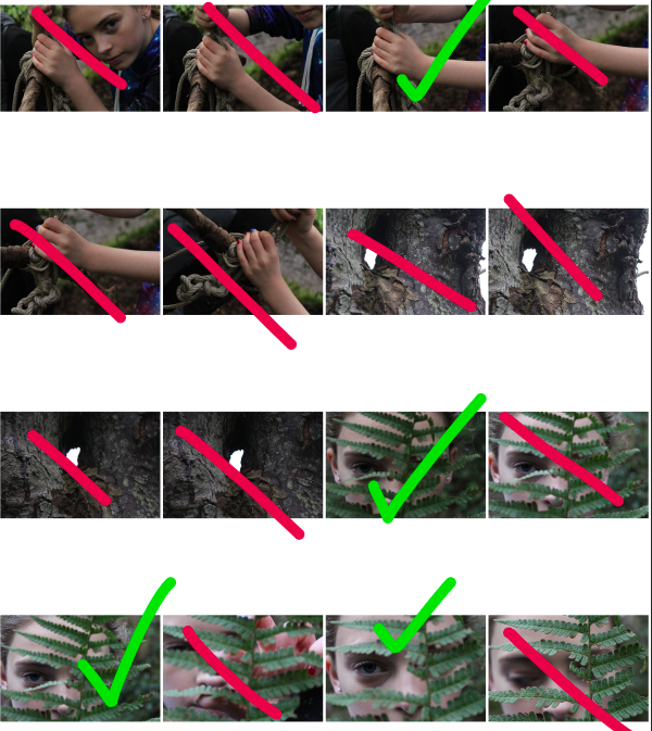
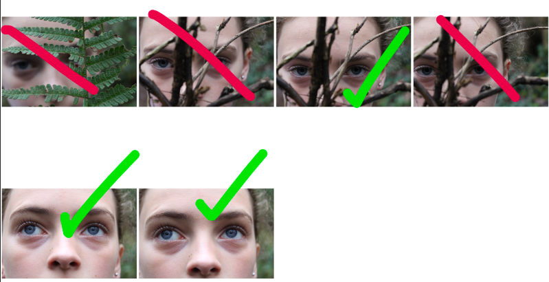
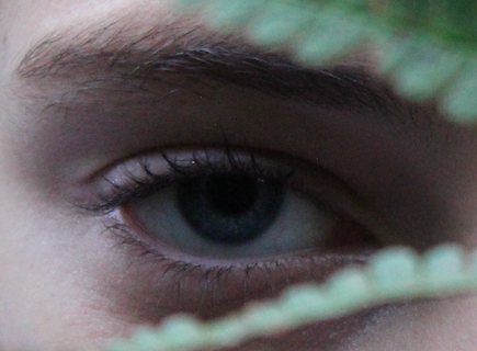
For my second photo-shoot, I focused on displaying a break in feminine gender roles by focusing on showing women/girls in nature, showing them playing in forests and getting muddy. I feel like this approach allows for a subtle line to be drawn between the expectations that society has for girls, and the reality that many girls find joy in “masculine” activities, such as playing in the woods, exploring and adventuring. I find this concept to be a more subtle show of braking gender stereotypes than my first photo-shoot, and therefore have included this in order to contrast the more overt, brash examples of gender stereotypes with more subtle, hinting examples.
After selecting which images I would use to edit, I used the software Photo-shop to create and edit a range of images:
For many of my images, I increased both the saturation and contrast. I did this to make the colours and contrasting shapes and tones of the image stand out, allowing the viewers attention to be drawn to certain aspects of the image.
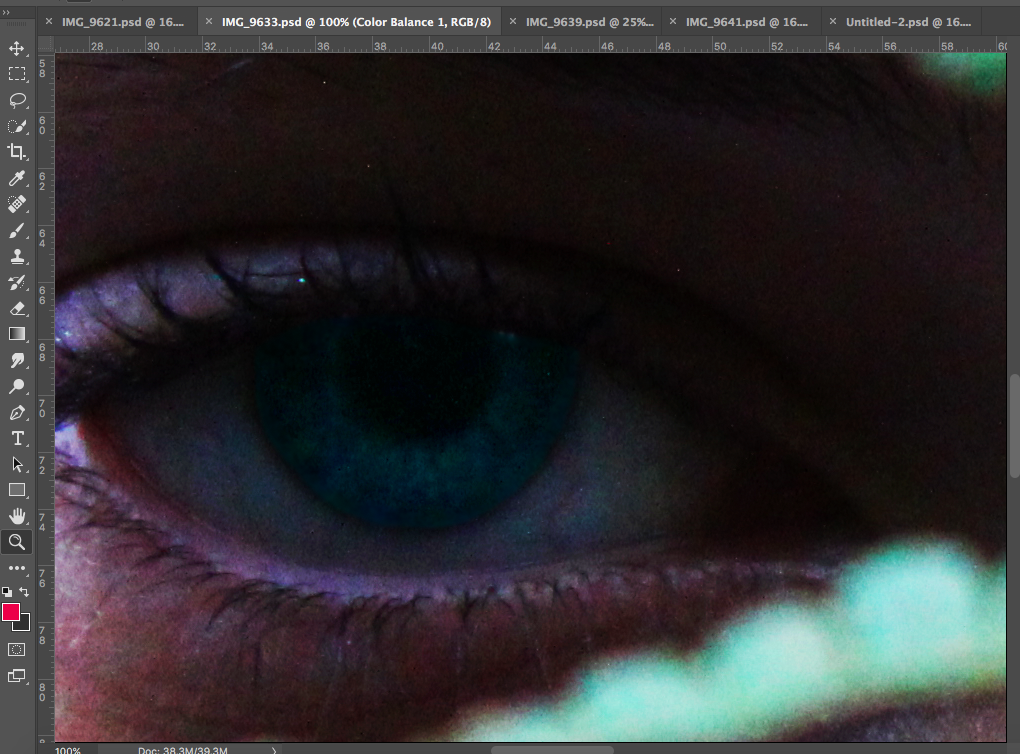
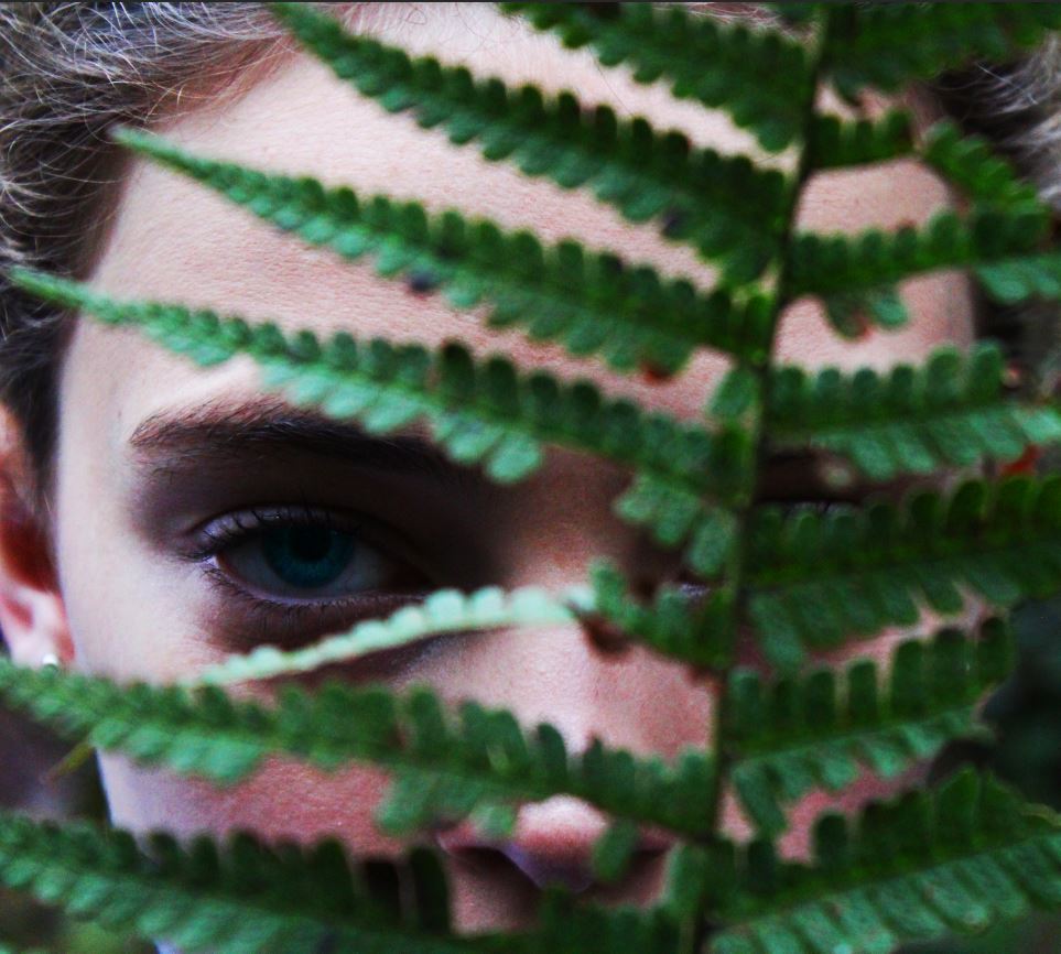
For the above image, I altered the saturation and contrast of the image, and then using the lasso tool on Photoshop, I highlighted the iris of the eye, and raised the contrast and saturation of the blue, in order to make the eye colour of the subject stand out much more. I did this to make the eye of the subject the focal point of the image, forcing the viewer to see the subject as an individual person by making eye contact with them through the image.
Simply by increasing the contrast and saturation of this image, and making small edits using the lasso tool, I was able to finish this image, using the colouring and shapes of the image as the focal point of the image.
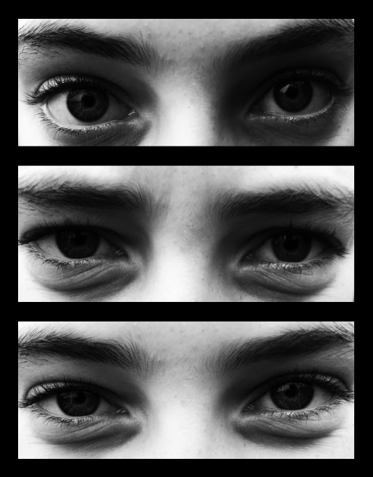
The above image involved turning the images black and white , increasing the contrast, and placing all images onto a single page (I outlined the images with black rectangles using photoshop to better define each image).
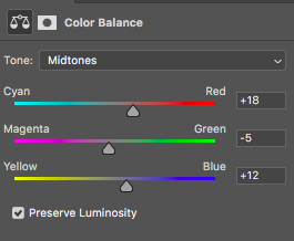
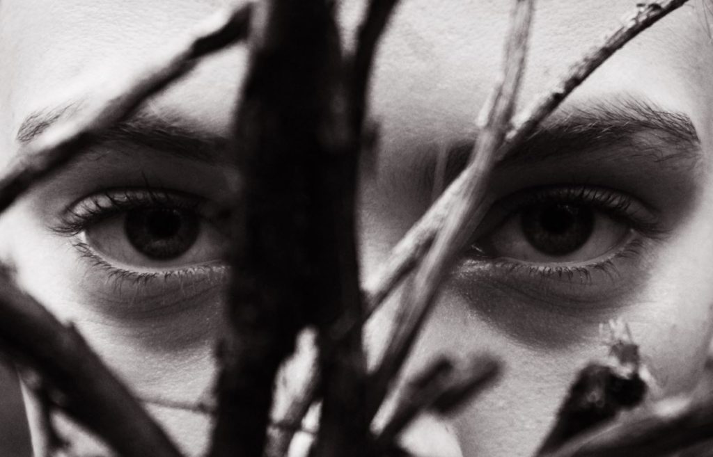
For many of my images, I also altered the colour balance of the image in order to emphasise certain shades and colours. In this instance, I increased the red and blue and magenta tones slightly (and I also increased the contrast and reduced the saturation), which gave the below final outcome:
The hardest image to create was one in which I would be merging a set of images together to create a background, while keeping a single image opaque in the foreground.
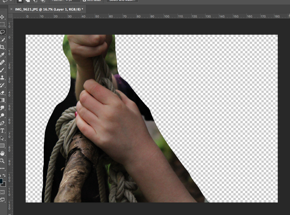
Initially, I cut out the part of the image I wanted to use from the background.
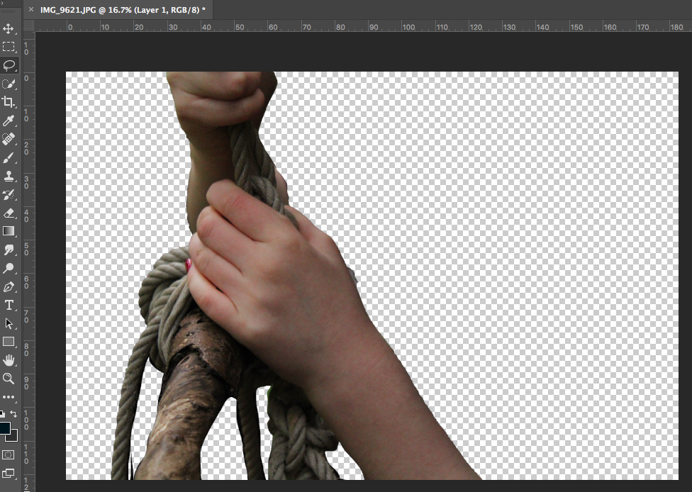
I then used the quick selection tool and lasso tool to cut the image out from the background fully. After this, I used the eraser with 0% hardness to soften out the edges of the image to make it look more natural.
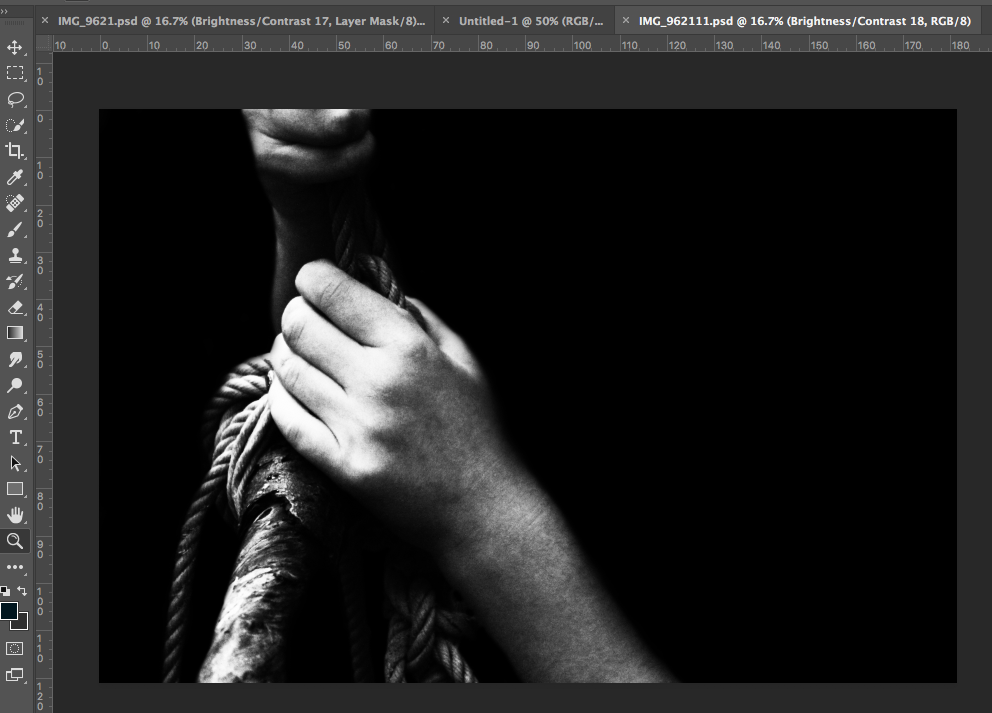
I then increased the contrast of the image and turned the image black and white to match the black background that I added. I used a soft black paintbrush to go around the edges of the image to patch up parts the edges that did not match the background.
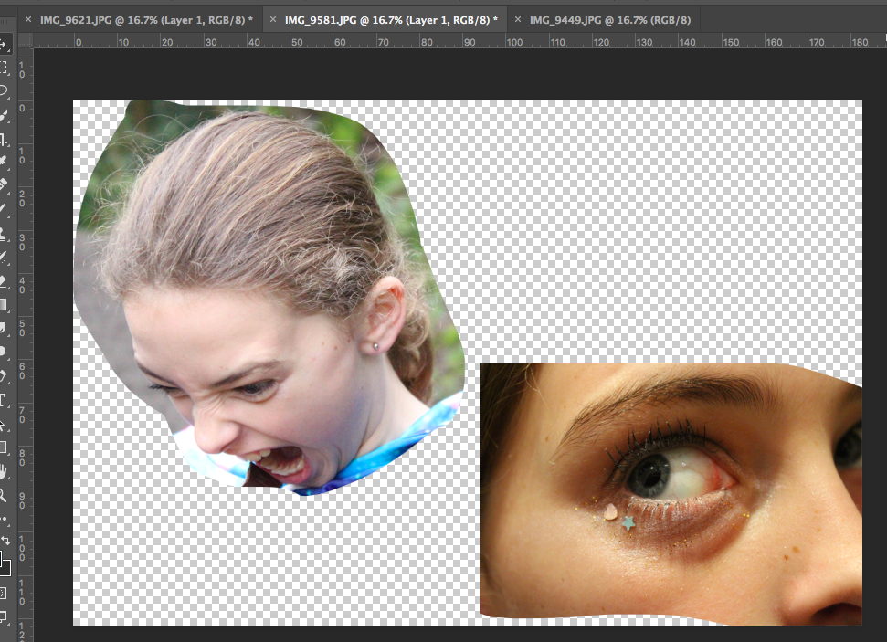
I then used the lasso tool to cut out a range of images of faces showing intense and varied emotion from a range of different images.
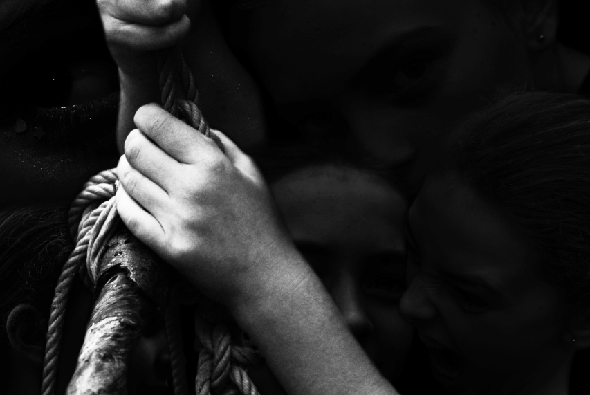
I then used the eraser tool at 75% opacity to make these cut out image more opaque and soft. Finally, I added these images behind the image in the foreground, allowing them to create the background for the image. I feel that although this image took a lot of work, I believe the outcome is an effective piece.