
Here is step by step on how I did my layout for my zine:
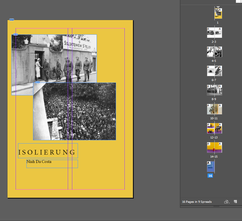
Firstly, I decided to match the coloured background of the objects with the front page to make it look pleasing to the eye. I then decided to translate the word ‘isolation’ into to German to relate to the German occupation. I used photos from the Société Jersiaise of the German soldiers and a large crowd of people on the front page to make a bold statement of how controlling the German soldiers were.
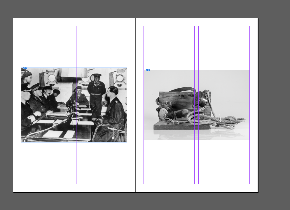
Next, I put a photo from the Société Jersiaise of German soldiers listening to the radio next to a photo I took of a WW2 radio. I wanted to do this so I could show what radios looked like back then and how the German’s could only use them and not the people of Jersey. I lined them up next to each other so that the viewers looking at my zine could see both photos at the same time.
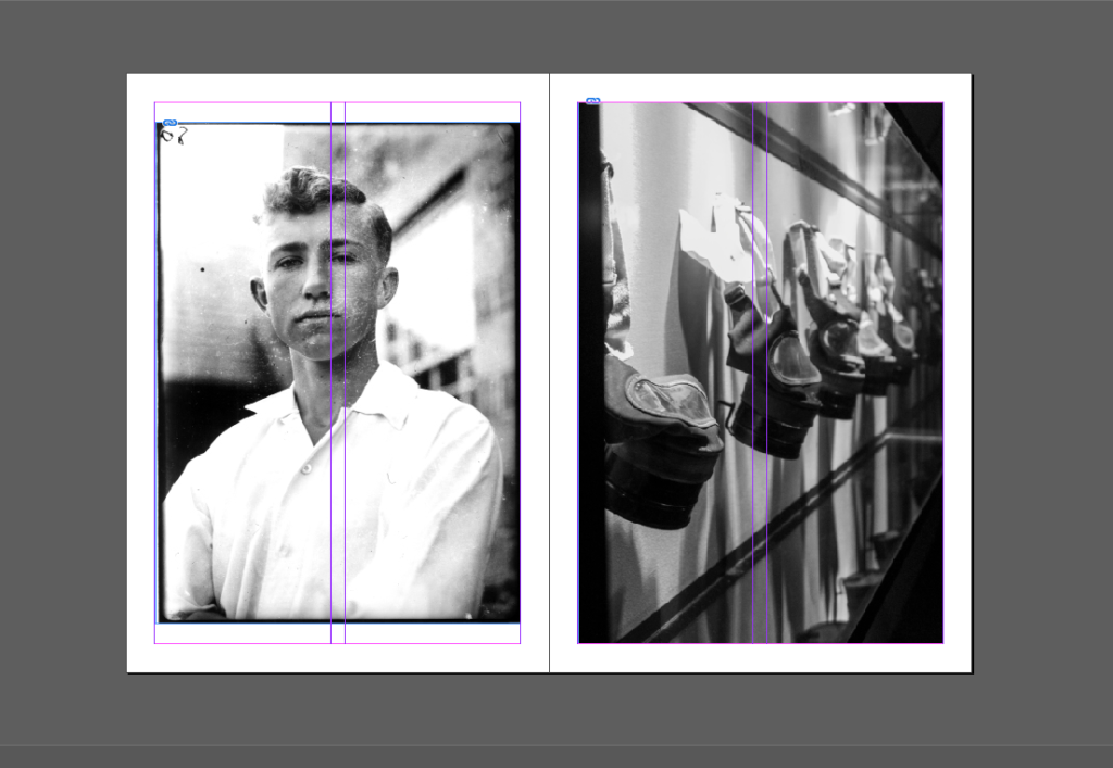
Furthermore, I put a photo from the Société Jersiaise of a teenage boy next to a photo I took at the war tunnels of gas masks. I wanted to show that even those the soldiers look young and innocent, they can cause harm to a lot of people. I put them next to each other so that they correlate with one another.
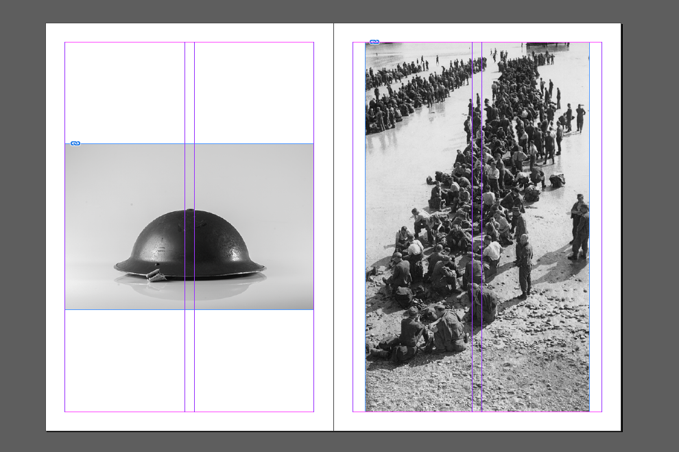
Next, I put a photo from the Société Jersiaise of a lot of soldiers on the beach next to a photo I took of a WW2 hat. I wanted to show what equipment the soldiers used and I wanted to show that the German had all the protection but the people didn’t.
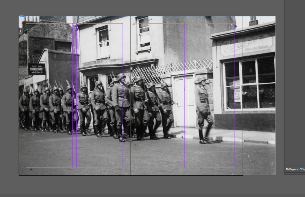
Additionally, I used a photo from Société Jersiaise on a full page to show German Soldiers marching away as to symbolise them leaving and Jersey becoming liberated. I wanted this picture to be large so that you could see the whole image, which gives it impact on the viewer.
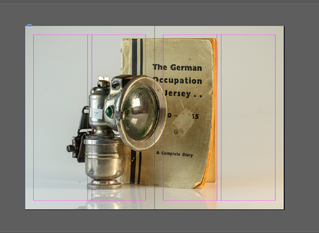
Furthermore, I used a photo I took of some WW2 objects such as a light and a occupation book. I wanted to show the present days of how these objects have aged and how they can easily be forgotten. I wanted to remind people of the limited sources people had in the occupation and show what they made to substitute things.
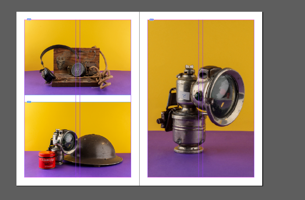
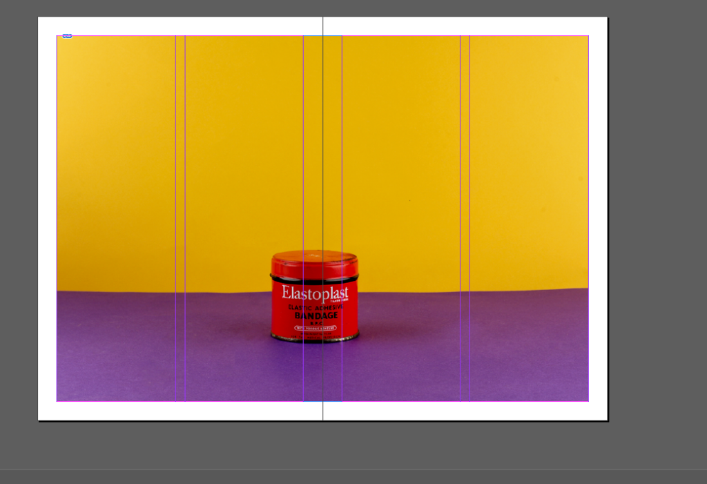
Next, I used photos that I took of WW2 objects and went the with the same idea as the last image before. I do this with the rest of the images until the last page.
” “
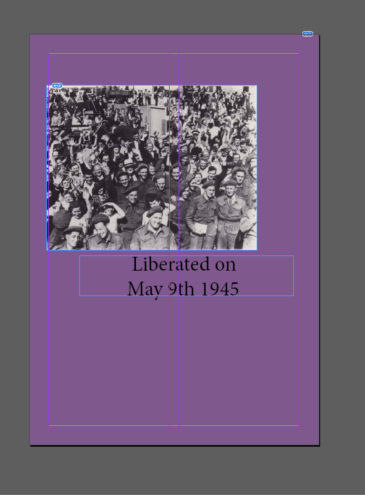
For this last page, I decided to match the coloured background of the objects with the front page to make it look pleasing to the eye. I used images from the war tunnels to show Jersey liberated and I used text to portray that as well. I wanted to show the contrast between the first page and the last, pejorative then ameliorative.