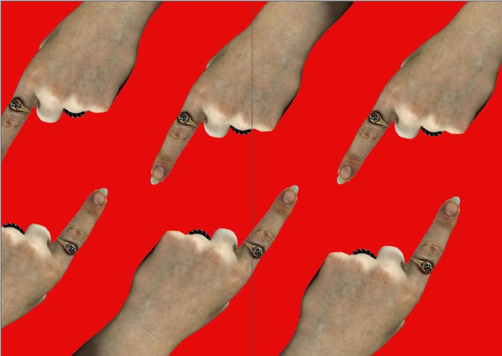
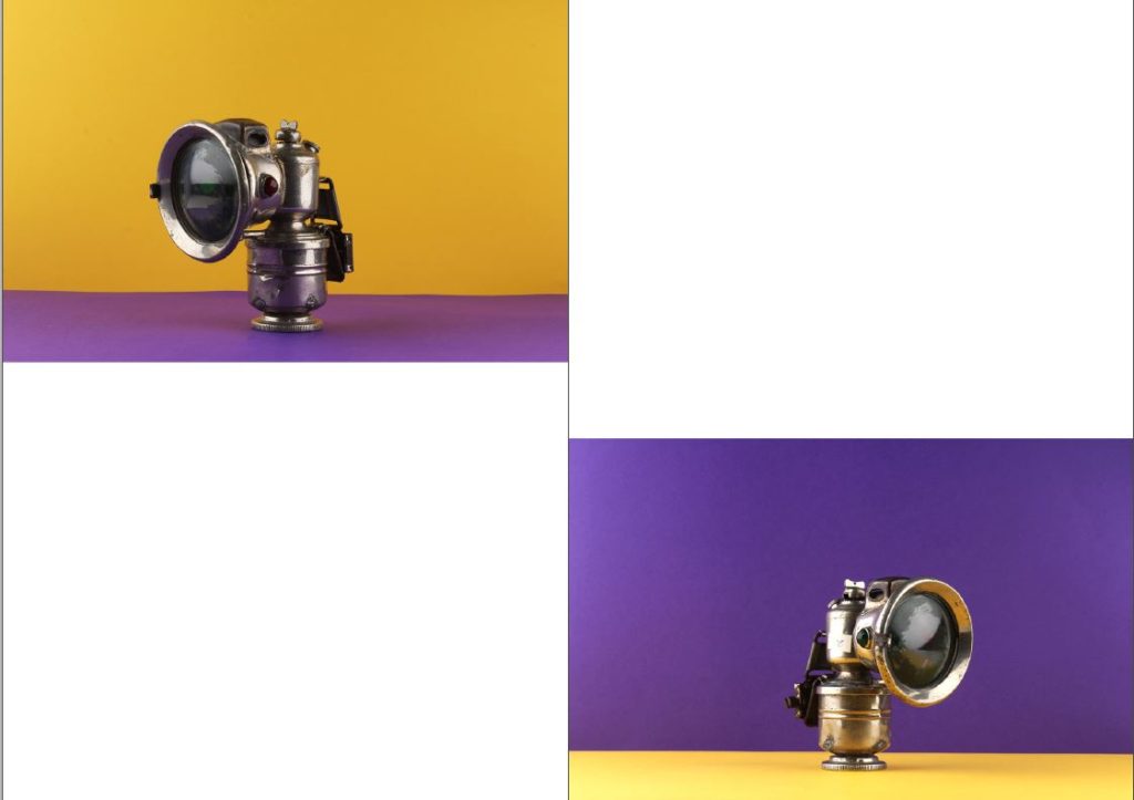
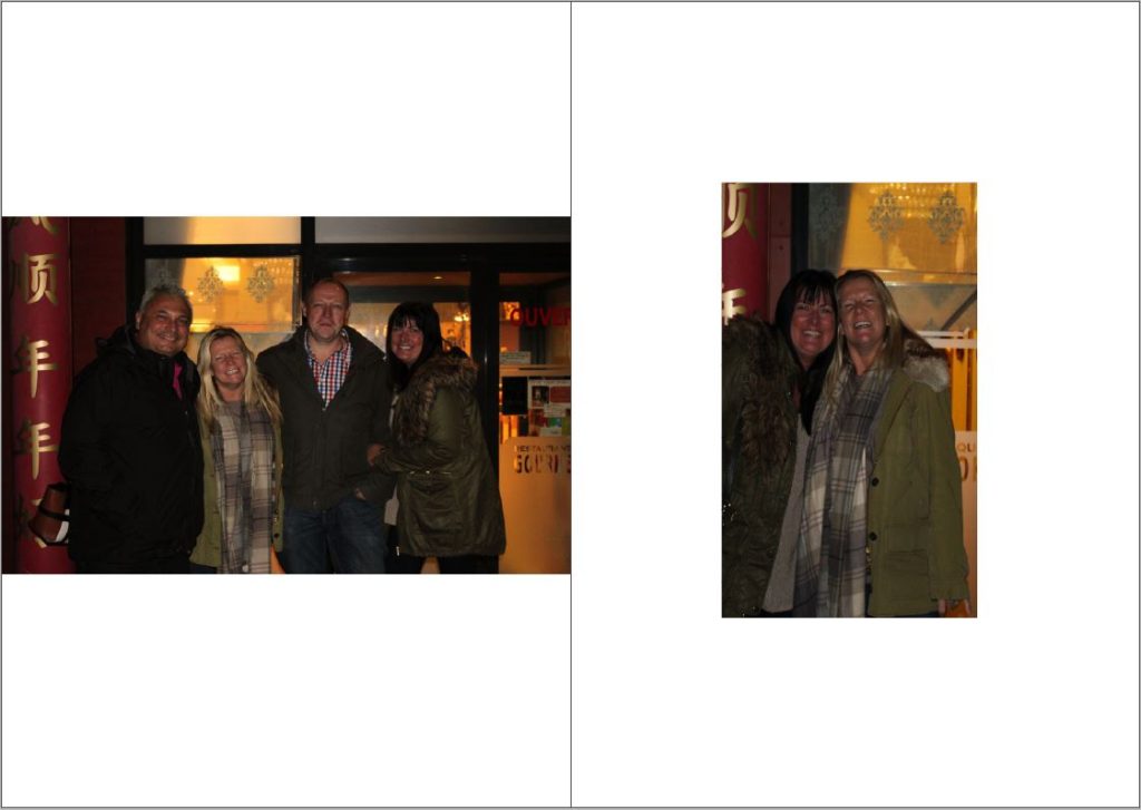
As my final layout of my zine, I have accomplished a ‘dos a dos’/accordion layout but displayed it on a different coloured spine. I wanted to do this because my overall idea was to create my own identity cards, like the ones given out during the occupation.I wanted to include my occupation related shoots and montages in the first section, then have images that relate to my life and my liberation. This personal section includes environmental shots of my family, alongside detail shots of my family. This overall I think was successful in the way it is laid out and how the content fits the title, however I was indecisive as to adding my photo montages due to the intensity of colours. However, this now in my opinion is very effective due to the pop of colour being needed to break up the rest of the content.
Zine 1
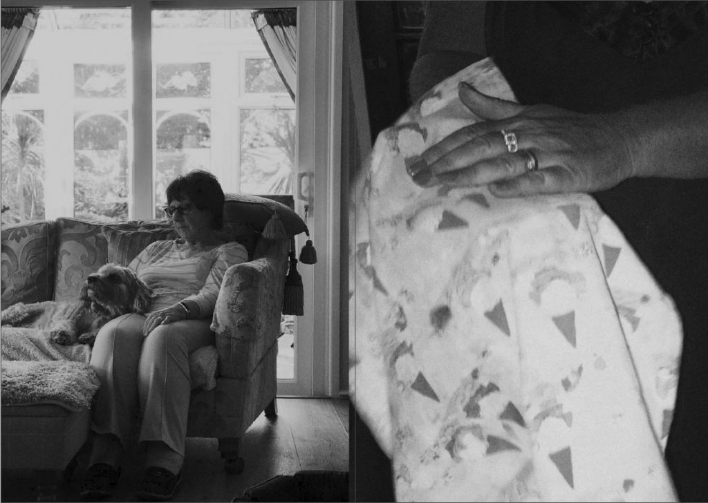
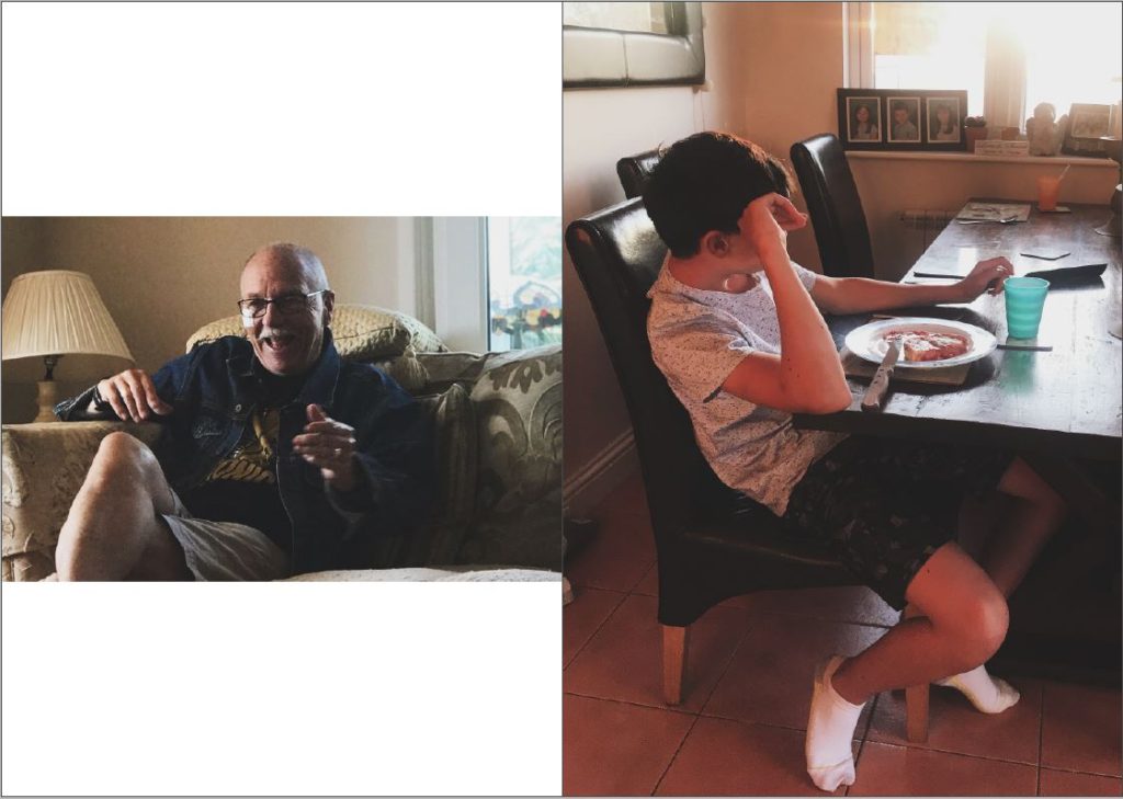
Zine 2
