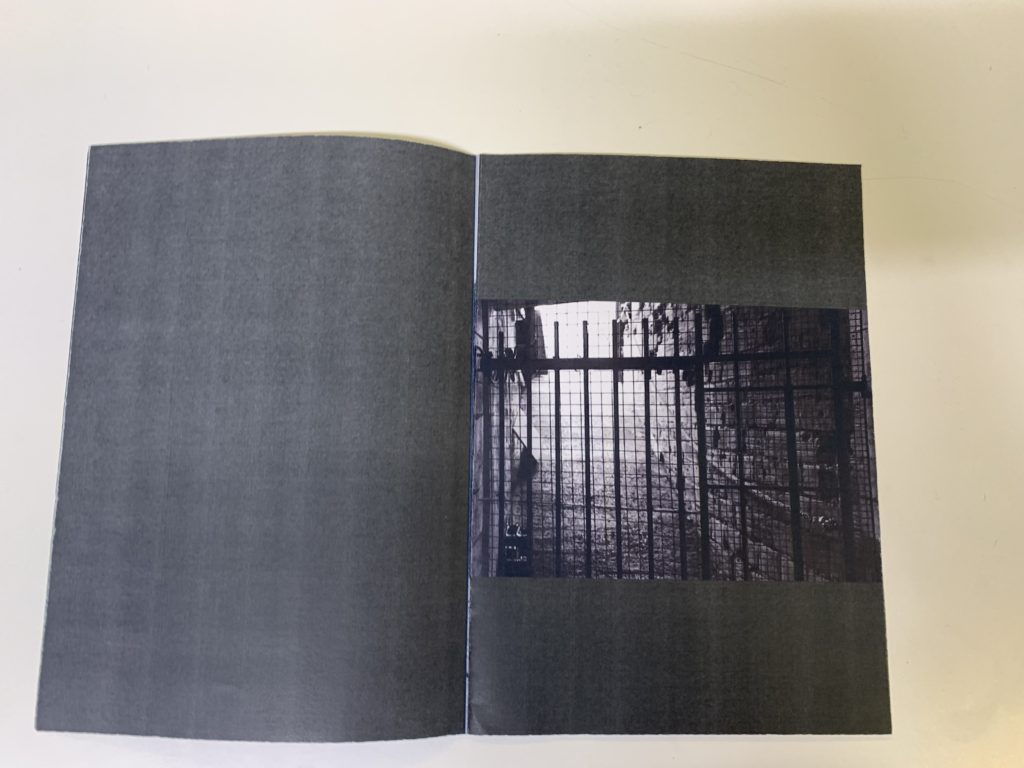
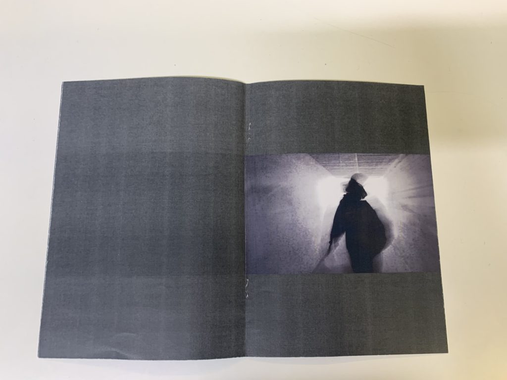
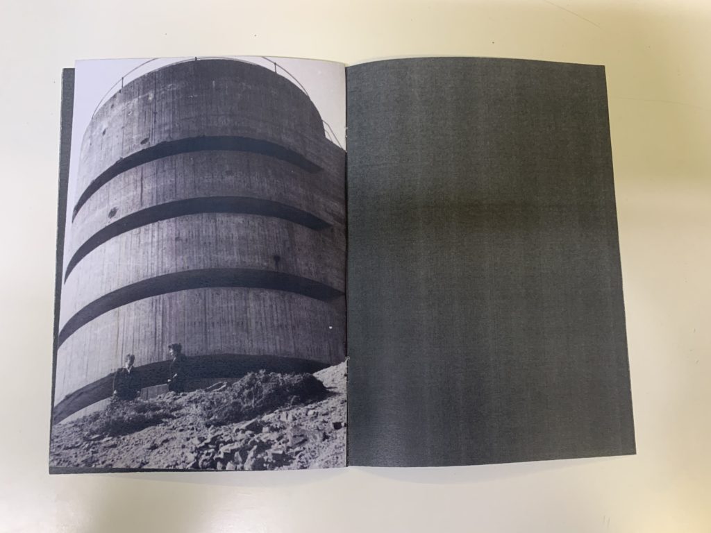
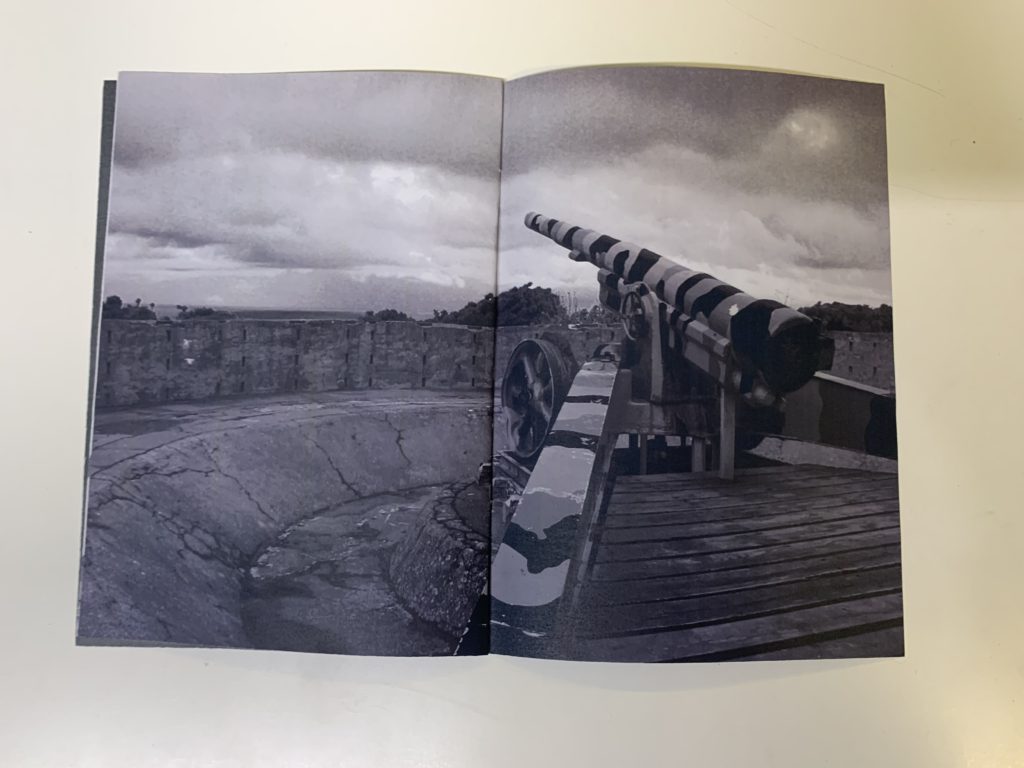
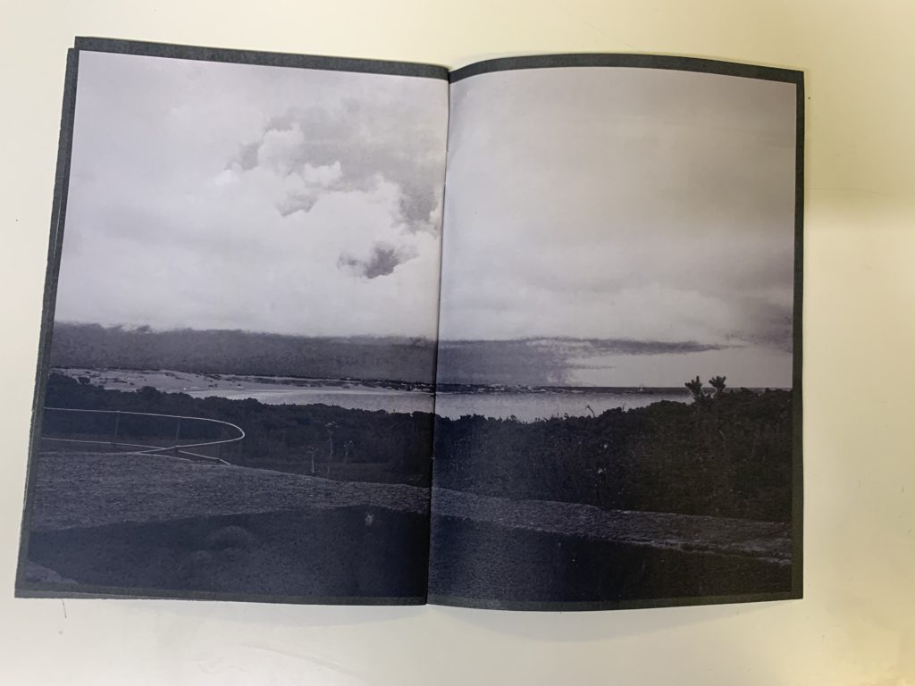
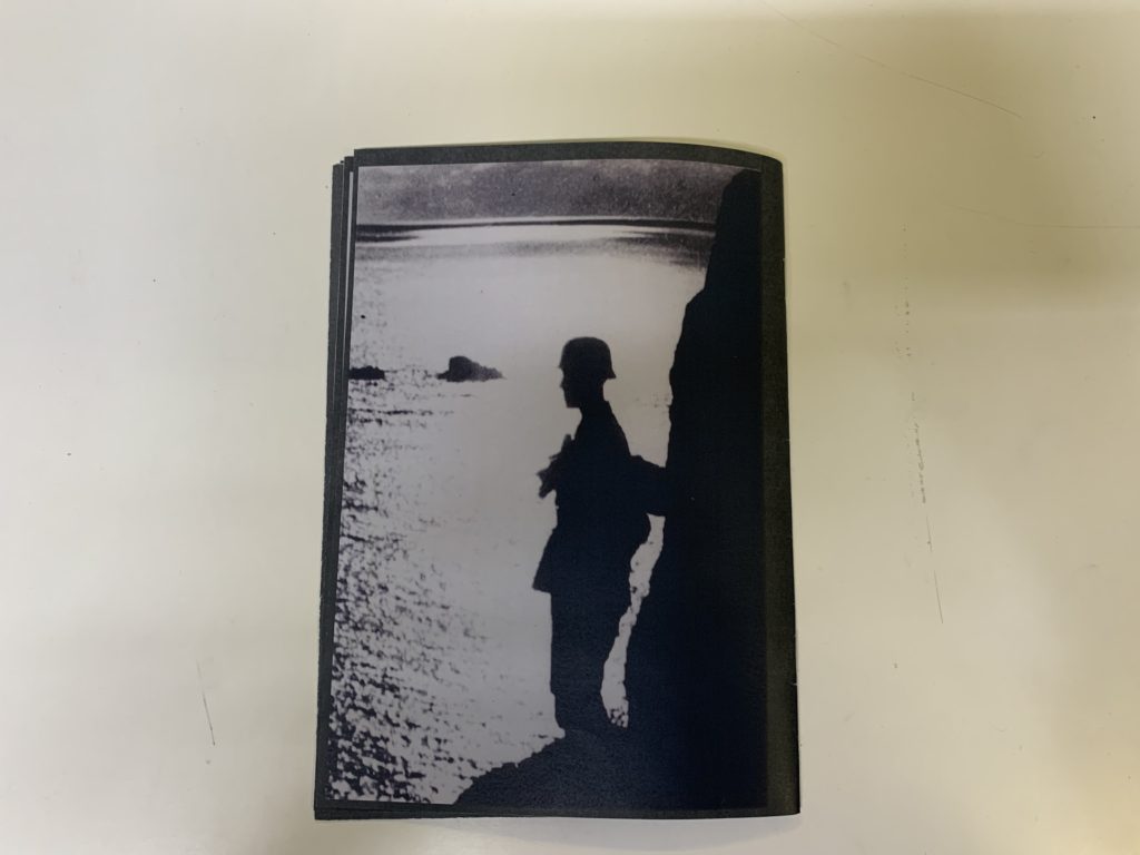
After developing my own personal research in to the creations of zine’s i started to focus on how i wanted to structure and develop my own. the first step was selecting around 16 images that i wanted to use within my zine. during the selection process it was essential to keep in mind the focal point for instance would be the relation to the occupation and the historical significance it holds, therefore when looking at each image in detail i needed to decide if the image was essentially appropriate and of high quality. i had now my selection of the image i wanted to use which had been cropped and edited to help project the feeling and affects i hoped to be portrayed through the zine. To continue the next thing to decide was the order and size of the photographs on each page, for example, will it fill the whole page/ half the page/one side/ both sides/ how many images will on each page? etc. An example of where this type of mind thought came in to play was the back page, it was determining whether having an image would be have a dramatic effect or not, after careful consideration i finally decided to fill the back page with one image of a silhouette of a soldier on rocks looking out towards the sea, i deemed this to be a perfect ending for the zine as the photograph has connotation of a more calmer semantic field and has suggestions of a deeper meaning of an end and finishing, with the solider looking out to the future and a new start.
I used light room to help me select and edit my images and refine them to the minim amount in order t be able to move on to actually creating the zine, furthermore this lead to be to the conclusion that all of my images being represented in a black and white form, to me this really helped reflect the historical features and what has come of Jersey and our surrounding since then whilst still holding and portraying the historical importance.
INDESIGN work:
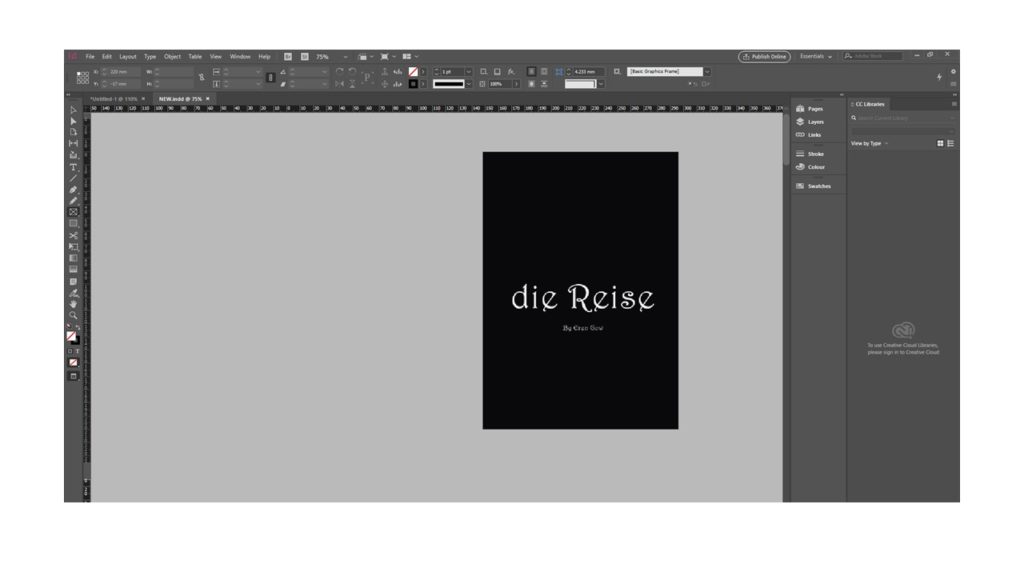
For my front cover i decided to keep it simple with a plain black background that continues to be displayed throughout the rest of the zine. For the title i chose a word ad translated it in to German to represent the historical features form the war, in this case i used the word ‘die reise’ which means the journey, this fitted perfectly as previously mention, is a genre i was concentrating on whist making the zine.
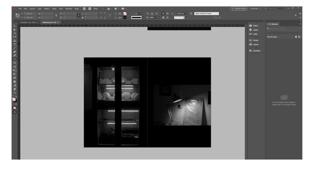


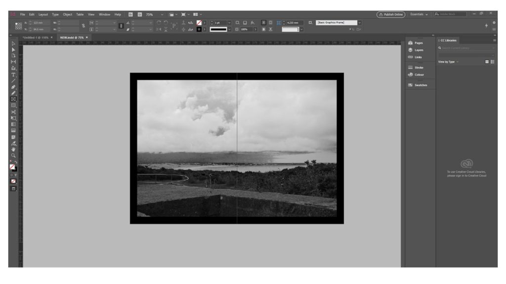
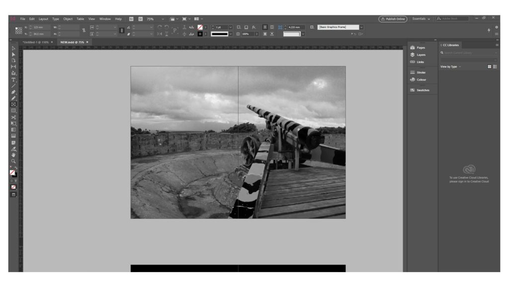
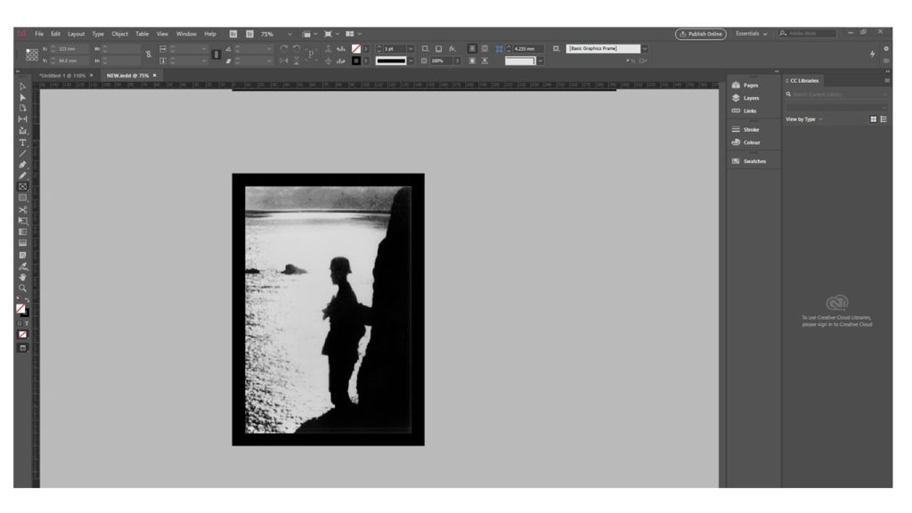
Finally after deciding on a definite structure and layout i printed out the zine making sure when it was printed and folded everything would still be in the correct position. As well as these factors i had to consider the over edges from the paper being folded and made sure there were no white stripes down the side of the booklet i did this by extending the image on indesign by an extra 3mm and trimming the pages when they were printed off, this resulted in a tidier and more complete finish.
The printed out zine:


