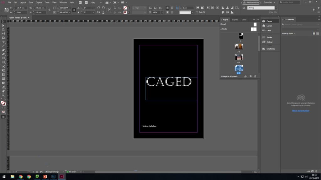
When working on my zine i didn’t start from the front cover i started from the inside out because i feel as you create a narrative with you zine the front cover will build its self and i will understand what will fit with the over all design of the zine and how i will tie it all together with the front cover.
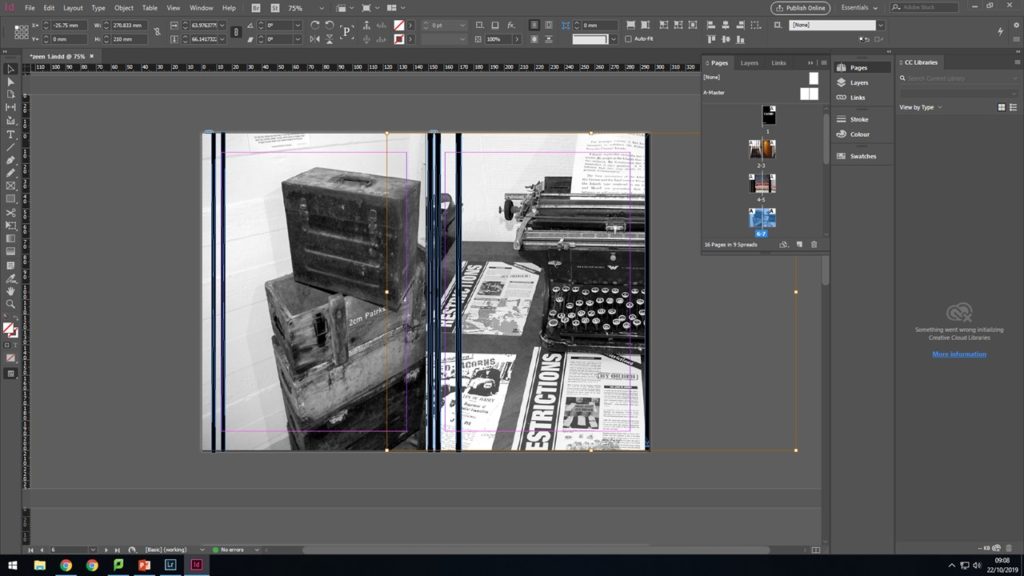
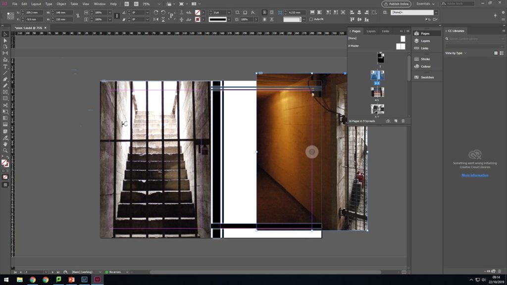
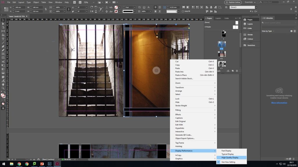
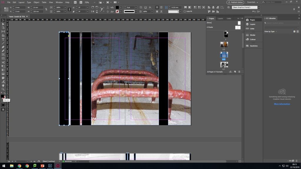
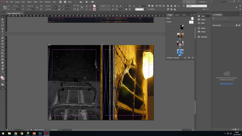
When making my zine i experimented with the idea of lines and the concepts of how this effects the images. I experimented with both horizontal and vertical lines on my images seeing the different effects that spacing and thinness of the lines had.
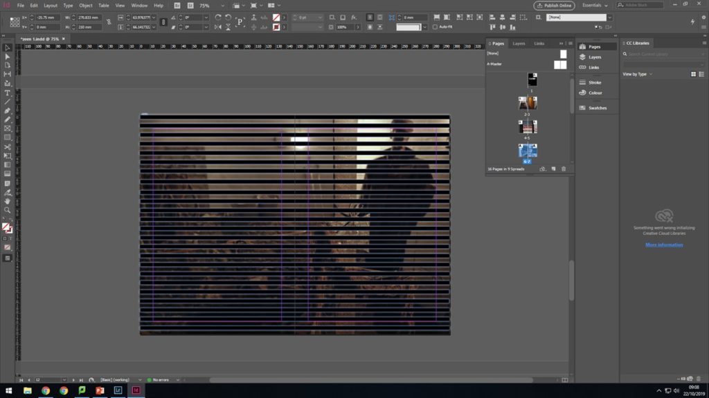
When importing an image in i would first make a box the size that i wanted the images to be whether than be full bleed to the edge of the page or that be a small box in the middle of the page. Once i have done that i pressed open and opend the image into the document and then the image would appear in the box . I normal have to do a small amount of re sizing just to make sure the image doesn’t become distorted.
At this point i had a idea for the tital it had to be something to do with the lines and how the fitted with the images. I brainstormed through a lot of words Such as trapped , bared, underground, but i felt caged fitted the best. It fitted because with the occupation and the entrapment that all the islanders felt withing WW2 and how they just couldn’t escape it.
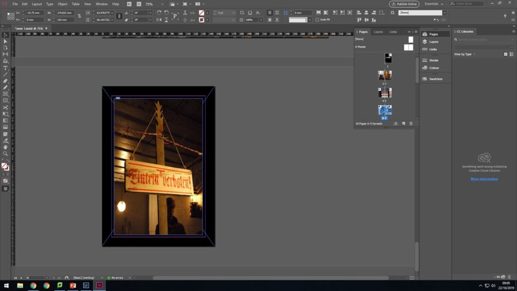
I then went on the make the back cover incorporating the black lines and the image with German phrases related to occupation.