Your second zine must be a combination of portraits and objects that either convey a sense of a story, or absence of a narrative. Your sequencing and juxtaposition of images require careful consideration of the relationship between forms, shapes, colour, meaning (symbolic, political, social, cultural.)
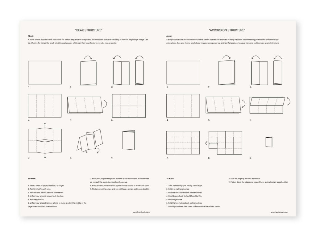
For your second zine try out a different design. Below are 10 different zine design. See also Zine Guide by Lewis Bush for more instructions about how to make your zine

Zine 1: Beak
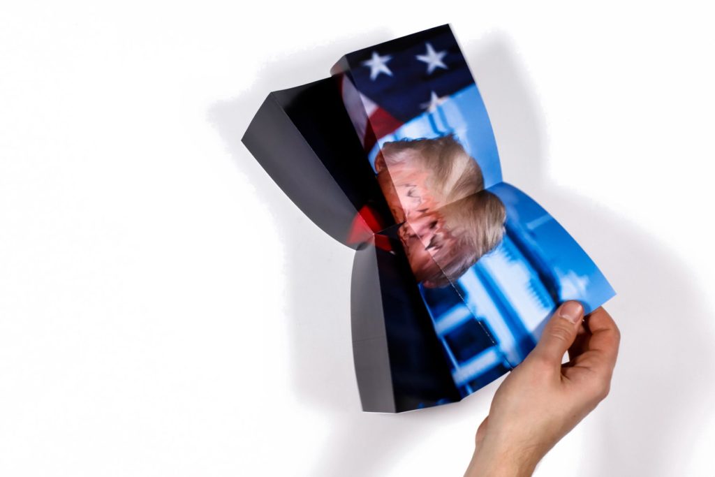
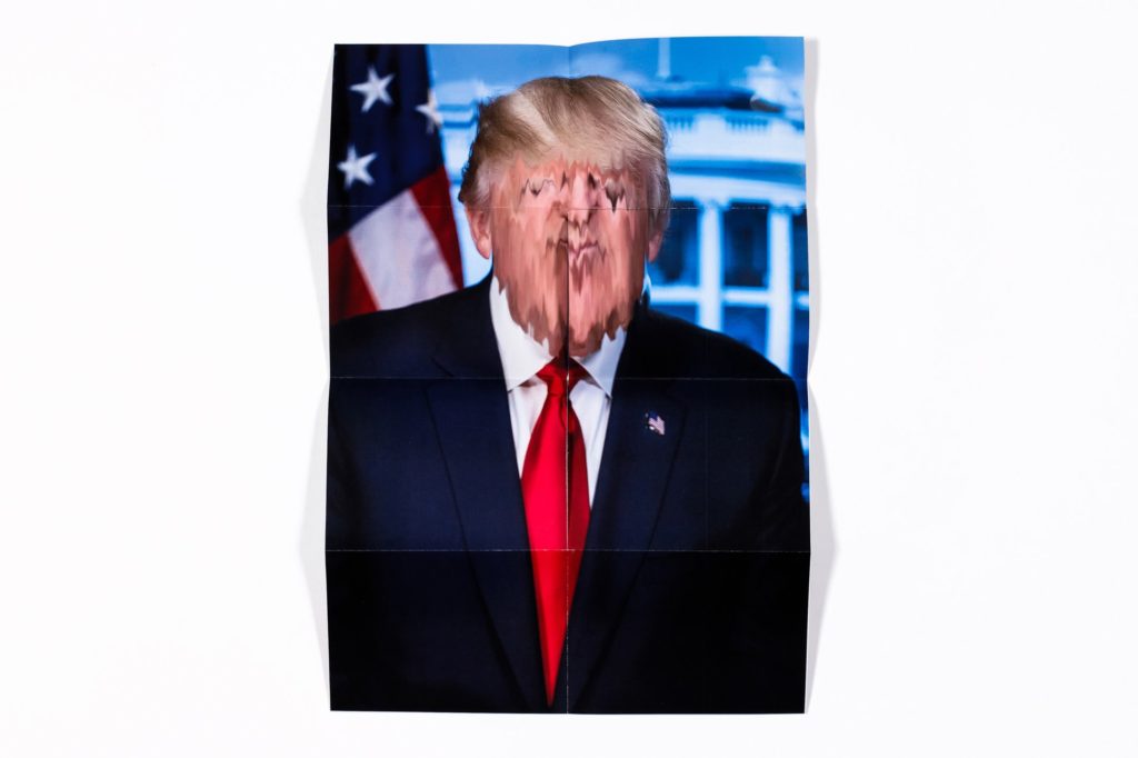
The beak structure is a super simple zine structure which is made from a single sheet of paper, it forms a small booklet but the neat part is the way the structure can be opened up to reveal a single large image. This one consists of a series of digital manipulations of Donald Trump’s super weird official presidential portrait, but then also opens out to form a large poster.

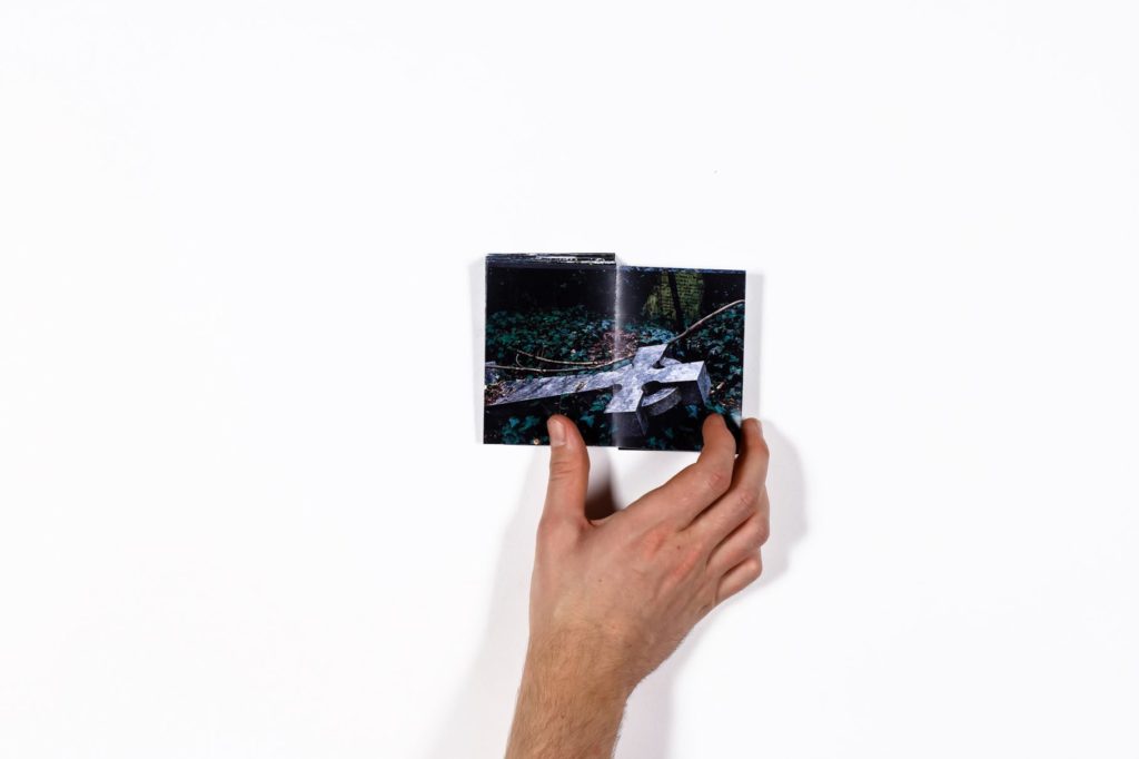
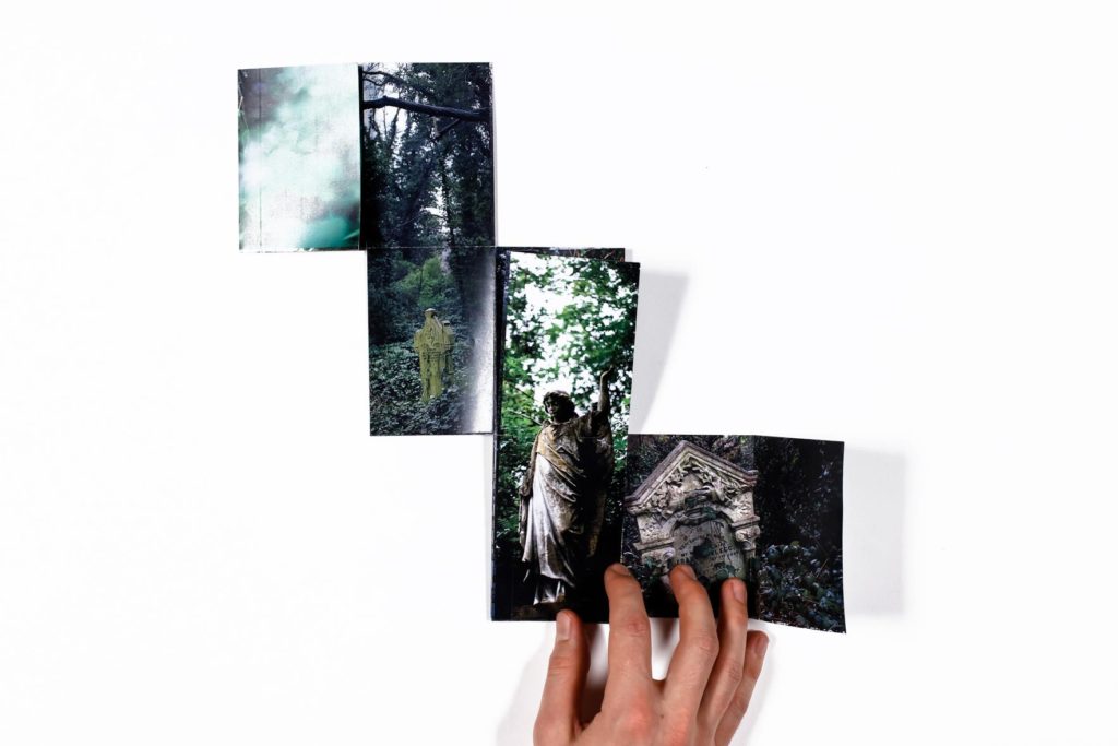
Zine 2: Accordion
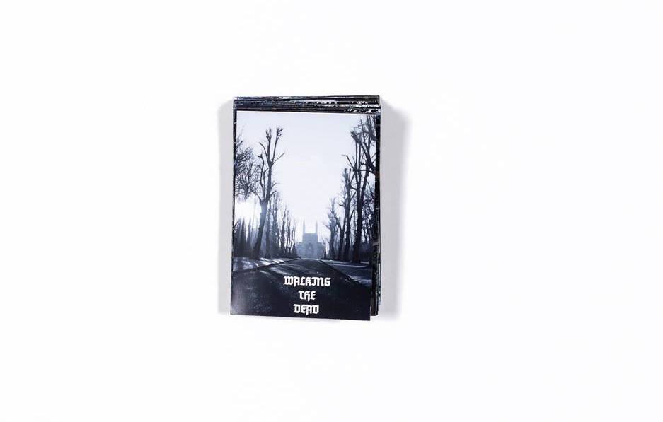
The accordion structure is also one you can make from a single sheet of paper, and it unfolds in a slightly unpredictable way which makes it a nice structure for zines with narratives about journeys, mazes, and so on. This one uses a series of photographs taken in a gothic Victorian cemetery which unfurls into a narrative about walking surrounded by symbols of death.

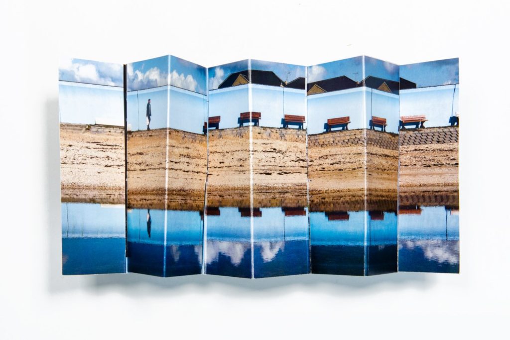
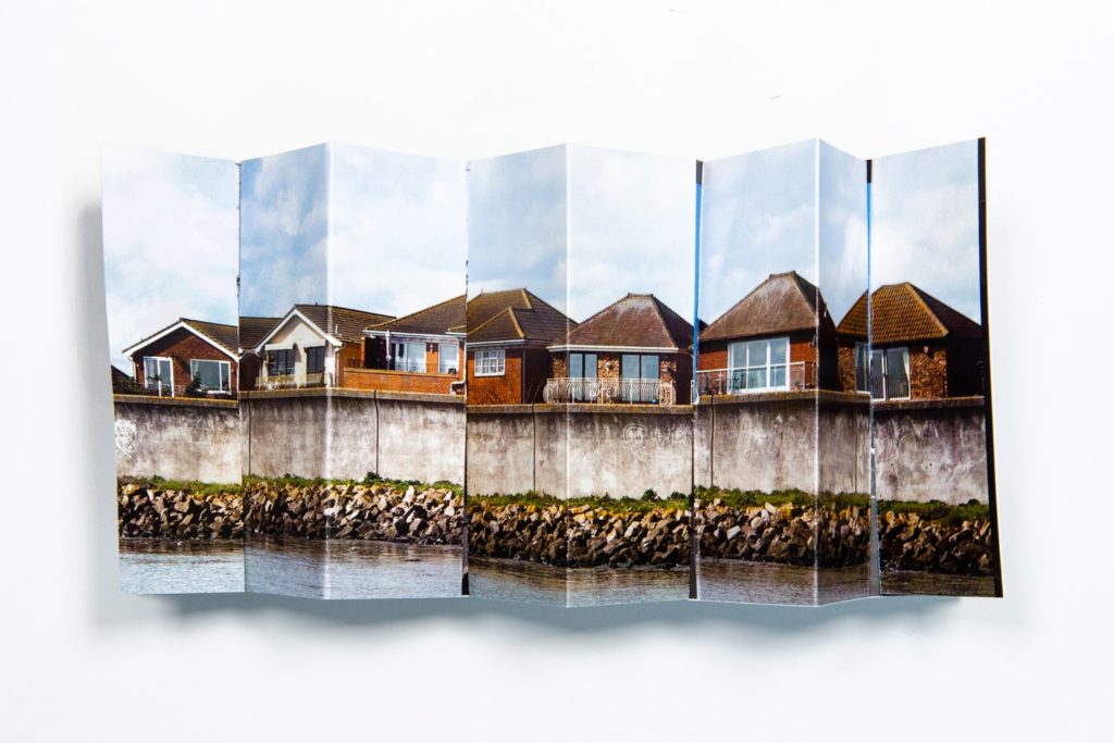
Zine 3: Spring
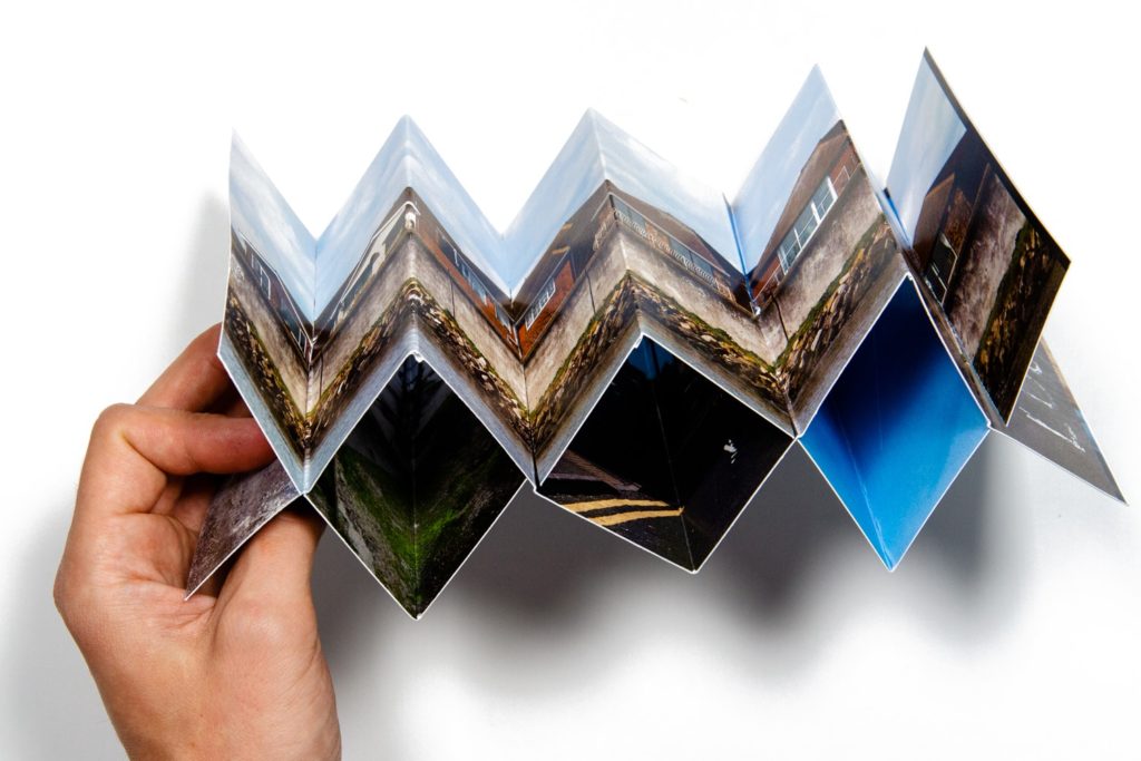
Another one that can be made from just a single sheet is the spring structure. It’s a more complex form of accordion structure, but one which also has some interesting internal spaces for images or text which are a little more hidden. You can also paste several together to make longer versions. In this case I used the structure with some photographs taken as part of a documentary project on Canvey Island, a very flat place with enormous skies, it made sense to use a panoramic concertina like this to show them off.
Zine 4: Single section
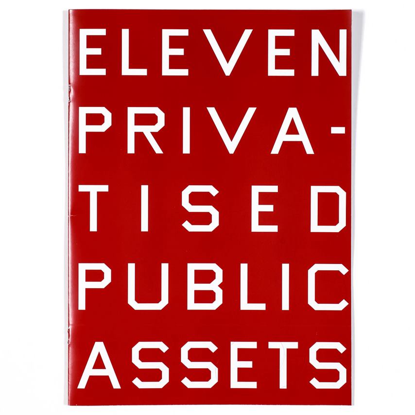
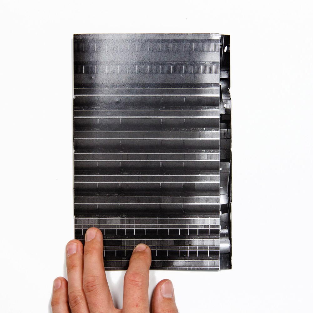
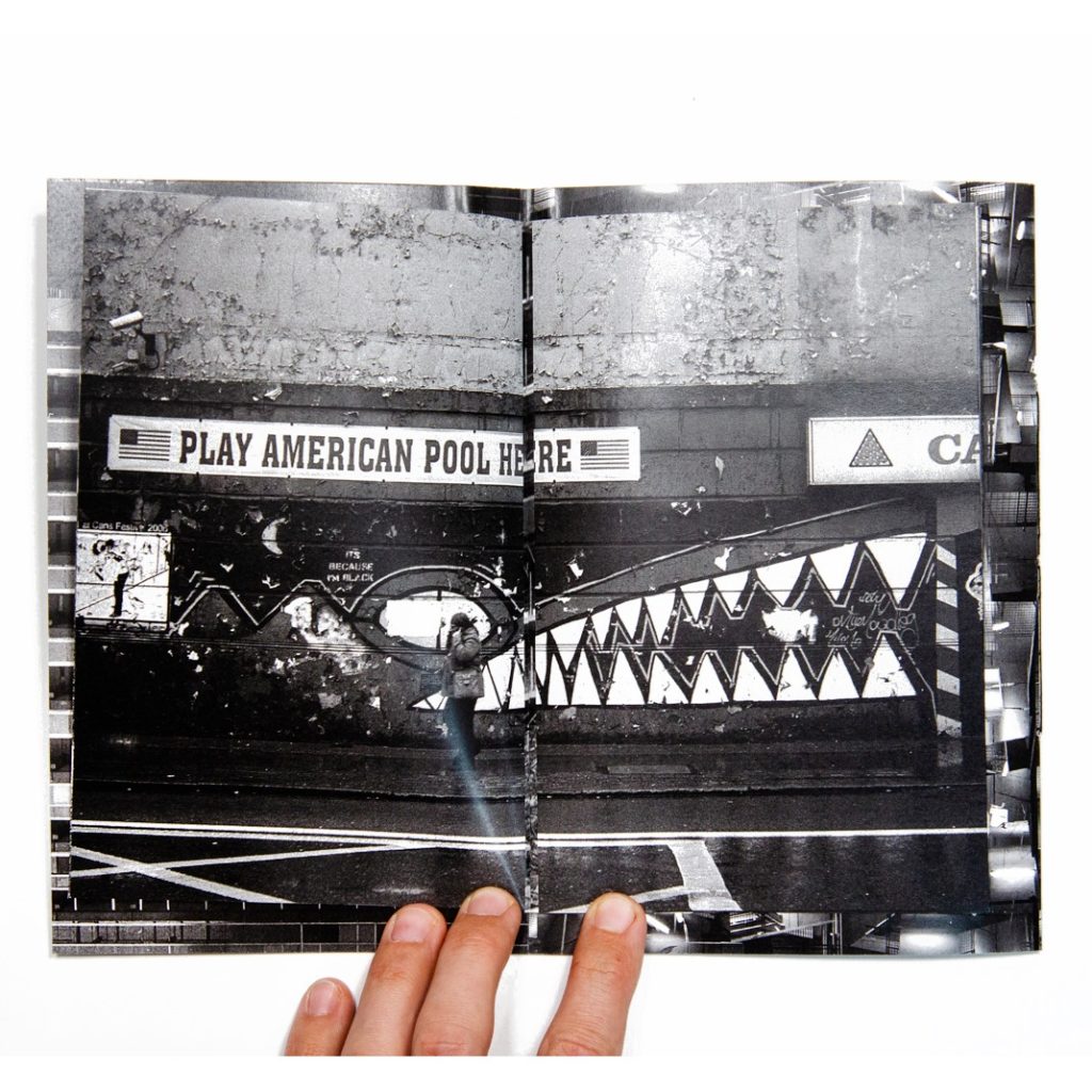
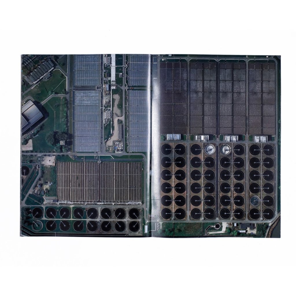
The single section zine, pretty widely known as it’s basically the same as a booklet. The structure is widely producible but has a lot of possibilities. In this case I used it for a publication consisting of satellite images of major sites and industries which were once publicly owned but have since been sold off and privatised. Opening to A3 size it really lets the detail in the images shine.
Zine 5: Fold-out
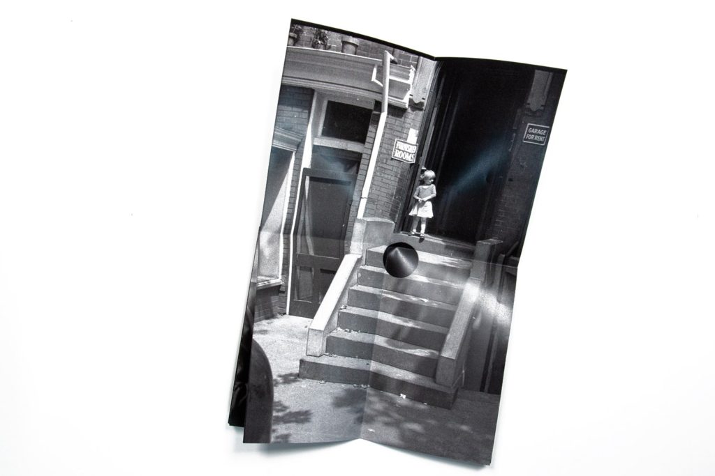
The fold out zine combines the possibilities of a single section zine with a nice surprise in the middle in the form of a large fold out. In this case I used it to contain a small project made using FSA photographs ‘killed’ by Roy Stryker, the FSA’s director, who went through a phase of hole punching photographs he didn’t like. To match the subject matter better I’ve also done a hand cut out on the front cover.
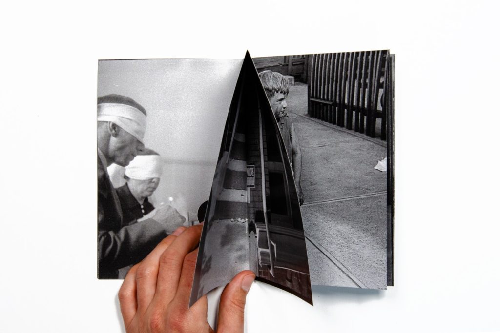
Zine 6: Dos a Dos
The dos a dos zine contains two single section zines within one cover, facing them in opposite directions, it’s a neat structure for combining two sets of material which you really want a viewer to experience separately, rather than in a sequence where one follows another. For this one I’ve combined two very different sets of imagery about my native London, one about the city’s history, and the other about it’s possible future.
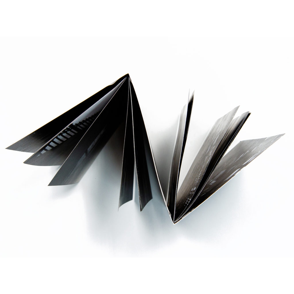
Zine 7: Multi-section
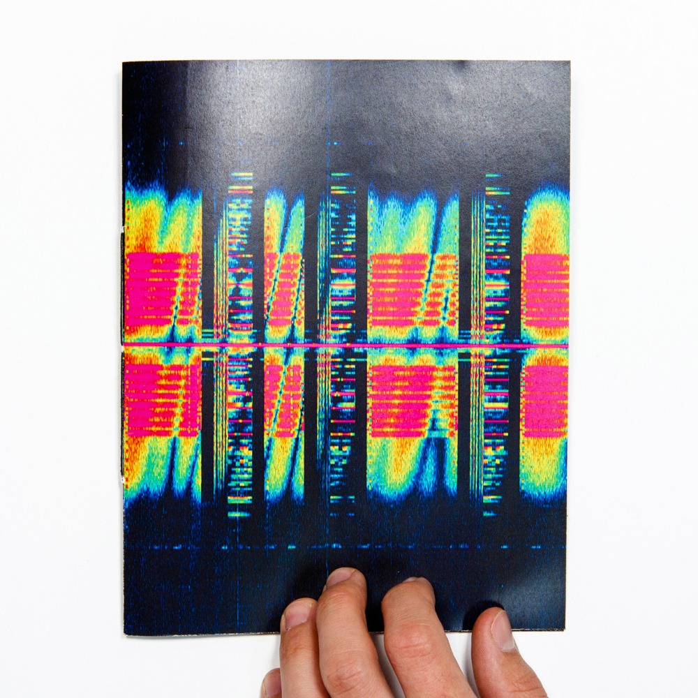
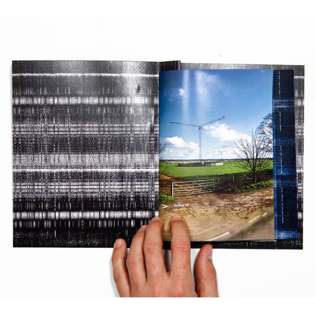
The multi-section zine is somewhere between the dos a dos zine and a t blown book. A couple of folds in the cover allow you to bind in three (or potentially even more) clusters of pages, which can function nicely as distinct chapters. In this case I’ve used the three different types of imagery featured in my project Shadows of the State, which documents spy radio stations.

Zine 8: Zine in a Zine
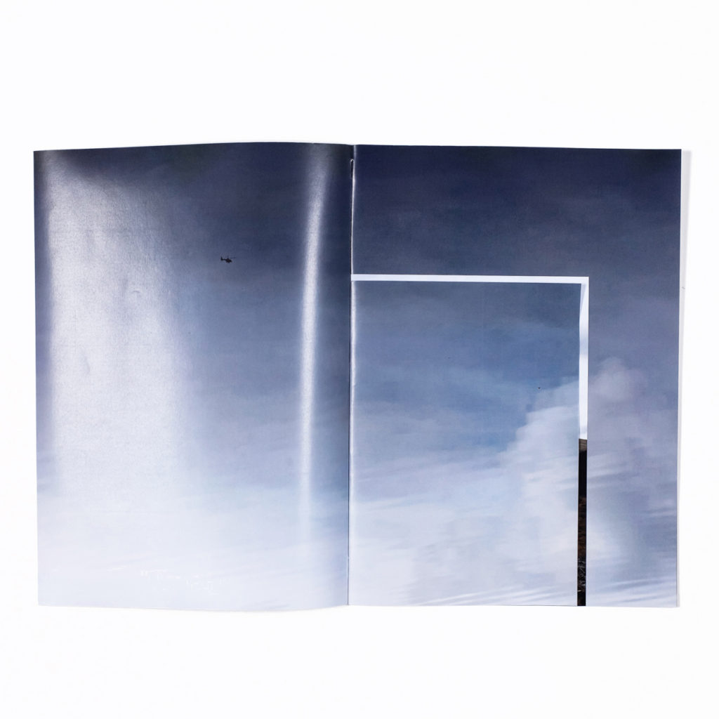
A zine in a zine is basically a single section zine combining different paper sizes, which can be distributed in a variety of ways, either creating a smaller publication within a bigger one, or creating hidden flaps which is what I’ve done in this case. These are a series of photographs taken during walks in mid-Wales, the wider images contain smaller flaps which open to reveal closer details.
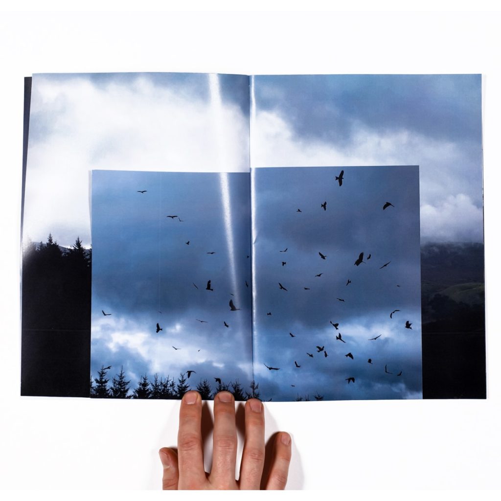
Zine 9. Flag
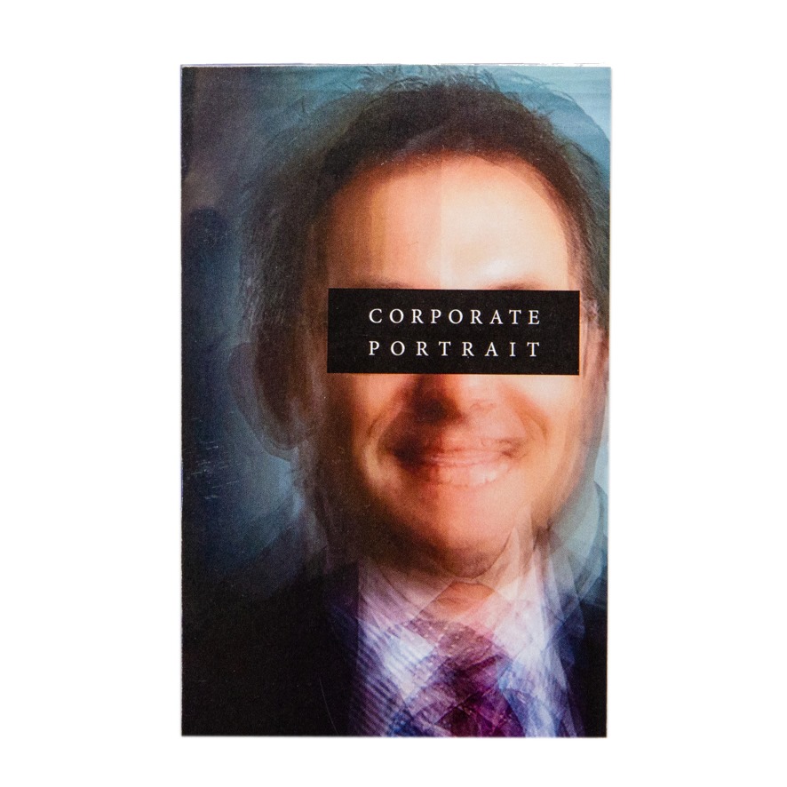
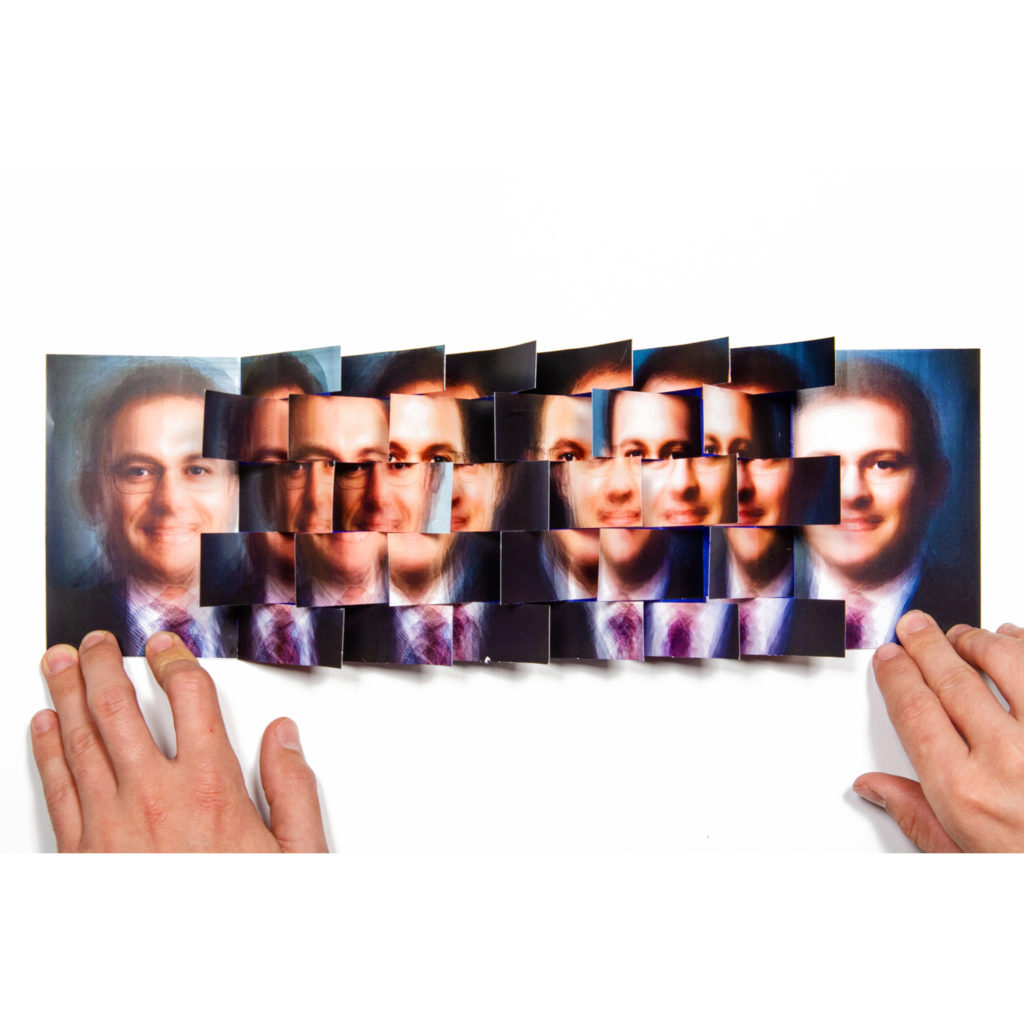
The flag book is a creation of book artist Heidi Kyle. It’s one of the most complex in the guide but can lead to some remarkable results. It uses a series of small flaps to create a sort of cascading wall of paper, great for making otherwise perhaps rather dull images more surprising. For this one I’ve used a series of composite portraits created from thousands of corporate portraits. The flag book structure seemed to add something to the already slightly shimmering, edgeless quality of the composite images.
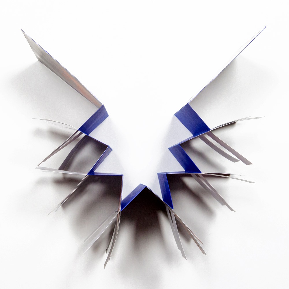
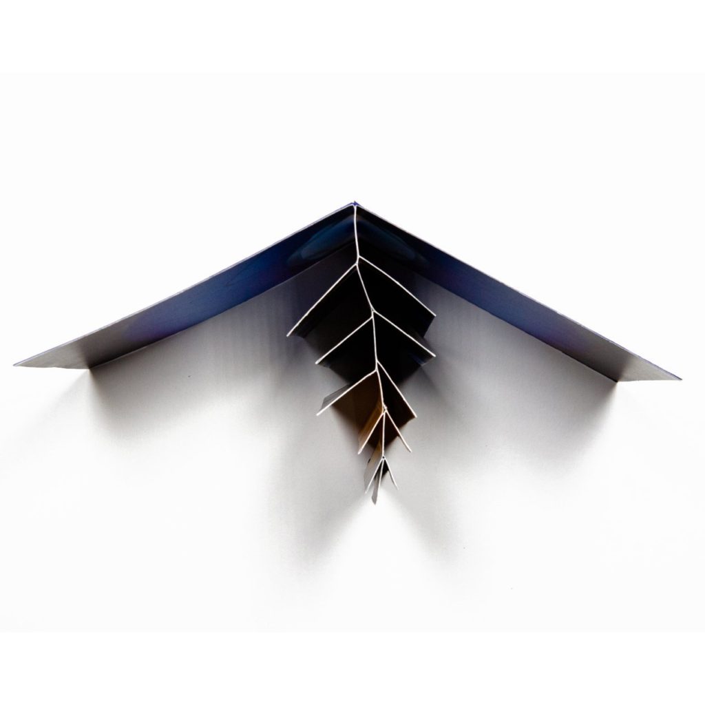
Zine 10: Fishbone
The fishbone folder is another Heidi Kyle invention, it’s structure looks something like a fish skeleton with a series of pages getting smaller and smaller towards the middle of the zine. For this attempt I’ve used a single large macro image taken of an old lens, the folds break up the image in a way which makes it less immediately obvious what it is, so I’ve added an image of the side of the lens as a sort of cover and clue to the contents.
Week 8: 21 Oct – 4 Nov (incl H-Term)
Zine-lab: Portraits and Objects
Complete the following blog posts
1. RESEARCH: Zines and newspaper design made by artists and photographer that will provide visual stimulus for your page designs.
- Produce a mood board
For inspiration see zines/ books by Lorenzo Vitturi (Dalston Anatomy), Sam Ivin (Lingering Ghosts) Rita Puig-Serra Costa (Where Mimosa Bloom)-, Laurence Aëgerter (Photographic Treatment), Batia Suter (Radical Grammar)
2. DESIGN: Plan how you want your zine to look and feel, in terms of
- Format, size and orientation
- Design and layout
- Rhythm and sequencing
- Narrative and visual concept
- Title and cover
- Images and text
- Use of other design elements or inserts: archives, montages, graphics, typography
3. EXPERIMENTING: Show variation of designs
- Create 3 examples of alternative layouts for your zine using Adobe InDesign and complete a visual blog post that clearly shows your decision making and design process using print-screens or save each page-spread as a JPEG.
- Make sure you annotate!
4. PRESENTING: Print, fold and bind final zine and hand in for assessment.
DEADLINE: FRI 25 Oct
All Blogposts by Mon 4 Nov (first day after H-Term)

