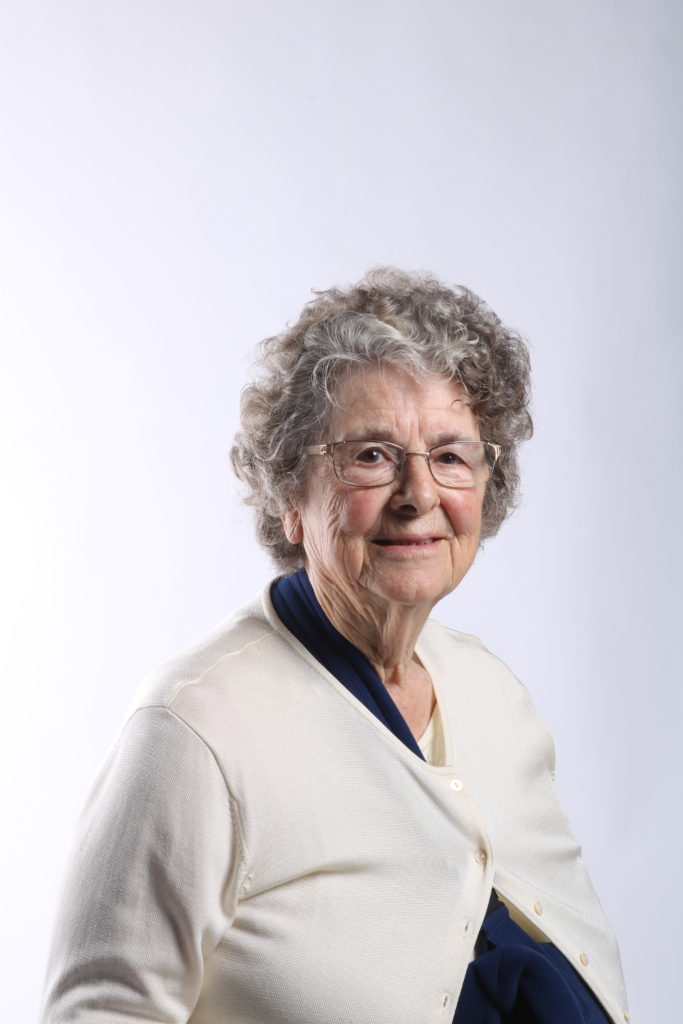
Contact Sheet:

Edit 1:
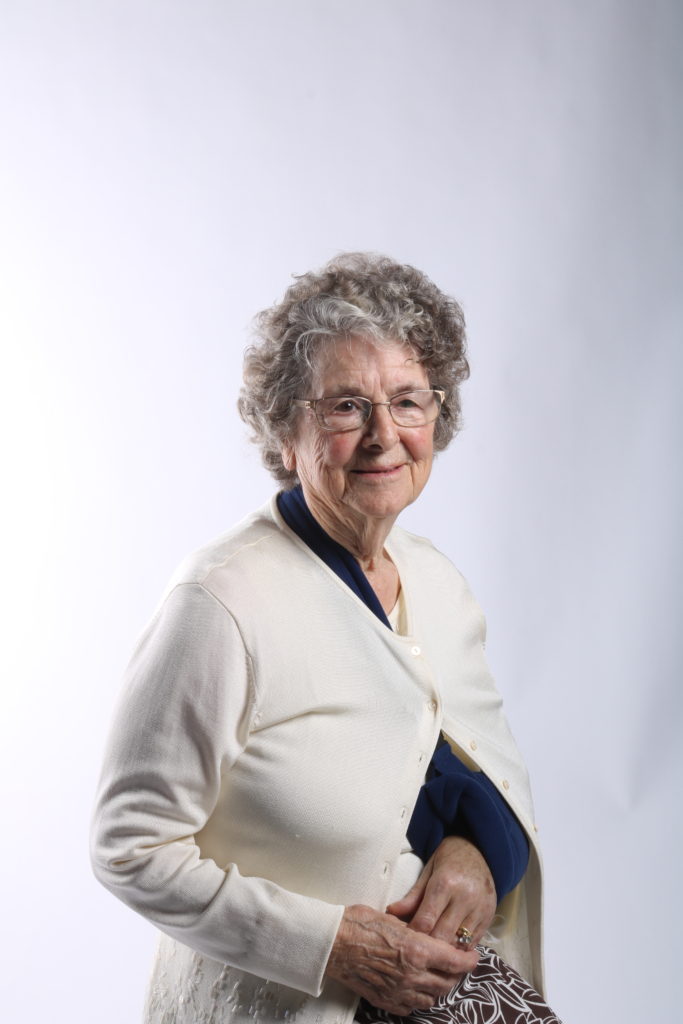


Edit 2:

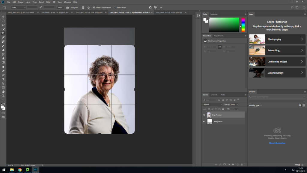
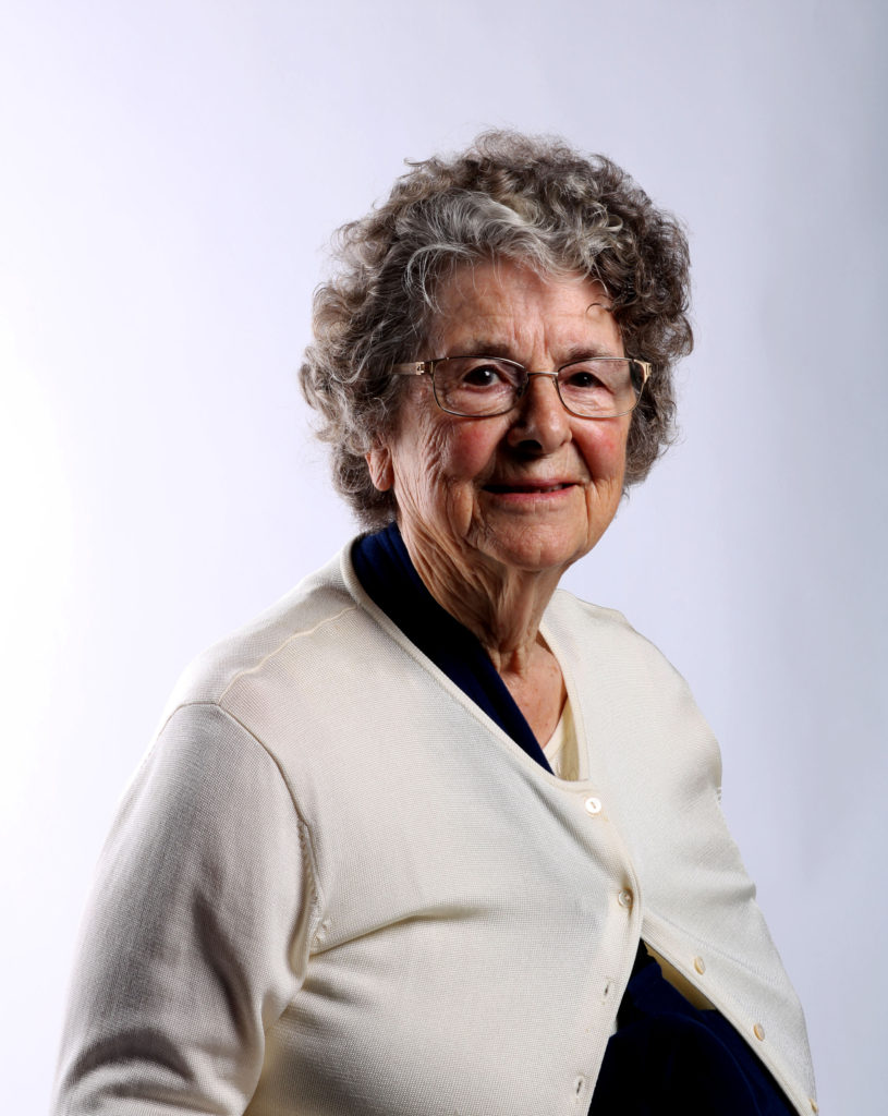
My main aim when editing the first two edits was to make the small details in Joyce’s face and what she is wearing to be as clear as possible. To do this I started by changing the white and black in levels on photoshop to create a stronger contrast, by using the white to make the background whiter and any where the light hits her face stronger and use the black to make the darker areas even darker, so that there is more of a contrast. I then decided to increase the contrast to try make the colours a little richer in the image and to make the details in the face stand out a little bit more. I finished both edits by cropping the image in order to get rid of the extra white background and to make sure that the viewers eye is instantly focused on the subject in the image instead of being distracted by the extra white background.
Edit 3:
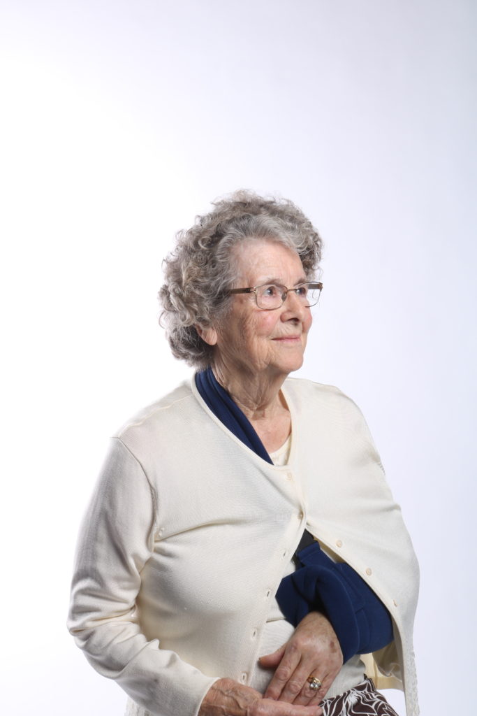
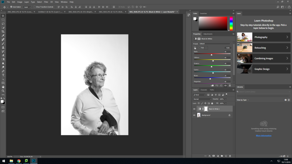
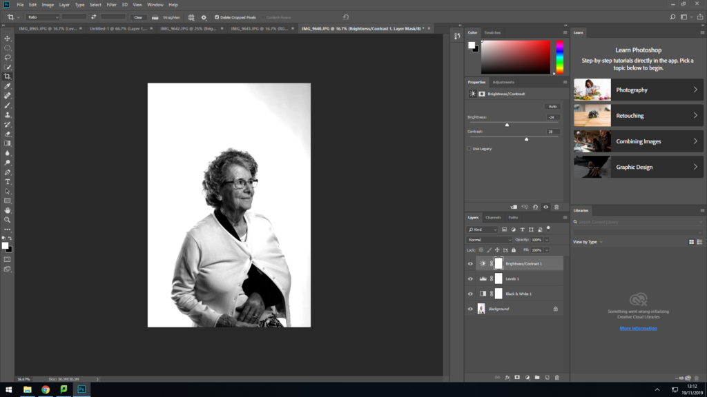
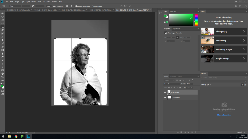

For the third edit I decided to experiment and made the image black and white to see what the outcome would look like. I began the edit by turning the image black and white, and then altered the black and white in levels to make the darker area in Joyce’s face a stand out more and create a contrast, and I mainly used the white to make the background lighter and to also make the areas where the light hits Joyce’s face brighter. I also used the contrast tool in photoshop to make the contrast in Joyce’s face a little stronger and to not make it too dramatic as I found that the levels tool was slightly limited to create a good contrast as it would sometimes be too dark or too light, which is why I used the contrast tool to just make the contrast as I would like it. I then finished the edit by cropping the image to get rid of the additional white background as I felt that it would distract the viewers eye from focusing on the subject if I had left it as it was.


