
Working with archival work, I decided to creatively explore and experiment with the imagery to create photomontages. Due to previously looking at photomontages, I knew that I could successfully produce imagery which holds many conceptual factors as we as historical. My previous work can be found here :
With my exploration with war archive I decided to take more of a surrelasism approach, presenting a new way to look at the material. I experimented with handcrafts (cutting, sticking etc) images and within photoshop in order to create outcomes which I believe present a new way with looking at the war.
Photoshop Outcomes:
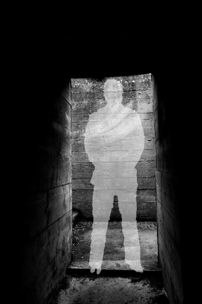
For my first experimentation I looked at the idea of silhouettes and the meaning behind them. This was inspired from the black metal cut out (outline) of soldiers which were spread across the UK, in order to remember those we lost during the war. This lead to the conceptual reasoning of the image above, I created a silhouette in the centre of the picture of the abandoned bunker to get viewers to not only remember the soldiers we lost, but also remind them that the bunkers had a massive impact on these people’s lives. In order to create this I found a cut out of a solider on google, and placed it onto of my image of the bunker. Then using the quick selection tool I outlines the solider, then on the layer with my image on I right clicked the selection and pressed layer via cut. I then deleted the layer with the solider on, and turned down the opacity of the outline I just cut out, creating a silhouette. This simplistic design works well as it clearly showcases the conceptual meaning, with still presenting history of the bunkers. It clearly takes the format of a surrealism photomontage and is an interesting piece for viewers to look at. I think that this outcome has turned out well, but is not the strongest one I produced.
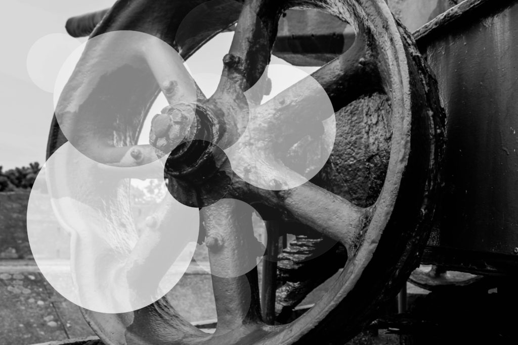
For my second experimentation I wanted to look at exploring with the formal element shape, considering my photograph was a wheel of a gun, found on a bunker site, I decided to use circles in order to manipulate this image. This contemporary final design conceptually presents the idea that although the bunkers are abandoned, and been left alone to rot, they will continue to stand there, reminding us of the horrors of the war. I believe this is mainly shown through the faded circles. Again this image presents the historical factors of the uses of the bunkers in Jersey during this time in history. To achieve this effect I used the circular marquee tool and created circles, adjusting the size by using the transformation tool (ctrl + t), and cut them out of the original layer. Then I turned down the opacity, randomly on each new layer creating the decay effect, reinforcing the conceptual factors of the image. I really like the way in which the outcome turned out, as it really emphasise the formal element of shape, creating and unique and interesting design for viewers to look at. The contemporary design, makes the concept more disguised, but needless to say it is still effective. To critique the design I would make the circles more central, to make them more ascetically pleasing.
Artist Research:
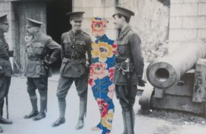
Sky-Alling Phillips created a series of photographs called ‘Paper’, in this she cut out parts of a war archival image and placed floral prints behind it, creating a unique and juxtaposing design. Although this series can not be found online, I captured a photograph of her work, when looking through different Zines. Contextually, this photograph is showcasing solider at a bunker, who seem to be off duty and socialising, making it seem like war was not all that bad as it was said to be. This further reinforced by the background, the structure of the bunker looks strong standing which creates a sense of comfort. Conceptually, Phillips is trying to showcase that those who died at war are still with us. The person in the centre of the frame, made out of the floral design, represents a solider who has been killed but is still with his ‘friends’, creating the sense that we never forget those we loved. To technically analyse this work I will explore the camera settings of the archival image. The camera settings would have been very basic, due to camera’s not being as advanced during the war as they are know. The image would have been taken outside, using natural lighting of the sun to illuminate the subjects, this creates a sense of warmth which is then juxtaposed by turning the image into black and white. The quality of the photograph is poor, which could suggest it has been enlarged to big, or that the shutter speed was slightly slow, creating movement, alongside the ISO being high due to a sense of noise being shown within the image. In addition, the soldiers seem to be in focus with the background being slightly out of focus, suggesting a narrow depth of field being used to capture the image. Visually, the photograph has many elements which makes it pleasing to look at. It uses the formal elements of space, show through the floral patter in the space of a solider as well as a sense of space between the for and background; form, shown through the structure of the bunker and the pattern of the flowers. Having the colourful flowers in the middle of a black and white photo, makes the viewers eye initially draw the there, main focus point, and juxtaposes the black and white creating intrigue and allows the conceptual factors to be presented. In conclusion, I like the simplistic design of Phillips work, as it holds a lot of meanings and is shown in a creative and successful way. The floral pattern in the shape of a solider is a cleaver design creates a sense of separation, even though the cut out is close in proxemics to the other soldiers, making it interesting to view.
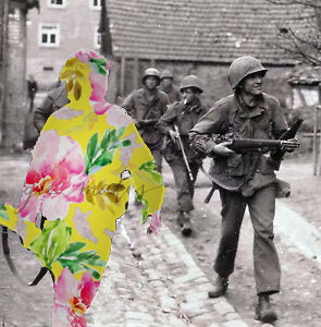
My final experimentation on photoshop was inspired by Sky-Alling Phillips. I found an online image of solider’s walking with weapons, as if they are ready to go into battle. I then decided to use the solider who was closest to the front of the frame, as the effect will stand out more, to cut out using the quick selection tool. I then found a floral pattern online and created a new layer on photoshop, placing it behind the original image, creating this effect. To make it stand out more I decided to add a drop shadow, which outlines the solider and makes the floral patter darker, creating a more subtle blend between the archival image and floral design. I am very happy with the way it turned out as it is very similar to Phillip’s photography, and represents the same conceptual factors. I believe this is my most successful outcome, as it has the strongest conceptual factor, and the design works and is ascetically pleasing to look at.
Craft Experimentations:
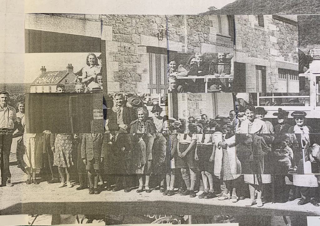
For my first experimentation I weaved two war archival images, one image of a landscape and an image of people, together in order to create a unique and abstract design. Due to the nature of the craft, viewers eyes are constantly looking round the image to try and make sense of what is happening, presenting the conceptual factor of the war was not as simple as it is told to be and there are many layers to what actual happened. Intertwining the two images clearly represents this as it is creating those layers. This outcome experiments with the formal elements of shape and space, which work together to create a eye catching image. Overall, I am pleased with the way in which this outcome has turned out, as the confusing design allows viewers to explore the concept of the overall image.
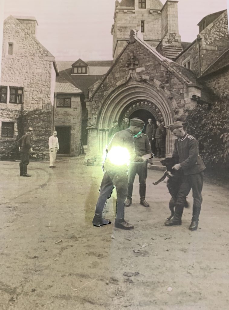
For my final hand craft experimentation, I kept it very simple, due to the simplicity of the image itself. The archival image used had a large sense of space, thus I wanted to utilise this. I decided to cut out man in the centre of the frame, but left bits of him still connected onto the image. I then placed a light behind him lighting his up and making him stand out from the rest, main focus point of the image. Conceptually, I am trying to showcase the light that each solider had but was eventually turned off as they were murdered fighting for their country. This is a more subtle concept, but can still successfully be told by the simplicity of my design. I prefer the outcome above compared to this, only because the design above is more interesting for viewers to look at due to the busyness of the frame, however this outcome is still successful.
Evaluation:
To evaluate my outcomes of my photomontages, I believe that I have managed to produce a strong set of designs. I have been able to showcases my competence in manipulating images on photoshop and give reasoning as to why I did what I did. I have also been able to utilise the main formal elements within an image, making more ascetically pleasing final outcomes. In addition, I have not only manipulated images on photoshop but also by hand to, showcasing the importance of experimenting by hand and computer. If I was to create more photomontages I would look at creating outcomes which take the form of dadaism making it easier to work out what concept is being presented within each design.