
Variation 1


Variation 2
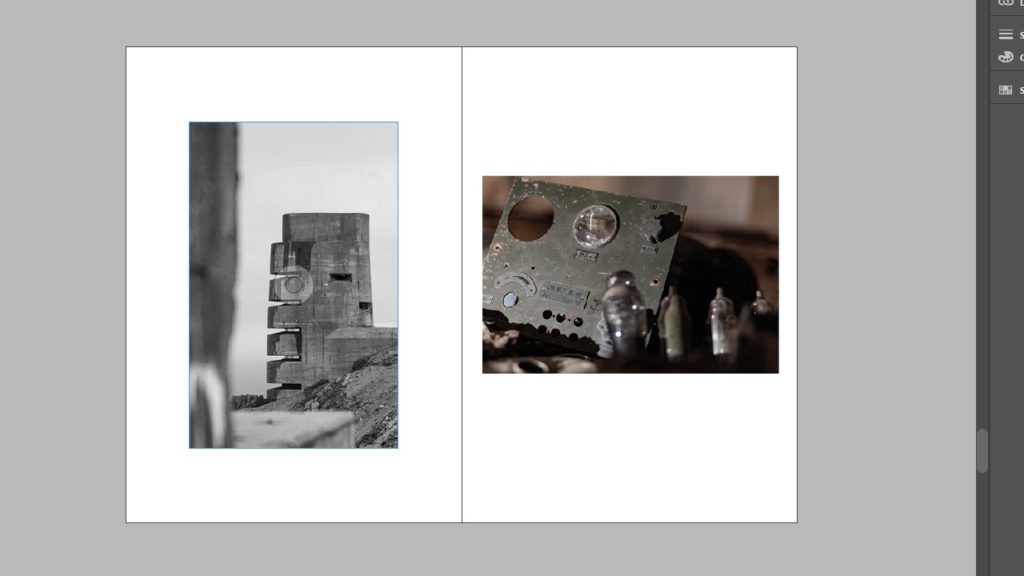
Variation 3


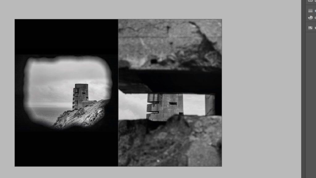
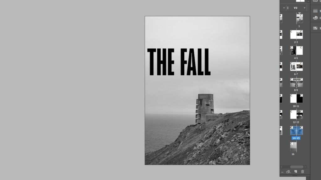
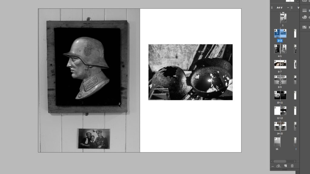
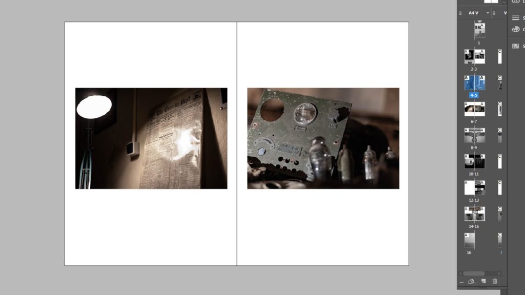
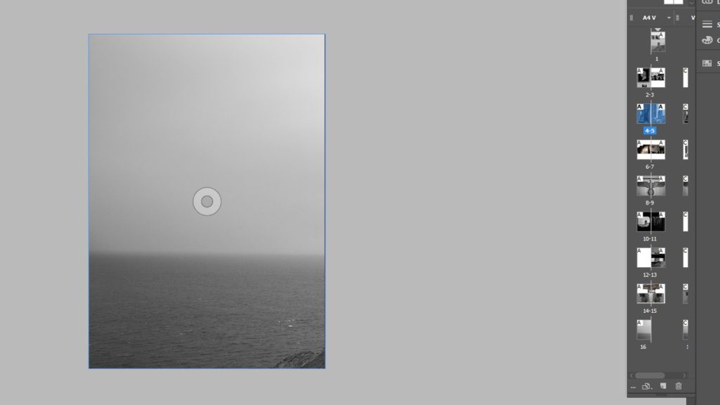
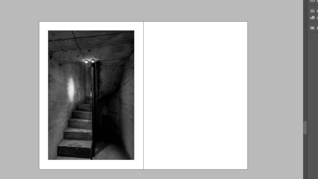
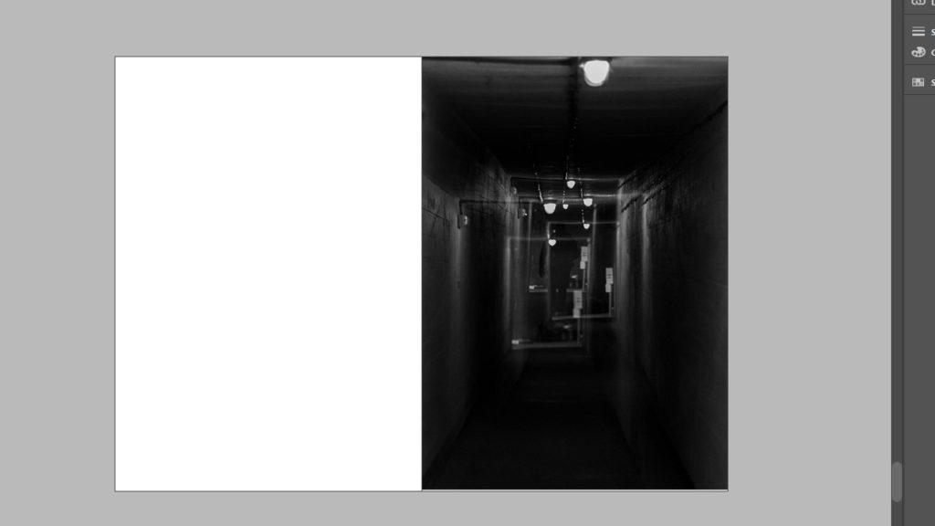
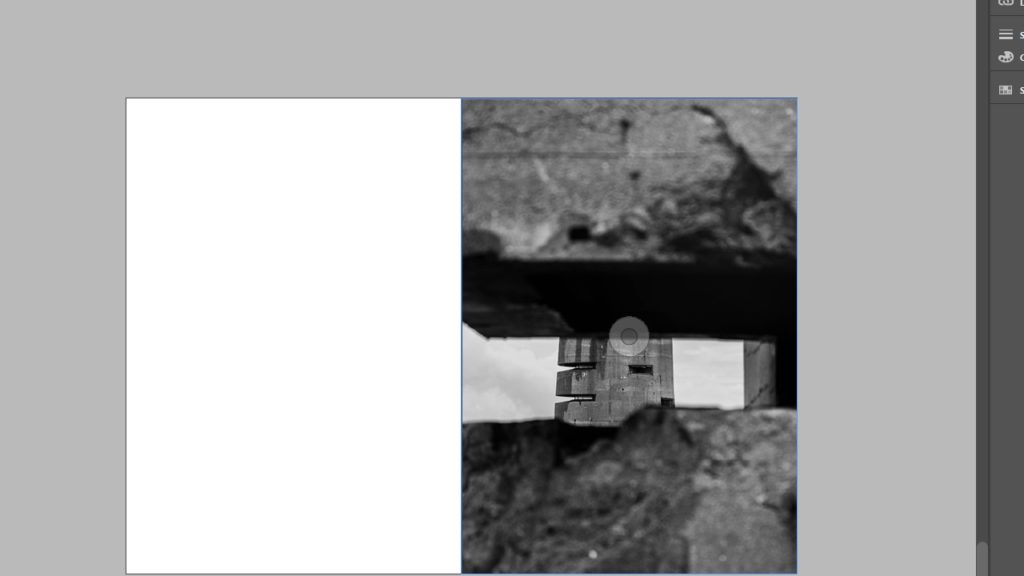
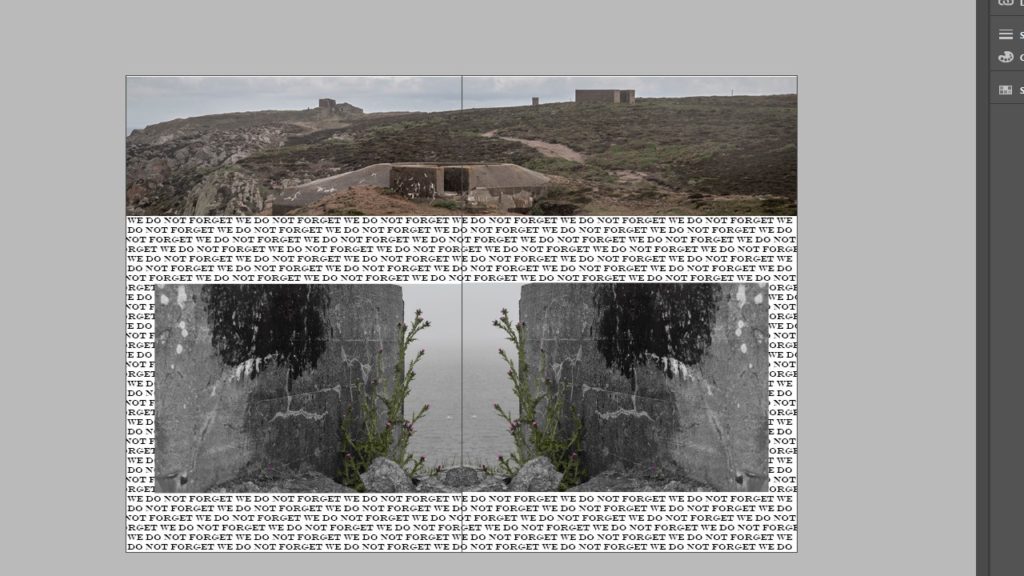
Of all the variations I have made so far, I think that variation 3 takes the best elements of the first 2 attempts and improves upon them. I liked the use of space in the 2nd variation, as it shows the isolation that some of the soldiers would have felt, however I found that the use empty space outside of the images, on the page, was not as effective as showing the images, as I wanted them to act as memories of sorts, in which the empty space acts as a hazy or uncertain memory, where as the large page spreads represent the key imagery that stood out the most both in and outside of the bunker.
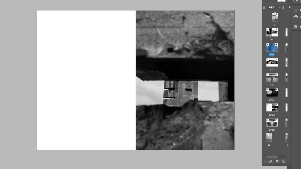
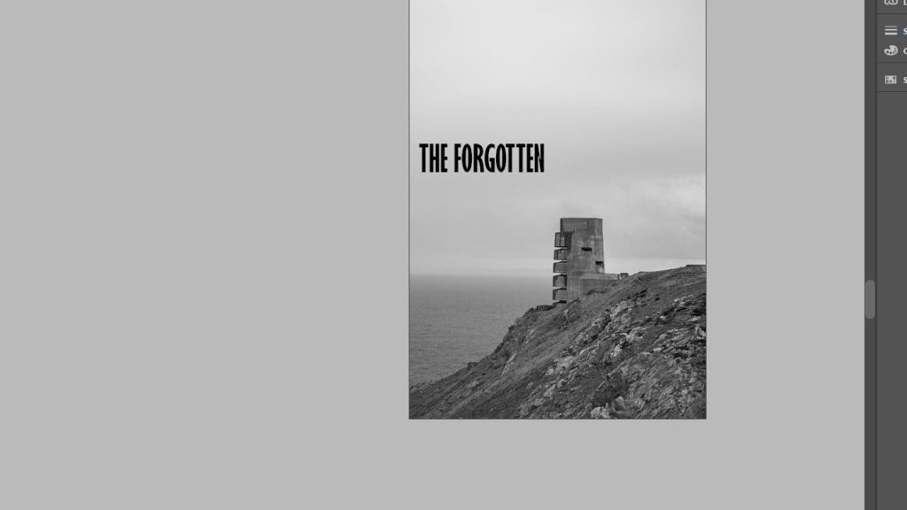
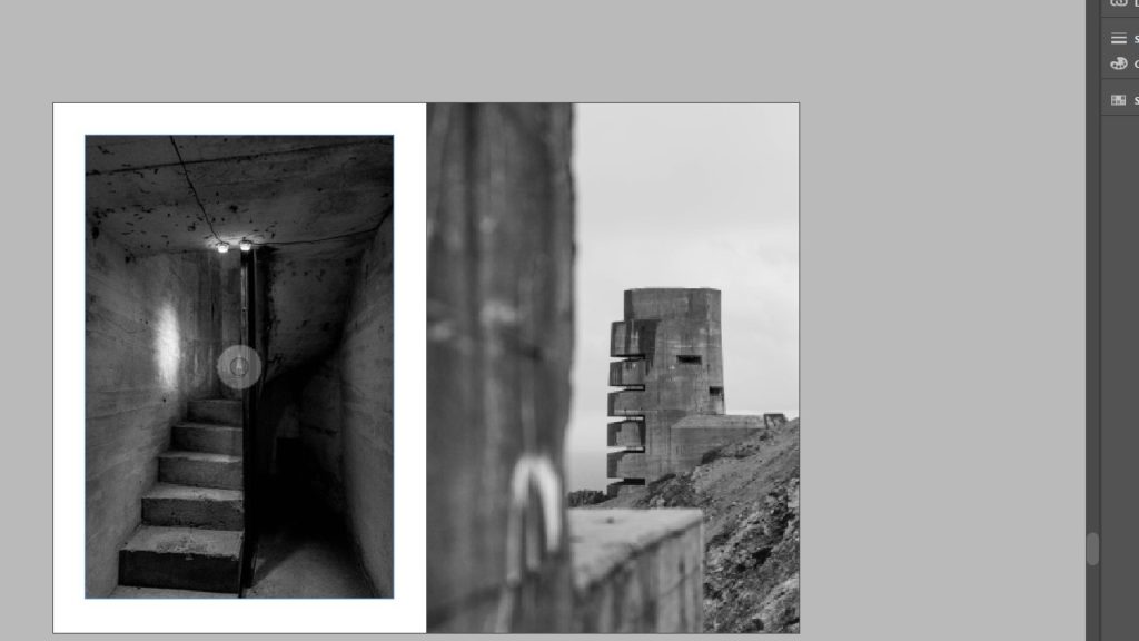
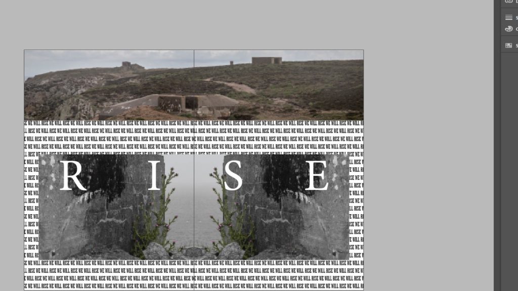
This is true throughout the zine, except for the final spread, as it represents the island taking back its own land, in which I used plants to show the overcoming of the occupation, making the German bunkers nothing more than abandoned old buildings. I will probably change the image on pg 9 as it doesn’t really keep the consistent flow of the rest of the zine. I also wanted to keep the spread of the landscape for the front and back covers as I feel it conveys the feeling of dread that I want the whole zine to have as a running theme throughout. For the final spread i also used the typography in the background to spell out “we will rise” when reading normally, but if you read each word down the page, it spells “will we rise”. I did this to encapsulate the emotions of the islanders who didn’t know if the war would be won by the British, especially towards the end of the war when there was a food shortage, and people were starving to death due to the lack of ships that could access the island due to the occupation.