A zine is an independently published booklet, often by a single person. They used to be created by physically cutting and gluing text and images together onto a master flat for photocopying, but now it’s more common to produce the master by typing and formatting pages on a computer. Since the 90’s, zine production has dwindled but that doesn’t mean it’s died out.
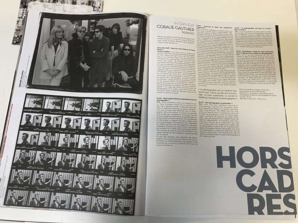
In order to create a zine lots of planning goes into it, many different elements need to be considered. Display is important to create a specific aesthetic, for instance in the zine below there are 36 images of David Bowie on a contact sheet. The creator of the zine could have chosen their favourite photo out of the 36 taken but they chose to include all of them. This could be because it creates a sense of originality and shows the journey in which the photographer took when photographing David. As well as that the contact sheets also are a form of sequencing, this is an important aspect of a zine as having structure provides an opportunity for the readers of the zine to decode the intended narrative in which the creator encodes into the sequence. This particular zine also highlights how text can be used, in this is one there is detailed writing as it’s an interview format but not all zine’s have this much, the majority have very minimal text. The font is very basic but it’s not a negative as it suits the basis of an interview, it’s simply just question and answer. Also it’s layout is very formal, it’s looks like a broadsheet in the way columns are used to display the text, this creates a sense of professionalism towards the creator of the zine. The chronological order of the contact sheets and the repetitive columns of the interview work in harmony and compliment each other nicely as well as them both being in black and white creating a simplistic feel to the two pages. On the left page there is also addition text which is placed vertically to the side of the featured photography, this is a common feature of a zine but also again links to the design and how it’s similar to a broadsheet newspaper as usually with an image comes a caption underneath it providing a description. The dates featured are 1966 and 1983, so the black and white helps the reader to identify the age of the photos and people in them without having to the read the side caption.