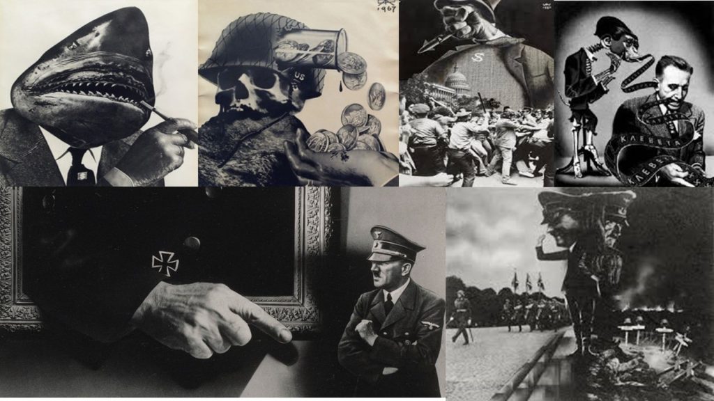
During the occupation and world war 2 many montages where made as posters, and where put up around villages and towns which had been invaded. The montages gave off messages to people and also governmental issues. There were many photographers and artists who have made montages based on the war. Two artists who I came across where Aleksander Zhitomirsky and John Heartfiled who have both made montages on the German occupation along with different wars. I like their work as it is simple yet effective as it is putting accorss a strong message to society.
Aleksander Zhiyomirsky was a Russian photographer who was boring in January 1907. After studying in Moscow he went on working as an illustrator and began making posters for magazines. Shortly after people began to realise what photo montage actually was and started to value and respect his work. Most of his montages would come from different types of culture he would experience but mainly the Soviet mass culture. After WW2 he began to find many photos based on the war and started putting them together, to show history in a different way which may have a everlasting effect on people. After this his work was published throughout Europe, Russia and the USA and it is still being viewed up to this day.
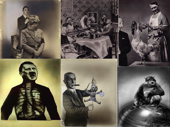
John Heartfiled was a German visual artist who was born June 1891. He was one a small amount who used art as a political weapon, such as his well known montages includes of anti-Nazi statements. His work appeared on many magazines during the time of the war. During his time making his montages, he had to flee from the Nazi’s on many occasions and had to leave his family.
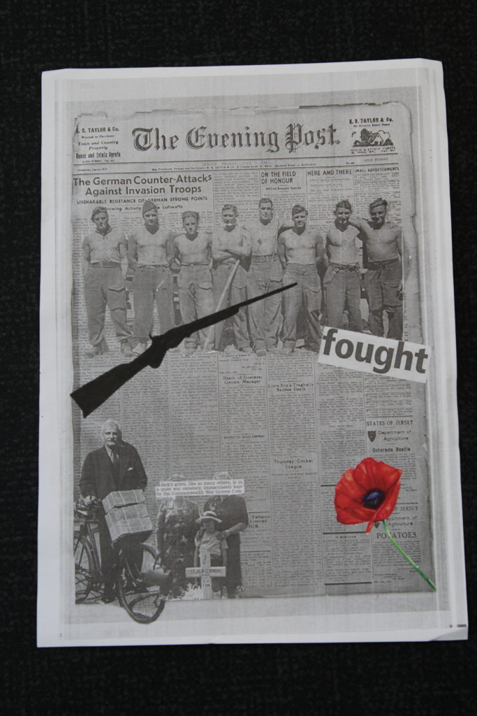
After being inspired after looking at these artists, I then began to picture and have ideas on what I wanted to produce. To create my montage, I found photos of images that had been taken back during the German occupation in the channel islands and used them to create my montage, so that it what have a bigger meaning and relate better to me. After picking the images I wanted to use, I began to cut out the sections of images that I wanted to stick onto my background, which was a copy of an old newspaper. I then places the images on top and arranged them how I saw fit. This is my final product of my montage I created.
After creating a paper base montage, I then moved on on to creating montages in Photoshop, which I preferred, this is because I could use more images, and select parts of the images with more precision. For the first montage I created, I wanted it to be simple yet effective. This is what I created and these are the steps I took;
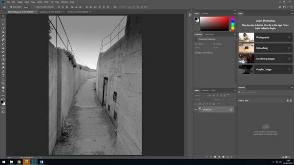
I firstly started off with my original image that I had edited in lightroom, in the previous lesson.
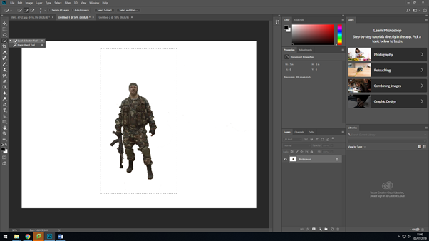
I then went on and opened up a new canvas in Photoshop, where I added this image of a soldier. I then used the ‘quick selection’ took and the ‘eraser’ tool to then remove the original background of the image.
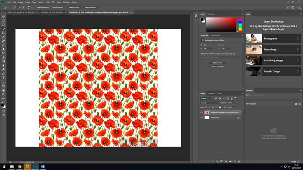
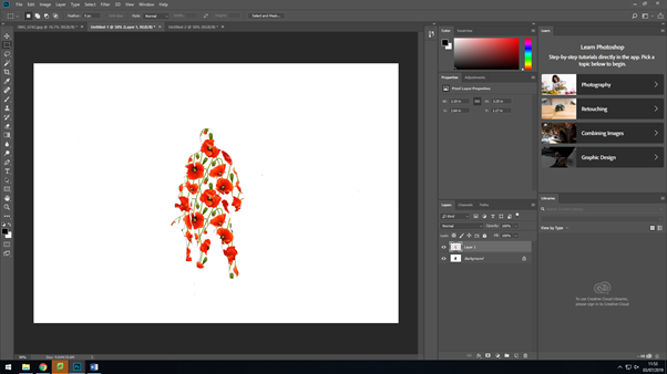
After editing the background of the previous image, I went on too add the image I was going to make the silhouette of the soldier out off, by adding a new canvas again.
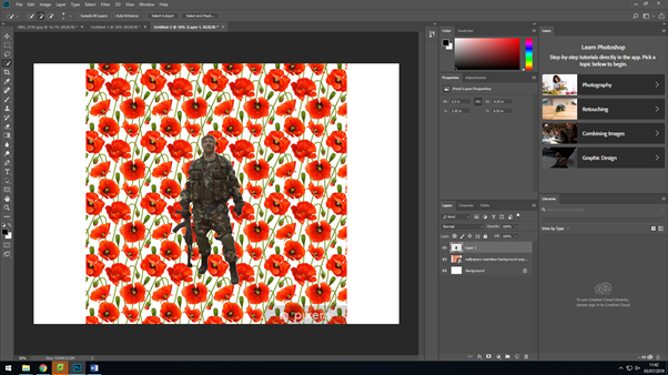
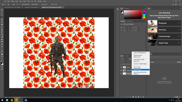
After dragging on the solider to the poppy background, I then selected everything by using the ‘magic wand’ took, I then made sure that the settings were set to ‘invert’ this is so that the background would change and come onto the outline of the soldier after this I then flatten all the layers together to make it one image.
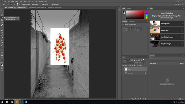
I then selected around the solider after flattening the layers and dragged it over to where I was making my montage. I then used the ‘quick selection’ tool again to removed the white background around the solider, so that I would just have them on their own. After doing that, I saved the soldier as it was, so then I could use it for any other montages I would make, so I would’ve have to remove the background again.
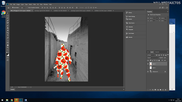
I then placed the soldier where I wanted it, by ‘Ctrl+T’ and then holding down shift whilst making the image bigger, this is so that everything stays within proportion of itself.
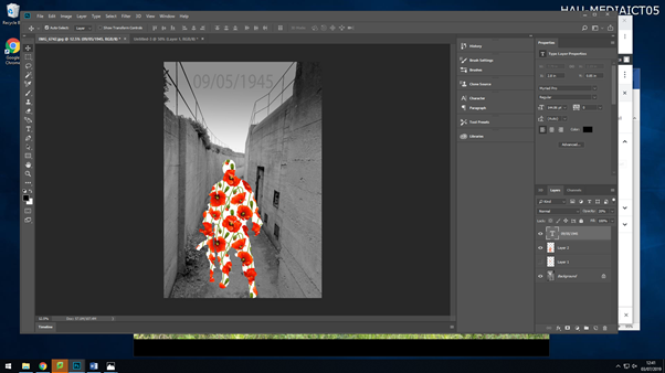
After moving around the soldier, I then went in and added some text to the image. After typing it in, I changed the text to black, made the font size bigger so viewers where able to read it at a glance, but then I changed the opacity of it, as I felt with the text being at 100% opacity, it was drawing attention away from the main aspect of the image. This is what my final first montage came out to look like;
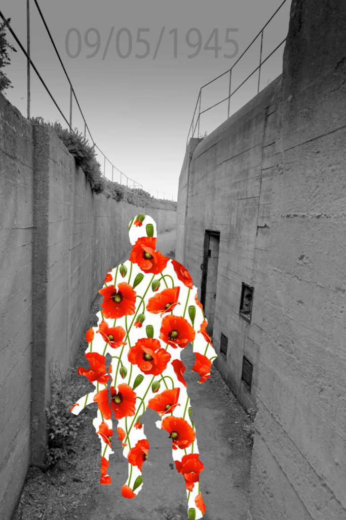
My seconded montage I created, was completely different to my first one, I wanted there to be a relation and link to the Jersey Occupation in this one. This is what I produced and the steps I took;
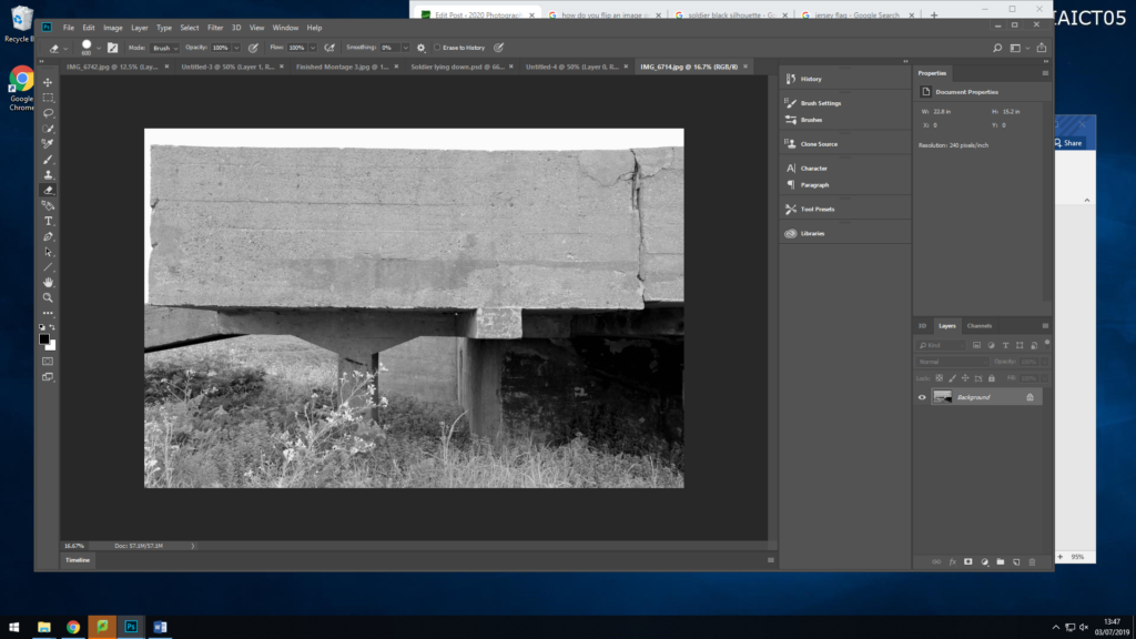
As before I have started off with my original image, this image is my background for my montage.
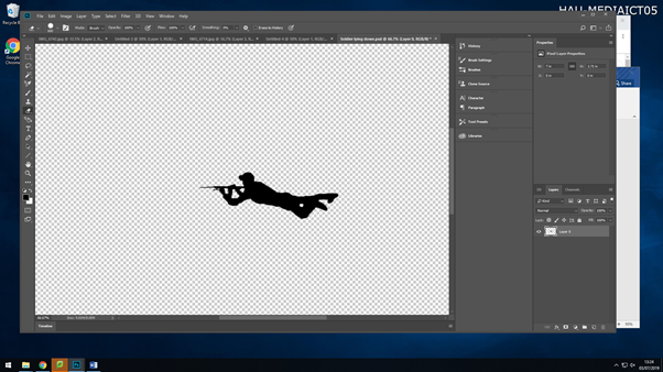
I then created a new page, and added on a black silhouette of a soldier lying down with their gun, I then deleted the background with the ‘quick selection’ took and then saved the image as a PNG so I could then use again if I needed too.
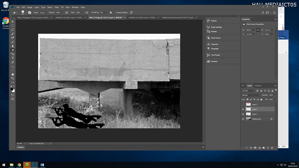
I then dragged the image onto my background twice and enlarged them by selecting the layer they were each on, going ‘Ctrl+T’, then holding down shift whilst dragging the image outwards to make it bigger whilst keeping the proportions the same.
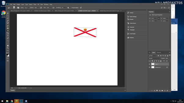
I then went in on downloading an image of the Jersey flag, as this allows people to connect to the image more as you have something relating to you which also defines you. I also then added this to my background image.
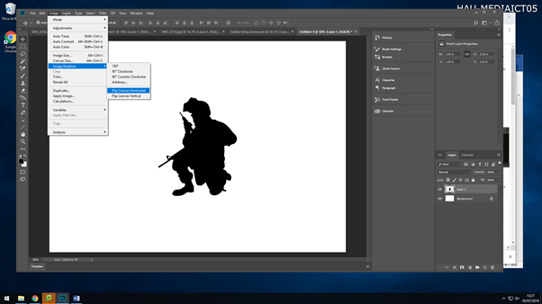
I then decided to ass another silhouette to my montage. But after downloading the image I realised it was the wrong way round for where I wanted to put it. So by selecting the image then going Image>Image Rotation>Flip Canvas Horizontal,I got the image to flip to the side I needed it to be. I then again removed the back ground, saved it as a PNG and then dragged it onto my background image.
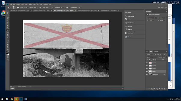
After adding all my images to my background, I then went ahead and changed the opacity of each image, to give it a shadow effect. I changed the opacity of the soldiers as they aren’t alive anymore, so they are representing ghosts.
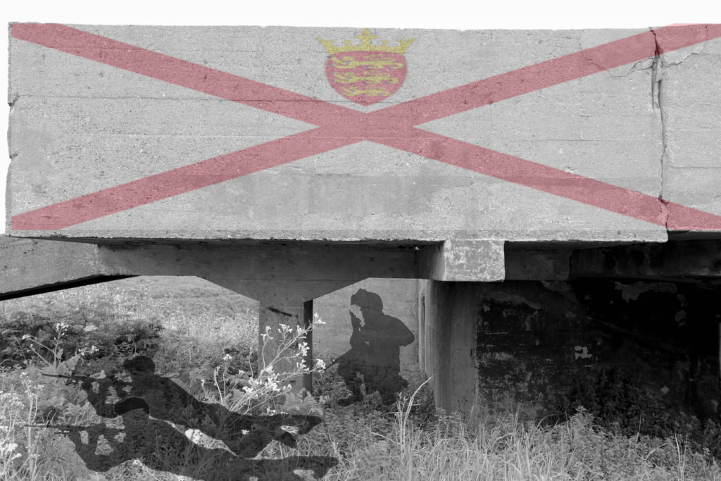
This is my third montage I created on Photoshop

In this montage I have used a war graveyard as the main background, this graveyard were for soldiers who fought in world war 2, as the German occupation happened during world war 2, so their is a link between the two. I then added a black silhouette of two soldiers walking, and lowered the opacity, so they are acting as ghosts walking around their fellow soldiers who lost their lives. And to then finally finish it off, I added an overlay of people who lost their lives in world war 2 and the occupation, I placed this over the full image, and lowered the opacity again, so you could see the image through it, this gives the image a touching emotion.
