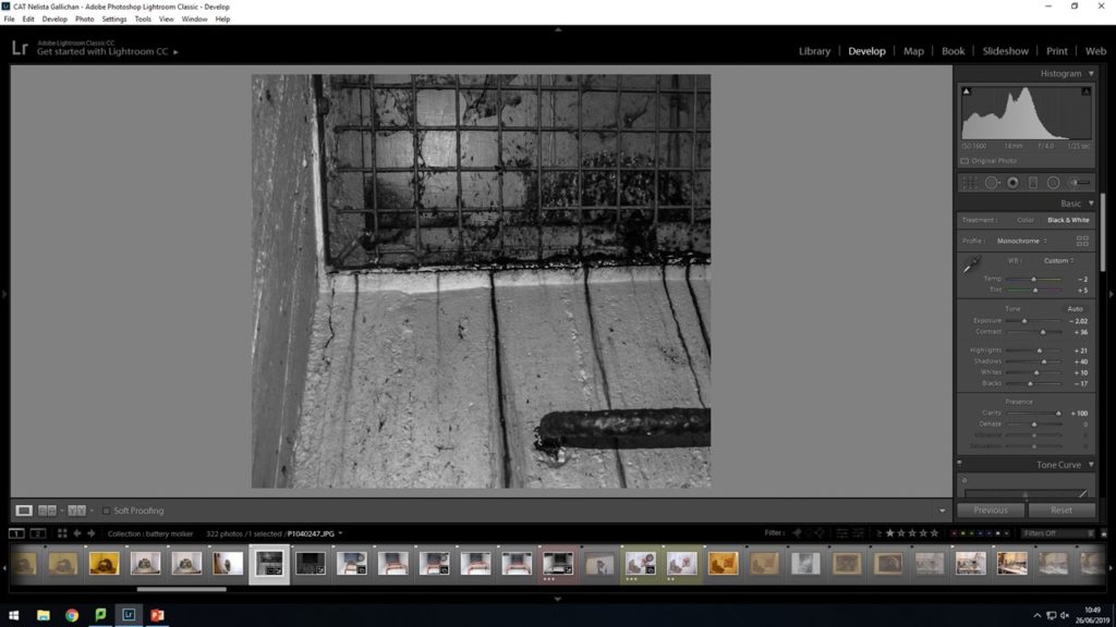
All Photos from the war are in black and white. So I decided to convert some of my images from the tunnels to black and white to make them feel more authentic and of the time period. I used lightroom when trying to achieve these black and white outcomes.
Using the starting tools, I gave images 3 stars to images that i wanted to take forward for editing. This meant that the editing process was made faster and more concise because i had all the images i wanted to use in one place at one time. When using the develop tool looking a the left hand side slider bar I turned on the black and white slider. This automatically changes the image to the black and white settings the computer programme deems to be the best levels of light and dark for the image.

With the sliders I experimented pushing the light and dark to the extremes. Also using the tonal color sliders with in the setting of blue,red,green etc. I chose to try make this image look more like an xray to experiment with the different settings in lightroom and familiarise myself with them.

Working on a different image . Changing this to black and white on the automatic setting is the best way for me to have a base image in black and white to go from and then edit in the way i want so the base photo doesn’t start off to dark or two light.
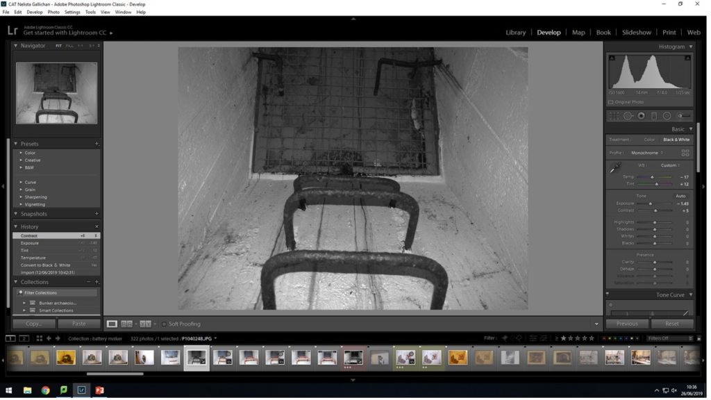
Using the slider tools I edit the brightness and contrast and enhance the blacks and whites with the B&W sliders so the there is more of a contrast within the images.
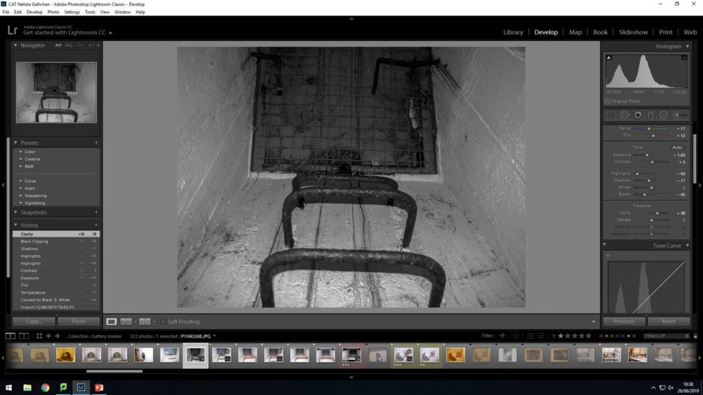
With this images I was using the color sliders to work on the more finer blue purple and red tones within the image so the wall area ended up with more of a grey tone rather than a harsh bright white tone at the back.
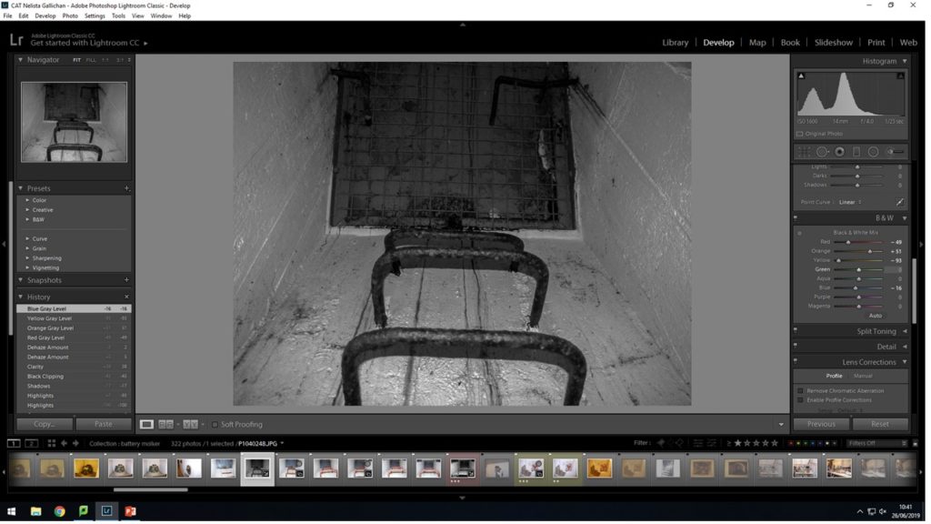
Again this was just an experimentation with the black and white sliders seeing what it was like when I push the sliders opposite ways to what i would normally have them . This gave the image an almost cartoon effect which i do like but it doesn’t really fit with the style of this project with images looking more older fashion. This looks more like modern pop art.
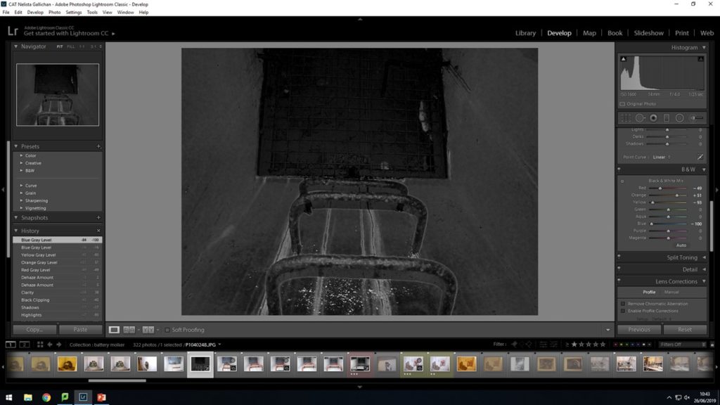
With is image I changed all the setting myself rather than setting it to the black and white default settings. I felt that in this image the great at the back was getting lost in the picture and I wanted to change that so it is more noticeable.

In this image I made the alterations i wanted to so the back ground great is more noticeable. I did this by slightly editing the exposure and the the white sliver upping these each a tiny bit. This also had an effect on the stairs so where the white was there was more of a reflection being shown from it. Also the lines of rust running down are more defined. You can see each individual strip a lot clearer.

I decided to change my approach with this image and see if cropping the picture will give a different impression or effect. Using the cropping tool i lined up the box to where i wanted my image to be cropped. I wanted to make sure i included in my crop the 3 main focal points of the image ; the stairs, the grid at the back and the light corner of the wall.
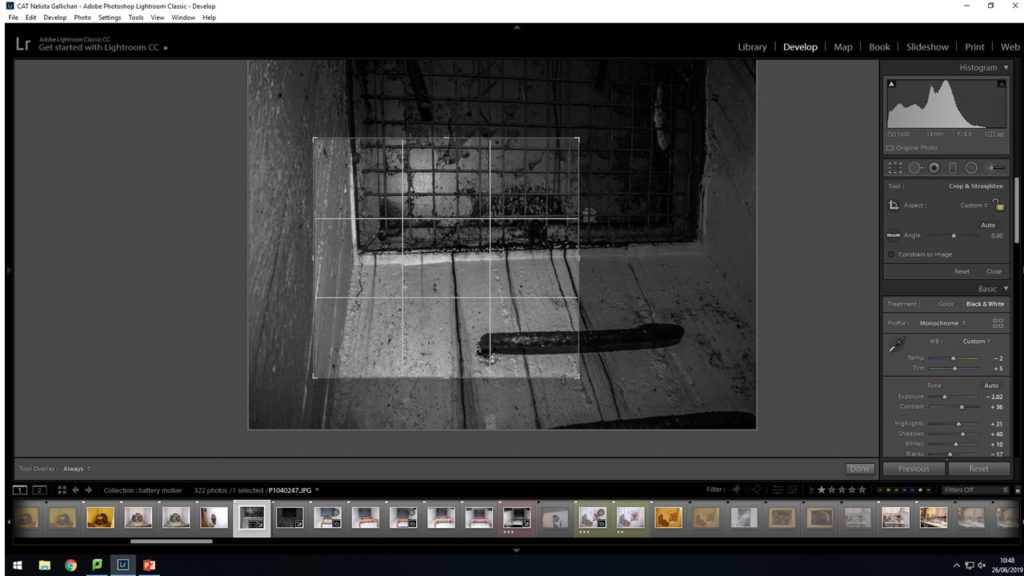
When cropping the image i found that it looked good but i felt like the story in the image is lost because you cant see the full stairs going up to the grid hatch. Also i felt like you couldn’t tell really what the image was about and it looks more like a modern art conceptual piece rather than a historical recollection photo shoot.
