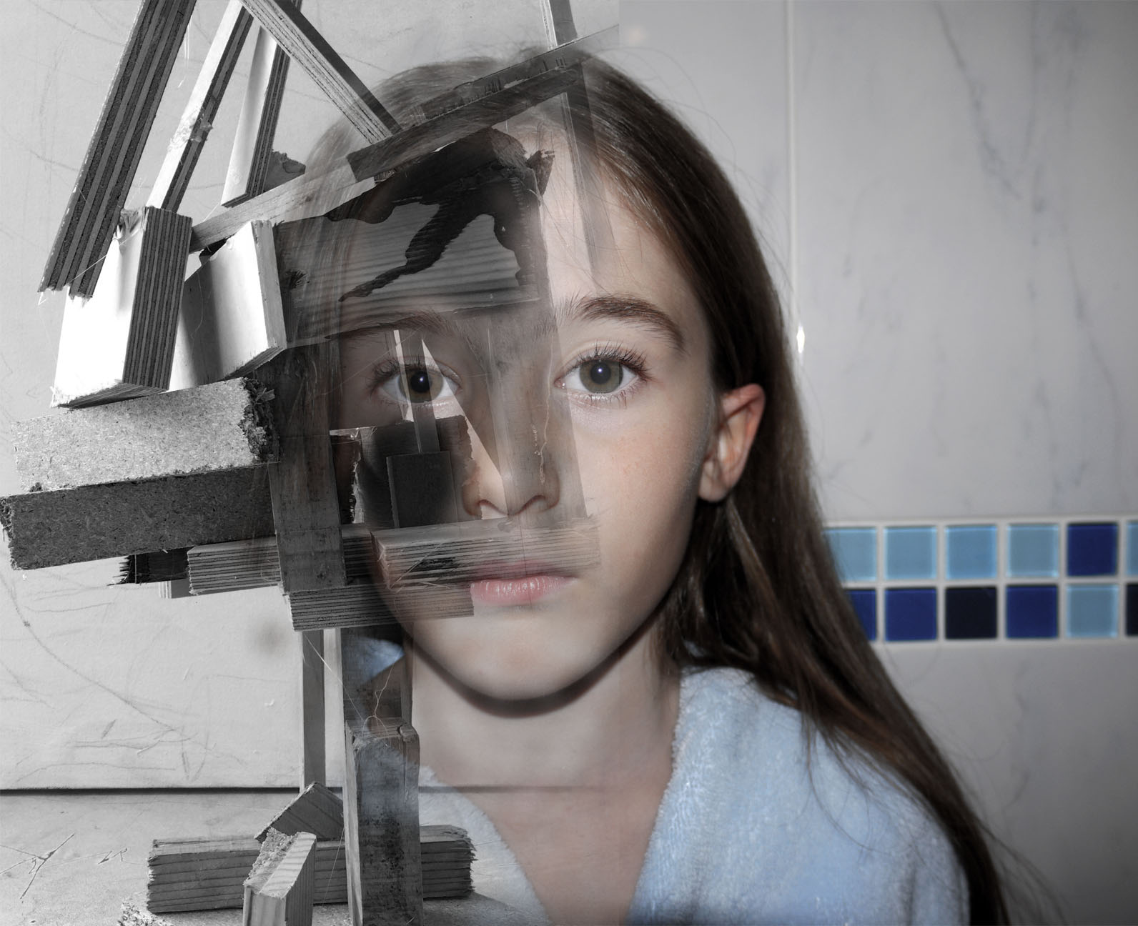
My final Images what I feel they show and the impression I want them to give off

These were my final set of images that i sent off at the end of my exam for printing. They all show development through the project they show how my work has change and been influence and taken inspiration from other artists work with there own-style of photography. I feel like this first image is my favourite, it shows a clear technical  skill behind the work. I feel like the image encapsulates the stimulus of 'identity and place'. The story/ theme that i am trying to portray behind the image is one of confusion and enclosure within the ever changing identity of the landscape we live in and how it has shaped us as people. Change is a huge part of human life it engulfs us every day, yet we turn a blind eye to it or take one glance and never look back. Constance change will impact the identity of a place and the people living in it and that is what this image is meant to capture. This is what the two images bellow convey to me when I look at them.


This image was created from the soul idea that from the destruction of a place new life and ideas can be created. The wooden image was taken in New Zealand, all the wood this sculpture is made from was wreckage from the earthquake that hit Christchurch.  This was then made into art, I found this sculpture when walking through the main city I feel it shows the identity of the place and what happened but also clouds people views of how hard it is to move on after that. This dilemma of if this constant reminder of identity and place should be celebrated or ignored. Thats what i hope my image conveys conflicting views on whats the right thing to do let go or hold on. I want my image to be a talking point not just something to be looked at something to be discussed relating to the identity and place. This is same with the orange cathedral image as well there is debate on weather they should leave the main cathedral as it is with the deviation of the earthquake or renovate it. I chose to over lay the colour orange over it because all the petition signs to keep it the way it was were orange, so i thought i brought the contextual identity to the image through the use of colour. Also i took inspiration from Xaviers work on derelict buildings and how the city just carries on life around it. I feel this image portrays this very well with like skyscraper to the left creating perspective and framing the image, also the crane across the middle breaks up the rigid vertical lines within the image creating a visual focal point to start off at.


This image was my favourite out of the studio lighting portraits because it looks like it tells a story or has a real secret meaning behind it. I fell like it creates intrigue and makes the audience want to ask questions. This is my main focus for my work is to make the audience think and come to there own concussions about the images and i feel like this black&white portrait does this perfectly.


This last image to me is from my photomontage experiments. This photo leaves you with a-lot of questions wanting to be answered. My main focus behind the image was to show pressure through facial expression and confusion through shape. This image is meant to make you feel like you are looking into someones brain while they are stressed and being able to notice each and every individual thought almost as the image is made up of individual memories each telling a different story which you can visually interoperate through imagination. This is what  I wanted to convey through this image and inner look into people thought patterns and identity.

