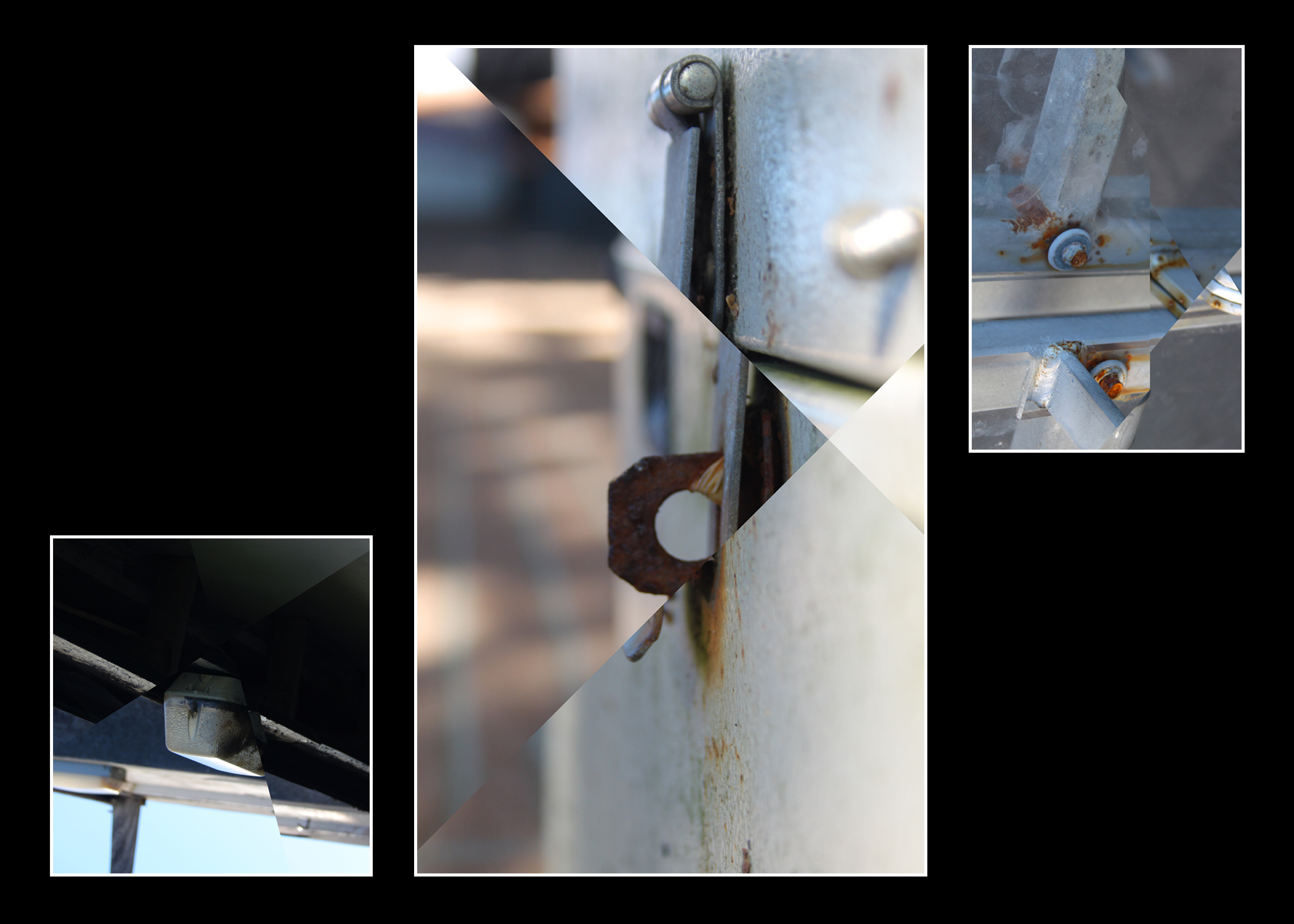
In conclusion I am happy with the final product, while my link to Letha Wilson is rather vague I feel it is still evident in the manipulation of the images. I like the lighting in the images as it creates very soft tones while still having plenty of contrast. I’m also happy with the color balance of the images as none of the tones are too overpowering except for perhaps the brown tones in some areas. The center-piece of the final product is my favorite mostly due to the strong depth of field which nicely compliments the sharp edges created by the style of editing. My favorite display of editing however is the image on the right as that had the most intersections of any image. If I were to redo this project I would likely make sure that the images were more similar in composition and perhaps color. I would also likely tone down the brown slightly as it is a bit too strong for my liking in the central image particularly in the background. I would also make sure that the 2 images on the sides were cropped to the same aspect ratio however these images simply didn’t allow for that as parts of the image were frankly boring and detracted from the image.
