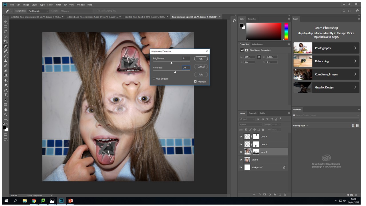
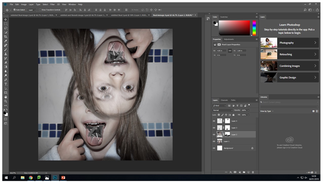
Image Colour Changes and Experimentation I wanted to initially change all of the images to black and white . Then I realised i could change individual layers to black and white, I thought this gave the images a new range of depth and visual interest. I selected the individual layer that I wanted to edit - Then I went to image - adjustments - black and white- then moved the colour sliders up and down until I got my desired outcome, which was a light grey back ground with the wood being darker and being lighter in the lighter parts to create more of a contrast.I also tried doing it the other way around with the same image. The exact same process on a different layer. I decided that i didn't like this image as much as the other one it just didn't look right to me. The contrast of the brown wood on stark grey background looks underwhelming. They look like two purposefully different images when they are actually meant to blend and flow together. These images together in this colour pallet just creative unwanted visual noise which confuses the audience because they are just drawn to the contrast of the colours not the actual image itself.
In this image i am moving around the colour settings so that there is more contrast between the light and dark of the wood in this image. In the first image they were just set to the factory black and white settings so i changes them to have my desired out come. I fell like it makes the image look more interesting and the left eye blends effortlessly into the wood because the pupil of the eye is the same tonal colour pallet range.
I have decide that for this image the face is to colour full it created imbalance in my photo the face shouldn't be as vibrant and it should be a cooler colour pallet to complement the b&w wood structure.
This image in balanced nether of the images over throw the other there is no direct focal point in ether it is just left to the viewers interpretation. The main tool i used was the vibrance slider moving the sider down to -56 gave my desired image composition. This again was through using the image - adjustments tool . There is still the cool blue tones coming through to give that image the need colour but they are muted.

Another tool that i used quite frequently on the original face images was the levels tool to create more depth with in the eyes so that they stood out and didn't get lots within the images different layers.

Again using the same black and white process with the wood from the images adjustments black and white tool and then sliding it to create the desired b&w tonal look.
Again the vibrance tool to decrease the vibrance of the image to put a real focus on what the image is trying to portray rather that the initial combination of broken wood and a face. This vibrance decreases mean the image is seamless and creates a dimensional feel that you can look into the image in different layers but then you zoom back out it still looks like all one image.
For me when editing my photos that I had created the vibrance slider created the most desired outcomes then it came to editing the actual face images i used this tool on all of them. It created the colour pallet that i wanted to complement the black and white wood without becoming a black and white image in its self.


