
first edit:
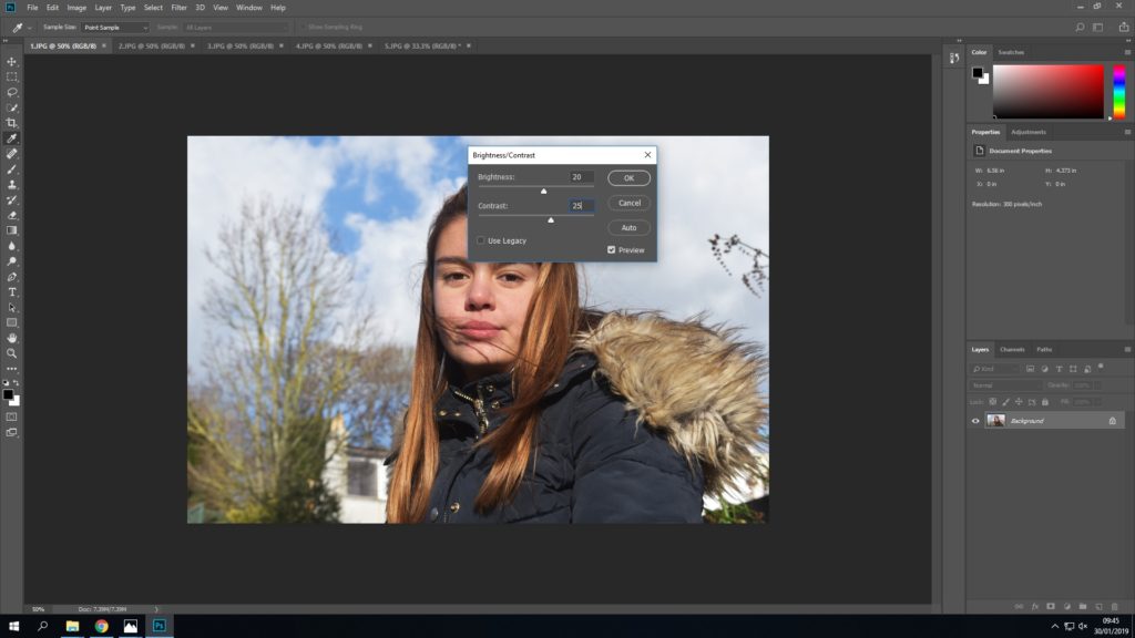
First I started by increasing the brightness of the original image to +20 and the contrast to +25. I thought this may give me more control over the darker and lighter areas when I came to adjust the threshold.
I then used the threshold option to turn the image into a heavily contrasted black and white photograph – inspired by Kruger.
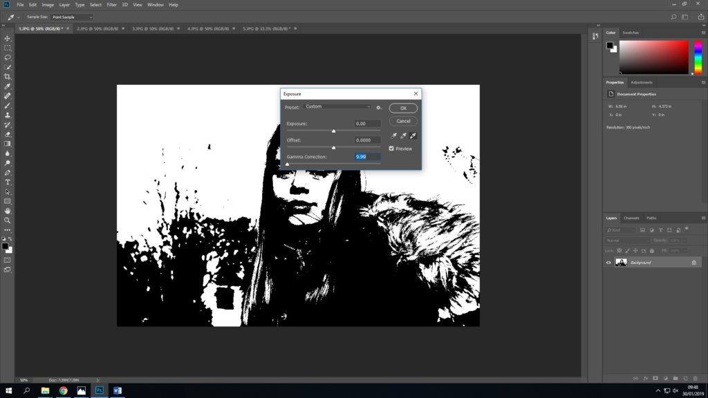
A lot of parts of this image were black, and so I attempted to use the exposure settings to try and change this. I changed the gamma correction to 9.99, which was the lowest.
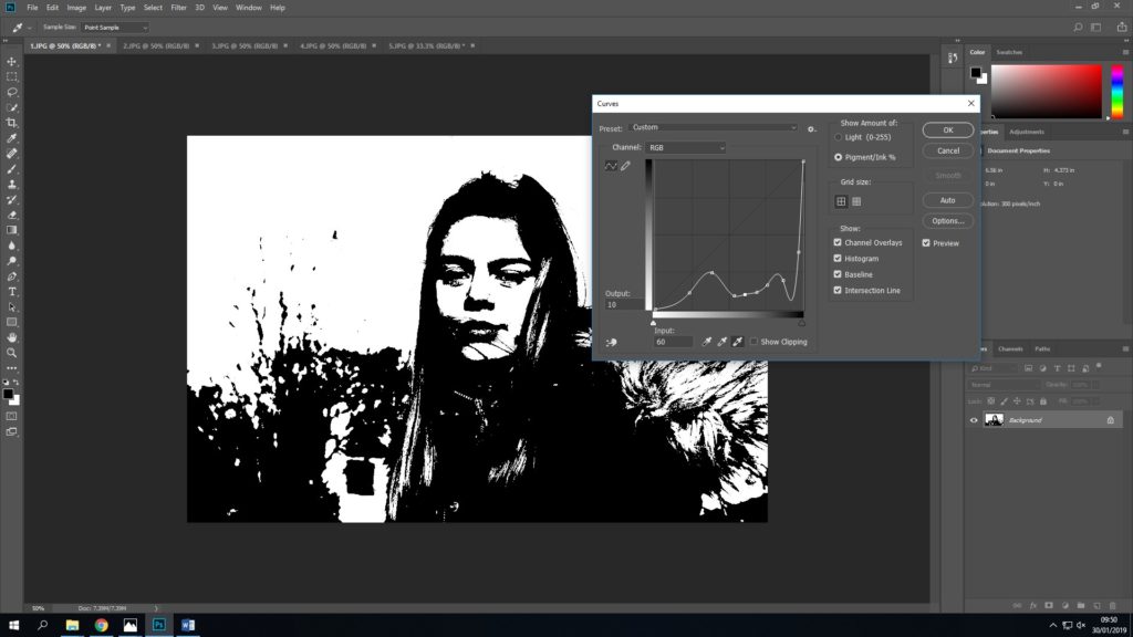
I then played a bit with the curves to see if I could lighten anything to bring out some detail, this was totally trial and error.
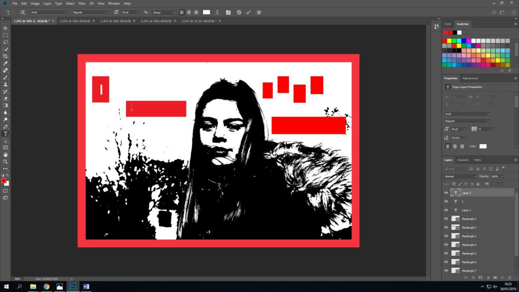
I finished by adding text, and the red border.
another edit:
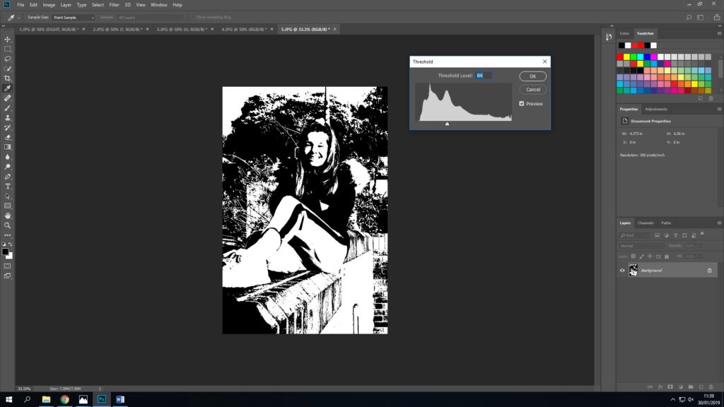
I began editing this piece by using threshold, I tried to use the amount where you were still able to see detail on the wall and the trees behind Katie.
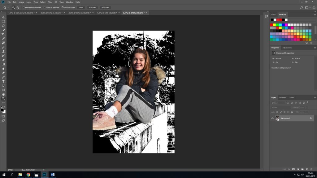
As this image was a lot happier, I did want some colour, and so I then used the ‘history tool’ which enables you to ‘colour’ things in to rewind them to their unedited, original state.