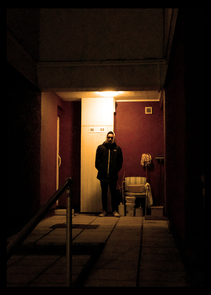
For my final outcome I would like to create a series of photographs that go together across the theme of Identity, so this means I will be choosing multiple images that follow through and compliment each other to sit in a series together.
I have chosen to trial my images in the specific layouts that I would use so that I can see how they fit and how I would organise them.
First Trial
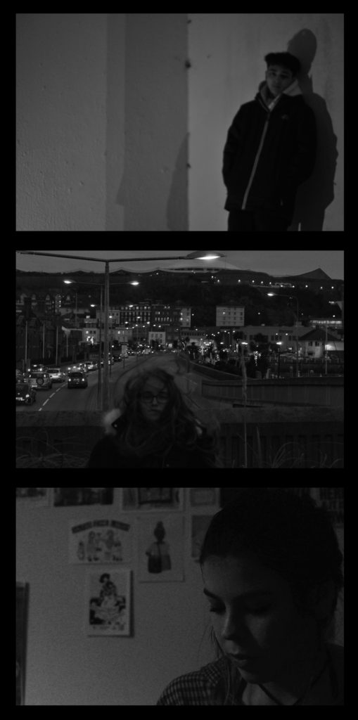
Below shows my first trial and experiment for the series of photos I want to produce. All of the photographs have been produced previously in the project under the influence of Philip-Lorca diCorcia, I feel the top and bottom image are working better together rather than the middle image as it has a lot of noise to the image and I feel it distracts from the quieter images above and below it. I feel the two images on top and bottom are more personal images and intimate in a way specifically the bottom image and I feel this is why those two work together.
Second Trial
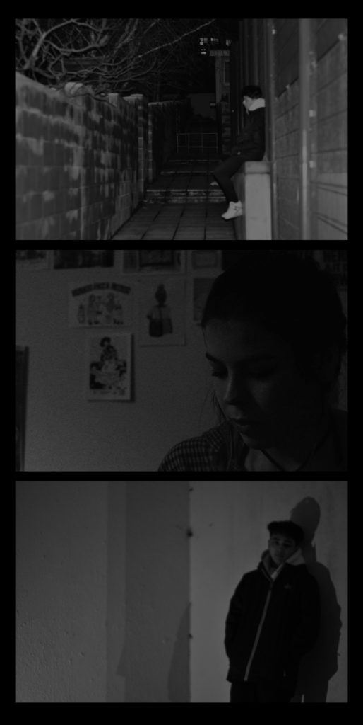
Below is my second trial of three images working with each other. The images I am trialing with jow have not been the most clear photographs throughout the project however I feel that in some ways they can work together as it does not stand out as one unclear images among clear images I feel this is helping them work together. This trial below is using two of the photographs from the previous trial however with a different third image that came from the same shoot as one of the others, I feel it is a more interesting and personal image compared to the previous one I used, however I still feel there could be better photograph compositions for identity.
Third Trial
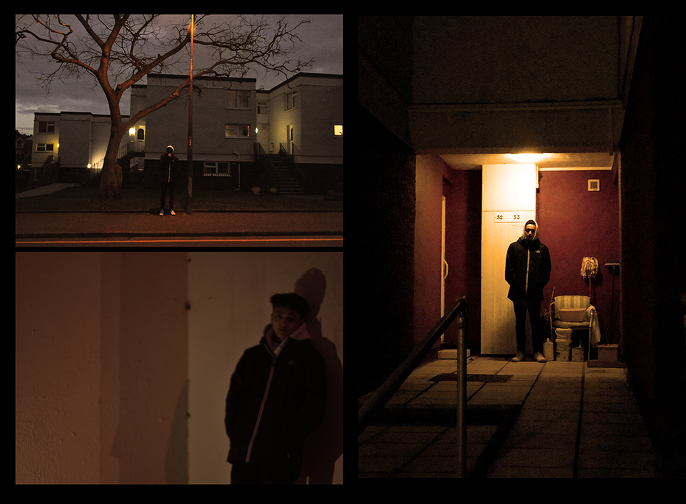
This is an experiment layout with my newer images that I have specifically taken for the final outcomes. I like this layout and collection of photographs as I feel each image is interesting and intriguing and I feel the images work well with each other. I feel this is one of the better layouts that I have produced and one that I feel could work well.
Fourth Trial
This is a similar layout to the one I produced above however with a different larger image on the side, I feel it creates a bit of difference to have the subject sat down in the larger image compared to being stood up in the other two and I feel this works well as he is turned to face me however his body is still moving away and it means the subject is not stood the same in all of the photographs.
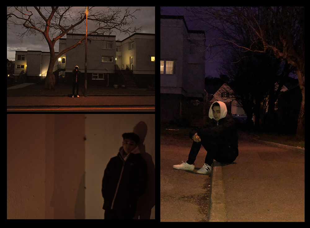
Fifth Trial
This was an experiment layout with one of my other images to test how it would work with the other, I don’t feel it is my most successful layout however was a good experiment for testing and trailing how they work together and how the tones work together which I feel for this layout is letting it down as being a successful layout.

Sixth Trail
This was another experiment trial layout with my more successful images however having them in a triptych layout, I feel that the photographs are working well together with the colours and the tones. For this layout of these specific photographs I have chosen to have the two images of the subject stood either side of the image sat down to test how to show different levels.
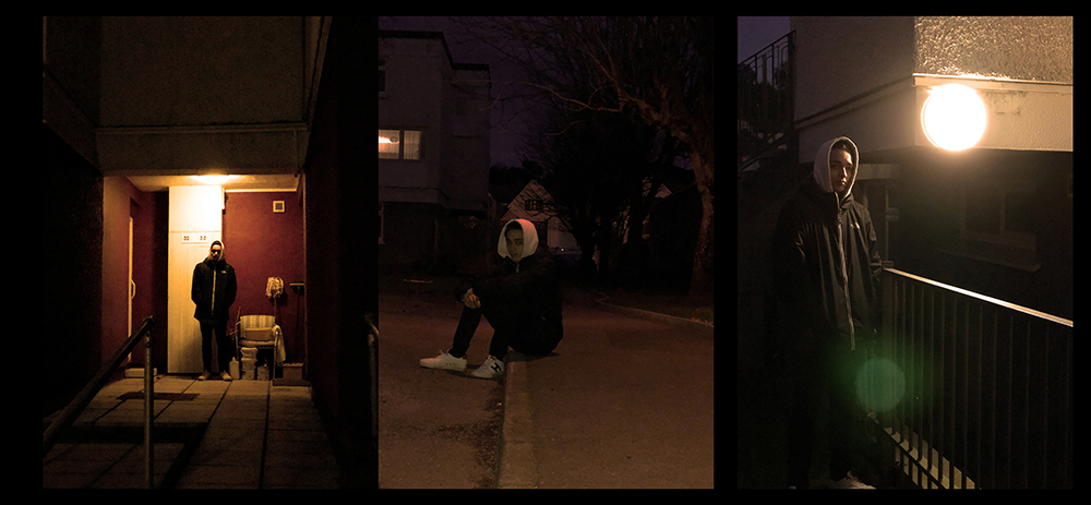
Seventh Trial
This is a different variation of the same image layouts as above however I have placed the two images where the subject is looking out and slightly away from the camera on the edges as they are looking out of the frame and then the centre image has the subject directly looking forward with their body and their eyes.
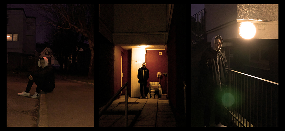
Final Choice to Print

This is my final choice of my images and of my layout that I will be using in my final outcome. I have chosen this layout as I feel it works well the best and all the images work well together and hold a good sequence. I feel I can relate them back to Lorca diCorcia’s work and show that this is where I have my inspiration from. I feel these images are the best for showing my inspiration and relation to him.
I have also chosen to print another of my outcomes by itself as an extra, the reason I chose to have this image by itself and not in the trio was partly because I want to have variation in the trio of images with how the subject was positioned but also because I feel this images is the one that will work best on its own and as a large image will be more impactful individually rather than the other option would be.
