
After compiling all of the images I took for the abstract project together, I nailed down my selection to 5 images., the following images are these choices: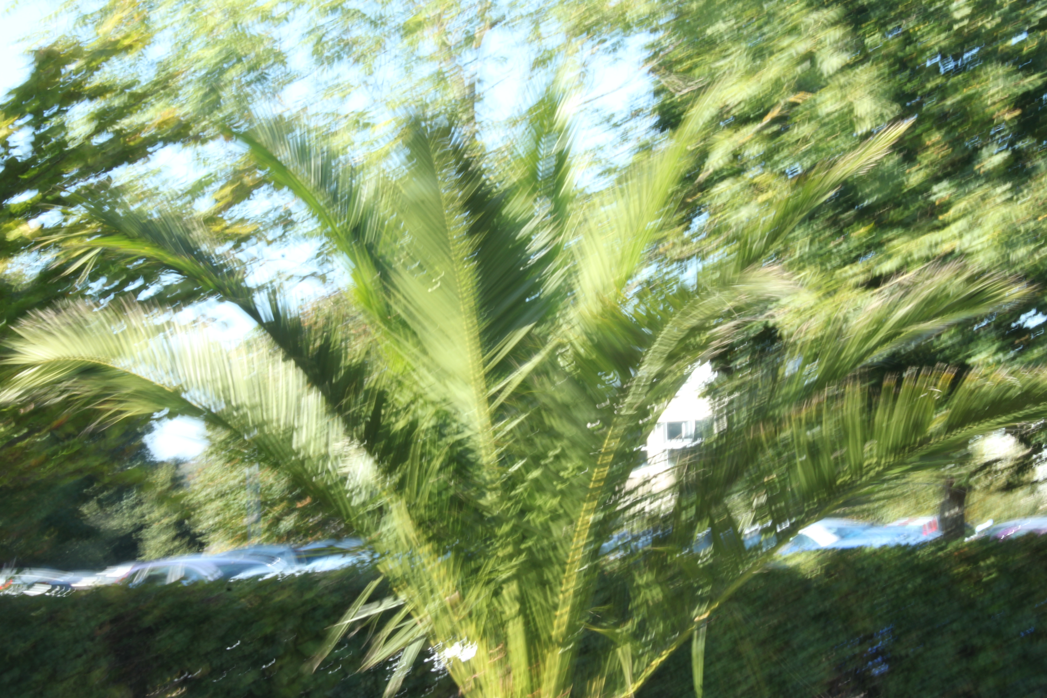
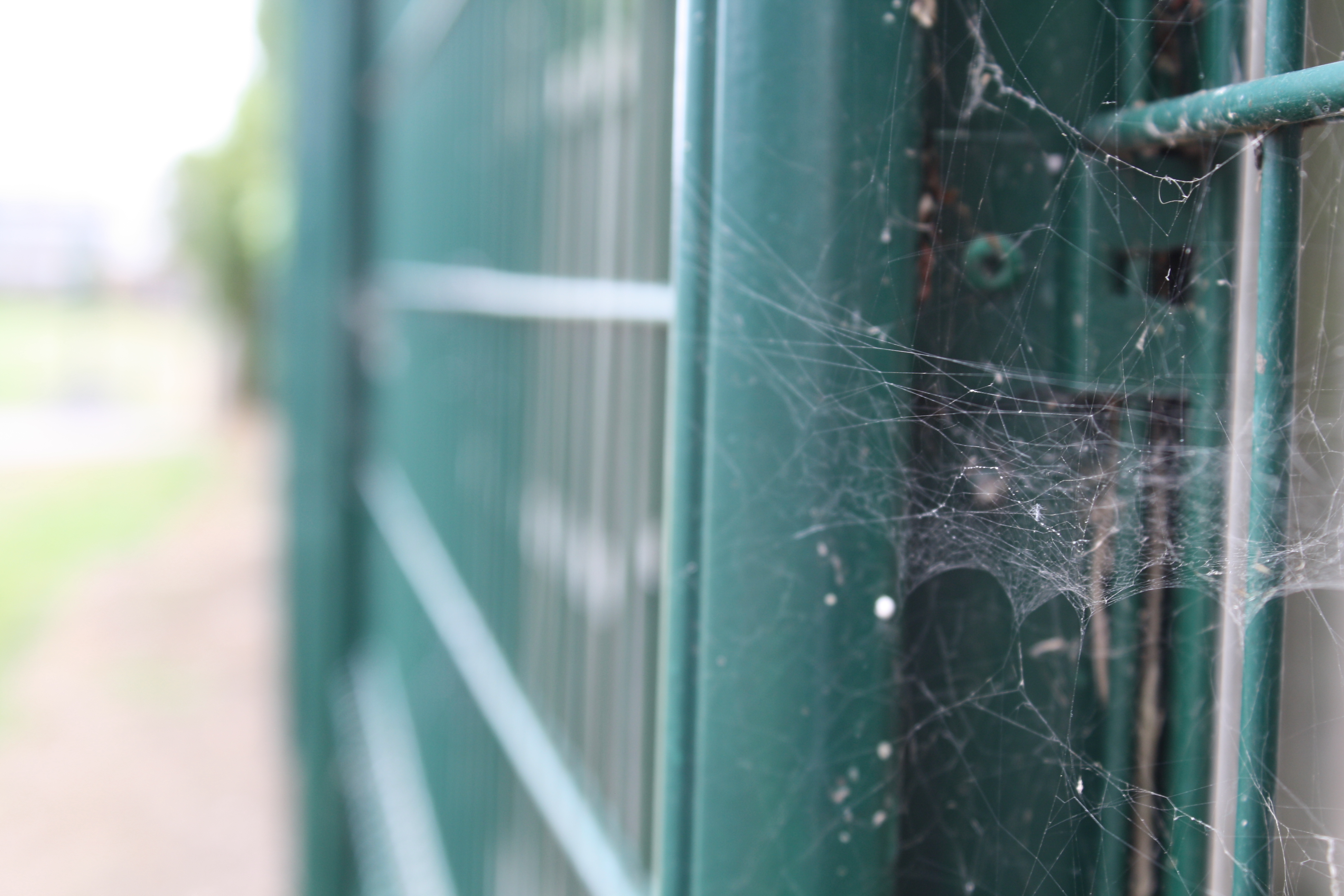
These images were the bare, unedited images that I took only using camera settings (except the second image across was edited black and white and was taken using a mobile phone), I then used Photoshop to refine the images and make them more eye catching. During the editing process, I decided on my final 3 images according to what best fit the project, and depending on what influence I took from artists in order to develop them. The following 3 images are the edited final 3:
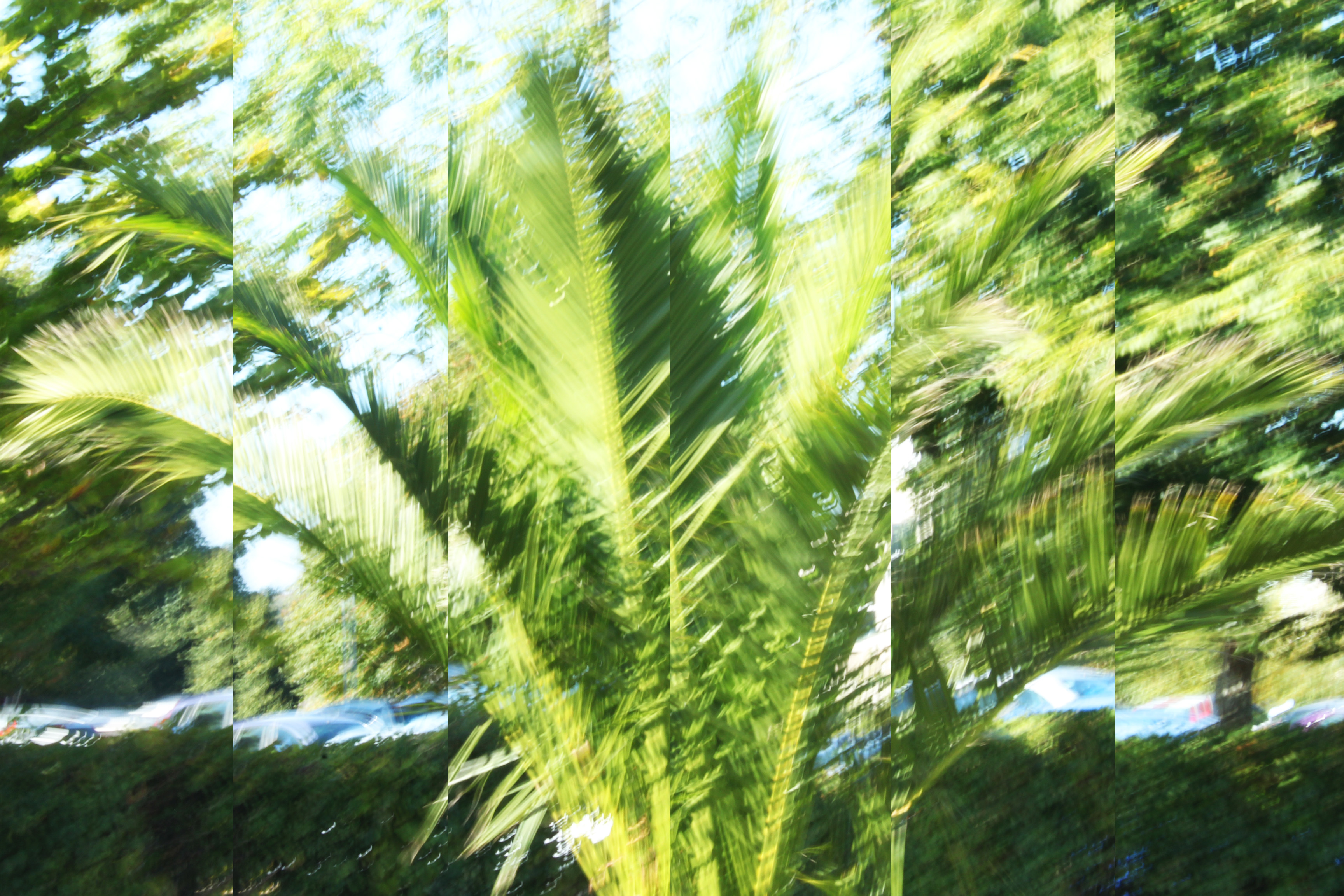
For the below image, I made use of a slow shutter-speed, and captured a tree that was moving with the wind. I found that using a slow shutter-speed distorted the subject, and made the photograph more abstract. After taking the image, I used Photoshop to edit the image. In order to make the image even more abstract, I split the image into 6 parts and expanded and adjusted each image, so that the 6 separate parts of the image added together to make the full image. This gave the image an even more distorted feel, and added to the abstraction of the overall image. I then slightly adjusted the saturation to make the image brighter and stand out more. In terms of inspiration, I took influence from the artists Uta Barth and Albert Renger-Patzsch. Most specifically, I took advantage of the high ISO that Barth uses to create very bright, vibrant images that reply heavily on lighter colours to bring her work to life. I raised the ISO setting of my camera to take this image, and in doing so, the image was naturally brighter than it would have been otherwise. I think that taking inspiration from Barth allowed for my image to come across as more abstract, as brightness slightly blurred the boarders of the subjects, making them more difficult to differentiate from the background. In addition, I took inspiration from Renger-Patzsch by using a natural subject, and taking my image in a slightly more scientific and objective way. Renger-Patzsch often made use of plant life in his work, and I took my photograph in the same style as Albert, looking straight on as if the camera was an eye> the abstraction came as a result of the ISO settings and the shutter-speed, but the initial image itself was taken with inspiration from Renger-Patzsch. This image will be my A3 image, as I believe that the image provides a lot for the viewer to see, and the splitting of the image into 6 sections will be more prominent if the image is printed as large as possible.
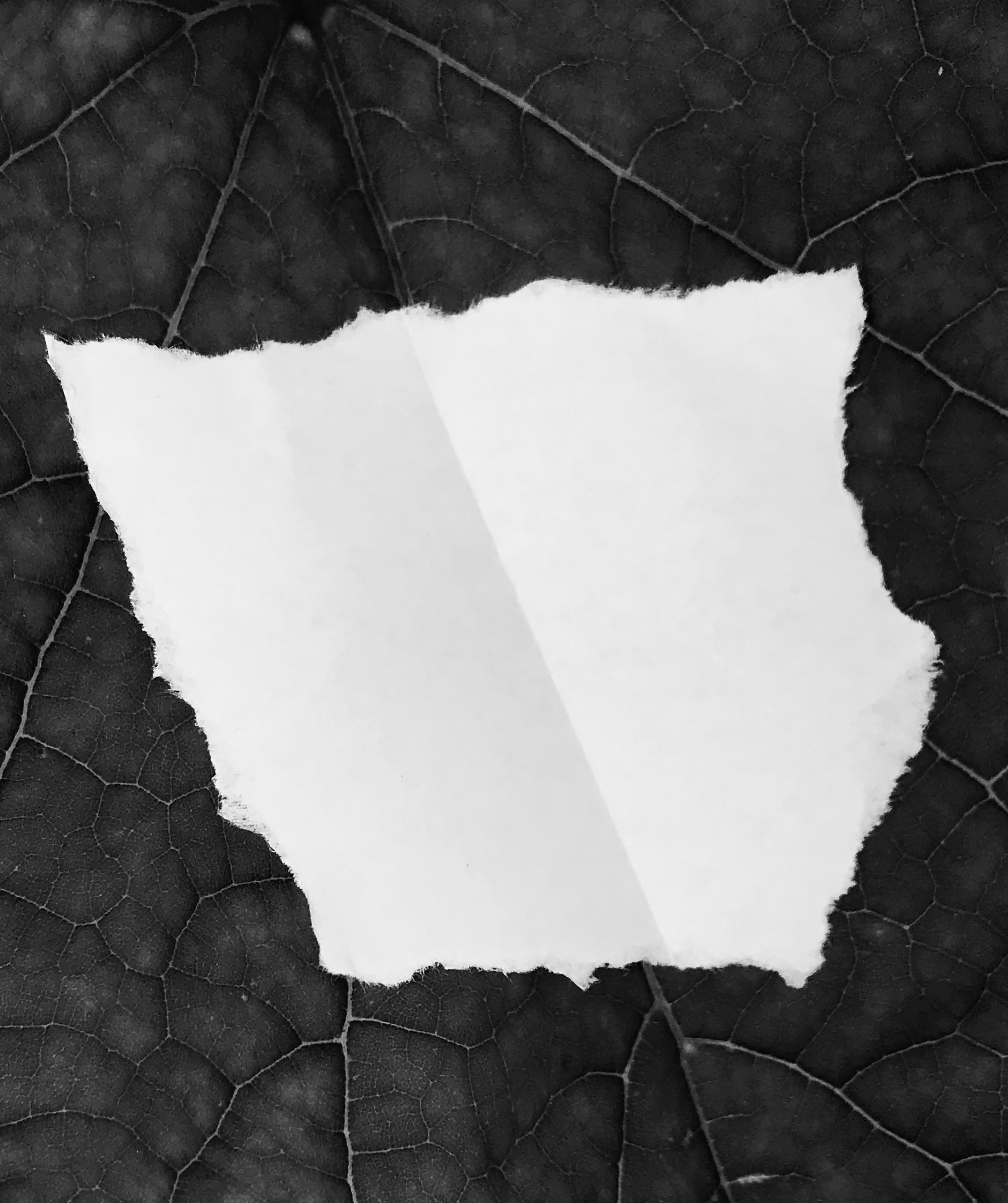
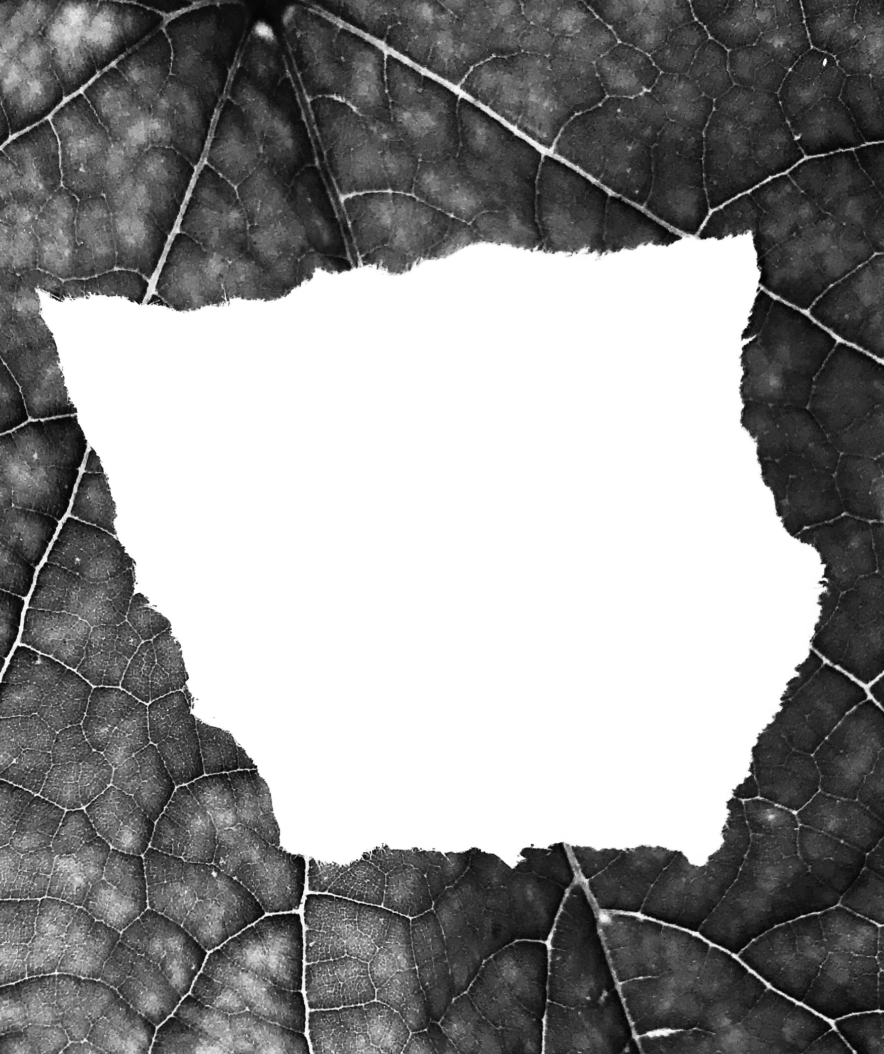
For my second image, I took made use of the manual zoom and focus of my camera, and captured a detailed image of a piece of ripped paper on a leaf. This image was originally taken for my Paper Project, and takes a small amount of inspiration from the photographer Aaron Siskind. Siskind often took close up images of subjects, and presented them in a more factual, objective and flat way. For this image, I am making use of a lack of context in order to present the image as being more abstract, and the high zoom used to take this image helps to cut out the context. I also edited the image in Photoshop to make it grey-scale, as this takes inspiration from Siskinds dark tones work, but also helps to emphasize the details within the leaf. I also believe that the contrasting colours of the leaf and the paper help to make the image more eye-catching as a whole. I will be using this image as my A5 image, as I feel that this will help to emphasize that although the image is detailed, the original subjects are naturally small, and I believe that this will create an effective juxtaposition, between the subject and the detail in the image.
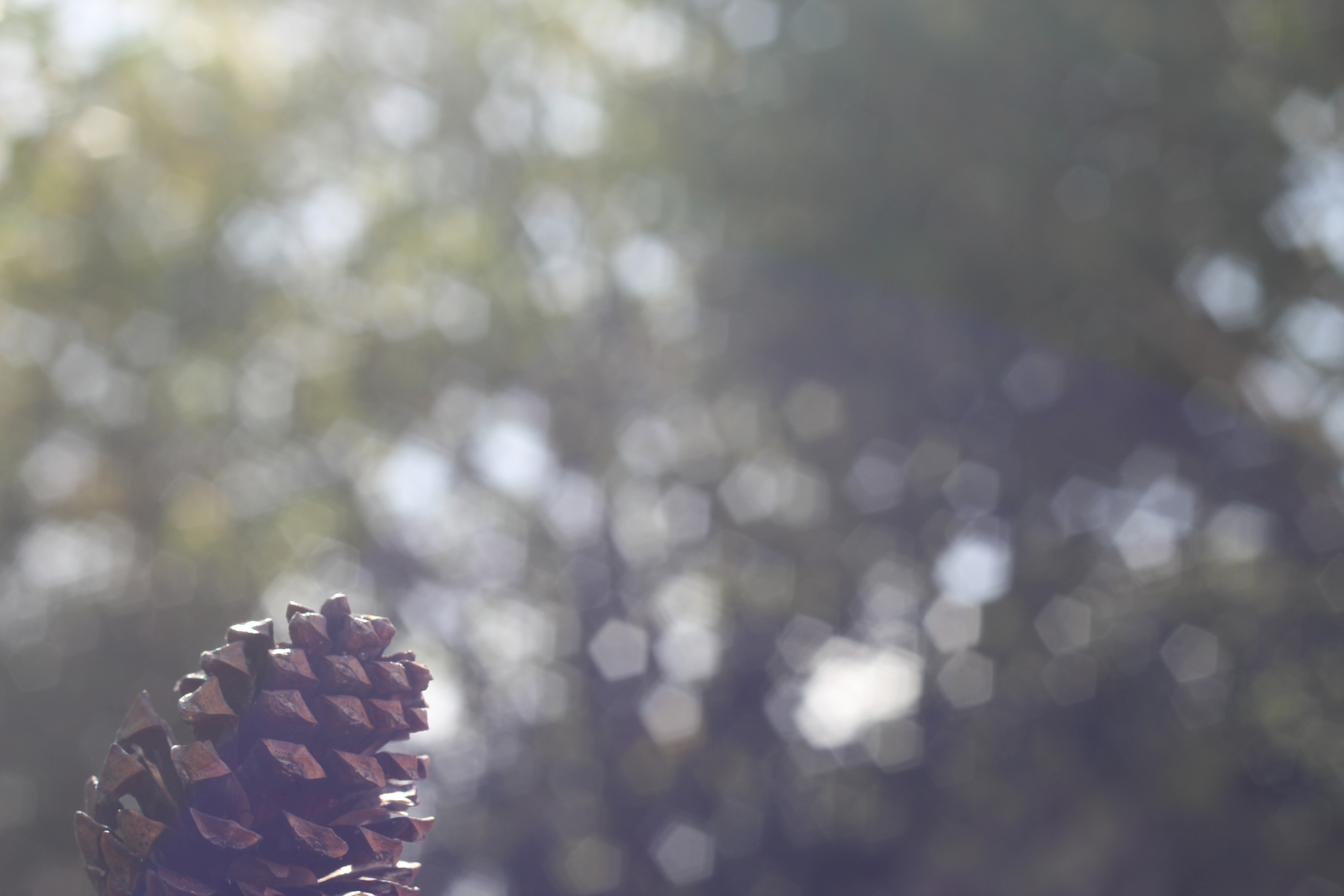
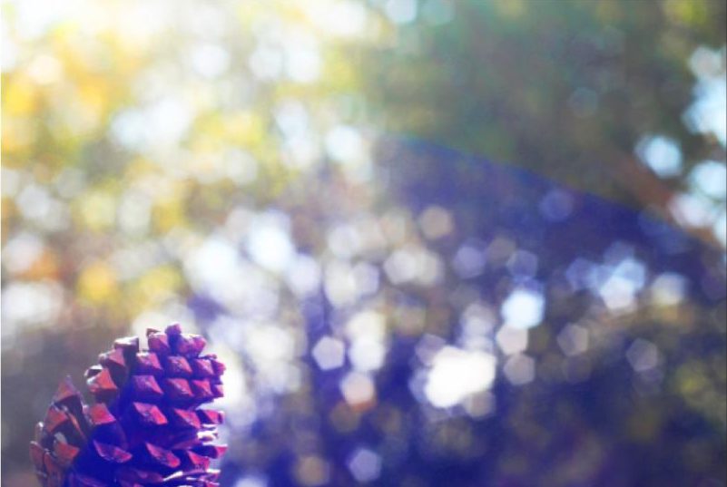
For my final image, I made use of the manual focus of the camera. for this photograph, I focused on the subject (the pine cone) while using a narrow depth of field to throw the background out of focus. I feel that this is an effective technique, as it allows for the viewer to focus on the subject completely, while questioning the context of the image due to most of the photograph being out of focus. I used Photoshop to edit the saturation of this image, and raised the contrast in order to make the colours of the image more vibrant, thus the image can draw more attention. I will be using this image as my A4 image, as I feel that the image will be more effective if it is large enough to make out the main focus point (which is small compared to the rest of the image), yet the image may become too boring and uninteresting if it is printed an larger. For this image, I took inspiration from Uta Barth again, as for some of her work she focuses on a small subject, and uses a narrow depth of field in order to throw the background almost completely out of focus. I was influenced by this technique, as I found it to be effective and eye-catching.