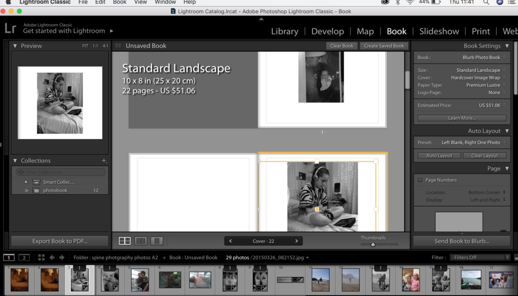
I started my book off buy putting in my archive images and seeing what sort of lay out I liked such a full bleed images on the page or Images not touching the edges of the pages at all.
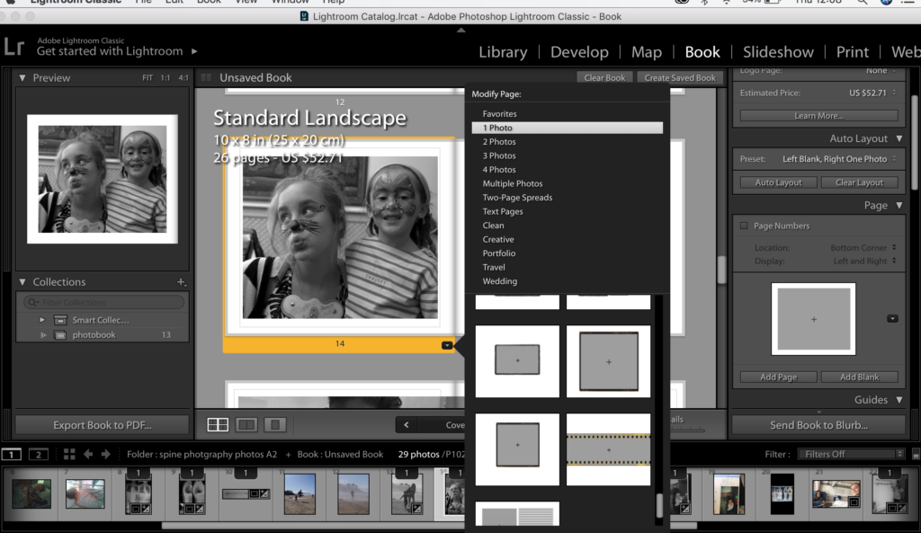
I chose to experiment with the modify page settings in blurb looking at how the different images fit to the bage on the different settings and experimenting to see what I think is best. When making the book I just did a lot of experimentation because then I felt that that wasn’t the best way to find out what I liked and what I didnt like.
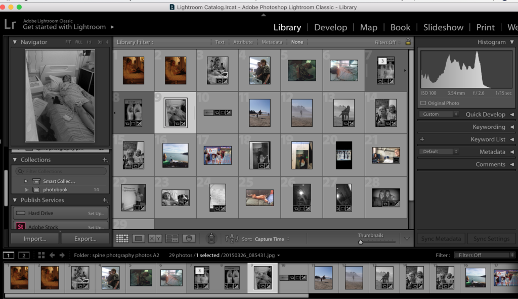
When looking at which photos I wanted to put into my book I could go back the the library page click on the icon with lots of little boxes and see all the different images in relation to each other. This is useful to see what images I have and have not Edited and which ones still need to be edited and which ones are not being used.
when editing images that are light in lightroom I often change the background colour to black from white so the image is easier to see and when editing I can see the changes really well so I can tell when to finish editing my images. I change this in the library seeing and then bring the image over to develop.
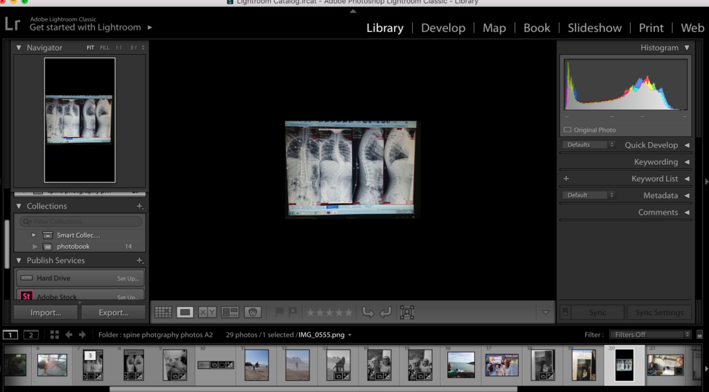
When editing this image I changed it to B&W and cropped it into two seperate images. I did this thinking that it could make a two page spread in my book which I thought could look really good and be visually intriguing than the image as a whole in colour and not cropped.
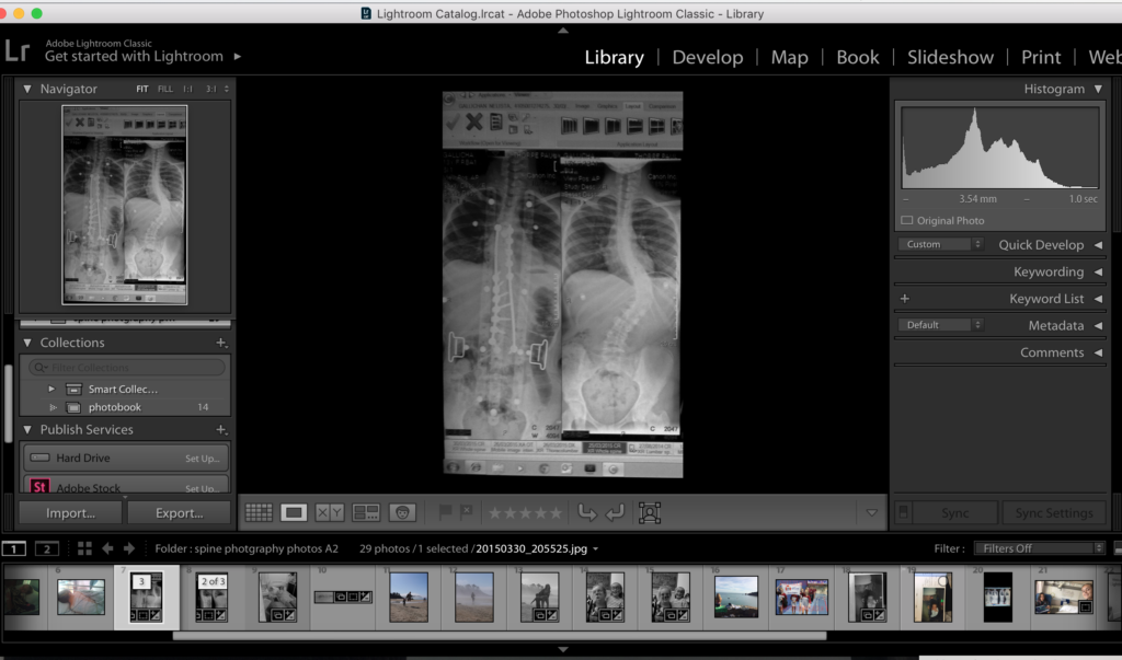
Again I did the same with this image in B&W because I though it looked more effective. My thought process for putting it in the book is ether to have it on a double page spread or have one half at the start of the book and the other half at the end of the book.
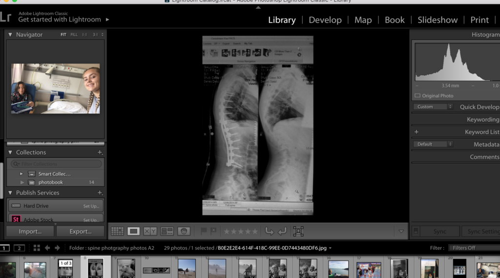
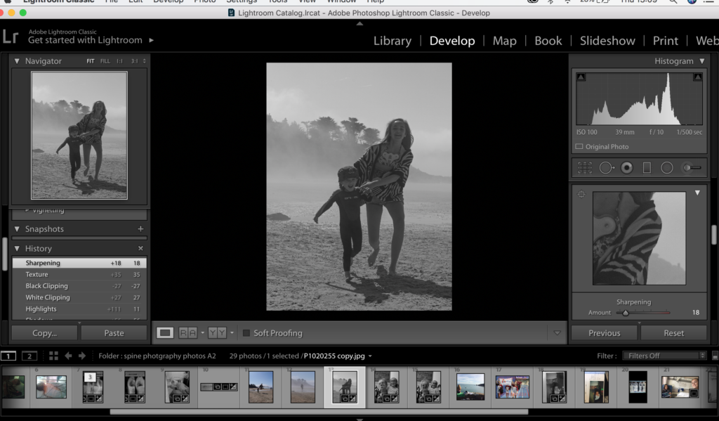
When developing and editing the images In lightroom I found the sharpening tool really useful It gives some of my archive images that are slightly out of focus a crisper and cleaner look and also the highlights and shadows sliders I alway use to alter the images.
