From this shoot I did I put these images into lightroom classic CC to eddit. I originally put these in a specific document folder on my mac and then go back in and import this file into lightroom where I can begin the editing process.
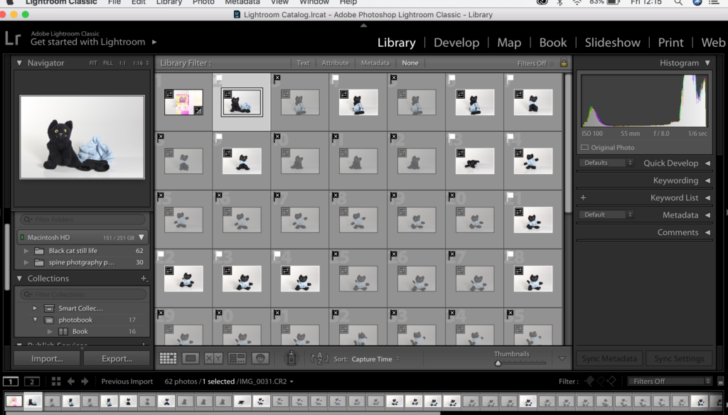
All the images with little white flags above them are images that I want to keep. I have decided to keep these images because I have liked the way they turned out. These will be due to factor such as them being in focus, the image chaving contrast, The images portraying a message also things such as the IOS and WB being right also the shutter speed but these were things i adjusted when I was taking the photos.
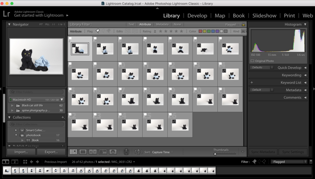
When in lightroom I just the letters x and p on my keyboard to keep and discard my images. Images that are not infocus or I don’t like the look of will be discarded so I don’t spend time editing photos that I don’t actually want to use in my final outcomes. This for me if the most efficient first step to editing.
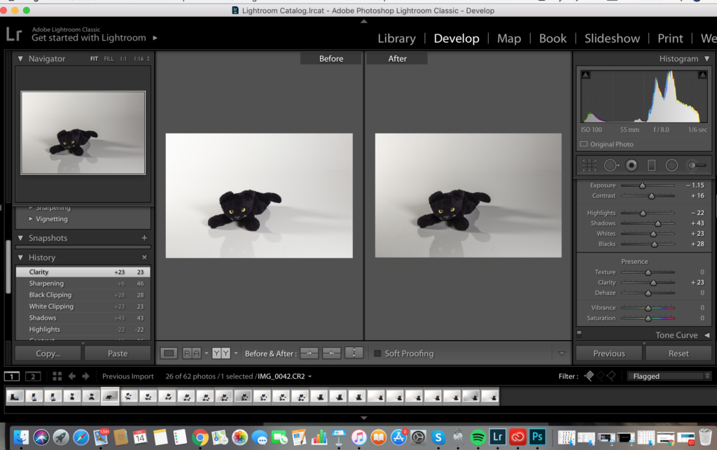
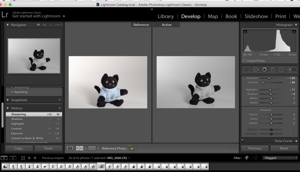
There is this really useful tool that I found when editing within lightroom and it’s the split screen where it shows the original image that I started off with compared to my eddied one. I have found this really helpful when editing because often I over edit images and the can not look at as successful as the original. So with this tool I can make sure I am not overdedditing photos and making the most effective outcomes.
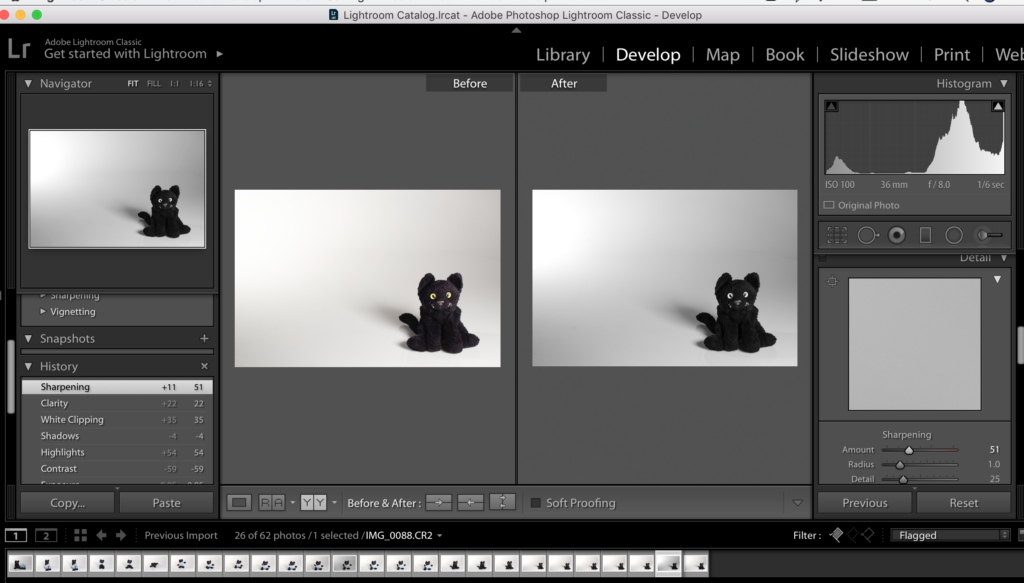
I chose to put the images into black and white because I felt that they were more effective in black&white because I want the images in my book to be in mainly in that style because I feel black and white will tell my story better. I think I want the first and last images in my book to be in color and the last because i feel it will act like a sandwich and tie up the story.
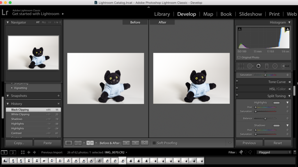
I experimented keeping one in colors and trying to blow out the background so there are less shadows. Making the background brighter and the colors within the image more intense. I liked this photo because the images are more intense.
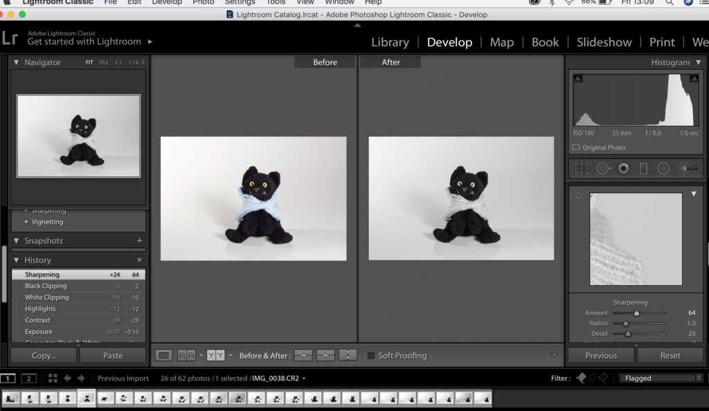
Also I was experimenting with the cat having his clothes on and off whether it made a difference to the feel of the image or the overall appearance of the final outcome. I feel that image looks better in black and white rather than colour. I need to edit the background shadow to get rid of it so the image look seamless.
This image I chose to keep the shadows in because I like the reflection of the cats face in the cats face in the still life table, so when editing I made this shadow more intense adjusting highlights and shadows.