Archival images – Part 3

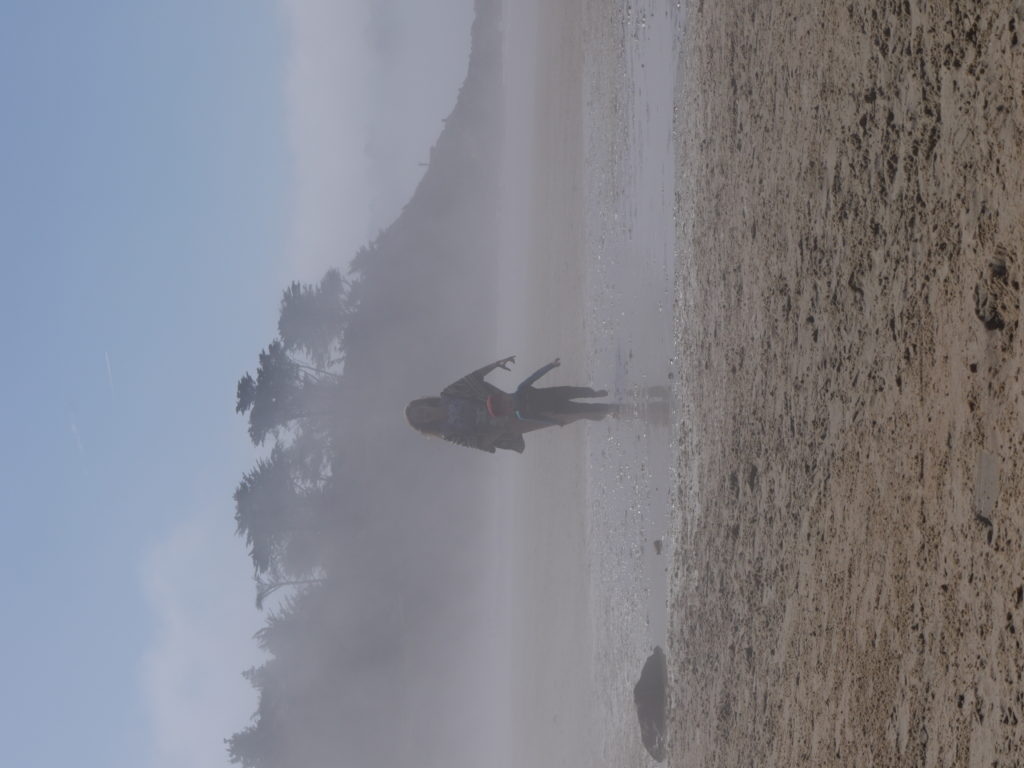
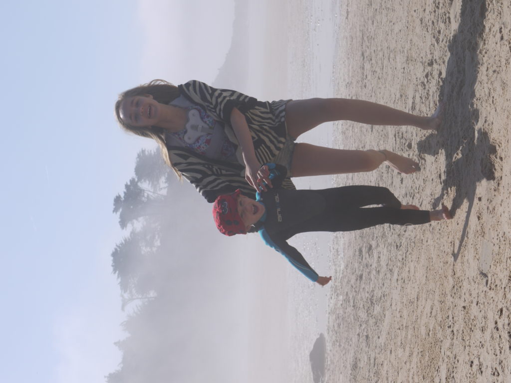
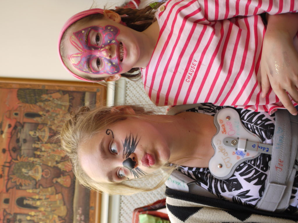
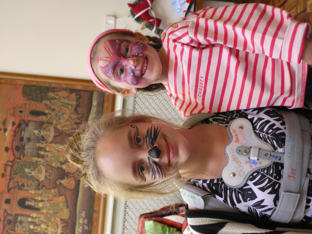
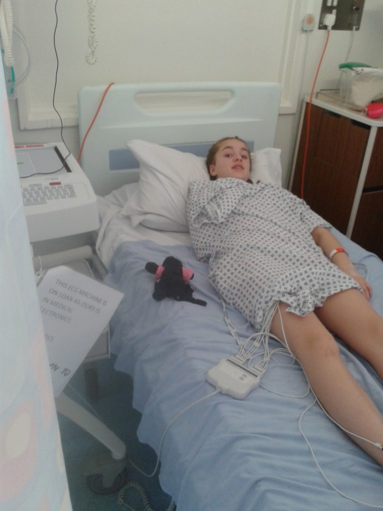
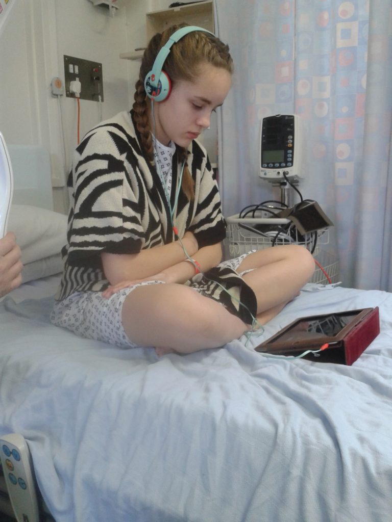
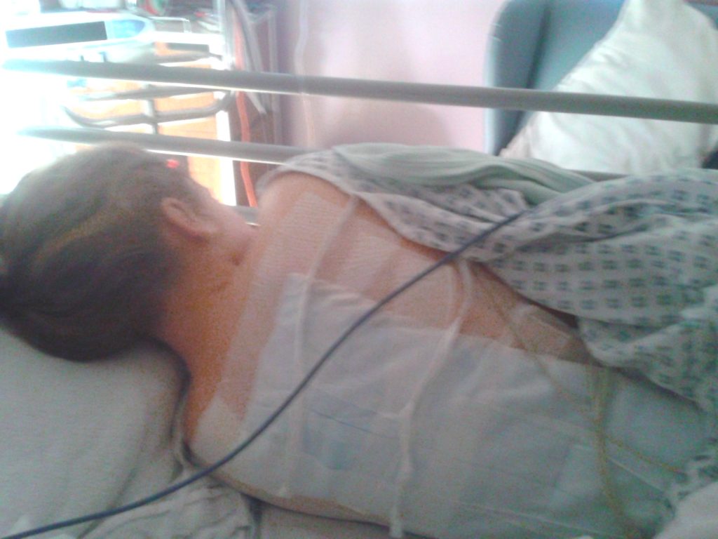
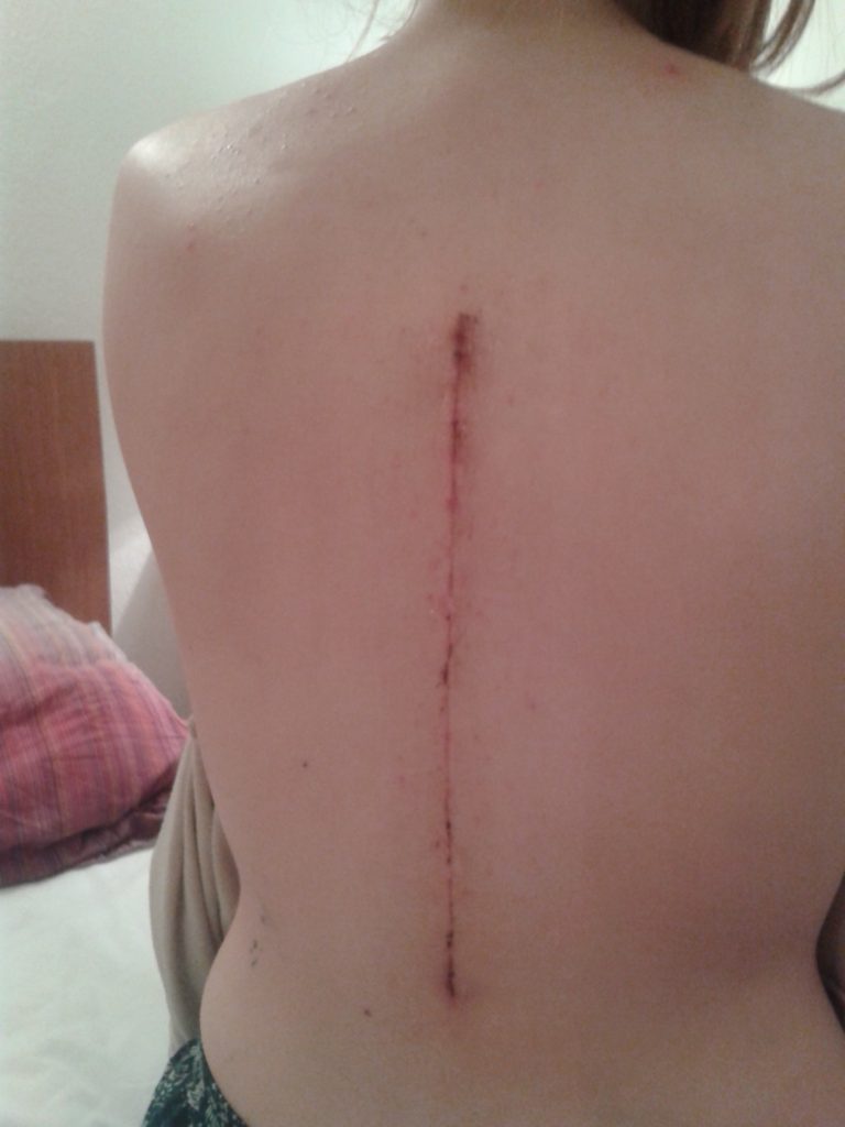
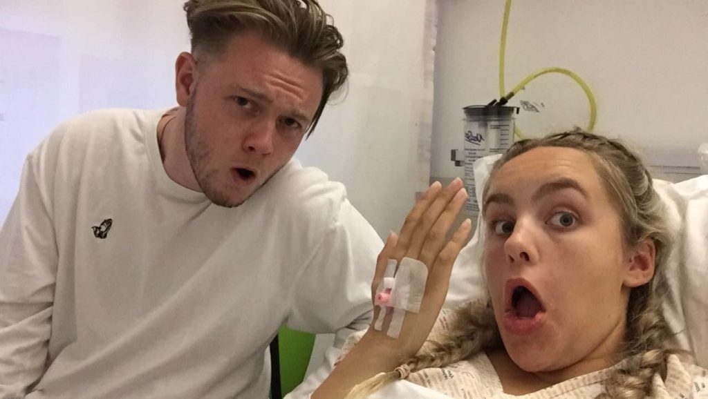
These are all images after surgery taken by me or someone else centered around hospital and images of me wearing my spinal brace after surgery. These images show how my operation has lead to further health complications but I have managed to stay positive through it all laughing and joking. Trying not to take the serious and sinister side of the reality of my health conditions.
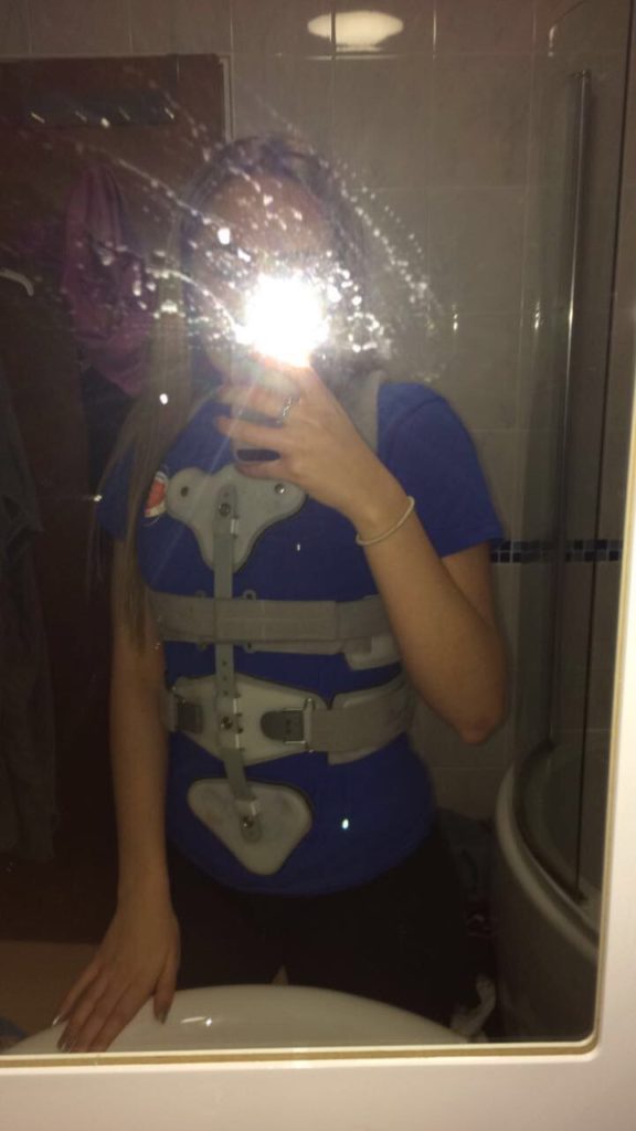
Having to wear a spinal brace over my clothes was a struggle for me because it meant I gained a lot of unwanted attention both negative and positive. Thinking back on it all I depth well with it all not letting it bet me down because it was not a prementat implication I had to live with for the rest of my life it was just for 6 months. I had the attitude of after that I would be completely fine.
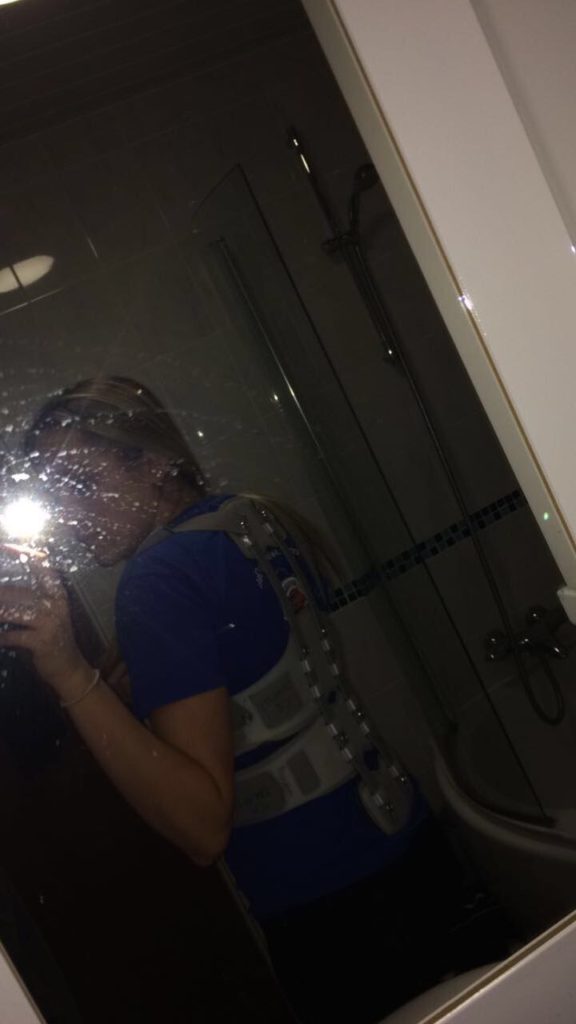
I have a lot of images from when I was taken back when my legs were paralyzed for 12 hours and I had to get admitted to hospital this is the morning after when my legs came back and the doctors kept me in to do lots of tests.
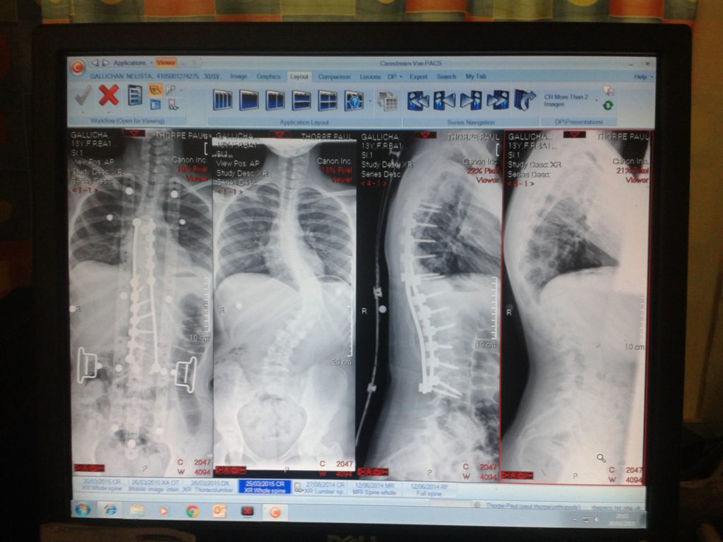
Also I thought I could use images of documents when I am in hospital such as medical records, food menus, tablet dosage time tables. These I feel can give interesting breaks in my photography and also help to guide where I want the story of my photobook to go.
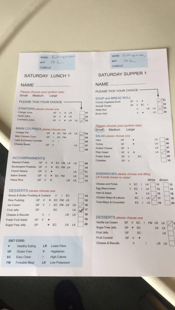
This image I feel is to obvious for the story that I am wanting to tell it has no room for personal interpretation or talking point. I feel like i will most likely not use this image in my final photo book.
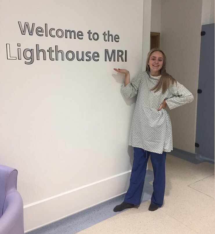
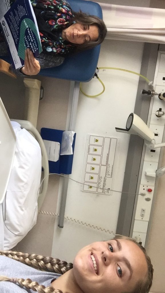
When I hospital I have to try make it all lighthearted so I don’t end up worrying about the underlying issues of what is actually going to happen. So my mum will often take photos of me un ugly hospital gowns and slippers to make it funny.
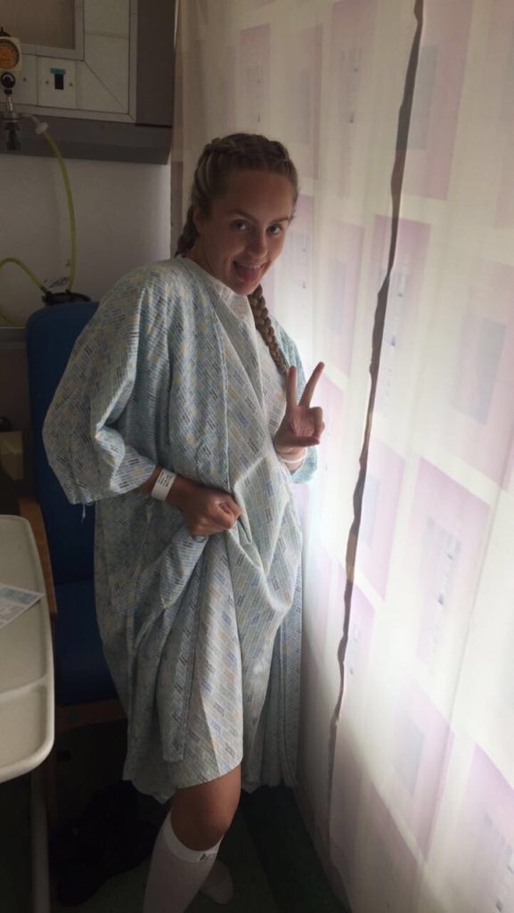
When I am in hospital I have a huge support network of friend and family how try there best to entertain me and keep me happy. I always like to document and take photos when I am in Hospital because it shows my journey of how far I have come and how far I have still got to go. I use images as a way to monitor when I am in and out of hospital.
Shoot 2 – black cat – EDITING

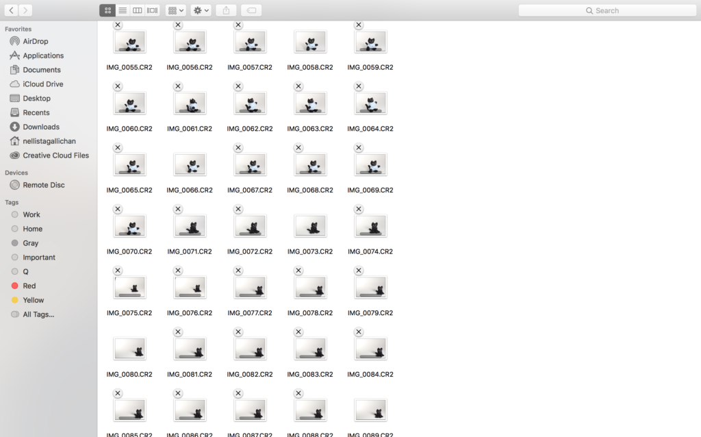
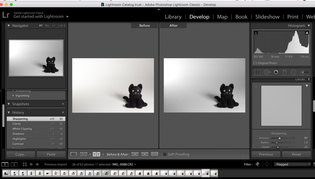
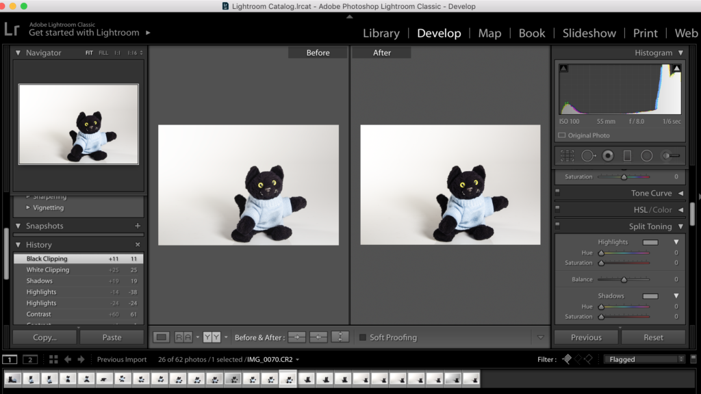
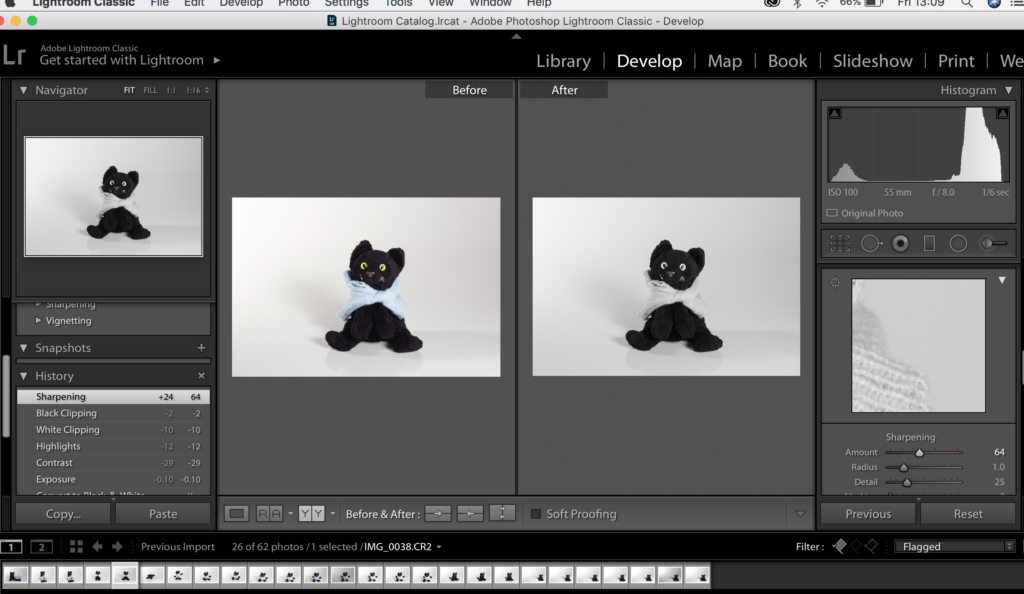
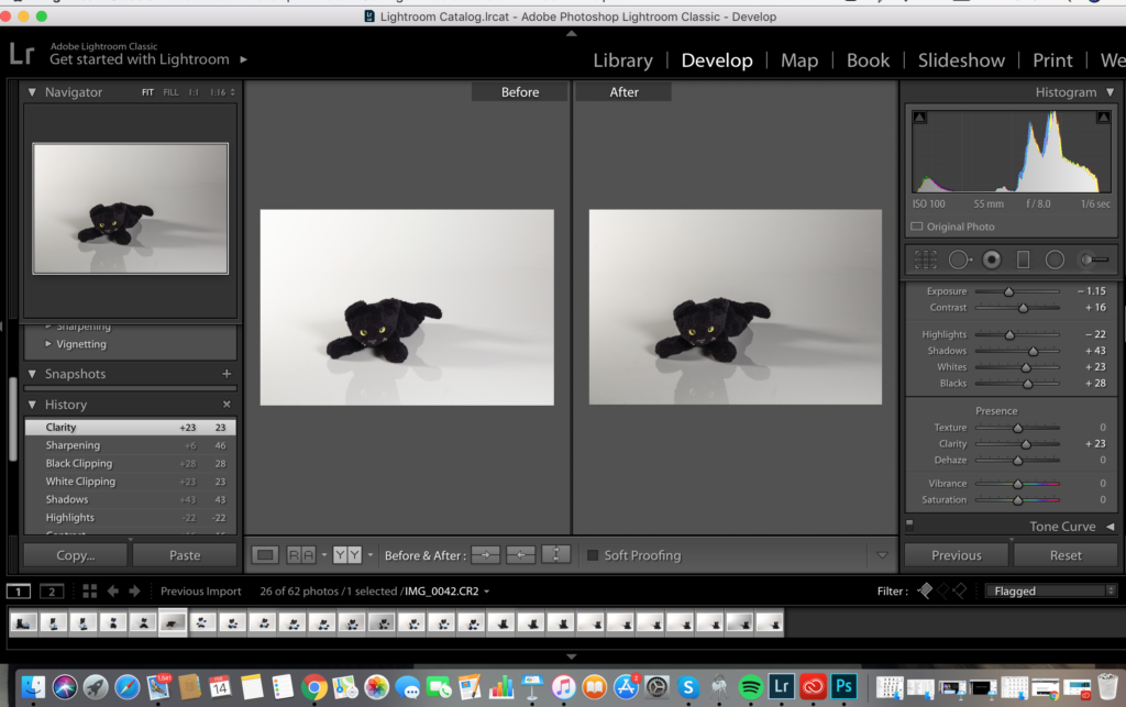
From this shoot I did I put these images into lightroom classic CC to eddit. I originally put these in a specific document folder on my mac and then go back in and import this file into lightroom where I can begin the editing process.

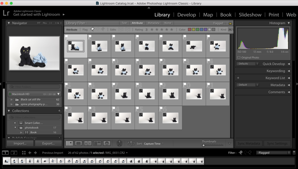
All the images with little white flags above them are images that I want to keep. I have decided to keep these images because I have liked the way they turned out. These will be due to factor such as them being in focus, the image chaving contrast, The images portraying a message also things such as the IOS and WB being right also the shutter speed but these were things i adjusted when I was taking the photos.

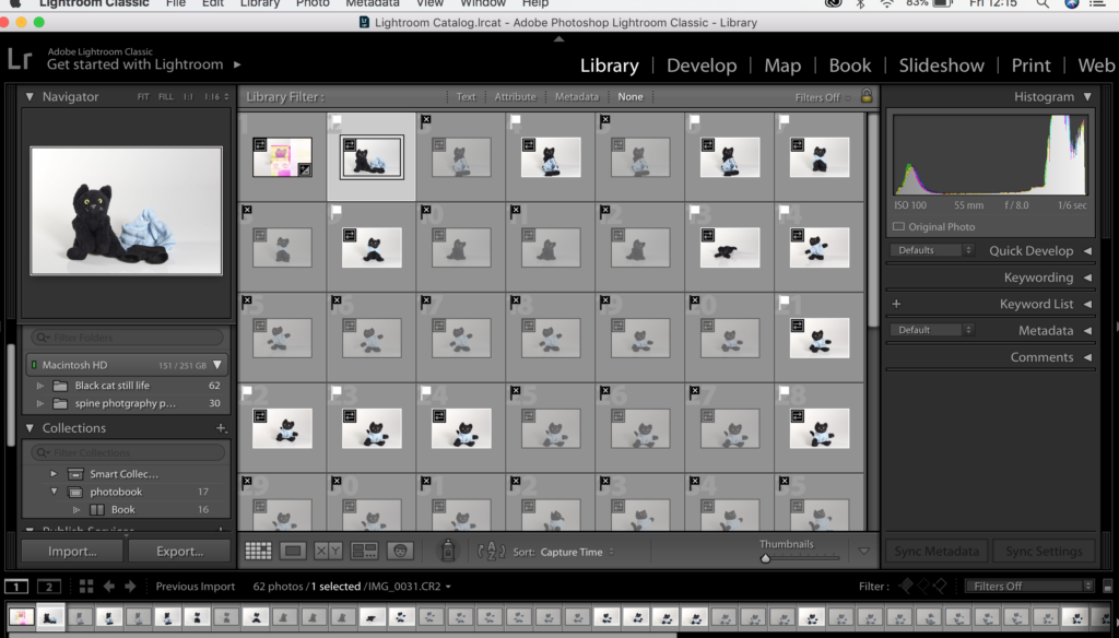
When in lightroom I just the letters x and p on my keyboard to keep and discard my images. Images that are not infocus or I don’t like the look of will be discarded so I don’t spend time editing photos that I don’t actually want to use in my final outcomes. This for me if the most efficient first step to editing.

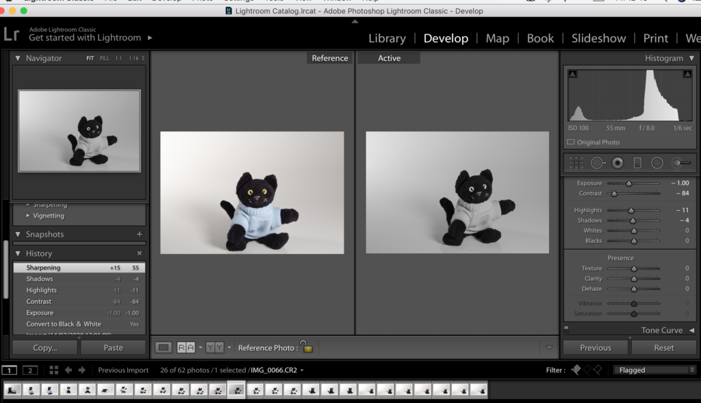
There is this really useful tool that I found when editing within lightroom and it’s the split screen where it shows the original image that I started off with compared to my eddied one. I have found this really helpful when editing because often I over edit images and the can not look at as successful as the original. So with this tool I can make sure I am not overdedditing photos and making the most effective outcomes.

I chose to put the images into black and white because I felt that they were more effective in black&white because I want the images in my book to be in mainly in that style because I feel black and white will tell my story better. I think I want the first and last images in my book to be in color and the last because i feel it will act like a sandwich and tie up the story.

I experimented keeping one in colors and trying to blow out the background so there are less shadows. Making the background brighter and the colors within the image more intense. I liked this photo because the images are more intense.

Also I was experimenting with the cat having his clothes on and off whether it made a difference to the feel of the image or the overall appearance of the final outcome. I feel that image looks better in black and white rather than colour. I need to edit the background shadow to get rid of it so the image look seamless.

This image I chose to keep the shadows in because I like the reflection of the cats face in the cats face in the still life table, so when editing I made this shadow more intense adjusting highlights and shadows.

Still life table- shoot 2 behind the SCENES-

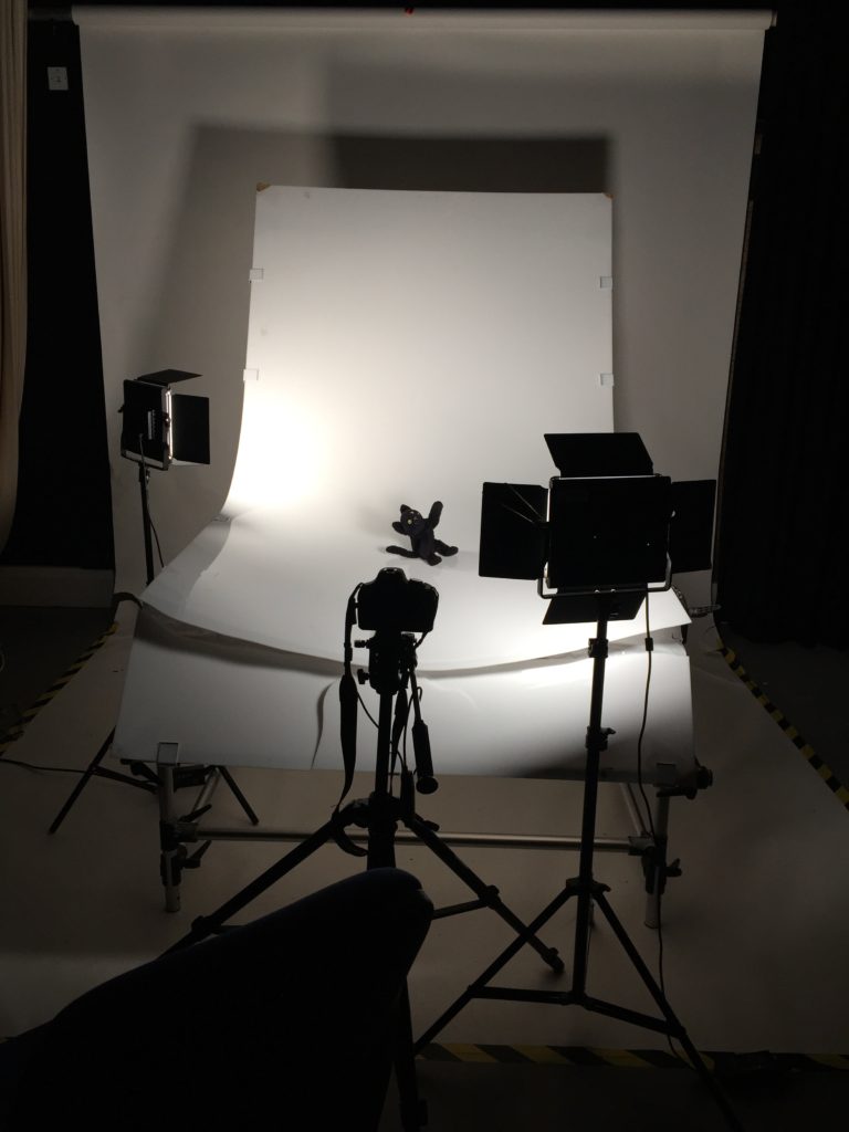
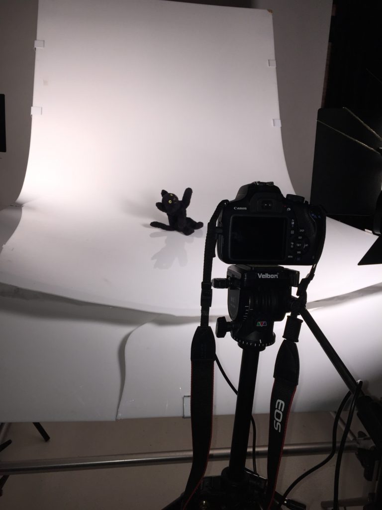
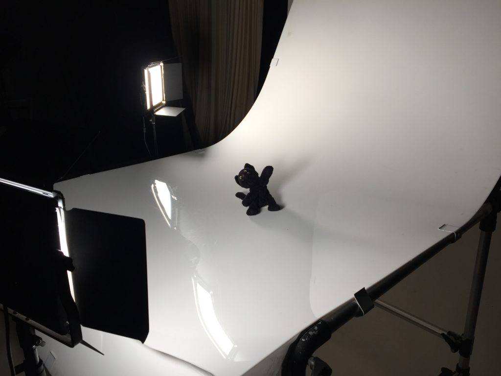
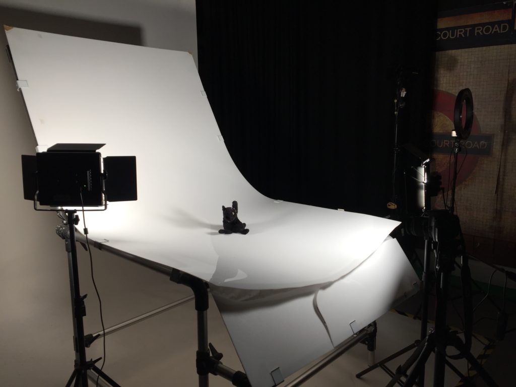
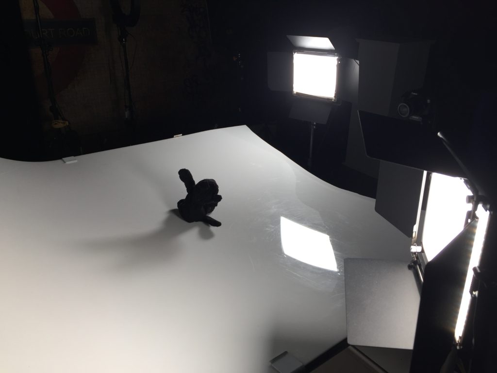
This is the set up I used to create the cat still life images. I used the curved acrylic still life table this table is amazing for shooting still life because there are no breaks in the curves or edges where I would be photographing that would show up. This intern makes the editing process easier for me because then I don’t have to photoshop these lines ad match up the foreground to the background which takes time.

There unfortunately a crack in the still life table because someone lent on it but this doesn’t affect my photos because I am photographing above to crack meaning the table is still seamless.

I set my camera to be straight on to the cat so I get a profile image and I feel like a profile image is more striking. Also I wanted to get the cat looking straight down the lense so it feels like the viewer has more connection with the photo because direct eye contact is shown to make people feel more connected to photos and it gives them more content to the image, they can also design their own story behind why the image was taken.

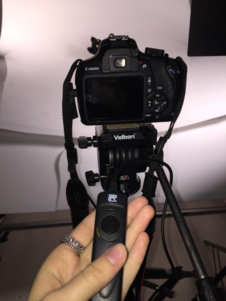
I used a timer button to take my photos to make sure then I am looking through the lens that i wouldn’t create a shadow effect the image so by using a timer button I can step back once I have got it all in focus and this also means there is not chance of me knocking the camera once I have focused it or so I don’t change the position of the tripod at all the the image is still straight on.

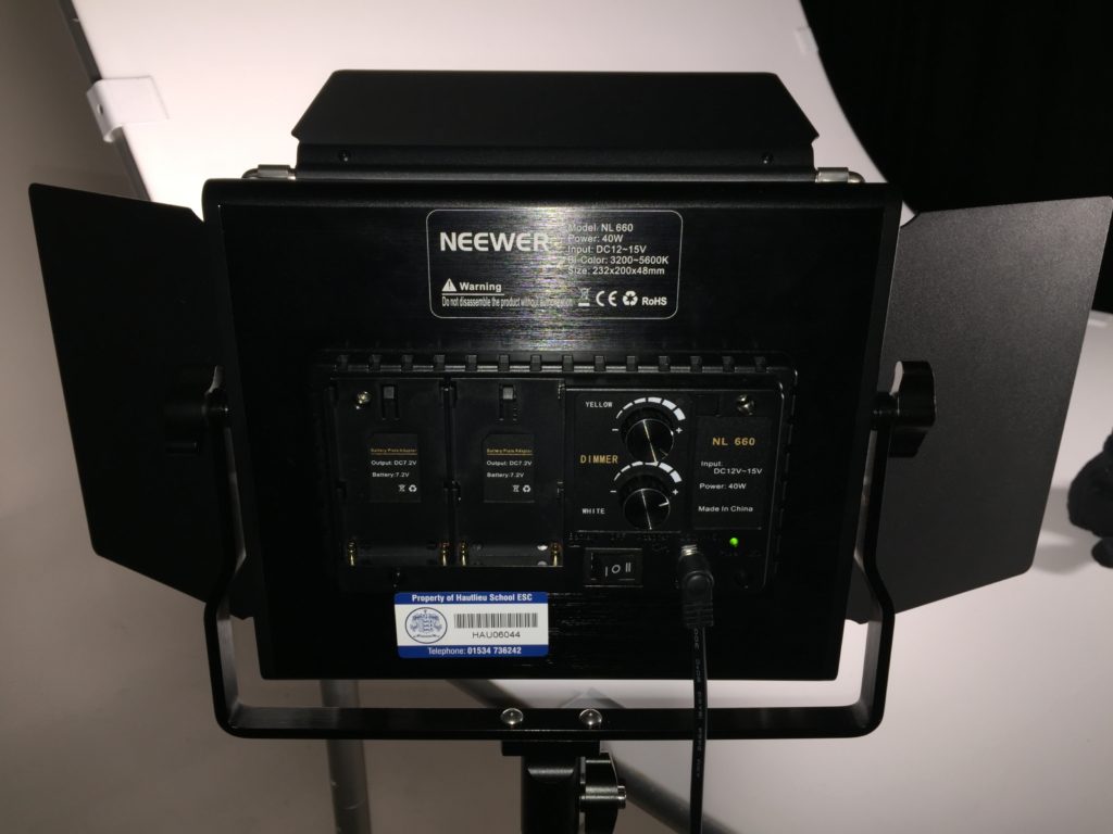
The lights settings were put up to both there maxes the yellow dial changes it from white light to yellow light and because I wanted the max contrast between the black and white. I turned the dial up to white on the max so this blasted out any shadows present and ment there was more contrast between the cat and that background. Also there is another dial that controls how much light the lights are producing e.g how dim the light is. When looking at dimness of light, the dinner the light the more shadows are cast. I don’t want shadows in my images so I will have the dial controlling dimness at max on the back.

The lights have to be adjusted so that on camera there looks like there is the most minimal shadow possible. I do this by moving the light slightly taking a picture and then judging off that and how it looks.

I found that angeling the front light straight on to the cat and having the back light slightly turned away from the cat was the best way. On this image there still doses look like there are shadows which there are but when photographed on camera these look alot more minimal.

I used a 50mill lens when photographing the cat also adjusting the focal ring accordingly and had to re adjust the settings on the camera every time I moved the lights adjusting the ios and the white balance. I kept it to a high shutter speed to make sure the images were in focus and the distinctive black and white comparison could be photographed.

Shoot 2 Plan – Black Cat-

I have decided to use Mike Kelley as inspiration for this shoot especially his set off work – Ahh… Youth!

When planning my next shoot for my project I chose to look at my favourite toy that I have had since the day I was born. This cat comes everywhere with me on holiday to important event. It is a sign of luck for for me and security and has been always since I was little. He sleeps in my bed every night when I don’t have him there I feel worried very often and can’t calm myself down in a uncomfortable situation. When I decided to go ahead with my spinal surgery I knew that I needed to take my cat with me because otherwise i would feel lost without him.

Plan for my shoot is to look at my cat on a completely plain background so the focal point is just on my toy and nothing else. I have chosen to do this rather than photograph my cat in my bed or a place where he normally remains because I wanted to show him in a still life situation. I wanted to do this because i felt a background could take away form the actual focus of the image. I just want to show the toy and how many people have this same experience with toys.

Actuall plan for the photo shoot: Go down to the studio and set up the still life tabel with the lights. Also set up the tripod for my camera so my images are still and in focus. I am going to set up two lights either side to block out the shadow caused by the teddy meaning the foreground and background are seamless so the focal point will soaly be on the cat. The background of the image will be white because that is the color of the still life table. I think this color will work really well with the cat because it is black and will contrast the background making the image stronger and will give it more depth because of the strong contrast. Also my teddy where’s costs so experimenting with him having them on and off and him in different positions and then put all the images into lightroom classic cc and see which images i keep and which images i will discard, to then take on to the editing process.

ARTISTRY Study – Mike Kelley-

Mike Kelley is a well known photographer. Many of his works have become high profile and have been widely talked about. Some of his most prevalent works are; The Banana Man, More Love Hours Than Can Ever Be Repaid, Pay For Your Pleasure,Ahh…Youth!, Deodorized Central Mass with Satellites. The works that I want to many focus on and look at in my project are from the Ahh…Youth collection.

Ahh…Youth! is a group of eight Cibachrome prints of mug-shot photographs, seven showing stuffed and knitted animals, and the eighth a youthful, harshly lit image of Kelley himself, taken from a high school yearbook. The seemingly innocent children’s toys are framed in such a way as to impart a sense of deviousness to each, while Kelley – well turned out with a buttoned collar and his long hair brushed neatly backwards – appears at once impish and awkward.

The inclusion of his own image amongst soiled toys is, in part, an act of “self-caricature,” as the artist, critic, and friend of Kelley’s, John Miller, has suggested. At the same time, Kelley stares menacingly outwards as if to provoke the viewer. The resonance of “youth” in the work’s title is, as in many of Kelley’s works, left up to his audience to fathom. As Miller has explained, “(Kelley) considered art to be primarily a belief system in which viewers will make of artwork what they will.” But here, with the clash between infant playthings and the disaffected and awkward adolescent laid bare, “youth” becomes somehow euphemistic, conjuring everything from boyish tomfoolery to channelled aggression and teenage sexual awakening.

In 1992, the experimental rock band, Sonic Youth, used one of Kelley’s thrift-store soft-toy portraits from Ahh…Youth! for the cover of their album, Dirty. This helped to establish the work’s place in the canon of Kelley’s best-known creations, while the album’s title nudged the possibly sinister subtext of the work a little further into the light.

8 Silver Dye-Bleach Photographs – Mike Kelley Foundation for the Arts

Image result for mike kelley photographer toys

Archival images part 2- Spinal Brace after surgery and family

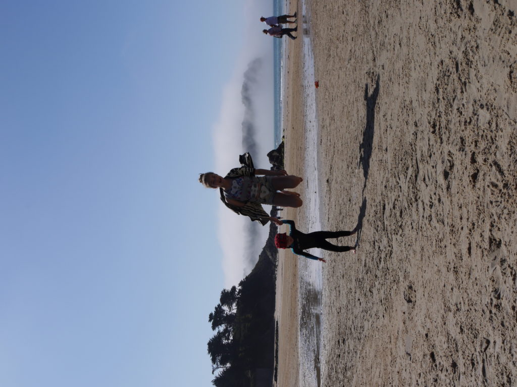
After surgery I was made to wear a back brace for 6 months post surgery this meant that it was visible over closes and I couldn’t hide it. This was very hard for me because I would get many people straining and making rude comments about what had happened to me. I decide to show the happy side of when I was in my spinal brace having my family there to support me and it didn’t stop we from enjoying myself completely. I wanted to show happiness through these images as the others are distressing and i felt there needed to be a break in that theme. I like these images of me and my sister I feel like they resonate freedom and happiness, much of the emotions I felt after surgery until all the health complications and repressions of surry came in.

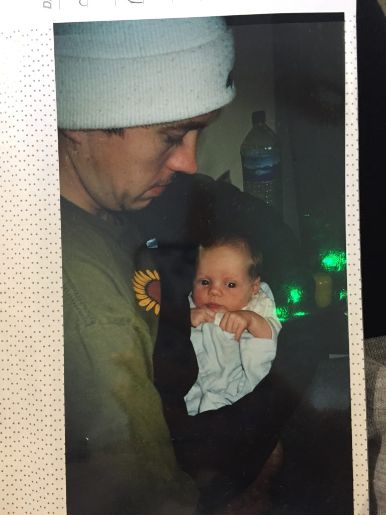
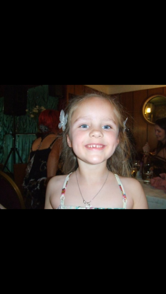
Also I wanted to include some images of me as a little child before all of this was happening to me. I thought this could work really well as a start off to my book because I could arrange all the images in chronological order from the day I was born to present day. I feel like this could really benefit my book and how people who don’t know me are able to interpret it.

essay questions – Possible essay questions to use –

We are being given the task of writing a photographic essay comparing our work and an influential photographer of our choice we were given the task of coming up with our own questions so these were some of the ones I liked.

How chronic illness has inspired people to document their story through photography as a way of healing? – This could link to Joe Spences- Misbehaving Bodies

How do photographers use documentary photography as a way of healing?

How do two photographers display their responses to dealing with chronic Illness in different ways?

What motivates photographers to document their personal experiences and display them to the general public.?

How do photographers make their personal experiences relatable to so many others through visual displays and exhibitions?

How do heartbreaking experiences change the direction in which photographers chose to take their work?

Life experiences shape the way photographers decided to make there audience perceive there images. How do I do this and another artist in our works?

Archive photos

These were photos taken before and after surgery documented by my mum. These are the original images and I am going to put them all into lightroom classic cc to edit and sharpen some of the images.

These images are a mix of before and after i had surgery. I had spinal surgery back in 2015 and it have had such an impact on my life.

All of these images I want to use in my book to help tell the story of what happened to me visually and will give the audience some context behind everything and why it happened.

ACADEMIC SOURCES – how to use the HARVARD system of REFERENCING

Litterary sources- find 3

  1. Text in a book
  2. Online article
  3. YouTube Interview

Harvard System of Referencing

Bibliography- Adams,R. (1996) Beauty In Photography. New York: Aperture

Quote: how to incorporate a quote inside my own writing

(own text info before) critic Robert Adams says ; ‘THE POET William states succinctly what most poets believe: “Ideas are always wrong” This conviction helps account for the uneasy place of artists in the academy, the home of ideas.'(Adams 1996: 23)

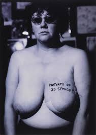
Artist Study – Jo Spence

I have chosen to look at her work because she uses a documentary photography style to showcase her battle with chronic illness much like what i want to do.

“An invigorating – if ultimately heartbreaking – experience.-The Guardian

Influential photographer Jo Spence’s (1934–92) work documents her diagnosis of breast cancer and subsequent healthcare regime throughout the 1980s. Her raw and confrontational photography is shown alongside Oreet Ashery’s (b. 1966) award-winning miniseries ‘Revisiting Genesis’, 2016. Ashery’s politically engaged work explores loss and the lived experience of chronic illness in the digital era. In October 2019, a new commission by Ashery, exploring the recent death of her father, will be added. 

Follow your own path through this exhibition, challenge your understanding of ‘misbehaving’ or ‘untypical’ bodies, and reflect on how illness shapes identity”

Currently exhibiting her work. 30 May 2019—26 January 2020

 Undoubtedly, her most heroic work was The Picture of Health, in 1982, which she began after being diagnosed with breast cancer. This series of self-portraits is both alternative therapy and a critical response to modern medicine, with Spence regaining ownership of her body by documenting her treatment.

In all of her work, Spence confronted us with the things society tries to conceal – not least women’s unconventional physiques. In The Picture of Health she upped the ante, bringing disease into the frame. In one bare-chested photo, she stands before a mammogram, her breast laid out between its slabs like a separate entity. Later, she poses in a biker’s helmet, holding up her arms to reveal battle scars.

Spence survived breast cancer, preferring Chinese medicine to more aggressive treatment. It’s incredibly sad that she then died of leukaemia in 1992, though she continued creating her playful, defiant photos until the end