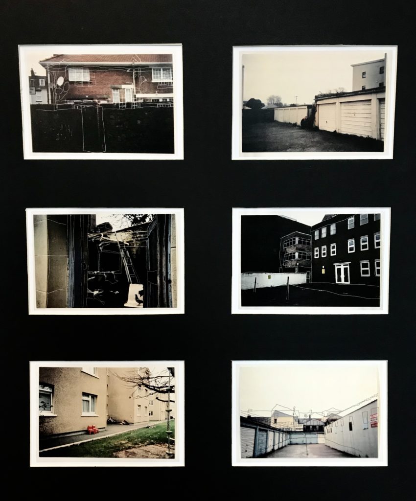
FINAL IMAGE SELECTION:
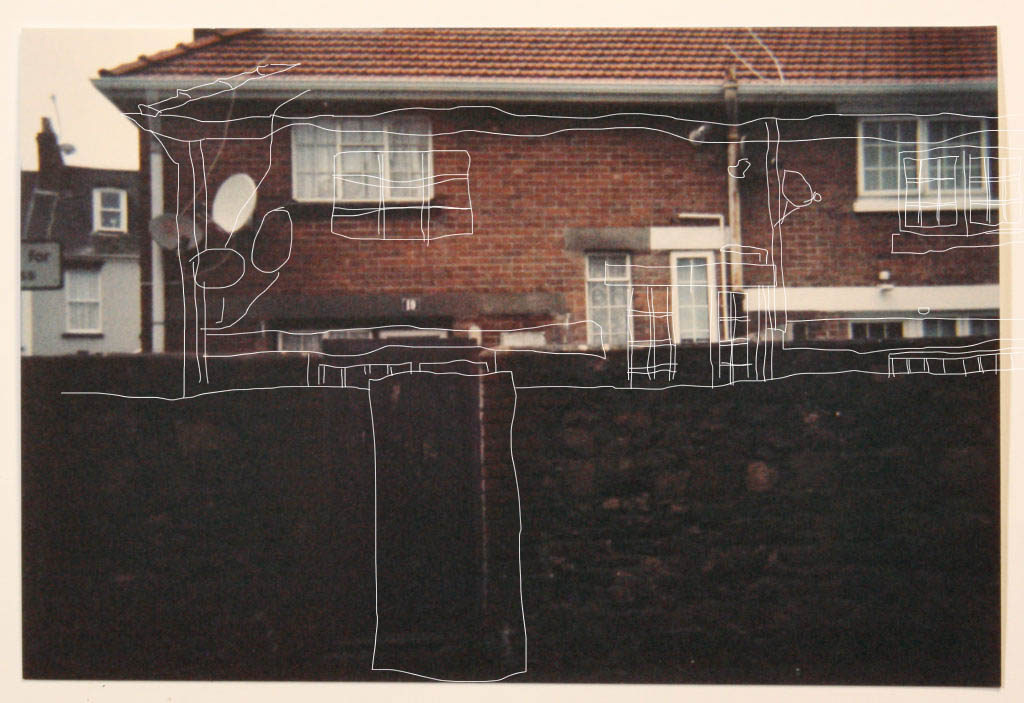
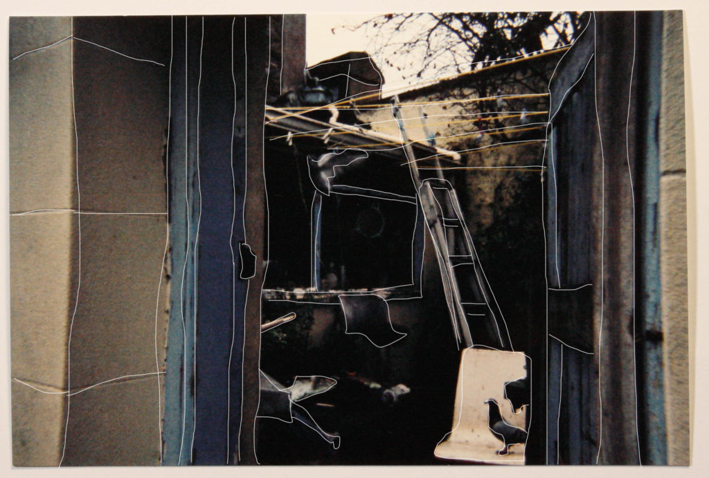
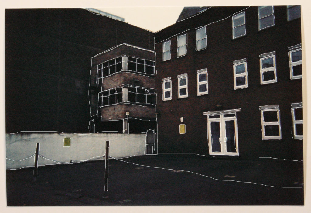
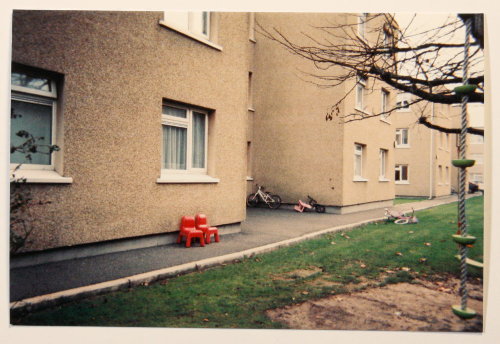
As a final mounting idea I chose to go with a selection of 6 film images to include in my final selection as I felt that they worked well together in terms of location, aesthetics and composition. Going back to the theme of nostalgia and wanting to home in on this, Using film was an effective way to achieve this. When looking at the images, one of the first feelings which is provoked is nostalgia with the grainy, warm nature of the final prints, looking like family archival images which have been taken from the attic, dating back to the 80’s. I want to to retain this feeling throughout my images as it is a different approach to modern digital photography. Using a medium such as film makes me appreciate photography on a deeper level by making me consider each shot before taking it due to the material restraints of using film. Each shot has to be planned and considered as this isn’t a priority anymore when using digital photography. Even if each shot is not perfect, I will be including each shot as this will reflect the “take what you can get” approach of housing as people will, in desperate times, take whatever comes their way. An idea which I found to be quite interesting in terms of the visual aspects of the image is tracing the outlines within the image and then moving this traced layer to one side, creating a sort of child like drawing which can be seen a top of the original. Although not directly linked to any contextual information to the image, I find that this editing technique is an effective way to give an image a stronger focal point and to draw interest.

FINAL MOUNT:
In terms of the layout of my final mount I have chosen to go with a simple set of window mounts with are set in a symmetrical manner. I chose to go with this as it best went with the classical film style of the images, and keeping to these conventions. I also chose to leave a significant white boarder around the edges as they aesthetically appear as genuine Polaroid images.
