Monthly Archives: February 2020
Filters
Essay
How can photography change the way we remember people and events?
“A great photograph is one that fully expresses what one feels, in the deepest sense, about what is being photographed.” – Ansel Adams
Photography as a tool to preserve a memory of someone has been widely used even from the early days as people would have their portrait taken and have it given to a loved one or a partner. Once a photo has been taken that is a memory that has been created and can last forever, once a photo has been taken something or everything can completely remain but the memory of the moment is preserved perfectly in the photo.
One example of regular people using photography to preserve a memory of someone is in the military as male soldiers who went off to fight in war in the early 19th century would often have a picture of their sweetheart with them, so that they can remember their partner and always have them by their side. And the same was true for the wives who remained home and worked, as they often had images of their partner who has gone off to fight as that may be the only image of them that they have because it wasn’t cheap to have a portrait taken in those times.
Portrait photography is a very personal from of photography and the relationship between the photographer and the subject is the deciding factor on the outcome of the image. If the subject doesn’t really know the photographer and doesn’t feel comfortable, they will often look stiff and un natural, the photo can be perfectly composed and have the perfect lighting but if the subject isn’t comfortable the photo will not tell a story. Where as if the subject and the photographer have a pre-existing relationship the outcome will be drastically different. Once a portrait has been taken that then forms a bond between a photographer and the subject that will last as long as the photo itself, even though the photographer cannot normally be seen in the final image it is their work, it is a piece of art that they have created of that subject. “It’s one thing to make a picture of what a person looks like, its another thing to make a portrait of who they are.” -Paul Caponigro
A portrait image can often hold lots of emotion too. They can hold specific memories of a time and place or just of a person. With a portrait the memories don’t always have to be memories that the person in the photo has it can be someone else seeing it remembers that person or the events they experienced when that photo was being taken. Portraits of a person can even hold memories for someone that doesn’t have a direct link with the subject of the image. For example a portrait of someone like Hitler or Stalin if shown to someone who lived under their rule will have memories of that time and will associate that figure heads portrait with the experiences and the memories of that time.
The portrait photographer Platon has perfected the art of using photography to seal a memory of influential people and the way that they were perceived by society. The photo of General Gadaffi on the right was taken at a time where he was an extremely ruthless leader and was hated by his people, this is shown in the image by him being higher than the camera, having a look of disgust on his face while looking down on the camera, the style of photo has been taken before they have been used by dictators and leaders such as Stalin and Hitler. The photo of Gadaffi can be clearly seen to have taken some inspiration from this photo of Stalin, taking inspiration form the colours, the clothes, the backlighting, the body positioning and the facial expression.
This is contrasted with the close portrait of President Obama who is looking level with the camera and he has a powerful expression on his face, he is also slightly facing right of camera creating stronger shadows. These two images show the different ways that photography can be used to portray people and alter the ways that a person is remembered as the image of Obama is portraying him as powerful and trust worthy and the image of Gadaffi is trying to make the viewer fear him slightly.
The use of photography in the home environment and by regular members of the public for taking photos of their lives and the important events and people in their lives was majorly popularised by the company Kodak, they dominated the photographic market in the late 19th and early 20th century, they created a snapshot culture which is still prominent in today. A snap shot culture is when people take quick pictures of an event or person that wasn’t really planned but they had a camera this can range from a classic ‘quick everyone get in for a picture’ or a completely candid photo of someone. This has been brought to the next level by smart phones in the 21st century as almost every person has a camera of some description with them at all times, this means that there are more photos of people taken ‘in the moment’. There is less and less need for the average person to purchase a standard style camera because of the smart phone camera.
A book that explores the change in relationships and uses archival photos to remember a couple is ‘Red String’ by Yoshikatsu Fujii. Red string is based around the splitting apart of his family due to their parents’ divorce. The name ‘Red String’ was is drawn from an the old Japanese proverb that states that two people destined to fall in love at one point in time have an invisible red string tied around their little finger, the string can stretch and shrink but if people are destined to be together the string will be there. Fuji says that the string between his parents has been cut due to the divorce.
Fujii uses archival images. This is powerful as then it is showing them at their best time. Then he uses some establishing shots that are of areas and objects that were important to the couple during their relationship. This was a powerful choice that Fujii made as it adds a level of depth and establishes an emotional connection between the reader and the subject of the book that is always present in the book. Fujii uses the personal and private images in tandem with the stories and letters that were only intended to bee seen by family members to make the reader of the book develop a connection with his parents and their relationship.
The book and it’s images are very well presented with the book being bound in a felt cover and all of the binding is done with red string, this is done as a reference to the aforementioned proverb about red string, the ends of the string have been cut and singed in a way so that they are clearly visible and sticking out so show Fujis message.
The book has a clear layout with the one being split into two and left set of pages being about memories and photos of Fujis father and the right being about his mother. This is powerful as there are some pages in the book like wedding photos that are split down the middle to divide the two people, with a distinct gap that lays between the sets of images. There are also hand written notes going throughout the book both from Yoshikatsu to his parents and from them to him. The notes and letters are bound to the pages of the book using red string again some are kept flat to the page some are completely lose with one string holding them on the page.
“As the snapshot aesthetic hints, these are memories. A glimpse into the past, when things were whole. But even at that early moment, the separation was evident.” – Alexander Strecker on Red string by Yoshikatsu Fujii.
Susan Sontag said “All photographs are memento mori. To take a photograph is to participate in another person’s (or thing’s) mortality, vulnerability, mutability. Precisely by slicing out this moment and freezing it, all photographs testify to time’s relentless melt.” This quote is powerful when thought about using photos to remember a person because it says that once a photograph has been taken it takes that moment in time a seals it forever, everything from the moment that that the shutter closes and that moment that has been photographed everything beyond that is the future and that photo will be a memory and in the past.
Susan Sontag’s book On Photography discusses her views on how photography has been employed to develop capitalist societies as of the 1970’s. among this she contrasts Diane Arbus’s depression era documentary photography work. She also explores the history of American photography in relation to the idealistic notions of America put forth by Walt Whitman and traces these ideas through to the increasingly cynical aesthetic notions of the 1970s, particularly in relation to Arbus and Andy Warhol.
In my book I have explored the relationship between my grandparents and how it formed and grew during the occupation, I am also looking at the landscapes that were important to them during this time and how they look today.
The reason I am recording the landscapes is that without the places that without them the two of them would never have met. I am adding them to my book because they are were the story of my grandparent relations ship happened and some of the most important events happened where or close to where my landscapes are taken. Also, in including the images that will help tell the story of them and I feel this is important as I don’t text to draw attention away from the images. I have also included a dust jacket in the style of a kodak wallet on my book, this is to pay homage to the archival images that are used in my book as they came in a similar wallet when they were ordered all those years ago and they are kept in one to this day.
I think that photography has changed the way that we remember as it allows us to see and remember finer details more vividly. Kodak’s snapshot culture has allowed more people to use photography to remember people and events more clearly.
Bibliography:
- Souza, P (2019). Ansel Adams’ Yosemite.
London; little brown book group
- Caponigro, P (Source unknown)
- Sontag, S (1977), On Photography.
London; Penguin Books
Book Evaluation:
Interactive Book: Click Here.
Positives:
As a whole I am incredibly pleased with my book. This was the first time had openly talked about that dark period of my life and I must admit there’s still parts I’ve kept to myself. The book explores the emotional side of depression and makes references to lack of identity, isolation, self harm and feeling trapped.
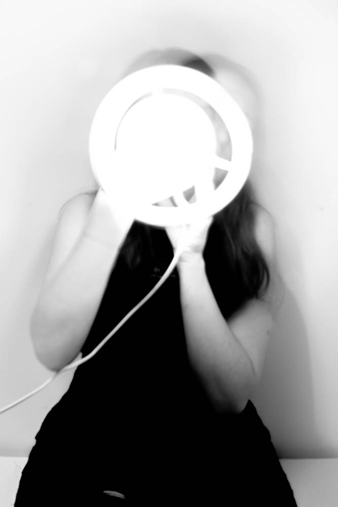
Lack of Identity 
Self Harm 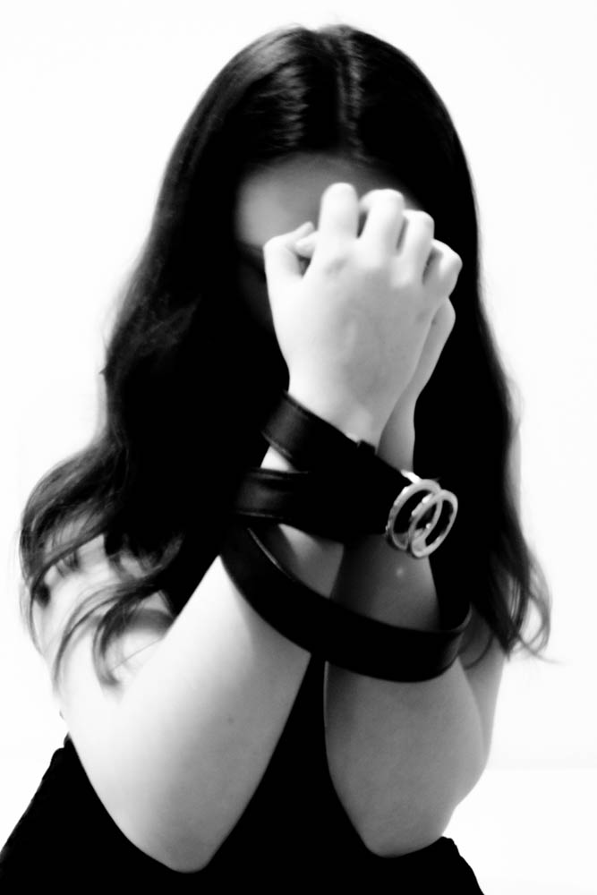
Trapped
All of my images are in black and white. This gives the book a dark aesthetic and compliments the overall theme of the images. There is also a harsh contrast between the two colours which often makes me look incredibly pale and unwell. This was intentional. When suffering from depression it can hard to find the motivation to even look after yourself properly. This includes showering and healthy eating which will contribute to depriving the body of what it needs to maintain what is known as ‘a healthy glow.’
Thirdly, I believe that my images clearly show that I was inspired by Francesca Woodman. Woodman’s images explored identity and are often linked with her suicide. One thing that makes her images so recognisable is her use of long exposure. This is something I also explored. Movement during a long exposure shot becomes blurred and can make the subject appear like a ghost. I did this in order to blur my features and empathise a feeling of invisibility.
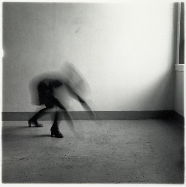
Francesca Woodman 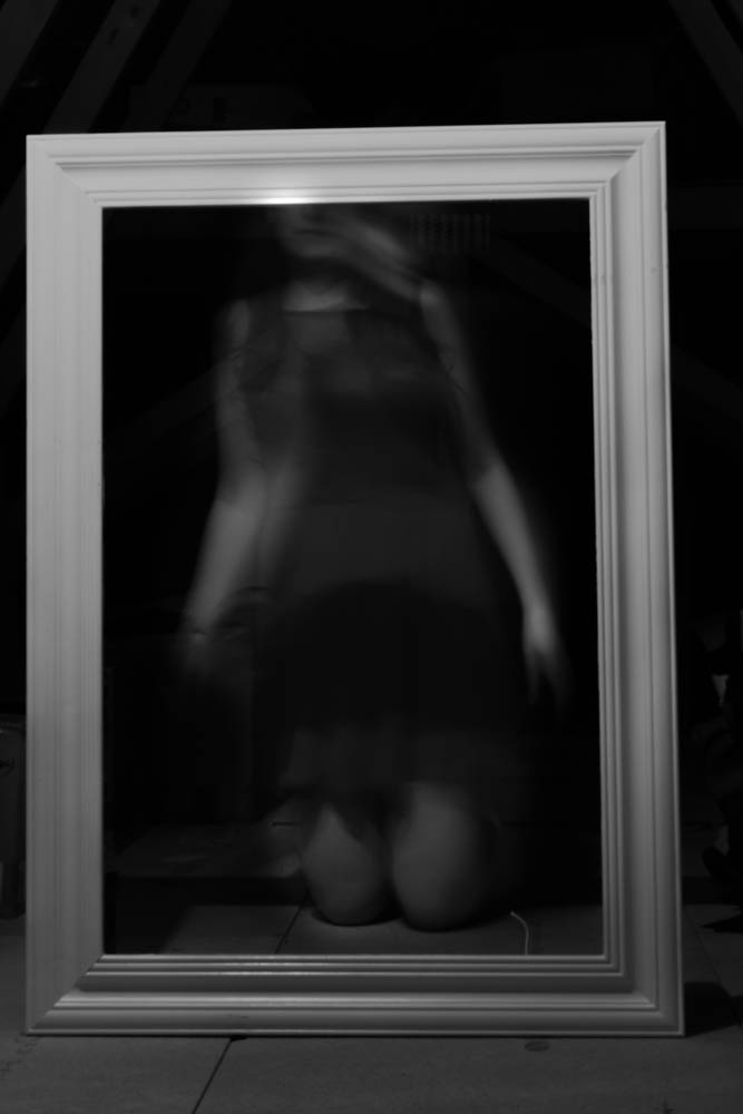
My response to Francesca Woodman
Finally, I chose to leave my book untitled. I started this project wanting to give people a better understanding of mental illness, but I was very aware that this is subjective as everyone experiences it slightly differently. However, the basic emotions felt are often the same. This is why I left the book without any text. I didn’t want to hinder the ability to relate to the images but changing their meaning with my own words.
Negatives/ How to improve:
My main criticism is on the length of the book. I feel as if it is too short. The book reads really quickly and I fear that it is too easy to flick through it and not take in the images properly. This is mostly my fault. Overall, I did not have enough images that showed enough variation from each other for them to be placed in the book without becoming repetitive. If I were to redo the project I would combat this by ensuring that I did as many shoots as possible.
Secondly, I would want to explore Mary Ellen Mark in more depth. I was intrigued by her work on Ward 81, but I never took the time to go over her other works. She hadn’t done any other projects that heavily related to mental illness so I didn’t think it was necessary to look at what else she’d done. I regret this as I found it hard to directly respond her and as a result there are only a few images inspired by Mark’s work in my book.
My response to Mary Ellen Mark
ESSAY – Final Text
How does the work of Darren Harvey-Regan explore abstraction as an intention and process?
“Something I’ve tried to cloud in the past by showing photographs alongside the exact objects they depict. While that considers the interplay around the translation of object to image – a photographic object being located at an intriguing point of overlap between the two –The Erratics does attempt to reach wider, bringing the flattening of that fourth dimension into the picture.” (Darren Harvey-Regan on Naomi Itami. 11.Dec.2016: ¶5)
This quote explores the idea that the medium of photography as a whole is an abstraction of times as it is able to capture that moment with no context of the prior nor future events, potentially meaning that abstraction is an unintentional reality for all works of photography. In my personal investigation I am looking to explore the concept of abstract photography, its application and the process of intentionally practicing abstraction. This work intrigues me as it is – at times – able to derive the basest elements of a complex three-dimensional form, resulting in a visually interesting product. The best works of abstraction are able to reduce a form to the point where there are no discernible three dimensional forms in the image similar to the works in The Erratics, the merging of three and two dimensional forms seamlessly through precise lighting and composition. I will be primarily exploring the works of Darren Harvey-Regan in The Erratics due to the use of shape and black & white photography to approach abstraction in a variety of forms of photography and lighting, revolving around a primary subject. Previously I have studied abstraction of forms using a large aperture and close up photography; I am now looking to practice abstraction via subject and lighting manipulation as opposed to camera/ editing tricks. I am looking to photograph the sea wall and establishing shots of the surrounds as well as forming sculpture from similar aggregates used in the sea wall in order to explore the forced labour used to construct the German defensive structures in Jersey. I will be shooting using a small aperture in order to capture the full detail in the image in conjunction with a tripod in order to allow the use of longer shutter speeds to capture any darker details. “If manipulation is the first thing someone thinks of in connection to photography, what does that say about the photograph as a reflection of reality?” (Bright, S. and Van Erp, H. 2019: 17) as such post-processing will be kept minimal and will mostly consist of contrast adjustments and/ or making the images black & white in particular cases as I want the image to closely resemble that of reality while not being immediately recognizable as an untouched image.
– Abstraction in Modernism –
This paragraph will be exploring the concept of abstraction in photography, relating to the modernist movement and its strong themes of abstraction. I will also briefly address the idea of abstraction time. The idea that photography is intrinsically an abstraction of time stems from the fact that photos capture a scene at a moment in time, quintessentially removing itself from the fourth dimension “bringing the flattening of that fourth dimension into the picture.” (Itami, N. 11.Dec.2016: ¶5). Since abstraction can be defined as the consideration of something separate from its attributes or associations, all photography has an element of abstraction as time is an intrinsic property of the scene however the scene is removed from time in a photograph. Abstract photography began amassing popularity approaching the 1920s, this was spurred on by the works of those such as Christian Schad and Man Ray and was preceded by several years by what many consider the birth of modernist photography. Modernism in design and art had already began in the late 19th century however photography picked up modernism in the 1910s. The term ‘abstract photography’ is incredibly ambiguous however from the definition of abstraction it can at least be inferred that a defining property of abstract artwork is the detachment from different attributes or associations. This definition can be interpreted in numerous ways; many of the early abstract photographers used this to explore taboo socio-political matters including that of the gradual absolution of gender roles within the modern world or tackling issues of racism and segregation prevalent at the time. Abstraction can however also be tackled in a more visual sense via the removal of dimensions to create visually interesting compositions, most commonly the removal of the third dimension in order to explore textural work or the interaction of different tones and colours together. Many of the early abstract photographers explored the possibility of creating photography without the use of a camera. This would be done by placing objects directly onto photosensitive paper, essentially removing the third dimension as only the surface in contact with the photosensitive paper would transfer onto it resulting in a flat composition with only texture, shape tone and colour. This relates to the ideas of modernist photography as works prior to the movement were to comply with the confines of traditional art in order to have a chance at being considered as art, this movement however served to defy these confines thus helping bring photography into an artistic medium of its own and not simply an imitation of traditional paintings.
– Darren Harvey-Regan –
“The photography of British artist Darren Harvey-Regan (b.1974) embraces the convergence of genres: abstract, landscape and still life. Darren’s photographs are not saturated with objects. He defines his focus towards particular sculptural forms and geometrical shapes, often looking towards nature’s own lines and curves – in order to create pure abstract worlds with mixed dimensions and clean contours.” (Savitskaya, A. 15.May.2015: ¶1).
This quote defines the aspects of Darren Harvey -Regan’s photography I am looking to explore. His work on The Erratics perfectly exemplifies this quote. The Erratics is a collection of work comprised of sculptures, photography as well as a book created by Darren Harvey-Regan. The word ‘erratic’ referring to “a rock that has been transported by a glacier to somewhere far from its native environment.” (Graham, T. 11.May.2017: ¶1). The body of work is focused of rock formations and sculpted chalk with the subject of the photos alternating across pages between the found rocks (particularly the stones within the desert at the start of the book) where these monolithic structures are contrasted with the manmade chalk sculptures. The outdoor shots spanned from the white cliffs of Dover to eastern Egypt. The use of sliced chalk facilitates the contrast of the textured, natural surface of the stone as well as the smooth faces where it has been cut. This results in an interesting reaction from the subject with the lighting; the lighting appears to be a single source painstakingly placed at an angle at which the drop shadows from the subject aren’t harsh despite detailing a lot of the texture surface while creating flat lighting of the smooth surfaces of the chalk resulting in an abstraction of the three dimensional forms by creating these surfaces which appear flat in the three dimensional space. The flat subjects are aligned with the edges of the plinth upon which it is placed. The plinth itself is cuboidal thus complimenting the sharp cut faces of the sculpture. By aligning the sculptures in this manner, it creates the illusion that the images are composed of two or more separate exposures, combined in the post-production process. The creative choice to shoot in black and white allows the white levels of the sculptures, plinth and the background as well as hiding any colour differences in frame. The lack of colour also allows for better control over tone by allowing the colour levels to be adjusted (assuming the images where originally, digitally shot in colour) while having no bearing on the saturation nor vibrancy of the image. Contrast and detail are essential to creating impactful images of such subjects when shot in this manner. The images shot in the desert are considerably more chaotic due to the lack of control over lighting conditions thus much of the work feature harsher lighting with more interesting background conditions. This work displays the erosion of these rock formations over time, linking back to the idea of abstraction of time.
For my response to The Erratics I decided it would be fitting to my narrative to use pieces of concrete collected from various defensive sites that had been chipped off on account of decades of weathering; as a result, the indentations are filled with various sediments giving more colour depth than the concrete alone. Outward facing surfaces of the concrete are also visibly worn down, creating a variety of textures in each image.
My responses were shot using single point lighting (with negligible ambient lighting) in the studio, using a still life table. All photos were taken using 200 ISO, 55mm focal length, 1/50th second shutter and an aperture of f/ 5.6.
I decided not to use a plinth to hold the concrete and instead used an infinity screen. This allowed me to better explore texture as opposed to shape. In reflection, more ambient lighting (and potentially backlighting) would’ve been beneficial as it would minimize the drop shadow further abstracting the third dimension. The presence of the reflection doesn’t bother me as it still appears flat and doesn’t add to form in the manner of a drop shadow. In spite of these issues, the images still serve their purpose from a contextual standpoint as it gives a closer look to the workmanship of the slave labourers. I believe my responses do visually reflect the work of Harvey-Regan to an extent due to the similar level of contrast however my images do feature a brighter white level although this may be a result of Harvey-Regan’s work being scanned from prints.
– Donald Weber –
“Once the link between flatness and immediacy is severed a concern with the surface does not vanish. It is rather that the surface is refigured and consequently it becomes possible to reintroduce the surface, though now as open space without a single unified texture. Hence-forth the surface will have been freed from the necessity to be a single texture and thus will have been opened up such that not only can it bear the complexity of the art’s work, but it can represent itself as the field of that work” (Benjamin, A. 1996: p.42)
Immediacy is a philosophical concept with implications of an event or object destitute of any intervening medium. An exemplar of this being viewing an artwork and experiencing the scene as your own, unlike the sense of viewing a photograph or painting and instead experiencing the moment captured by the artist, Irregardless of the medium. This is a philosophical concept that primarily lends itself to realism in photography or ‘Trompe-l’œil’ painting. The quote above can be summarised as breaking the link between flat artwork and realism or representation, implying that art doesn’t have to represent the real world, and this applies to photography. This idea and its antithesis are explored throughout War Sand by both including Tableaux vivants images comprised of figurines and sand samples, re-enacting the Normandy landings while also photographing everyday scenes in a manner which abstracts form from the scene and by using spectroscopic imagery of various sand samples from the beaches of Normandy – known under the alias of micro-archaeology – providing an unusual perspective on an all too usual subject. This medium allows the highlighting of the remaining shrapnel across Normandy from the infamous D-Day landings; this metaphorically explores the long-lasting impact caused by WW2, still experienced today by people across the globe. Many of images in the given body of work are shot featuring overcast weather thus creating an abundance of ambient light resultantly lacking in drop shadows and minimising saturation subsequently maintaining a documentary approach while exploring abstraction of form. Many of the images are quite similar and can appear repetitive by design; this appears to be a conscious choice made by Donald Weber to maintain the clinical approach to this body of work, further emphasized by the inclusion of spectroscopic imagery towards the conclusion of book. These images are later contrasted by the Tableaux images which ironically are more familiar to the viewer than the images of the – so to speak – real subjects.
In response to Donald Weber, I have decided to stick to photographing solely landscape subjects as I found that the tableaux and spectroscopic imagery wouldn’t fit thematically nor aesthetically with my body of work.
My response shots were taken using natural lighting under overcast conditions to create soft drop shadows and diminished contrast and saturation. The photos were taken using a variety of camera settings according to the different lighting situations encountered as well as differing subjects. All photos however used an ISO tending towards 1600 and the shutter speed matched the inverse of the focal length in mm in allow adequate exposure without capturing motion blur – to a reasonable degree – and an aperture of f/ 5.6 to allow more light to reach the sensor.
I believe that my images quite closely resembled those of Weber in composition however due to my choice of lighting and editorial choices to keep the images muted they do not resemble his images tonally nor in saturation.
– Conclusion –
In conclusion I have found that abstraction is more than simply a genre and is however a powerful tool that can be used to explore a wide array of subject manner, ranging from simply exploring interesting visual compositions to peacefully protesting various socio-political taboos. The introduction of influence from the likes of Weber and Harvey-Regan have allowed me to develop my work in a manner that allowed me to better explore abstraction of visual elements. The studio shots allowed me to explore shape and lighting in a manner similar to that of Harvey-Regan while having an element of texture within the primary subject while introducing elements of my own artistic identity. While this did distract from the initial intention of the artist study, I believe this did help me to grow as both a photographer and an artist, while deepening my overall understanding of abstraction as a medium as there is no precise definition to abstraction in art, only loose guidelines and implications associated with the genre. My artist study of Weber was more faithful in a visual regard as I believed that his style of composition particularly fit my desired aesthetic. I did however take some artistic liberties when choosing both the timing and weather conditions for my shoots as well as the choices made in post-production as my work is more muted than Weber’s body of work. My study on Weber was an excellent opportunity to explore texture in photography as the lack of discernible three-dimensional forms left ample room to incorporate form without resulting in an image that looks overly cluttered.
Bibliography: Bright, S. and Van Erp, H. (2019). Photography Decoded. London: Ilex.
Itami, N. (11.Dec.2016). Darren Harvey-Regan/ The Erratics/ Interview. Berlin: Hatjecantz.
Graham, T. (19.May.2017). Snapshot: ‘The Erratics’ by Darren Harvey-Regan. London: Financial Times.
Savitskaya, A. (15.May.2015). I think we confuse photography and art by trying to harmonize all its possible contexts – interview with Darren Harvey-Regan. Belgium: ArtDependance.
Benjamin, A. (1996). What is Abstraction. London: ACADEMY EDITIONS.
ESSAY FINAL 2:
How does the work of Diana Markosian and Yoshikatsu Fujii explore childhood and family breakups?
“My family will never be all together again. But I feel without a doubt that there is proof inside each of us that we once lived together.” Yoshikatsu Fujii
In my essay I am going to investigate how Diana Markoisan and Yoshikatsu Fujii explore childhood and family breakups through the use straight photography. I be looking at both photographers and evaluate their most influential work that inspired me.
I will also be addressing how separation can have an impact on how we grow up and how we understand the concept of love. I will be situating their work within the development of Realism in documentary photography. Documentary photography is associated with storytelling and It Is an approach that I have placed In my book about my family. I shall begin by including single sized, passport images of my family members. This being mum, dad, me and my little brother. I will include images of when they first met, when they began their relationship and items and gifts, they gave to one another. Although the reasoning behind their divorce can’t be shared, I tried to incorporate images that are significant to me and can be used to show their happier times. I have found images from holidays and images of just me and my dad which I would also like to incorporate. I’m wanting to include him in the majority of it as although we may not be as close, I want him to still be a part of it.
Family and childhood images are important and are often recalled on later on in reaching adult life. I think for me, this project is simply going to close a chapter on something I have finally come to terms with. During their divorce I tried to isolate myself from both my parents. However, it got to the point where I was always in the middle of both. This is why a project on my parents is as important to me as it will bring back memories from parts of my childhood. Moving to Jersey from the island of Madeira and not speaking any English meant that I wouldn’t often ask to go and stay at friends’ houses instead I became more family orientated.
Realism and Documentary Photography
For me, the concept behind realism is for it to be real and exactly as it is being shown. Documentary photography is often used to show chronicle events and focuses on the environment that both associates with the subject and is significant in history. Exploring a theme like childhood and family is an exact category that their works fit into documentary photography.
Realism is an art movement that began in the 19th Century taking photography as its main inspiration. The whole aim was that artists could formulate these highly detailed paintings that was a replica of the image. Artists such as Ralph Goings, Chuck Close and Richard Estes attempted to produce what the camera could capture. Documentary photography and realism go hand in hand as one offers the reality and the other is telling the narrative. Doroetha Lange is an American female photographer that is known for one of the most recognizable images called “Migrant Mother.”
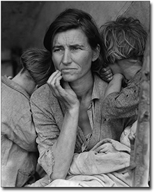
The image was made in 1936 while she was employed by the US government during the time of the Great Depression. When she went to California, she encountered this lady Florence Owenes and her children. She explained that the family of 3 were crop picking. Lange explained “I do not remember how I explained my presence or why the camera was there. I liked her approach and think all the images she has taken falling under this category are captivating and tell a story. Knowing about the reality of things but not being able to change it is the exact reason I wanted to document parts of my childhood and what I can access. The disheartening fact of reality is that when a snapshot is captured there is no way of re-photographing that exact moment again. This fit well with my theme and the photographers that I have chosen to explore. There are a lot of contrasting theories and views on Doroetha Langes ‘Migrant Mother.’ For example James Estrein a critic for the New York Times published an article called ‘Unraveling the mysteries of Dorothea Lange’s ‘Migrant mother.’ He explained that this image has been round for several years and has been used on t-shirts, postage stamps, post cards and many other things. The message behind this love between mother and child is an iconic image that has been represented since 10th century in religious painting and murals. The reasoning behind the image becoming so popular is due to the anonymity of this family, which realistically could have been many families suffering In America from the Great Depression. There have also been many questions raised in relation to gender, race and class. Lange has been referred to as the ‘mother’ of documentary photography, being one of the first woman to follow this tradition. It has been argued that her gender made her pictures, particularly of other woman, more compassionate. However, In 1978 Ms. Thompson wrote to the editor of Modesto bee newspaper explaining that she was the woman in the photo and that she felt exploited because she was never compensated for this photograph. The Image appeals to emotional empathy, a mother worried about her children. The Image also reflects a humanitarian notion of universal similarities in the condition of human kind. It can reflect a symbol of motherhood, poverty and survival. Ms. Thompson later explained “For others this might represent the depth of the Depression; and for others this might represent a suppressing of racial identity. Each of those interpretations is perfectly valid so long as we agree on the facts.”
Diana Markosian
Diana Markosian was born in 1989 and is an American and Russian artist of Armenian descent, working as a documentary photographer and writer. In 1996, she moved to California with her brother and her mum, whilst her dad remained in Russia. She had no contact with him until 23, when she found her father in Armenia after 15 years of being apart. She explores the relationships between memory and place and is mostly known for how well she tells the narrative through the use of photos. One of her most famous projects is the one I am focusing on called “Inventing my Father.” Her work embraces uncertainty as a tool to craft her narrative.
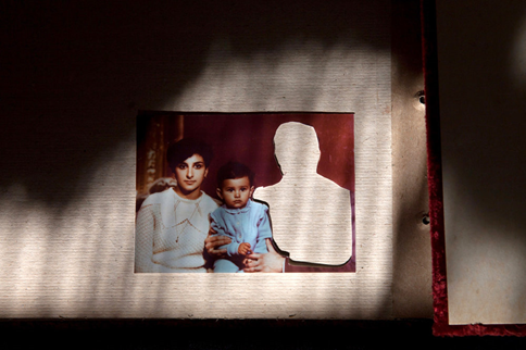
Contextual: This is the image Diana Markosian has used for her front cover of her “inventing my father” project. She explains that for most of her life her father was nothing but a cut out in most of her family albums. An empty hole as she has written herself and a simple reminder of how he wasn’t there. She explains that in one image they are dancing together in their tiny apartment and in another he is leaving. Her descriptions for her images are blunt and short which would be done initially to symbolise their relationship coming to an end. She tells the story that her father would disappear for a few months then return unexpectedly until one day in 1996. This day, they decided to leave him. Her mother woke her up and told her to pack her belongings and told her they were going on a trip. The next day they arrived at their new home in California. She also wrote “We never said goodbye to my father.”
For her mum her best solution in order to forget her husband was to cut him out of all the family albums, but for Diana it only made matters worse. She also explained she missed out on the feeling of having a father and sometimes wonders to this day what it would have been like having a relationship like that.
Visual: This image is taken with very low lighting. Immediately looking at the image without knowing any context behind it makes us as the viewers take a step back and think why has she done this? Markosian wasn’t the person to actually cut the whole in the image though. The darkening of the image and how the lighting sits on the subjects of the image make the image more mysterious and adds elements of curiosity. In the image we can see Markoisan, the baby, and her mother on the left and the missing figure that has been cut out is from just reading the title of her project is her father. It looks like it’s been taken from a family album but also looks relatively old.
Technical:
Her images have a rather warm yellow and reddish undertones. I think she has done this purposely to create that mysterious yet inviting element to her images. It looks like she has used normal day lighting coming through maybe a kitchen window or something. Her focal point in the image is herself, her mother and father. Although when you first look at the image the first thing you notice is the cut-out figure which just from the title of her project “inventing my father” we can infer that it’s going to be him. The image is also a bit under exposed due to the lighting in which it was captured in.
Conceptual:
The meaning behind cutting the image as previously discussed was due to her mother not being able to cope with his abandonment. She told Markoisan that in order for her to deal with him leaving was to cut him out of everything that associated them together. I think her decision to photograph these and make a project about her father was almost to gain the closure she has always wanted. In order to help her mum officially close this chapter she needed to see what she had before as a reminder that most things happen for a reason and maybe this could have been a blessing in disguise. For me she maintained this idea that she will always care for her father despite their problems growing up.
These are a couple examples from her photobook:
It took me fifteen years to be here, sitting across my father in his home. I had forgotten so much about him- the shape of his face, the sound of his voice, the way he laughed.
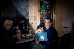
This is one of the only images of my father and I together. I saw it for the first time when I was 23.
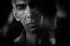
As a little girl, my father felt like a secret being kept from me. When I would ask my mother about him, she would tell me he was gone.
Yoshikatsu Fujii
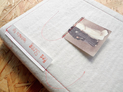
Yoshikatsu Fujii was born and raised in Hiroshima City. He began taking photos in Tokyo in 2006. Most of his work often deals with historical themes and memory lingering on in contemporary events. He created a project called “Red String.” Which was highly inspired by his parents’ divorce. This hand-made book has been nominated as one of the best photo books of 2014 by contributors to numerous publications including TIME magazine. This book which he decided to make hand-made has been bound together by the red string. This was important to him when making the book as the colour red in his community is known to symbolize unity. In Japan, legend has it that a man and a woman who have a predestined encounter have had each other’s little fingers tied together by an invisible red string since the time they were born. Not only is he bringing some of his cultural references he’s also making a project on something that will always be significant to him. Only 35 copies of this book were made which was also done purposely as his parents were married for 35 years.
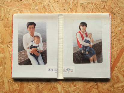
Contextual: He was born and grew up in Japan. For places like that in the world family will always be a priority and Japanese are known for being massively family orientated. Too come out and decide they wanted to divorce after 35 years of being married was more of a shock to those who knew them than to themselves. Fujii explained that at the time of their divorce he didn’t feel any particular emotion apart from thinking that the time had come. He was anxious he might not be able to see them anymore and how many days he would be able to see them considering the distance to get to them. He explained that “my family will probably never be all together again. But I feel without a doubt that there is proof inside of each of us that we once lived together. To ensure that the red string that ties my family together does not come undone, I want to reel it in and tie it tight.”
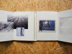
Visual: I like the layout of these image and I think he has really thought out his process when designing his layout. The photo looks like it had been taken on the same day due to what the baby is wearing in the picture. It looks like they’re on the same wall as well. On the left the photobook is dedicated to his father and on the right his mother. I like the spacing around the image and how he has defied what a normal photobook would look like and chose to create the middle as a starting point. Right from this page we can already tell that it is going to be about his family, because of the way their holding the baby and doing some research on the red string and the reasoning behind that.
Technical: The lighting he has used to obtain these images was natural day light. I can tell this from the quality of the image and how you can see fine details. The images used are archival and looking like they’ve been glued down and others stitched together. When opening the book these are the first images we are presented with. The images look like they’re on the right exposure setting due to the clearance on the picture. Its sharp, focused and the focal point for the image is directly in the middle as the images look like they should join up but don’t.
Some more examples of Yoshikatsu Fujii’s work from Red String:

My Project


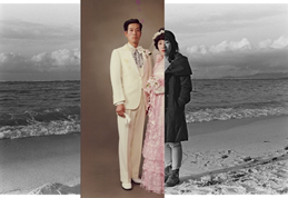
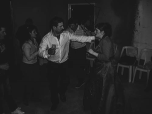
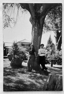
These are a few of the images I am going to incorporate into my photobook. The image on the left was one of their first images taken together when my mum moved to Jersey just sometime after my dad.
I feel like these image capture the idea of family and all being united. I am also going to include photos of my brother too as he was also an addition to our family in early 2009.
I have taken some of my inspiration from both photographers. The example on the top right is inspiration from Diana Markosian and her example in which she cut out her dads’ figure. The images from the past are now the only images in which I can keep from the time of my parents being together. Reflecting and keeping these images close to me allows me to understand that things happen for a reason, not only that but also help me come to terms with their decision. Being 12 around the time the problems started was fairly young and a lot to handle, but now being 18 and producing a project like this has allowed me to view things differently. At the end of it all I wanted what was best for both of my parents, despite their continuous effort to stay together it just wasn’t meant to be. All the images I have chosen to use in my photobook are significant and have a connection to either the divorce or how I coped with it. I have included pictures of my little brother who is 10 years old now but was only 3 or so when all of this was happening. Due to their divorce, me and him became a lot closer and I started looking after him more and helping my mum a lot more. Having my brother so close to me during their separation helped me cope with it a lot more because I knew I wasn’t alone. To this day, years after their divorce I would still say me, and my brother are still close if not closer because of this. My parents’ divorce allowed me to create a bond with my brother that I would have never expected ever, despite the 7-year age gap. In my book I have also incorporated images of my childhood, these images are some of me and my brother when we we’re younger and I have even found some images of our house in Madeira. As I was born there and as it was there that it all started, I have chosen to use a photograph of our house and some images of the interior. The house is significant in my parents’ marriage as that is where it all begun, and it is where I associate with the times of them being together.
Conclusion
To conclude, I believe Diana Markosian and Yoshikatsu Fujii explore the theme of childhood and family, through photographing archival images and comparing and editing them in order to resemble that hidden message of absence. Each photographer has had similar situations that have somewhat led to abandonment. Although to some extent they can still communicate. This linked well with my personal study and my chosen topic which was separation and divorce. They both kept series of images that they’d collected and gathered throughout the years of their families and of themselves.
Similarly, to my project I also chose to do this. Their work inspired me to do something that affected me as a child and even at times whilst growing up. I’ve chosen to maintain a greater focus on images of my parents together and as the time went on I created this blurry and distorted effect on some of the images. The narrative as a whole is pretty simple as I didn’t want to offend anyone or even have my book only focused on one parent. Obviously, the beginning of it all started around 2010 so I’ve collected some images that I had when we went on a family holiday. That was one of the only times we went all together therefore that trip and even that island will always have a special connection to me. I am in contact with both my mum and my dad but live with my mum at this current point. My mum is single and has been my main root of support for my own life. My dad now has another family therefore were not as close as we used to be. There are times where I think about it and get angry but part of me knows he’s happy. I think overall, the photographers convinced me that things like separation happen to lots of families, some at younger ages than others but that everything happens for a reason. The first image from Markosian is the image above for her project “Inventing my father” this is the story line I liked as each image from her project had a sentence or so explaining the image and why she’d put It there. It was simple yet short and I think this is the exact effect she was trying to portray to us as the viewers and maybe mirroring the relationship she had with her father. Having something so personal be told in such a creative way adds the element of excitement and makes the sadness of the topic sort of fade away. At times when looking over the images I did begin to get quite upset but I am glad I chose this as my topic as it made me research a bit deeper than what we can just see in the photos.
Bibliography:
- https://www.yoshikatsufujii.com/red-string-book
- https://courses.lumenlearning.com/boundless-arthistory/chapter/realism/
- http://www.dianamarkosian.com/projects
- https://www.lensculture.com/markosian
- https://time.com/3809867/fathers-day-inventing-my-father/
- https://www.lensculture.com/articles/yoshikatsu-fujii-red-string
- https://huxleyparlour.com/the-early-documentary-photography-of-dorothea-lange/
- https://www.nytimes.com/2018/11/28/lens/dorothea-lange-migrant-mother.html
Final Prints
Final Print Display
For my final print display, I wanted to use a ‘mounting’ technique to display all four images on one large spread. The images will be printed in A4. I think using the A4 size will allow for all the images to be seen clearly and for there to be no unintended blurring. I also think that having all the images the same size will add to the aesthetic of simplicity which was carried throughout my photo book. Pairing all the images together will be a good idea as the images are linked through style and have enough resemblance to be seen as a group. After experimenting with how the images should be positioned, I decided to go with having the two costume images opposite each other diagonally, with the trophy and ballet shoes diagonally the other direction. I think this will showcase the narrative clearly as the trophy positioned next to the silver costume goes together for a narrative, where as the ballet shoes and the blue costume are also related. This design is also not too complicated so still adds to the simplistic aesthetic. I personally like this selection as the images compliment each other and I enjoy the simplistic composition.
Carrying on, the images produced are on a black piece of card which will be cut out with boarders to show the images in a creative manner. This is called mounting and I think the design allows a successful display on my photographs, with the white boarders separating the images well.
Evaluation
To evaluate, I believe I have successfully selected some of my strongest imagery within my project and have creatively experimented with displaying my photographs within different methods. The display can be seen to be very simple, showing I have thought about any design as it matches my photographic book. I have shown the ability to display ‘like’ images together to compliment and create a strong narrative. I have therefore successfully displayed my photographs and am happy with my outcome.
Final Prints
My first final piece includes three A4 images from my photobook, two of trees and one of bloody hands. I turned them landscape and cut individual mounts into black card for the display. The black background worked better than white and added more contrast. I chose a colour photo to break up the dull feel but the blood also adds to the darkness. The repetiton of the tree acts like a preview to my book as it starts, ends and has a tree half way through it.

My second print is an A3 of one of my favourite images from the photobook. Similarly to my first display I created a window mount with black card as a background, which works well with my black and white theme. I wanted this image to be on it’s own as I felt it may have over powered my other photos as it’s very striking.

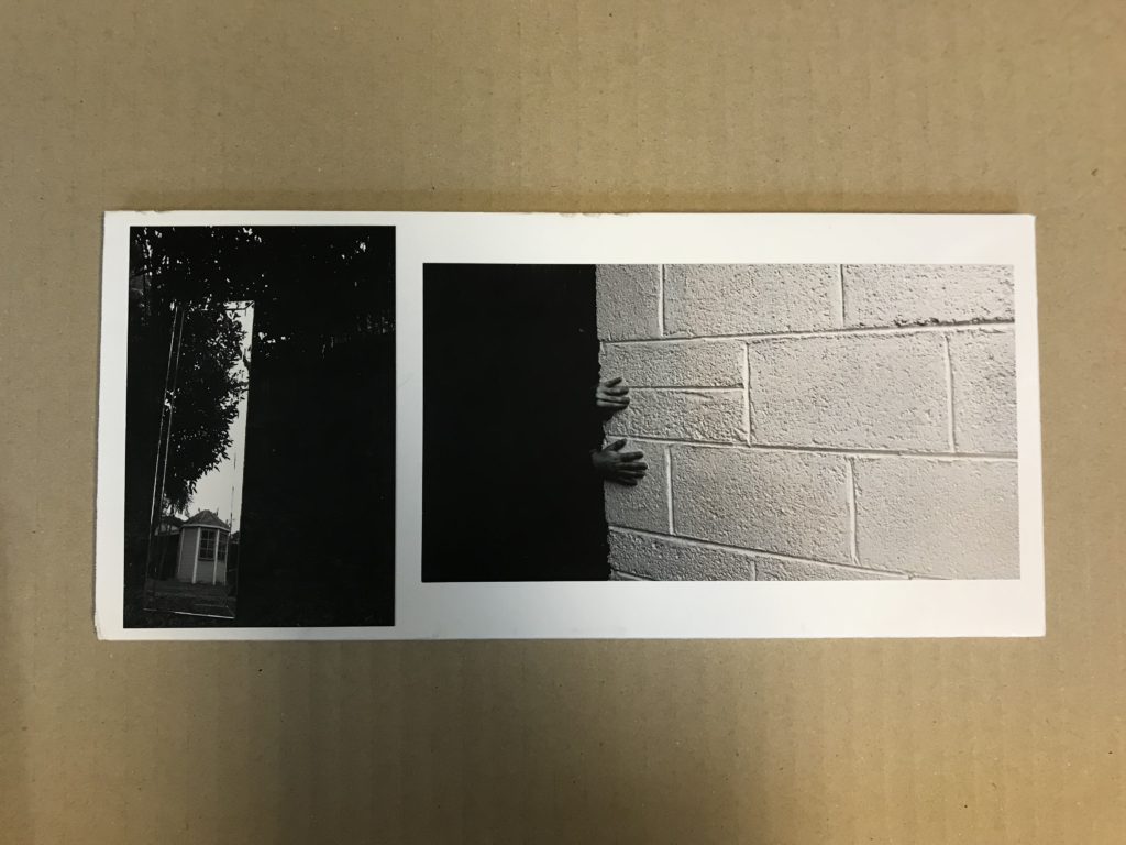
For my third piece I used two A5 images, one of a mirror in my garden and the other of my brothers hands on wall. I chose trimmed my images with strimmer to get rid of the white borders then sprayed them and placed them on a white foam border I had cut to size with a knife. I was planning on them being exactly A5 but because of cropping the mirror was smaller so I had to rearrange my inital idea.
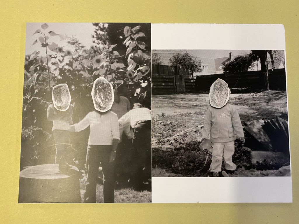
For my final piece I used two A5 images, both are archive prints with fingerprints stuck over the faces. After trimming them, I set them out to resemble the layout of a page in my photobook. I cut white foam board to fit the images and stuck them on as seen below.
FINAL ESSAY
HOW DOES GJON MILI REFLECT DANCE MOVEMENT AND THE SIGNIFICANCE OF EMOTIONS BEING PORTRAYED THROUGH HIS PHOTOGRAPHY?
‘Questions of self and identity have long concerned artists and are intensified as digital lives become ubiquitous and an aspect of performance becomes the norm in terms of modes of behaviour’ (Bright and Van Evp, 2019; 150).
In our lives we portray and represent ourselves among many others and highlight our passions and significant features that make us who we are, enabling to show our individualism. The world we live in is somewhat being taken over by the performing arts genre and takes up a huge amount of social and contextual importance; portrayed to our society that individuals who shine over others are one in a million, that making it to the top is a one in a billion chance, so why do people even bother trying? The dance industry is something I have always had a drive to be a part of and I believe is an area that helps me identify myself and show to others my deeper emotions and feelings that may not always be depicted through speech; along with hundreds and thousands of other people around the world that use dance to do so. To use dance and movement to tell a story, to show a feeling, to show a concept, an idea. However, the idea that dance is just a ‘performance’ or a show rather than an expression, a place to hide away rather than to flourish, a secret rather than a narrative is a consistent debate that continues to divide critics and our society. This demonstrates that within a dancer there is a front, a side that they want to show the world, the side where they put themselves forward, contrasting with their hidden deeper meanings and insecurities that they hide away from the audience when they perform. Therefore ‘The question arises: if manipulation is the first thing someone thinks of in connection to photography, what does that say about the value of photography as a reflection of reality?’ (Bright and Van Evp, 2019; 17). This quotation is something I will keep in mind during my investigation; a reminder that I want the reality, the truth not a manipulation or a cover up to hide but the certainty of reality. For my personal study I will be investigating the idea of representing emotions that an individual may feel through dance, however I want to diverge away from the norm and look at more uncomfortable subjects rather than the stereotypical face of dance. In my photography, I want to show both sides of individuals in the dance community, I want to show the hard work that goes into it, to show the love, the relief and the drive. I want my images to represent a narrative to its viewers, for them to see my images and ask more questions but most importantly I want to use my photography to highlight each emotion that someone feels when they dance and why they feel certain way; to exit the norm of dance photography and enter a new realm of ideas that reflect more than just a pointed toe, I want to show the vehemence of a dancers response to how they truly see themselves and the industry.
When taking a closer look at my photography work it is clear to see it has connections with realism, and a documentary point of view. There is a narrative. However, it is vital to consider that realism was a rejection from the pictorialism which was a movement from the 1860s through to early 20th Century. Pictorialism is the development of photography into the reinvention of an art form placing beauty, tonality, and composition above creating an accurate visual record. This was where photography finally began to be fully accepted and began to be seen on the same line of painting and start to have it recognised as such by galleries and other artistic institutions. In the early beginnings of photography, it was mainly for scientific and representational purposes. This soon shifted in the 1850s when advocates such as the English painter William John Newton who suggested that photography could also have artistic trait.
In this case, I am looking at the genre of dance. We know that photography can create a more realistic point of view of real experiences. But, as can be seen with Cindy Sherman who exploits various tools of the everyday cinema such as costumes, makeup, stage scenery to uphold an illusion of ‘realism’ when capturing what is known as ‘iconic snapshots’ that can reflect significant pre-conceptions. Tableau and staged reality create an illusion that is fed by stereotypes, and this is something that I want to keep away from with my own work.
Cindy Sherman quoted ‘The still tease with the promise of a story the viewer of it itches to be told’ (Sherman. C, 1982, Cindy Sherman) this quote itself demonstrates the sheer point of my work and why I have decided focus on this particular area.
A prime example of how this helps relate and boost the background work of my own photography can be out laid to one of her most famous self-portrait images from her series called ‘Disasters and Fairy Tales’ (1985) photo shows Sherman as a damsel in distress. Crouched on the ground, she fearfully looks away from the camera. With wetted hair and a tensed position, she appears as if she just walked off the set of a horror film. The clever and thought out use of the specific lighting helps shows how Sherman favourably evokes an old tradition, quasi-racist ‘’cheap tricks’’ represented in the movie industry. By using this particular freeze frame, it is demonstrating how Sherman portrays as a visual ‘truth serum’, a force of social change by way of its ability to stop a viewer in his/her tracks and suggests how certain assumptions are culturally inherited and therefore not necessarily ‘natural’ and cause a fake front hiding the true and deeper meaning of the ‘fairy tales’. This overall, highlights the significance of representing the correct forum of the genre of dance in favour of the realistic view contrasting with the covered-up front provided by the media. Sherman’ postmodernist approach questions gender roles and stereotypes, common in mainstream media, cinema and the performance industry. The femme fatale has come full circle now in the age of the #metoo movement.

After looking more closely and in depth into the background of my initial idea for my investigation it is essential to continue looking back at my questions and statement of intent that helps guide the study and overall investigation of my projected.
Born on November 28th, 1904 and passing away February 14th, 1984, Gjon Mili is a extensively influential photographer that was a flourishing influencer to the type of photography he produced, known for using stroboscopic instruments to help capture a sequence of actions in one photograph. Furthermore, his life dedicated to photography allowed him to be one of the first to tamper with electronic flash and stroboscopic light to create images that had a more scientific background to the creation. Many of his notable images revealed the beautiful intricacy and graceful flow of movement too rapid or complex for the naked eye to discern. Gjon Mili’s highlight of his career that aided his popularity and well-deserved credit was his work published by Life, in which he photographed artists such as world-renowned painter Pablo Picasso. Mili was a photographer I wanted to use to investigate for my study and potentially be my inspiration for my images that I produced, due his simplistic approach creating such astonishing outcomes, as well as this factor he has done a lot of photography were he has captured dancers specific movements; instead of just the specific movement he presented the steps towards and after that certain movement. Mili once said ‘Time could be truly be made to stand still. Texture could be retained despite sudden violent movement.’ To me this clearly demonstrate his approach to photography the concept of time and movement being projected in his images.
Here is one of my favourite images that he has produced using stroboscopic technique to allows each movement made to be capture and represented; this image is a multiple exposure of Alicia Alonsa (vintage sliver gelatin print). From this image, it is clear there is a deep technical consideration to be made and highlighted; firstly, there is a strong artificial lighting being produced from the left of the image and illuminating the dancer’s main features in each particular movement to be captured. In addition, the positioning of the camera is pretty much straight on which gives the illusion of being on par with the flooring which helps the ballet shoes on the dancer have a significant standout feature which additionally aids the point of the image; the image has high intensity with a strong detailed focus on each aspect of the dancer in each position.
Overall from the texture of the images it suggests a low light sensitivity due to the lack of graininess being shown in the photograph, as well as the colouring of the image which are warmer forms of black and white shades producing a more emotional point of view of the image being transformed though each aspect of each position of the dance move being captured. On the other hand, you have visual aspect of the photograph to consider as previously mentioned though the use of the black and white shades used in the image, it aids the feeling of a darker representation of the photograph to be exhibited; alongside the view of a 3D image due to the shadows of the dancers which help highlight this point. Evidently though the technique Mili used to create this image there is a visual aspect of repetition of the image, seen through the consistent repetition of the dance with a slightly different position as she moves through the whole movement. In terms of lines you have the strong lines being formed through the dancer herself through the specific positioning of her body and her gradual arm movement which creates a different point of view and overall positioning in each step and section made. Contextually the image is clearly showing the motion of a dancer, the dancer in the image is Alicia Alonsa who was Cuban prima ballerina assoluta and chorographer whose company became Ballet Nacional de Cuba in 1955; this additional information helps the point of the image and the actual emotion, the genuine passion that the dancer has for the movement, which is believed to be very well represented in the photograph by Mili through the specific positioning and layout of the ballerina dancer.
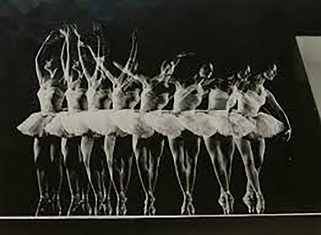
Overall this analysis and general research in to Gjon Mili helps to answer my questions on how photography is used to reflect dance movement and the significance of emotions being portrayed through his photography; Gjon does this through the technique of using stroboscopic instruments to allow each position of the overall movement of the dancer to be seen through the image therefore reflecting the dance movement, as well as using conceptual and contextual factors to help support the emotions that are being projected and represented by the image; Finally being supported by the clever throughout camera techniques which help the end concept.

Finally, after going into depth about Gjon Mili and getting a true understanding to how his work reflects dance movement and emotions, I began to investigate myself through planning and piecing together aspects of the investigation that I wanted to incorporate that would allow for the best possible outcome; whilst still considering work produced by Gjon and other relevant artists. For my own image I began by creating a plan and making a final decision in whether I would photograph myself in the form of self-portraits or take images of other people to project the feeling and emotions of myself through the use of others through myself. In the end I decided to use other dancers for my investigation. I used three other dancers and planned four to five shoots that would help tell a story and the final result that I wanted to have by the end of project; a shoot where I photographed their baby photos, one where it was in the photography studio, dance school studio, detail shot shoot and then photographing my dance school environment. When adding all these photoshoots together to help aid my story and emotion that I wanted to project through my images relating to dancing. After finishing up on my shoots it was essential to look back at Gjon Mili’s work and reflect on how I can relate it to my own, of course unfortunately I do not have access to stroboscopic instruments in order to create the movement of the image and capture the whole layout of the dance step. Furthermore I had to come up with a way that would enable me to give off a similar effect, for this, when in the studio I used the sports mode of the camera and got each dance to perform a pattern of movement for example, a high kick or a pirouette; this meant I got a photo of each different position that happens when carrying out these motions. Next I opened the images of each dancer’s movement which consisted of about 7 images per movement in Adobe Photoshop. Firstly, I edited each image to a certain standard in this case black and white with emphasis on the costumes so it would stand out when photographed were over laid. After the images were over laid, I adjusted the opacity which would enable all the images to become slightly faded so they would become transparent; therefore, be able to see the process of the movement of doing a high kick, from start to end. This is somewhat a representation of Mili’s work as it creates the same forum when answer my question as the image represents the dance movement as long side emotional aspects presented through the colour and editing of the image; which helps tell a story when placed with other photographs that may aid this point. Overall, I am extremely happy with my final outcome and response to Gjon Mili’s work due to the technical and visual aspects that have been produced. On the other hand, it is key to consider that there are defiantly different conceptual and contextual differences between my own work and Gjon; in terms of the dance movement and emotions being projected.
In conclusion, there is over whelming evidence to suggest my investigation had guided me to answering my initial question ‘how does Gjon Mili reflect dance movement and the significance of emotions being portrayed through his photography?’ I believed this to be presented through the specific camera setting and illusions created in order to give the effects of literally showing each movement through each position being captured, this is a more visual front and approach to the question. On the other hand, when looking at the emotional reflection of dance movement being portrayed in the images; for this projection I think that the temperature of the image aids this point as well as the actual face expression being reflected through. Overall, highlighting the final argument that clearly shows how Gjon Mili Mili reflect dance movement and the significance of emotions being portrayed through his photography.
Bibliography
https://www.theartstory.org/artist/sherman-cindy/#key_ideas_header
https://www.artsy.net/artist/gjon-mili https://www.britannica.com/biography/Alicia-Alonso
PHOTOSHOOT 5:
Photoshoot 5: Dance studio interior and exterior design
For my final shoot I decided to look at more environmental aspects of dancing, in this case photographing the studio its self and important aspect that make up the area of the studio. I felt that I have fully understood each individuals dancing experience through the different concepts that I have photographed. Furthermore, the next step of developing my ideas about my subjects dance experience was the actual location where they dance; where the ultimately spend the majority of their time. As I am a dancer myself after and during my own lessons I photographed the studio itself, where we get ready, where the dancer sit and communicate, and where we get our drinks and snack from. This is a very important part of the project as it aid the emotional and contextual aspects of the project overall. Like my other shoot I open the images up on Light room so I could see them all and select the best photographs that would go best with my photo book.

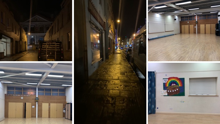
After selecting my best images I began editing them to create an even deeper meaning and aiding to the overall narrative of my photo book.
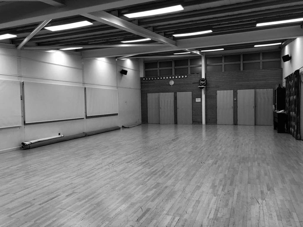


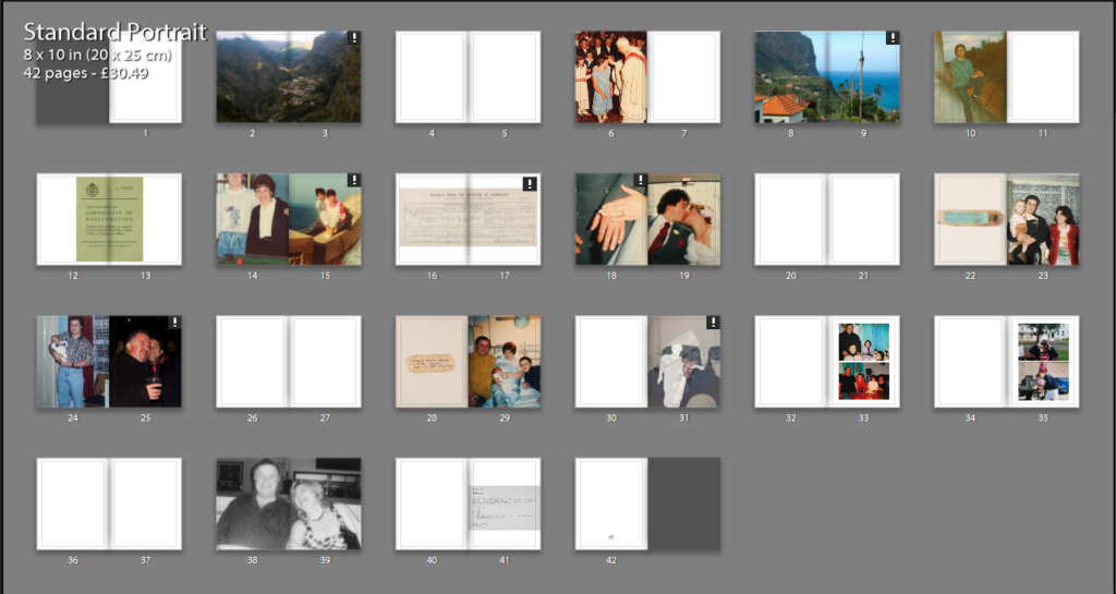
Photo book design process
To create my photo book I will be using this blog post as a guide: https://hautlieucreative.co.uk/photo20al/2020/01/17/archival-images-establishing-a-timeline-narrative/
I will most likely begin my ordering my most effective archival images in chronological order beginning from when my parents were teenagers, to showing them meeting, through to marriage, having children and eventually separation. I may also include some montages I created in this too, if I feel it fits in with the rest of the selection to make the book flow easily.


2nd Layout:
3rd layout:
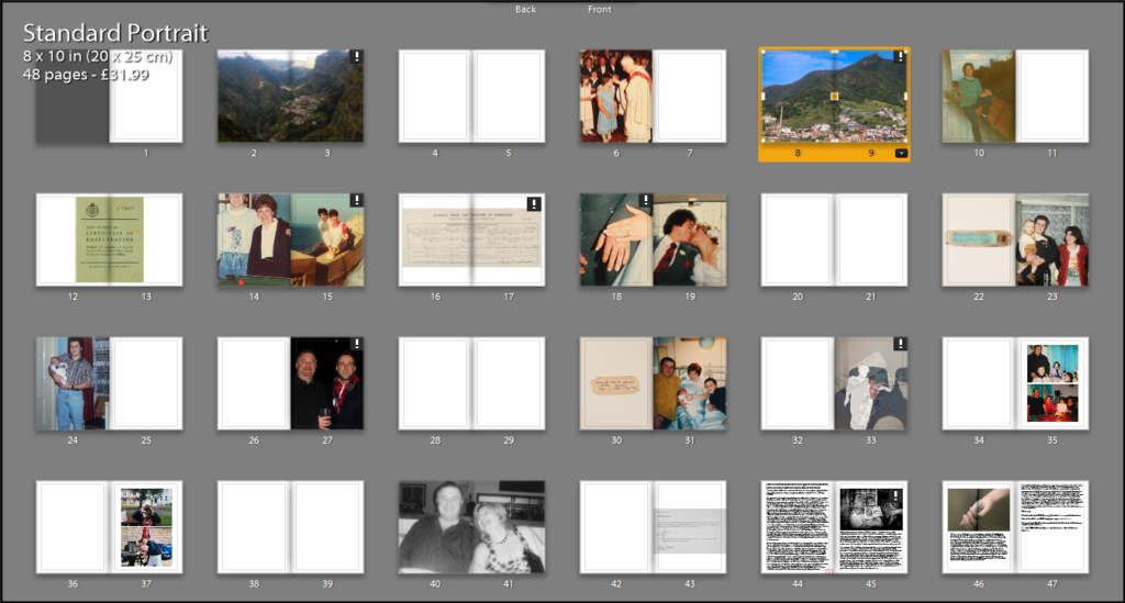

4th layout:

5th layout:

6th layout:

current Final layout:

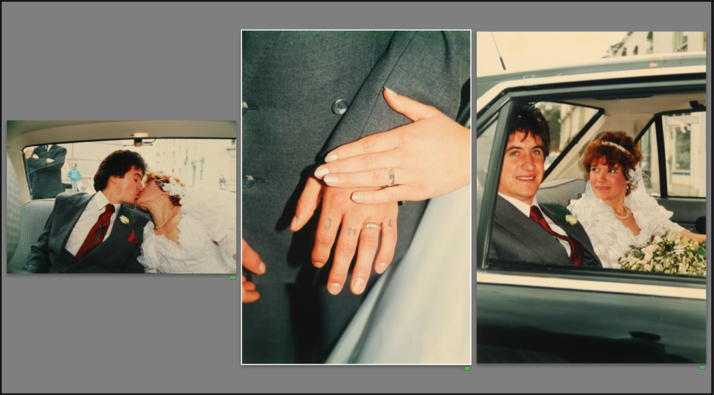

The layout above is my current final layout. I plan on adding some quotes on some of the blank pages to add more context to images. I will also edit the image on 38-39 to further convey their separation.
Front/back cover:

