MY BOOK SPECIFICATION

Book Specification

My book is about the genre of dance and the reflection of dance through movement anticipated against emotions that each individual dancer may feel. For my book I will be using three other very different individual dancer to project my work through them, due to the connection they have created using dance. The idea of representing identity through photography techniques and specific, controlled investigation that will allows this stance to be projected. In the book I want to tell a story of each dancer working their way through each of their own stories from a child, to the dance studio, to general life and how danced is incorporated to all these aspects of their own lives. Throughout the book it is essential from me to remember my own experiences and almost place my own ideas of the controlled photographs which will allow for an even stronger demonstration of my main point.

Mood board of possible layout ideas

Narrative: 

3 words that I would use to help describe my photo book

  • identity
  • reflection
  • movement

A sentence that would help describe my photo book- The reflection of emotional responses of individuals in terms of the genre of dance through the representation of movement.

Design: 

  • How you want your book to look and feel

I want my to have a more simplistic feeling to it to help focus the concentration of the viewer on each individual images, and each individual story. Being a dancer myself and understanding that there is so much more than just what is being presented in the media; the idea of the hard work that goes into the genre and performance, this is what I want to present and what I want the viewer to feel is the true background process of being a dancer and the hidden secrets of the dedication and hard work that goes into being part of the industry.

  • Paper and ink

Through the narrative of my photo book I decided to stick to the premium lustre which will create a more glossary appearance, when looking deeper it this decision it is possible to suggest that the representation of the glossier choice of paper could be a representation of the spot light of being in the performing arts industry.

  • Format, size and orientation

For my book layout it will be 7 x 7 small square book (18cm x 18cm) , due to the sizes of my images I believe this to be the best possible fit for my images and layout of photographs aiding my narrative.

  • Title 

  • Structure and architecture

As previously mentioned I want to take a simplistic approach and understanding to my photo book, I want to do this in order to create the best possible narrative that the viewer will understand in the best possible way. Furthermore, this means that when I was deciding on the order of my images I grouped the images in collections that would go best together and then put these collection in a new order.

  • Design and layout

I will mainly be using singe page spreads to help tell my narrative; the idea that each page is a new stage of each individual dance career and experiences. In addition their will also be elements of two spread sheets to show a comparison and a contrast against images or an experiences, this help create different types of views for the viewer. As well as the single and double page spreads I will also be incorporating 3/4 spreads of images of the environmental factors opposed to the actual subject which helps highlight a difference in the overall narratives.

  • Editing and sequencing

The first selection of my images will be archive images from each subject that present them to when they were much younger which highlights the beginning of the journey. Furthermore, the next pages will carry on the story and experiences of dance. Contrasting with the last images which is the back of the studio almost presenting the end of the journey and a start of a new beginnings, as the individual finish school and go off to university.

  • Images and text

I will not be adding texts or extra information to each of my images as I don’t want to depict how the viewer interoperates the overall narrative of my book.

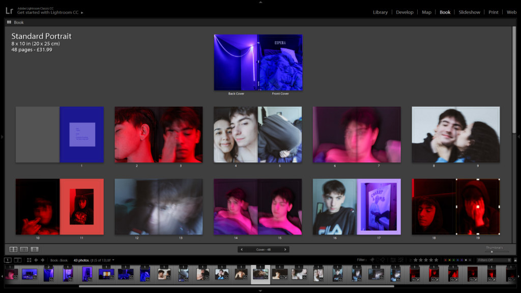
Layout of My PHOTO BOOK

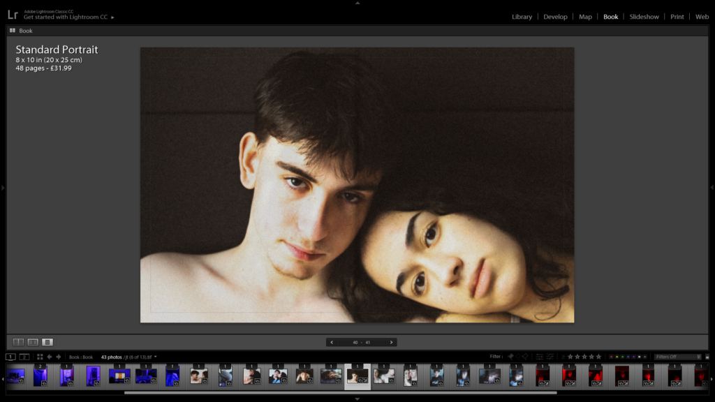
For my photo book, the main theme was intimacy and young love. I wanted to explore my relationship with my boyfriend and show a series of different styles of images. I called this photo book “Espera” which means to wait in Portuguese, as this word (besides love) is a word that both Jack and I use frequently.

I put the definition of wait at the beginning of my photo book to start the narrative of waiting and longing for something, and showing the connection I have to that word and its definition.

Additionally, I wanted keep the pattern of the colour scheme to be one normal coloured photo then a neon coloured photo. I think this worked well in my book as I had a purple, red and pink theme mixed with neutral toned images, which created a nice visual.

Throughout my photo book, you can see that I have tried to put a image of an object next to a portrait image in some of the pages. This gives the sequencing fluidity and shows the narrative of Jack’s living space, further showing his personality.

Here I couldn’t find images that fit with the sequencing so I tried to match the colour of the images background to the colour of the blank page.

Evaluation:

Finally, I am really pleased with how my photo book came out as I was able to showcase my idea and theme of intimacy and young love. I also think I was able to sequence it really well and you could see there was a narrative in my book. Moreover, I think the overall aesthetic of my book was really well done and looks visually appealing for the viewers of my book. I hope that I was able to show my relationship and put across the idea that it’s okay to express love for others and that intimacy is good. Additionally, the theme of occupation and liberation guided me and gave me inspiration for my book at the thought of being in a relationship can be really liberating and free. Overall, I think I was able to capture raw moments of intimacy and young love and showcase those ideas into my photo book.
Link to preview my book:

https://www.blurb.co.uk/bookstore/invited/8565044/66bc0744ecfad1db5ec8d9d401af9c438dff9837

PHOTO BOOK FINAL

This was my book final and this is the link below to the PDF version of the book.
The way I have designed it is in chronological order.

NARRATIVE AND SEQUENCING –

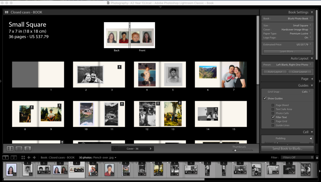
Starting right from the front cover I have chosen to use a picture of my whole family including me, my brother, mum and dad. I have also chosen to use this childlike scribble over each picture to show and underline that this book is about my childhood and will reflect that within the pictures. The book I have chosen to call ” Casos Encerrados” which actually translates too ‘closed cases” which is used to reflect their marriage. Then right from the beginning of the book I have used one of the oldest archival images of my parents. This was actually taken on the day of my christening so very early on to their marriage. As we move further into the book across this double page spread I have used 2 archival images of my parents as children. The left is my mum and on the right is my dad. These pictures show childhood and underline this feeling of innocence that each of individual had at that time. These images are important to me as it shows a beginning of two people who knew each other through mutual friends and family who eventually became like best friends.

My book also has some images of places and things that are significant. The image of the house is important and I felt like it had to be included because it was my parents first home in Madeira and it was actually constructed by my dad and a few of his mates. Despite not being able to find an image of the house being built I found this and decided to include 2 versions one in colour and the other in black and white. One of the images is upside down and I have chosen to do this to incorporate the idea that everything sort of went downhill from the moment my parents decided to get divorced. Although there are worse cases to me and my brother who is now 10 but was only 4/5 at the time it turned our lives upside with little to no time to adjust. I have then added images of my brother who was born when I was about 7 so I wanted to add images of him after a good few pages into the book.
Towards the last 6 pages of my photo book I have used photoshop to cut out myself o one of the image which I took inspiration from Diana Markoisan’s example from her project. Moving on I have another image of my parents with that pen overlay to create that sense of innocence from the time these images were taken. The rings I chose to photograph as they were a gift from my dad to my mother in the 17/18 years they were together. Then I have chosen to include one photo taken from my half brothers christening with my dads new girlfiend . Finally for the second last page I chose to crop one of the images I had used before and create that split in the middle of the page to incorporate their divorce followed by the image of the official papers with their agreements.

Project evaluation

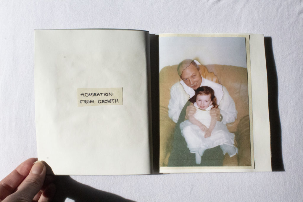
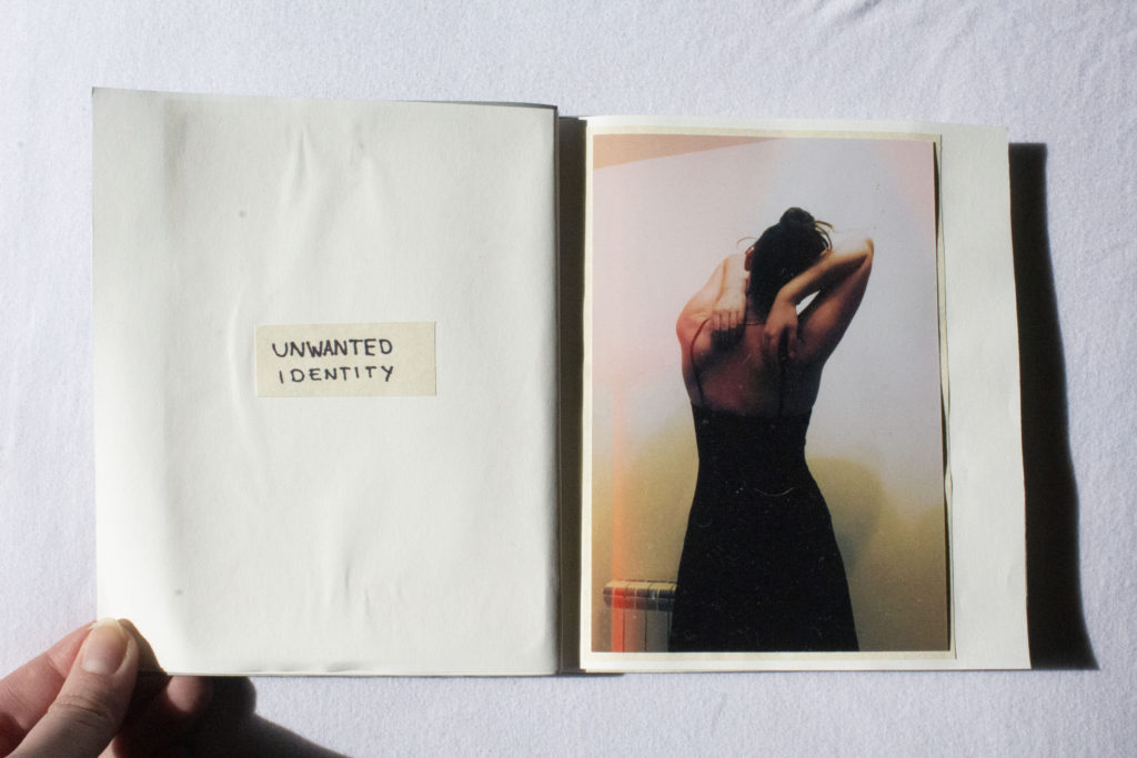
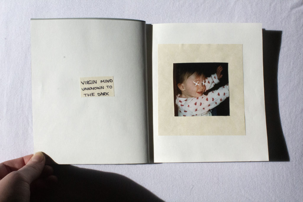
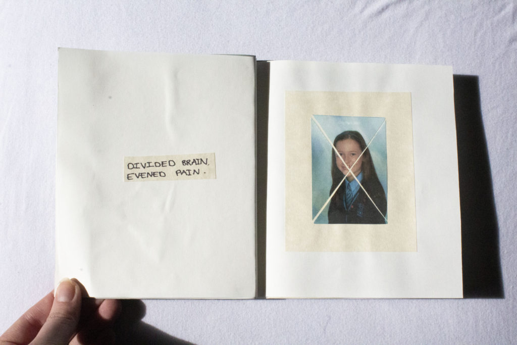
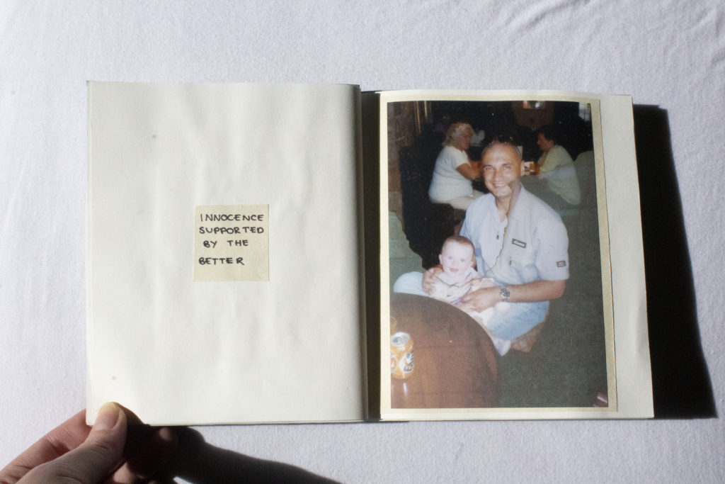
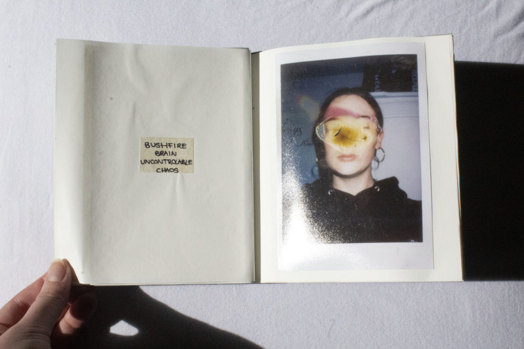
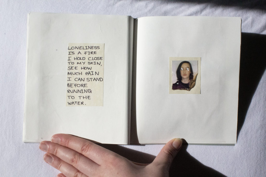
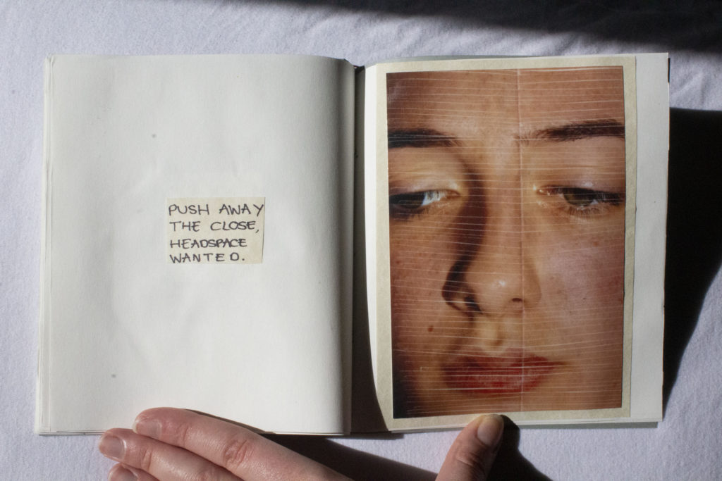
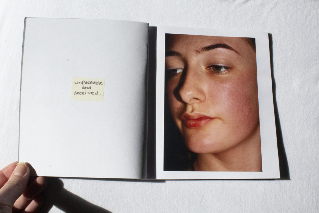
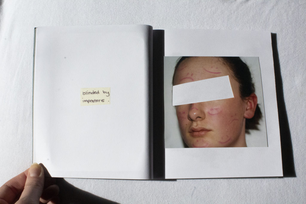
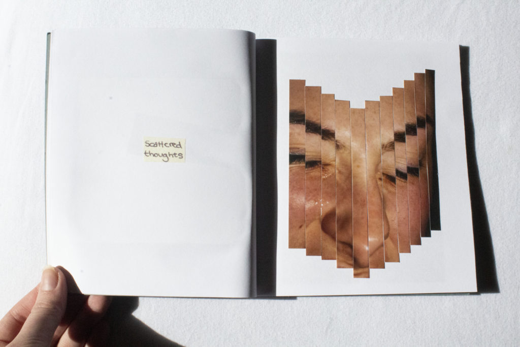
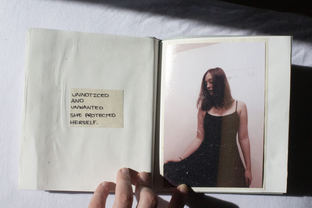
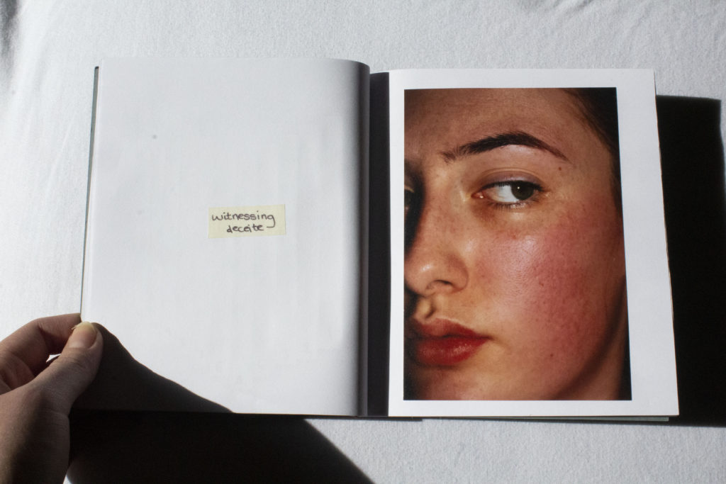
To conclude, this project has overall been successful in terms of recording and capturing the concepts which I brought into the project, focusing on self identity. Given the titles ‘Occupation Vs Liberation’ I had a large range of work I could explore, however I found the idea that suited best was the liberation of personal identity and the occupation of your own thoughts. Initially I wanted to focus on the destruction of self portraits that would reflect a physical emotion towards these pictures, but through experimentation and photoshoots I created images that reflected an identity. Through my responses to Francesca Woodman and Edward Honaker I was able to combine both response imagery together in which they completed each other and formed a narrative. The narrative being the unwanted identity I was given and how I view myself within those images. Within my final zines I utilised self portraits both archival and new so that it was reflected even as I grew, the sense of unease was consistent.

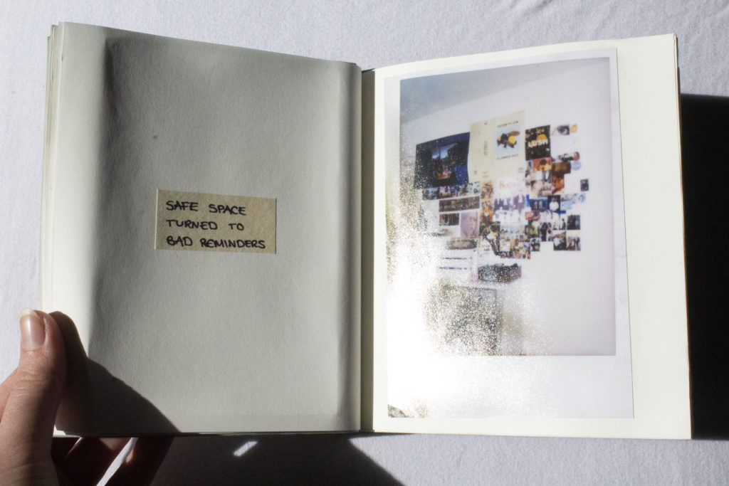
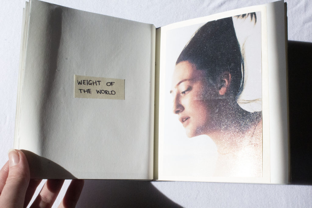
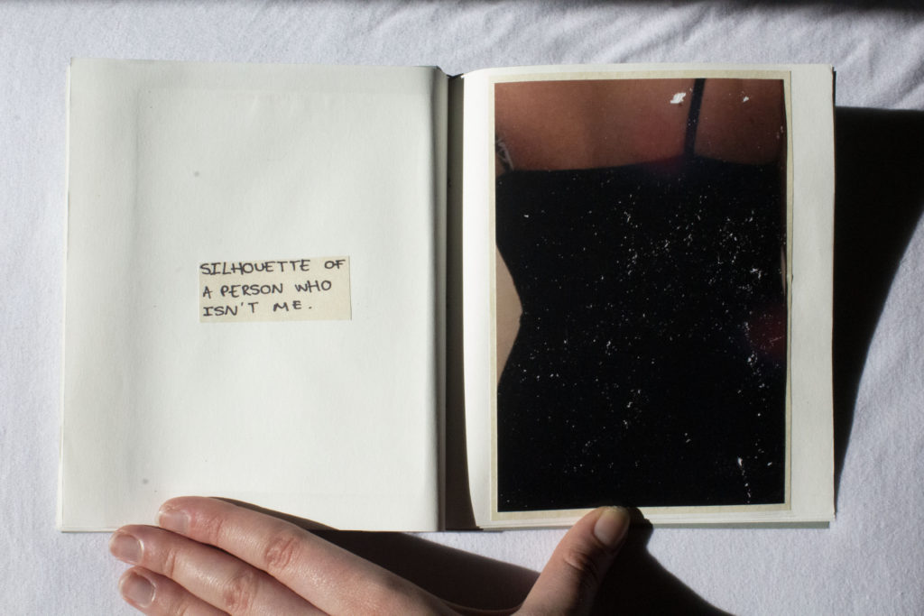
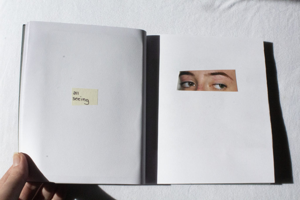
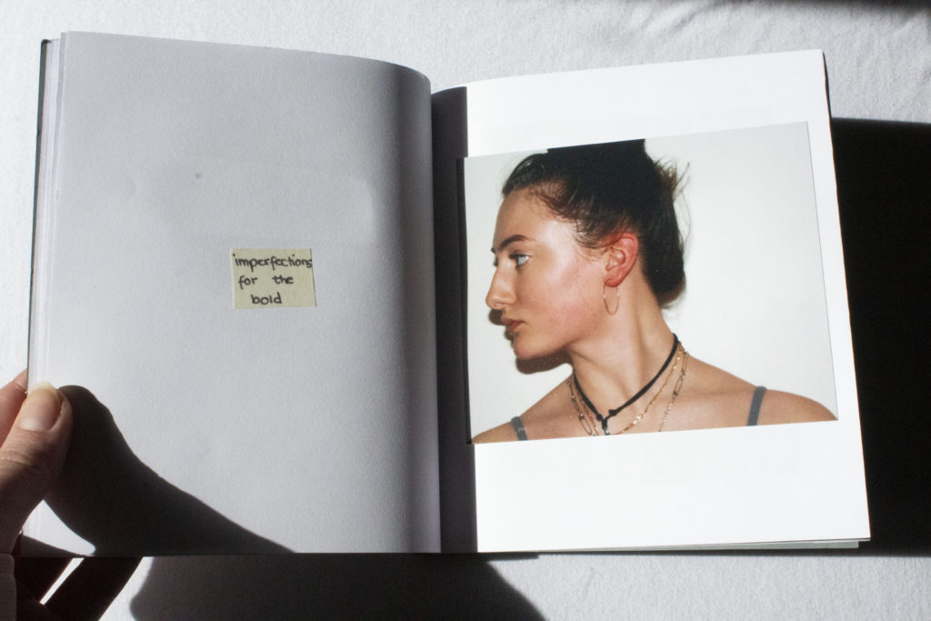
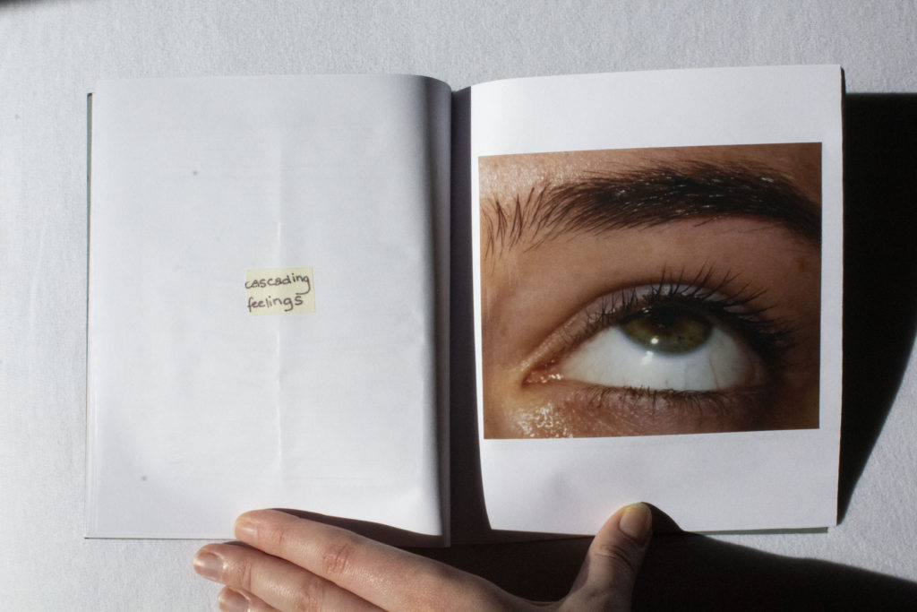
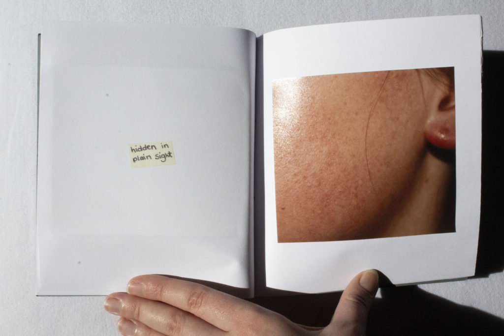
Overall, with the four photoshoots I conducted I was able to produce work that reflected a personal touches such as, if the image wasn’t physically manipulated it had it’s own individual characteristics due to the use of film photography. Taking my inspiration from Francesca Woodman meant creating authentic film self-portraits, however to make it my own I used coloured film because you can see imperfections and light leaks. To enhance my images, on the opposing page where the image was I wrote poems for each individual image in a such a way I was translating miscellaneous thoughts into poetry.

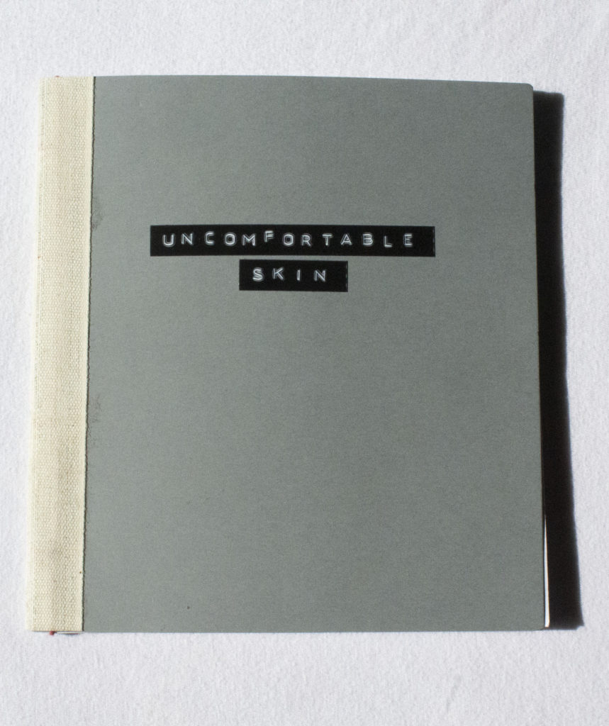
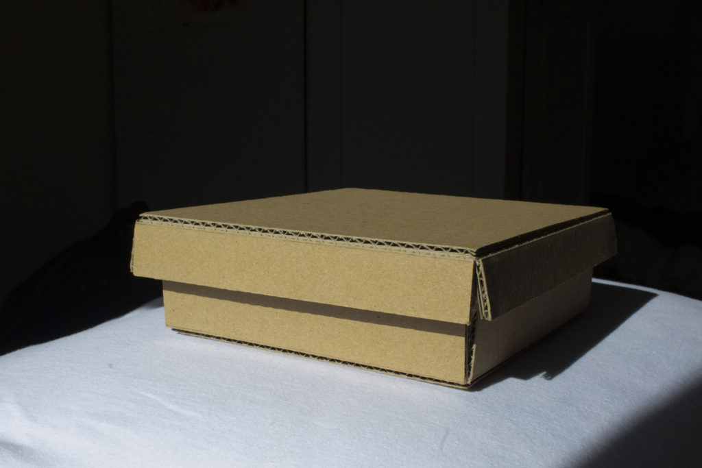
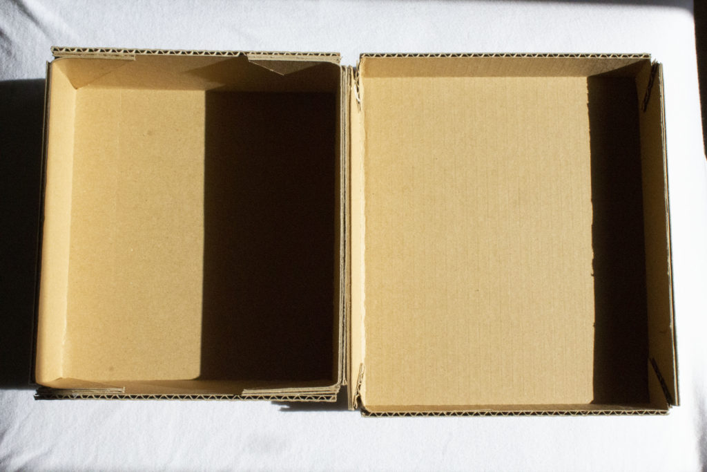
For my final pieces, I am very proud in how I managed to construct 2 photographic zines, a storage box for them and a mobile for my mounted and hung images. I wanted everything to be done by hand because it was a project about myself and I don’t think something made by a machine would convey the right message.

FINAL MOUNTS:

The way I found was best to display my images was through using the foam board and creating a story with it. I have included images of their home in Madeira which I haven’t visited in 7 years so it has a lot of significance being able to put it on their. Theres images of my parents as children and me and my brother when we were a bit younger and swell as some of the only images I could actually find of them together. Then I chose to use the images I edited with double exposure of my dad and put it more to the right top hand corner to create this idea of him being distant.

EVALUATION

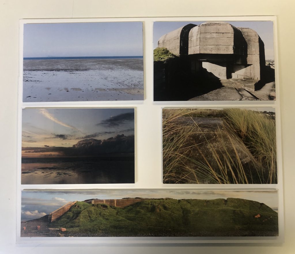
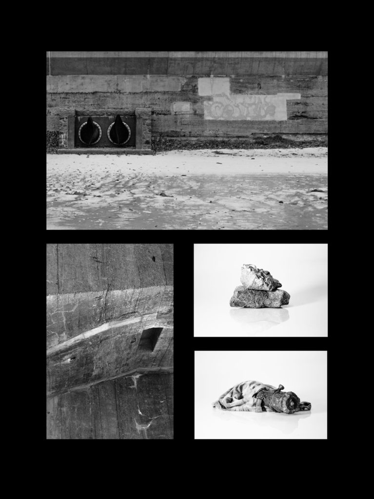
Overall, I believe my personal study on Occupation vs Liberation is a success. I believe my photoshoots and experiments with editing have yielded many strong images which I have included into my photobook. I believe my final prints represent a good variety of images included in my photobook. I believe my personal study essay fits quite well with certain aspects of my coursework project as it focuses on landscape manipulation and conservation. I have created responses to all of the photographers from my essay: manipulated landscapes from photoshoots 2 and 4 responding to Andreas Gursky, and objective angle photographs from photoshoots 2 and 3 responding to Hilla & Bernd Becher. In my future projects, I would like to develop a more thorough concept which would allow me to experiment in many different aspects as I felt like the concept which I focused on: recording bunkers and German defences, was quite narrow and limiting.
FINAL IMAGES – Framing

For the framing of my images I had the idea of tessellation prior to selecting my images. This eventually evolved to the idea of arranging the images similar to the logarithmic spiral created in accordance with the findings of Phidias (more commonly known as the golden spiral or golden ratio). As such I arranged my prints in such a manner that the images appeared to roughly halve length-ways, with equal spacing between the images in all directions.

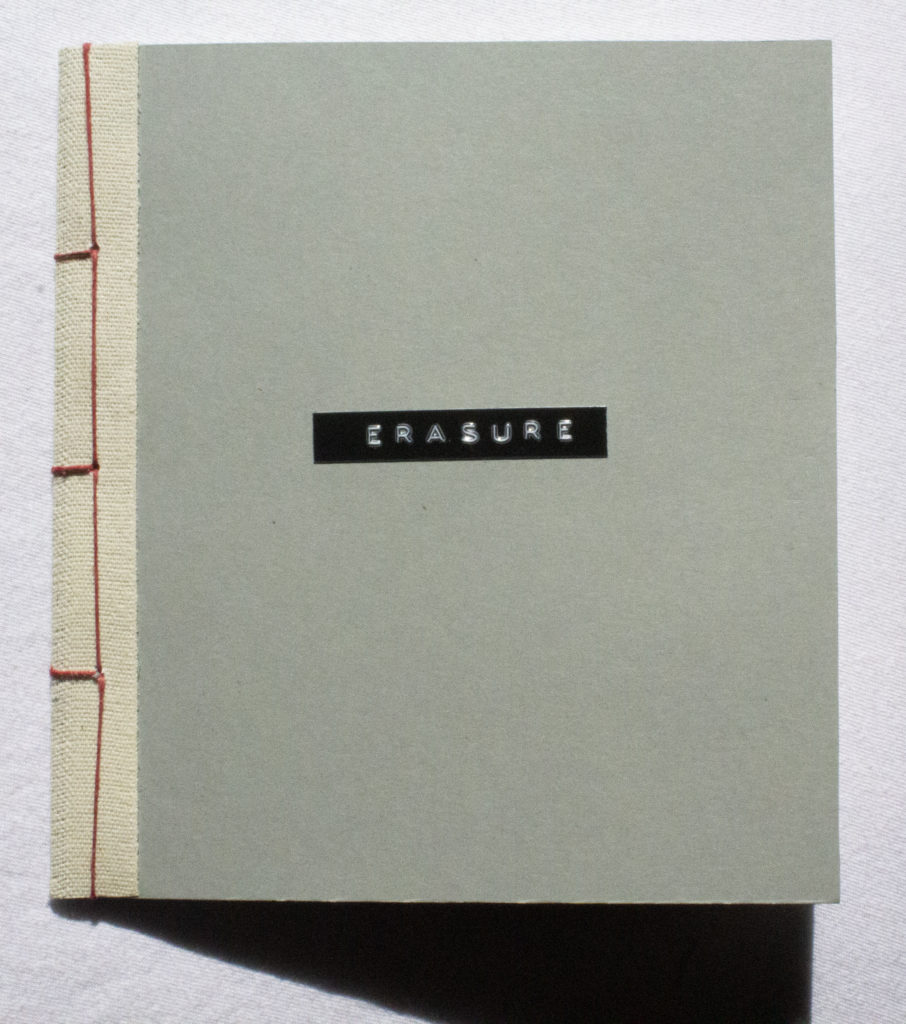
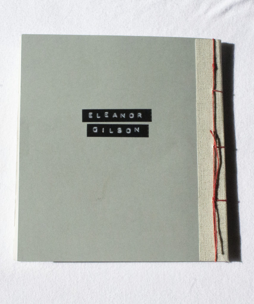
PHOTO-BOOK – Final Composition

Below is a link to the final composition

Zawody

The sequencing of my photo-book is primarily for aesthetics reasons, as to not crowd particular sections of the photo-book with images to visually similar to the images proceeding them, with much of the narrative aspect coming from the photos as a collective as opposed to a linear narrative.

Interspersed within the images are commentaries on abstraction and photography as a medium from myself and other photographers/ writers.

In order to occasionally break up the landscape oriented images are several studio photographs to introduce more elements of 3D shape in form.