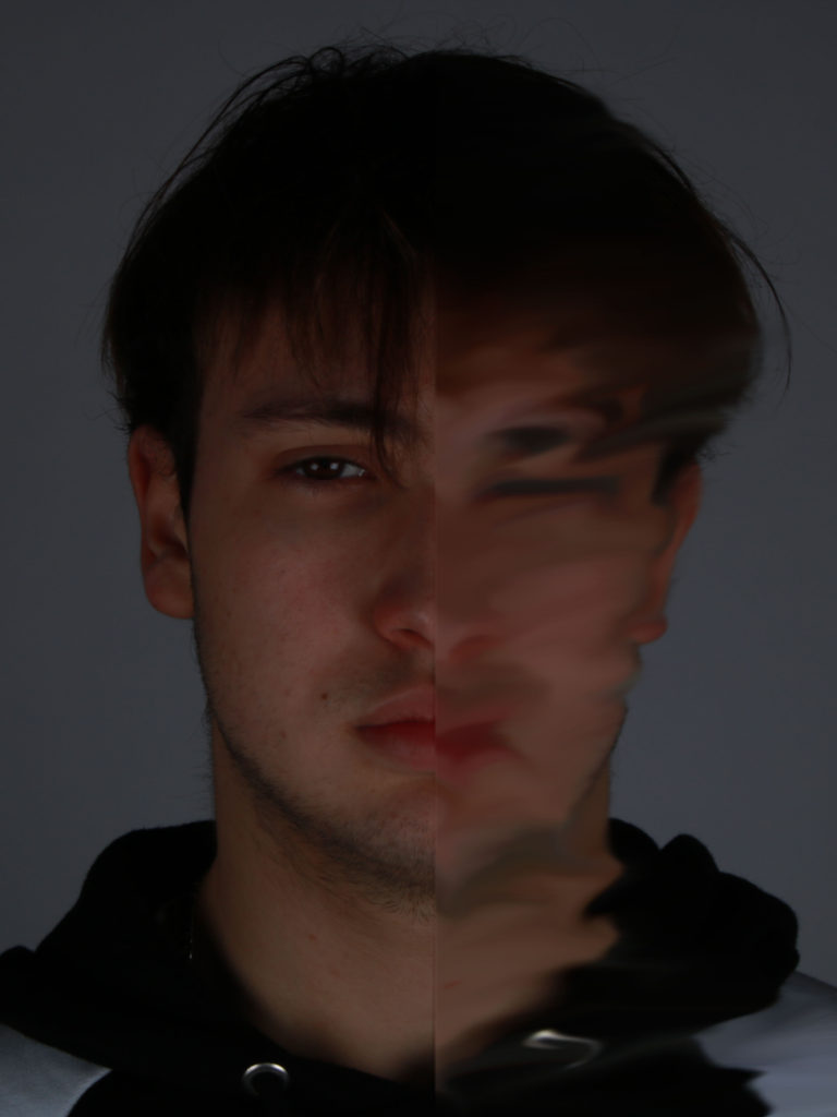
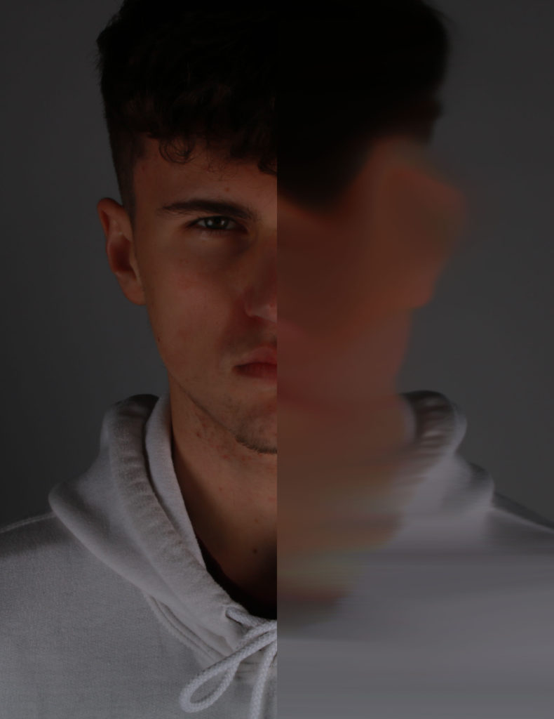
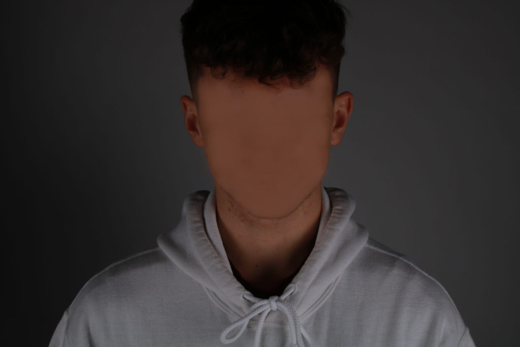
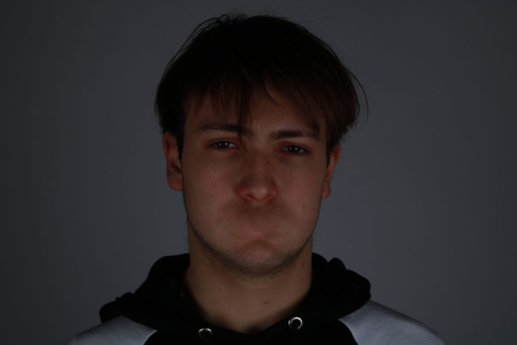
Essay draft 2

‘What are other women really thinking, feeling, experiencing, when they slip away from the gaze and culture of me?’ Naomi wolf, The Beauty Myth.

My personal study will focus on how idols within society have created not just a loss of identity but body issues and unrealistic body standards.  I will do this by using the stereotypical idols of dolls and Barbie who came under a lot of critic from the public for being an idealised and toxic role model. I plan to demonstrate my skills in photoshop by editing them in scary and haunting ways. My project will address matters that match my views of society such as prescribed female gender constructions and unrealistic body images. 

In the 21st century because of trends and social media it takes longer to become aware of what the real world looks like. Fads have caused a lack of individualism when we are supposed to be living in an age of acceptance. ‘Woman’s desire is subjugated to her image (…) as bearer, not maker, of meaning,’ (Laura Mulvey’s ‘Visual Pleasure and Narrative Cinema,’ 1975) Mulvey theorises that the male gaze is a social construct derived from the ideologies and discourses of a patriarchy. Mulvey applied this theory to Hollywood films believing that Hollywood films were shot from the point of view of a heterosexual masculine perspective displaying women as an object to be desired, she also believes that these films reinforced stereotypical gender roles and the idea of men being the dominant gender and the woman being ‘the weaker’ gender. My beliefs are that still in the 21st century the male gaze is very much still a societal issue, however, it’s not just in Hollywood films. It’s on Instagram, commercials, the clothes and make up women wear and even in the doll’s girls play with as children. Young women feel that they need to comply with trends in order to be wanted, transforming themselves to fit with the male gaze. This can be dangerous for young teenage girls because it causes them to hate themselves, the way they look and their body. Instead of teaching young woman that they are beautiful and strong the world and social media teaches teenage girls that they are not beautiful and portrays this continuously. Beauty is no longer in the eye of the beholder but in the person, who takes the photo and uploads it to social media. How do dolls represent this? Part of the Male Gaze theory is that in films the camera pauses of the female’s curves and figure. Dolls are made to have the perfect hourglass figure and some even have this to an exaggerated extent. Young girls idolise Barbie so from a young age, they are conditioned into thinking that they’ve got to look like that, like a living doll and that is an unrealistic representation because the human body is not made to be like that. 

I am analysing Sheila Pree Bright because in her series Plastic Bodies, she constructs a reality that puts across her socio-political views. She believes that women are misrepresented by dolls, so to prove this she takes pictures of dolls and women before editing them together. This creates illuminating and haunting images.  The other photographer I am analysing is Laurie Simmons because she constructs a reality out of dolls and toys that show her opinions of society in a tableaux vivant style. With her work, she comments on stereotypical gender roles. Both photographers believe that these conceptions of life start from when we are a child. In 2003, Sheila Pree created her series of image Plastic bodies which aimed to show unrealistic body images and to challenge western ideals of whiteness and beauty. Heteronormative beauty ideals of whiteness and being virtuously beautiful have been embedded in society for hundreds of years. For example, in the Brother Grimm’s fairy tales’ physical attractiveness in females was rewarded and “beauty is often associated with being white, economically privileged, and virtuous.” (Baker-Sperry, L.; Grauerholz, L. (2003) For example, Snow White was described as the fairest of them all with ‘skin as white as snow.’ These heteronormative white ideals are what her work challenges and her goal was to explore how this impacted young girls and women.   

In 1972 after her work, ‘objects with legs’ Laurie Simmons found an antique doll house and was inspired with how is represented roles in society and matched how many saw the world at the times. This was during the second wave feminist movement who saw dolls as creating unfeasible body images and domestic indoctrination for young girls. Her work borders tableaux vivant in the way that in most of her pieces she has set up dolls to be carrying out stereotypical domestic roles. During my AS study I looked at how society has made the female identity mass-produced. This follows on from that project in the way that I’m looking at how idols within society have created not just a loss of identity but body issues and unrealistic body standards.   

The image above shows how Simmons works. She sets up little narratives in a studio with lighting and takes photos with a tripod.  

The images that I construct in my personal study is borrowing elements from tableaux-vivant. This is because I’m constructing scenes or realities in which to take my photos using objects. Tableux vivants originated in the medieval era. Actors would re-enact famous bible scenes during mass, this then evolved into actors creating live versions of famous paintings during the Renaissance era. These actors re-enacted paintings of Greuze, David and Isabey. Tableux viviant acting was also popular at weddings and other events. Tableux viviants became less popular in the early 19th century due to the realism movement. However, in the 20th century, actresses re-enacted nude classic paintings but then tableaux started to die out because of the invention of film, however, became popular within photography. In terms of photography, Jean-Francois Chevrier was the first to use tableaux in association which was during the 1970’s and 80’s. Photographer’s then began replicating famous paintings in constructing new meanings. Previously in my coursework, I studied Tableux viviants and reconstructed fairy tales with modern day twists. The difference with this project is that I won’t be doing it with real people but with dolls and doll house sets.  

My work also has roots in Surrealism which is all about unleashing the unconscious mind and I believe my work does this but also has socio-political connotations because they also comment on politics and society. Surrealism grew out of the World Wars in the early 20th century and Dadaism. According to Breton’s Surrealism Manifesto (1924) the new art form is a means on linking the conscious to the unconscious so everyday life will be joined up with the subconscious in ‘ an absolute reality, a surreality.’  Some of my previous work has involved quite scary looking images and I’ve planned on doing the same with this project but by taking it another step with editing. My project is surreal in the way that the realities I plan on constructing will appear dreamlike and there is a socio-political message behind them. My Socio-political message is that society and social media has developed an unattainable and unrealistic beauty expectation for women. 

Sheila Pree Analysis:   

Plastic Bodies, Sheila Pree Bright 2003. 

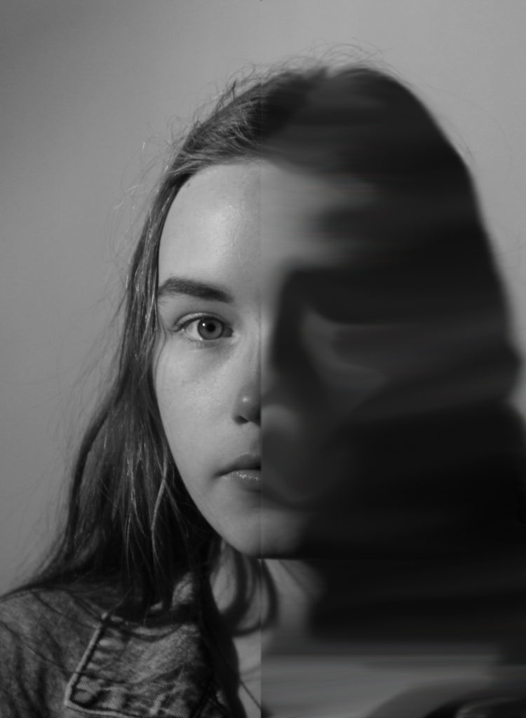
This image is part of a series of images by Sheila Pree Bright called Plastic bodies created in 2003. The focus of the series was the misrepresentation of black women in dolls and Barbie. It focused on non-viable beauty standards and illogical body stereotypes. Sheila Pree Bright in conversation with Naima J. Keith Aperture.org said ‘ Although Barbie serves as a toy for children, she represents much more. The doll somehow becomes a model of beauty, a false representation of how women are physically formed. In some cases, women will aspire to this model to the extent of deconstructing their own image by various forms of beautification. I show how these extremes are illusions by using models and dolls as the subjects.’ Bright has digitally manipulated the image so that half of the face shows what a black woman looks like as a Barbie and the other side shows what a black woman really looks like, by merging two images together and blending them. Bright has taken the image with a main front light on the left side of the face leaving a small portion of the face, the part that is the real woman’s face in shadow. This could be symbolic of how the real representation of black woman is being kept in the shadows whilst this fake representation is always in the light. She’s taken the image with a larger aperture f/stop value because the depth of field is narrow, only the dolls face is in focus. Therefore, the focal point of the image is the face because it’s the only thing in focus for you to look at. Bright’s concept, of lack of correct black female representation, ties in with other works she has done. Her work always focuses on civil rights and racial inequality. This piece also ties in with my project in the way that it looks at how society has created a toxic idol and unrealistic standard of beauty. Bright told the Huffington Post that society’s constant airbrush has manipulated women’s view of themselves ‘as a result the female body becomes a replica of a doll, and the essence of natural beauty in popular American culture is replace by fantasy.’ This fits in with her concept for this image in the way that as you can see by juxta proposing two images, the real and the fake, she is startling people to look at how our ideas of beauty has become distorted and how we and pushing that onto children from a young age.  

Contextually, Bright created this image in 2003. It was part of her travelling art show called ‘posing beauty in African-American Culture.’ Bright drew upon her personal experiences to create the series and believes that her military upbringing exposed her to different cultures that made her question where she fit in. In response to Bright’s work for my project I also decided to juxta propose images together. However, instead of using an image of a doll and an image of a real woman I decided to experiment with removing the makeup that dolls have naturally because women don’t have natural make up on their faces at all time so even the little thing like the pink above the barbie’s eyes and the big eyelashes symbolises unrealistic beauty standards and makes women feel like they have to be what society thinks is beautiful all the time. Therefore, I took picture of the dolls like Bright did but then used nail varnish remover and took off their makeup. I then took pictures of them again and digitally edited the images together. The result was kind of shocking because the dolls without their makeup looked out of proportion and damaged.  

Laurie Simmons:  
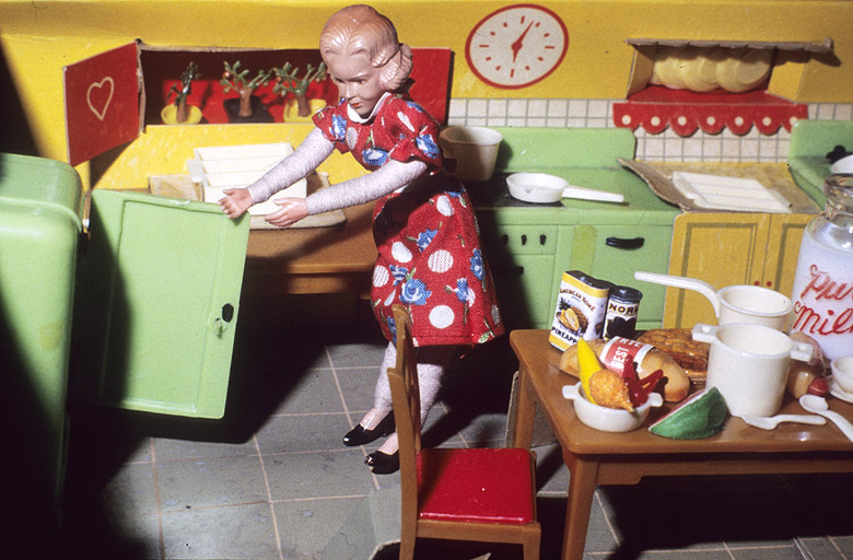
Woman Opening Refrigerator/ Milk to the Right,’ Early Colour Interiors, Laurie Simmons 1978-79. 

This image is called ‘Woman Opening Refrigerator/ Milk to the Right,’ it’s from Simmon’s series Early Colour Interiors taken from 1978-79. Conceptually the doll is meant to represent the classic housewife which is given away by her outfit and hairstyle. She photographs this doll in multiple constructed scenes of her doing stereotypically household chores.  The concept was to demonstrate the daily life of a housewife but also to illustrate the loneliness and isolation felt by some housewives. I think this is shown by the fact that in most of the images she is the only doll and using lighting and shadows. I think she intentionally kept those shadows in order to symbolise the darkness, isolation and emptiness some housewives feel. Her work is like Bright’s in the way that she uses the doll as a symbol or manifestation of society however instead of beauty standards created by society, she looks at the role for women created by society that she herself has grown up in.  

What is interesting about her work is that she uses the doll as a bridge between generations. It’s a doll therefore, a children’s toy but she constructs and brings it into the role of an adult therefore also representing the little girls who will grow up into this isolated role. What I find most disturbing about Simmon’s work is the fact that its context has evolved with the eras. Now in the 21st century she has focused on something many feminist photographers have been focusing on which is the role of pleasure dolls and how they symbolise how women are seen in the eyes of men, how men have replaced women with this perfect life sized doll. The results have been very startling images. The context behind Bright’s work is controversial and you can really see how it influences her work. The 70’s were a massive decade of feminism and women’s rights; there was the take back the night Campaign in 76, 1972 The Feminist Art Journal was founded, 1973 first-trimester abortion was legalised. She took them at the time of the second wave feminism movement which was all about having more than just the right to vote and reproductive rights. Therefore, it’s fascinating how instead of all that positivity she wanted to highlight the fact that women’s role in society are still not what women want them to be. That’s what I find really fascinating about her work. She focuses solely on women’s role in society and if you looked at her timeline of work you can see how women’s roles have changed in the way that more women have jobs  but at the same time the way a women’s role is seen hasn’t completely changed. I was inspired by her construction of reality using doll house sets so I did a photoshoot involving a doll in a kitchen doing ‘a woman’s tradition role’ however I put my own slightly frightening twist on the images to show how women are fighting to not be pigeon holed into domestic or objectified roles and are more open about fighting the patriarchy and striving for equality.   

My personal project has had other influences. Since this project is meant to be personal, I have taken the narrative from my own experience. Throughout my teens I’ve had issues with body confidence and my looks because of social media. However, luckily, I’ve managed to re-find that confidence in myself and realise that I may not be a size six with perfect skin but not many people are. Just because I don’t fit into what social media deems beautiful doesn’t mean I’m not and I’m proud of being able to pull myself out of the hole I was in and now I try to look nice for myself, not other people. My work has also been inspired by an Instagram account called Trophy wife Barbie who uses adult humour and barbies to recreate what she and other women are really like. So, in my project I’ve tried to apply the same humorousness to my work but make it darker. Another inspiration I had for this project was the poem Barbie doll by Marge Piercy written in 1971 the same time as some of Simmons’ work. It’s a dark poem about how a girl who dies trying to live up to the unrealistic expectations of society that is represented through the Barbie Doll.  

In conclusion, I think Bright’s and Simmon’s works are similar but different. They both construct realities to put across their point of views about society. They are both influenced by the times and by their backgrounds and both create haunting pieces of work which puts across their message even more. However, what I like most about their work is their differences. I like how Bright focuses on the misrepresentation of women and focuses on unrealistic beauty standards. For me personally, this is a very important issue to have a public debate about. Many teenagers not just girls like myself find it very hard to like the way we look and struggle with body image because of social media and just societies expectations in general. I also like how Simmons looks at women’s roles through the eyes of society. This is also a very important issue because it reminds us to keep pushing for more equality as women. For me her work has a beginning which is images like the one I looked at in this essay about women’s role as a housewife and it also has an end which is her recent work called ‘the love doll’ which for me as a teenage girl creates so much discomfort in the way that it’s about the ultimate objectification of a human being not just women. For me it shows that thirty to forty years down the line things have changed but there is no happy ending which makes her work a whole lot darker than Bright’s. I am happy because with my project I’ve been able to look at these two artists work and social influencers’ work and refine it to show my meaning, my understanding and I’ve also been able to tie their two works together.  

Bibliography:  

Wolf, N (1990). The Beauty Myth. London: Chatto & Windus. 

Mulvey, L (1975), “Visual Pleasure and Narrative Cinema.” London: Afterall Books. 

Baker-Sperry, L.; Grauerholz, L. (2003). “The pervasiveness and persistence of the feminine beauty ideal in children’s fairy tales”. Gender & Society

Vision & Justice Online: Sheila Pree Bright in Conversation with Naima J. Keith, Aperture Foundation New YorkAvailable from: <https://aperture.org/blog/vision-justice-sheila-pree-bright/> [15 January 2020] 

Vitto, L. 2013, Photos merge Barbie with real women, Stuff, available from <http://www.stuff.co.nz/life-style/9493417/Photos-merge-Barbie-with-real-women> [11 February 2020] 

Breton, A. (1924), University of Michigan Press.  

Essay

How have artists such as Toroptsov shown memory and remembrance through their use of photography.

I have no personal memories of him.” (Toroptsov Y. Deleted scene;). Links to my work as I have no personal memories of The Nazi Occupation of Jersey 1939 – 1945. Within my work I am going to try and begin through the use of landscape photography. Though I am mainly focusing on the bunkers and fortifications, I am also going to try and commemorate those that died during war and those that had interesting stories that occurred due to war around the island. Many artists such as Paul Virilio have explored this concept before, and generally have gotten to the conclusion that we build structures as some kind of tomb or mausoleum for those who lived at a time. We often look at these buildings, re-use them, admire them and often, allow them to become a permanent part of our landscape. Which can ultimately shape peoples lives and history.

Lots of interesting stories happened within the occupation and liberation phases of the war in Jersey. I am going to try and find out about lots of these things and try to reflect that and tell a story using photography to show things people have gone through within Jersey during the period of war.
With this work my main goal is to show remembrance and to commemorate those soldiers and people in Jersey who were affected by the effects the occupation and liberation would have had on them.

The main photographer I am going to analyse is Yury Toroptsov and his deleted scene project which shows Toroptsov challenging himself by trying to commemorate and show his family memories of his father who passed away when Toroptsov was young. This will also help me as it gives me a way to receive inspiration for different things I am able to do to show memory of war, even though I did not live through it. Photographing something that has already happened throws up many challenges, but is something that I am interested in doing.

I am also going to analyse work by Chris Dorley-Brown. I am mainly going to focus on his work within his project The Longest Way Round. This project focuses on his parents within the war (unlike Toropstovs project.) Though it is still used to commemorate and remember what happened to his parents within the war, and how they ended up together at the end of the war. This will help me get inspiration for the kind of work I need to do to display memory of war and occupation, likely more so than from Toroptsovs work due to the fact this project links directly to war rather than just to memory.

The quote “it is not just photography that is complicated, but the concepts of realism and reality too.” (Bright. S. and Van Erp. H. is it real?; 18), relates well to the work I am going to create, this is because this quote is not just saying that photography is difficult but is saying that everything you catch on photograph can be altered or changed, though may be unable to capture the full picture of what has happened in an area. This quote allows me to question my work and helped me realise, no matter what imagery I take, It will be near impossible to show the full story of any story I decide to try and show, from a time period such as The Occupation.

Historical/Theoretical Context:

Modernism was a broad term used that encompassed all the avant-garde movements, such as; dadaism, constructivism, expressionism and straight photography. Modernism was named and used mainly within the first half of the twentieth century. There were lots of different well-known artists that took a modernist approach, and though most of them such as Salvador Dali were still painting, there were a few like Alfred Stieglitz and Paul Strand that moved to modernist photography not only because it was different and new, but also because photography was accepted a lot more within this movement and not just thought of as a tool for science. Modernism has influenced my work and so I have tried to take a modernist approach, this is because this has allowed me to experiment with lots of different ways I can approach my photography and edit the work. It lets me decide from lots of different art movements to see how images will look in loads of different styles. Unlike approaches before modernism, such as pictorialism, which normally uses photographs with filters over them to make them seem as though they are paintings, modernism is based a lot more with the idea of photography in mind and normally rejects the ideas of religion within its imagery, which is why my images generally don’t have obvious religious aspects within them, unless they link directly to the idea of remembrance I am trying to portray. Modernism normally experiments with different forms to create an unusual look. My initial work has mirrored this idea by using images taken from unusual angles to create an idea of different shapes and lines going into unusual places.

The bunkers and other fortifications created by the Germans, tended to have a modernist edge to them. This was influenced by The Bauhaus Movement (Germany). Though, the quote, “Housing schemes, factories and office blocks designed by modernist architects were clear-headed and geometric, suggesting clean and unembellished lives for the people inside them.” (Ballard, JG. (2006) A handful of dust;). Gives us context to why the Bauhaus was shut down, this is through the fact that Hitler would have been weary of clear-headed people and wanted people to blindly follow him. So when the Nazis came into power they quickly closed the Bauhaus and turned it into an SS training school.

Artist:

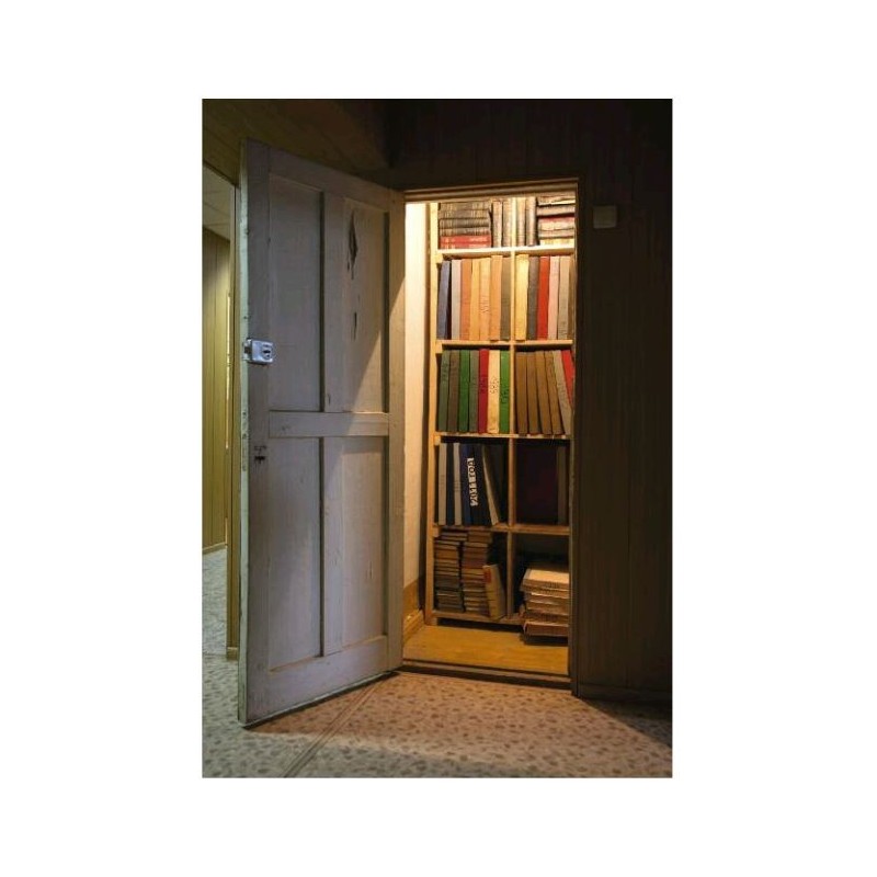
The artist I have chosen to analyse is Yury Toroptsov. Toroptsov is a well known photographer, whose most well known project would likely be his project named Deleted Scene. Toroptsov began this project in order to relive memories of his father and commemorate him through his work. This links well with the work I have done because, I have also tried to commemorate and create a feeling of remembrance, but for those who were involved within the war and the occupation of Jersey. Below is an image from Yury Toroptsovs, Deleted Scene.

This image shows a small room containing lots of different books. This image is important as it can directly link to the quote “his camera. When I was nine I found it in the wardrobe where mother kept it safely for years. I dismantled it to the last screw as if looking for something hidden inside. By my own unaware hand I destroyed the last personal item connected to my father.” (Toroptsov, Y. Deleted scene). This image likely depicts where he found it or somewhere similar to show something from his past and his fathers past, when he was still alive. This can be used to link them together and show that they are and have been connected even though Toroptsov states that he has no personal memories of his father.

The image is taken at an angle and has been taken as a portrait image. This means we are able to see the whole door and entrance to the room within the image properly. The door looks very old and has cracks in it. This could also link back to memory of his father as it looks as though it has aged and been untouched for years between his death, the camera incident and now.

Lastly, the image is taken in very dim lighting using only the lights within the room and what looks to be natural lighting. This kind of lighting creates a focus on the room and may make people wonder what has happened inside, while also creating a sense of remorse in those reading for Toroptsov and his loss.

Artist 2:

Chris Dorley-Brown and his book The Longest Way Round. He shows the story of his fathers capture and eventual release from Stalag VIII B. Which is a German prison camp his father was captured and sent in 1941 while fighting in Crete. During his time in the war camp he befriended his jailer. Whose name was Conrad Barnack.

The book is also a love story between Chris’ father Peter and his mother Brenda, which is shown alongside Peters time in the war camp.It gives us a glimpse into Brenda’s lead-up to marrying Peter. Firstly, by showing us that her first husband had been killed in war and that the second had returned to America after the war. Leaving her with Peter after the war.

This is an image that Chris Dorley-Brown has taken as a part of his project the longest way round. This image depicts a part of the story of the book. He has taken this image to further the story of the project, without using more archival material. Even though he often used archival material. He still used a lot of his own images. These images he has taken are very important to the project as it creates a much clearer and very personal connection between Chris and his parents past.

This image shows an area of land full of trees and bushes surrounding lots of rocks extruding from the ground. rocky parts are likely apart of some kind of World War 2, German fortifications. This can link back to remembrance for Chris because it shows that he has been able to experience where family members have been. Nature has reclaimed this land, possibly a metaphor for time and inevitability.

This is another one of the images within Chris Dorley-Browns book. It is one of the archival images within the book. It like the other image creates a very personal connection for Chris, but this time towards his mother, Brenda, as the image shows her smiling in a car. The image is also in black and white, which would have been standard at the time the image was taken during the second world war. The image due to being in black and white, creates a lot of contrast between Brenda and the vehicle and her surroundings. This means a lot of the detail is taken out of her face and clothing, but highlights her out a lot more and makes her into the focus point of the image. Glamorous and light-hearted, this image betrays war time tragedy and circumstance.

Conclusion:

I have taken inspiration from two main artists for my work within this photobook. Yury Toroptsov and Chris Dorley-Brown, which in each project, both are looking to remember and show memories of two different things, but do so in quite similar ways. Often using close up images of places and areas that represent or link to the people who they are being used to remember. I have tried to do similar to this within my work by using close up images of different bunkers and parts of bunkers that have been destroyed or eroded over the years since the occupation. Getting a lot closer rather than at a distance allowed me to capture a lot of the intricate detail in the bunkers and walls built and maintained by the forced workers during the war, and it also lets me see how they have held up since without very much maintenance since The Occupation. With the images from my photoshoots I have taken for this project, I have selected twenty eight images from these photoshoots to be in my photobook, along with a few maps and a few images of models of the inside of some bunker tunnels. With every single one of my images I have elected to go for a black and white approach with high contrast. I have done this to create a uniformed look throughout the whole photobook, and to draw peoples attention onto more detail within the darker areas than they may have noticed without. Most of the selected images are from two different areas in Jersey, Batterie Lothringen and Batterie Moltke. So I have also added information about the defenses in these areas of the island within the photobook. Overall, I believe I have followed both Chris Dorley-Brown and Yury Toroptsovs styles within my work and have created a photobook to show what the bunkers around Jersey look like now. Though, I have slightly moved away from my original idea of showing off the landscapes with the bunkers throughout, and have moved to more architectural and close-up view through using inspiration from these chosen artists and experimenting with how different images worked.

Academic Sources

Harvard system of Referencing

Bibliography

EXAMPLE: Sontag, S. (1979). On Photography. London; Penguin Books Ltd.

EXAMPLE: Quote inside your text: ——critic Susan Sontag says; ‘he tried to see beyond the difference between beauty and ugliness, importance and triviality.” (Sontag 1979: 27)

Toroptsov, Y. (2003 – 2019) Deleted Scene. Russia; https://www.toroptsov.com/deleted-scene – blog of his work and explains his work

Pantall, C. (2015) Deleted Scene blog;
http://colinpantall.blogspot.com/2015/11/deleted-scene-ethnic-landscape.html – blog about Yury Toroptsovs Deleted Scene project

Ballard, JG. (2006) A handful of dust;
https://www.theguardian.com/artanddesign/2006/mar/20/architecture.communities – modernism and how it affected Germany

FINAL ESSAY DRAFT

In what way does Nick Hedges portray a sense of state discrimination and hopelessness through his monochromatic imagery?

“An imbalance between rich and poor is the oldest and most fatal ailment of all republics.”  — Plutarch

INTRODUCTION
In order to approach my personal study, I will be focusing on three main concepts, the housing crisis, nostalgia and control. A topic which I am highly interested in and willing to explore is the housing crisis which affects a large population of Jersey, not only the immigrants but young people and the elderly all face institutional discrimination which makes it extremely difficult to get on the property ladder or be able to find suitable housing in Jersey. There is an extreme lack of affordable housing for low income families and young people alike, who start out on a low-income, earning minimum wage at the start of their careers. With the use of film, an older method of photography, I am hoping to capture images that capture a nostalgic and reminiscing feel. The fuzziness and grain which can be captured using this flash provokes ideas of the old and outdated.

A prominent photographer which links to my area of study is Nick Hedges, photographed and recorded of social housing in post World War two Britain in the 60’s and 70’s. Mikhael Subotzky is also a photographer who closely ties in with the topics which I will be tackling, taking striking images of a high rise, low cost housing in the heart of South Africa. Using both candid photography and the surrealism of the architecture of the building, creating a photo book, ‘Ponte City’, tackling the subject of inequality. The themes and subjects which both these photographers tackle closely tie in with the overall focus of my personal project, using a documentary style, and biographical approach to their work.

In order to respond to my personal study I will be employing the use of both a film camera and digital camera. As I will be using the theme of nostalgia, the use of a film camera will be an effective way to display this through the grainy and soft nature of the photos themselves. The subject of my images will be of the low cost, affordable housing which can be rented in Jersey. I will be contacting estate agents in order to show the contrast of the way in which housing agents glorify these homes in a way which makes them more commercially appealing, versus what the reality of them are. I will be focusing on small and minor details which distinguish each property such as the flooring, bathrooms and kitchen cabinet. I will also be photographing the exterior of buildings, going around the dingier parts of St.Helier which depict the depressing lifestyle some people face by living in the urbanised town centre.

According to a report from Statistics Jersey, shortages are now predicted for every size of flat and house, with the exception of a small surplus (70) in the number of large homes of four or more bedrooms. And the situation has worsened considerably since the last Future Housing Needs report was issued, covering 2015-2018, with almost twice as many more homes now needed. The gap between the number of people looking for homes and the number of homes available widened by 90%. I will be investigating the state of social housing, their conditions and the impact which it has on individuals for whom this is their reality, specifically interviewing my mother who intersection-ally falls under a migrant and single mother. I will be examining the personal impact which the housing crisis has on my family.

Taking a documentary photography approach to this subject, my work will be following the conventions of realism. The idea that picture knowledge could be universal relates to what is known in philosophy as the ‘realist’ approach. Realism is the idea that a photograph of an object or a person bears a close relationship to that object or person. There is a link between the object or person photographed, and the photograph. The photograph, in other words, is a trace of something real. Because it was necessary for the object or person to be present at the moment of photographic recording, it can also be said that there is a link between the photograph and the events, objects, people, etc., it depicts. Examining the work of Nick Hedges, there is a clear link between my own personal study and the depictions which I aim to imitate in terms of its contextual aspects and intent. I will be comparing two works from Nick Hedges, from the exhibition ‘Make Life Worth Living’, It was commissioned by Shelter, a charity working against homelessness to raise consciousness about the poor living conditions many Britons experience. The photographs were taken between 1968 and 1972 and are an intimate glimpse in to the human cost of poor housing.

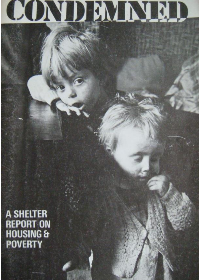
Due to the contextual time period of these images, a sense of nostalgia is provoked through the critical use of lettering and composition. By displaying the photograph alongside related images and Shelter publications, it is possible to expand its narrative. A richer understanding of the final print is made possible. It is also interesting to see how the charity used Hedges’ photographs in their publications, and how they framed them with case studies which included interviews with subjects. A comparison between the contact print and the final print raises questions about the nature of photographic truth, and how the photographer’s intentions shaped his representation of the homeless. The significance of the formal qualities of the final print as it appears in the Shelter report (it is much grainier than the contact print, and has a heightened contrast) is also relevant to a discussion of the photograph’s semiotic effect creating meaning from the contextualization of the images. By including excerpts from interviews in interpretation panels, details about subjects are made accessible, despite remaining anonymous (Shelter used pseudonyms in their campaigns). The biographical information about the subjects of the Shelter photographs, published in reports and displayed in exhibitions, is fundamental to the kinds of narrative generated by Hedges’ photographs. The original intent of his photography has remained original, dodging the alteration of marketing editors and professionals who ultimately decide upon the final meaning of these images.
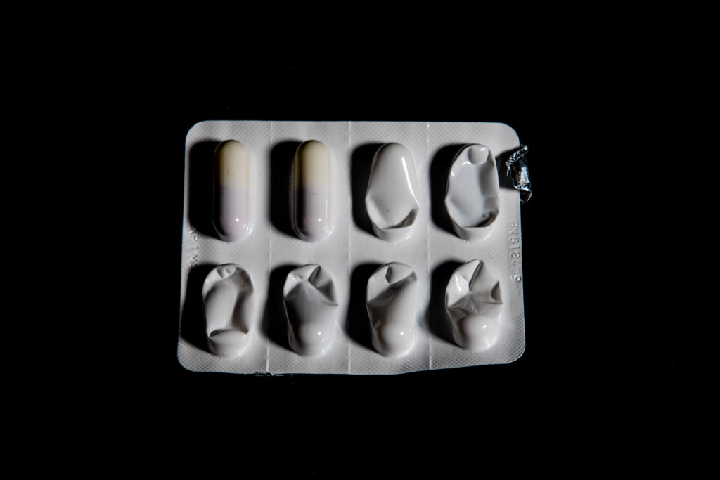
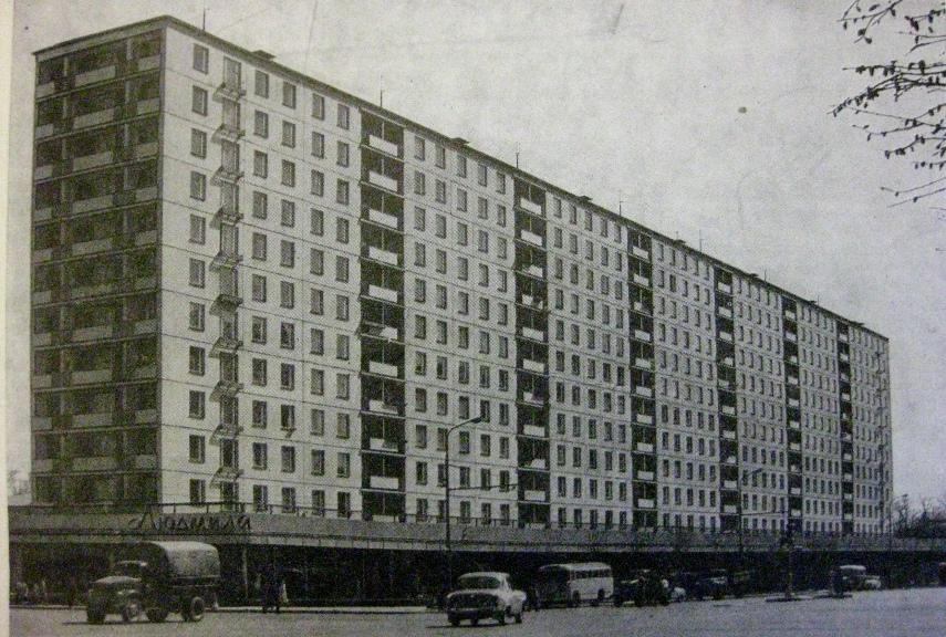
Image result for post soviet social housing
Soviet state housing

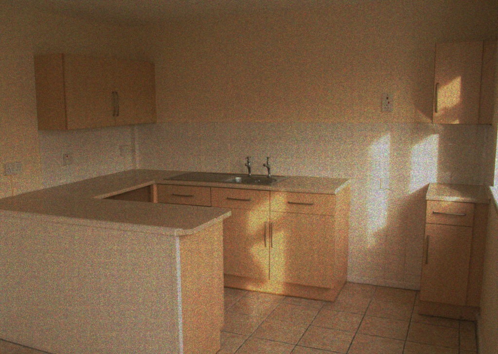
In response to the works of Nick Hedges, I have tackled the same relevant issue in Jersey, and the lack of sustainable and affordable housing for the general public. An agency which has sparked much controversy within the Jersey housing market is Andium homes. The privatisation of more than 70% of the Jersey property market has meant that little or no regulation has been put of the pricing cap which has set it’s highest record to date, rising be an average of 7% every year, making it more expensive to buy and rent in Jersey than it is in central London. Andium homes aims aid in the “delivery of affordable housing in Jersey, with financial viability being a key focus”. Fiona Halliwell (2019:9, Annual Report). Andium homes has been a key focus in my personal investigation as they come as a last resort for a lot of islanders struggling in the housing market. Within this investigation I was keen to explore the housing quality versus its price point. By contacting a local estate agent I was able to have a look inside these homes and asses the state of affordability.

Upon first glance, the entire estate was drab and uninviting. The streets lined with homes comparable to the mass housing style of post soviet 1990’s Russia, with the cubist style architecture and close living quarters, a style which I am familiar with, all coming back to my own heritage and my time spent in a country still very much influenced by the many agents of Russia. It was undeniable that a lot of these homes would stereo-typically be presumed as the epitome of social housing troubles, coming with them the notion that the next generation of drug abusing, gang related youth would be spawned from them, “Home sweet home” being the last description coming to my head, yet none the less it is a safe heaven for those in need. The terraced style arrangement of these homes means that there is an ever lasting repetition from the first house to the next, very little privacy is to be expected by living here. Much like the outside, there was again the cookie cutter style home on the inside, zero character or stylistic integrity, simply the cheapest and simplest methods of building a home have been applied. Rooms have been sized to the smallest possible fraction before they could be named a cupboard, most likely leading to over crowding to any family deciding to reside here . All in all this description seems harsh and unfair for these homes which at first glance, apart from the lack of character and structural integrity, seem to have nothing wrong with them, yet taking into account the £425,000 price tag, the story shifts quickly. Value versus product far outweighs what you can buy for your money, and even a public government agency is unable to truly provide affordable housing for the large variety of people that call Jersey their home. As a stylistic extension from the start of my project I have continued with the film style imagery which I have produced, and even within this context it fits in well stylistically and metaphorically as these homes are comparable to housing estates from post war Britain.

Image result for nick hedges
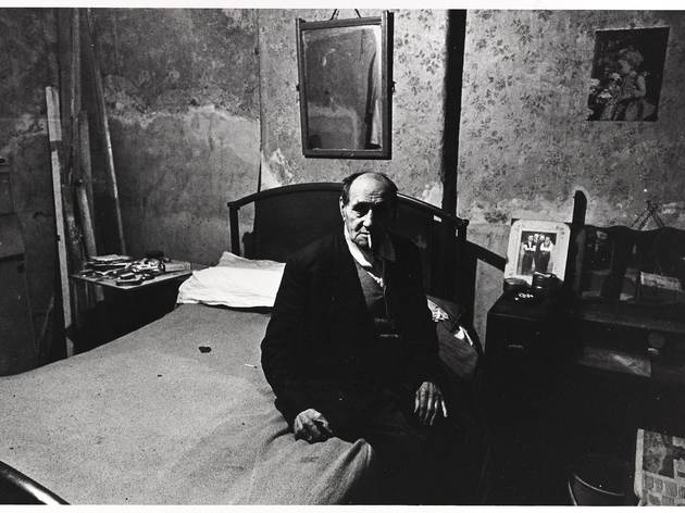
A deaf Jewish man living in fly-ridden tenant flat off Redcross Way. Southwark, London, November 1970. Nick Hedges / National Media Museum, Bradford.

Hedge’s produced a variety of work within and around London, which was hit the worst during World War 2 due to the extent of the damage done to infrastructure and social housing, leaving many to live on the fringes of what it is deemed to be safe or acceptable. Looking at the visual aspects of this image there is a distinct focal point, the man in the centre of the image can be very clearly and bluntly be seen looking at the camera, creating a candid portrait. The full body shot which has been taken of the man is an intentional aspect of this image, most likely being used in order to capture the man’s surroundings and the environment which he lives in, being a dire reminder of the housing conditions in which he resides in. The overall image is extremely dark, with most of the shadows being in the same tonal range. The man can also be witnessed smoking a cigarette, adding to the dark and grungy aesthetic of the image. He is of old age, wearing very period specific clothing. It can be concluded that due to this man’s age, disability and social status, he is likely living in conditions like this because of a lack of money. The illumination which can be seen on the mans face and the surrounding environment suggests that there was one very strong light source in the middle of the room, likely coming from a ceiling light. This article focuses on housing constructed during the decade or so after the end of the Second World War as part of the progressive, experimental establishment of the Welfare State in Britain. Housing provision by the end of the war, particularly in urban centers, was considered inadequate, not only in quantity, but in quality as well. War damage had impacted on the quantity of housing stock, but additionally, much ‘obsolete’ housing had been earmarked for demolition before the war.

Contextually, knowing that this man is Jewish, living in 1970’s England, it is likely that he was a victim of discrimination. Living through the Second World War and into post war Britain. This man is a great example of the intersectionality relating with religion, disability and age. He is seen living in very dire conditions, much less suitable for a human to live in. He is a great example of the discrimination faced from multiple facets within society, and what Hedges perfectly captured within his imagery. The lowest fringes of society living in ways which were simply unacceptable, receiving little to no governmental aid. Technical restrictions and the physical characteristics of slum housing, the darkness of the photographs must also be interpreted in the light of an established art historical convention. Hedges’ choice to represent the homeless in a dark space as a recurrent trope in his photographs serves to tie his photographs to a recognizable pictorial tradition. Representations of the urban slum dwelling poor have invariably been located in dark, dirty and overcrowded domestic space.

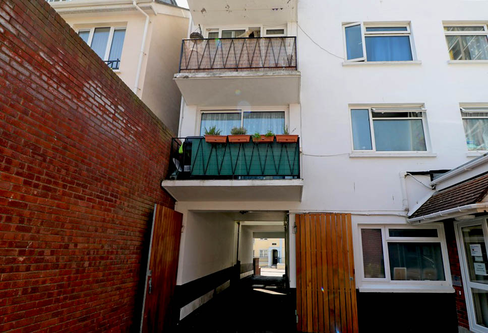
Two bedroom apartment located in central St.Helier

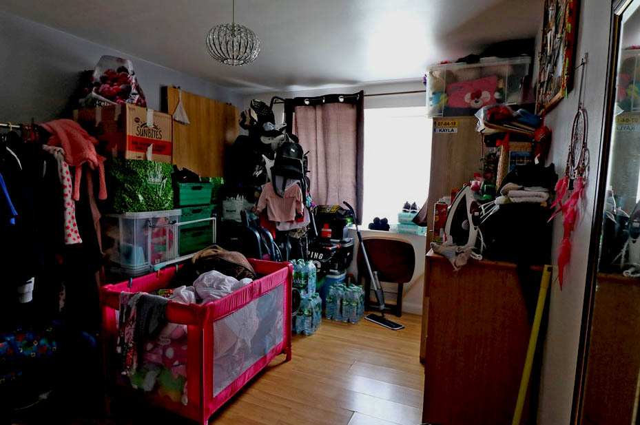
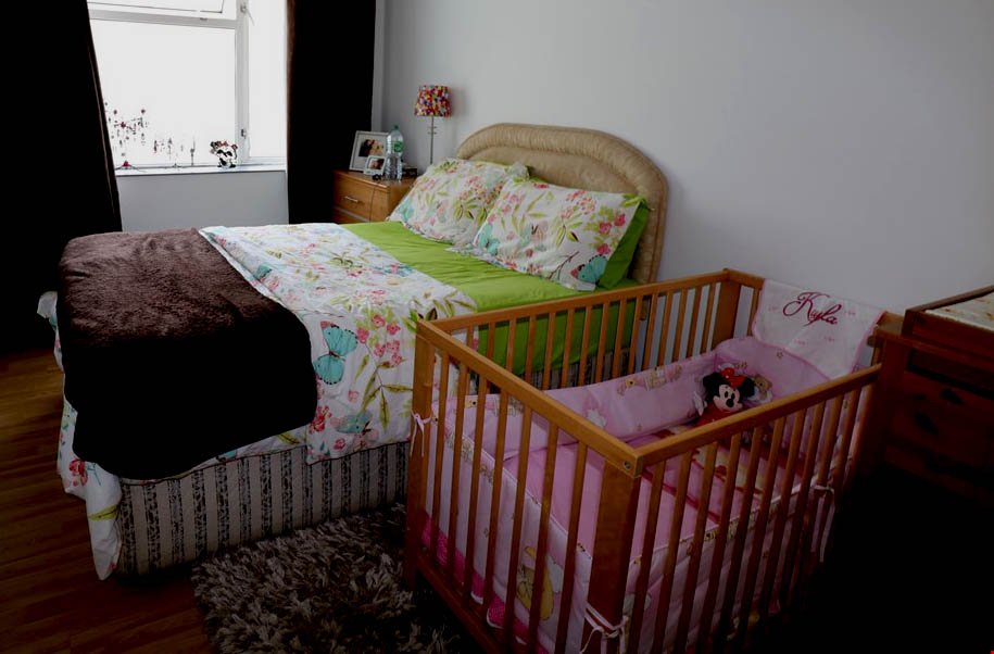
As a further response to my over riding statement of the “crisis in the Jersey housing market”, I have responded with another series of images which reflects this statement. After coming into contact with another estate agent I was able to privately arrange and pose as a potential buyer. Much like the housing estate seen by Andium Homes, the flat which I was able to view was far from the conditions which would be expected for its price tag. A second floor, two bedroom apartment priced at £330,000. “An average working family in Jersey can now only afford to buy a one- or two-bedroom flat, and private rental prices increased by almost a tenth last year, according to new figures.” Ian Heath, (2019), Families priced out of Island housing market, JEP. Taking into account the people which can be presumed live here, owning a home of their own as young parents is unlikely.

With my image making, I am much less focused on the pictorial aesthetics but rather just a documentation which clearly reflects the inequity between housing prices and the property conditions. Further, this investigation led me to posit as a prospect buyer, yet my intent was purely image taking, which lead to my work being rather up front and raw, simply taking an image as it first appears. It was also unsuitable for me to take images which appeared as close ups of possessions as I had to take in mind the privacy aspect of the people who live here, and their lives being all on display for people to see as they enter. I felt this property was a good representation of my statement as in an image we can see one of the allocated bedrooms being used as a storage room, demonstrating how small and cramped conditions “low-priced” properties such as these can have. Much like Andium Homes, the exterior of this building is much more reminiscent of 1990’s Russian cubism with the minimal architectural features. Not only taking into account the housing conditions, this property is located near Springfield Stadiums which is socially considered as a rather dingy and hopeless area to live in due to the concentration of social housing and migrant communities.

Referring this back to Hedge’s work heavily relies on his monochromatic image making in order to relay a sense of hopelessness. The dark, dim and shadowy nature of these images means that the overlying theme for this series of images are despair and misery, this arises the question of how these people got into this situation and how the state allows for this to occur, Hedges is able to effectively capture the struggle of lower class Britons, trapped in between impoverishment and the aftermath of war. Hedges purposely chooses locations and estates which showcase the true reality of the lower class life. The reluctance to recognize extreme poverty and poor housing as homelessness persisted until Shelter successfully negotiated a change in the law in 1970. At this point, the legal definition of homelessness (which had previously been limited to people living on the streets, those literally without shelter) was expanded to include people living in poor housing. Due to the technical limitations of cameras at this time, these photographs represented exterior, rather than interior, scenes: it was not yet possible to make photographs inside slum houses, yet even these exteriors were a very clear window into how these people lived despite not knowing the personal conditions of each flat. The image of the homeless child is what captured the imaginations of the public in the middle of the 19th century, being the iconic image of social crisis and economic depression. The human’s metaphorical understanding of what black and white is again ties back to the effectiveness of Hedge’s work and the way’s in which he redefines the “homeless”, using highly emotive and striking imagery in order to highlight socioeconomic issues on a larger scale.
Hedge’s work undoubtedly called for social and legislative change, allowing for the working class to strive for appropriate living conditions within social housing, yet his photographic work doesn’t come without fault. His work is unquestionably cliche within the themes which he worked in, portraying the working class as living in dirty, mold-ridden homes with young and starving children. With his work, he very much reinforces the stereotypical notions of poverty which we already see in modern media, people living in crumbling homes with no obvious way to change that. His work very much lacks the portrayal of humanity in these very people, many of whom are well educated individuals, simply ending up in these conditions due to the turmoils of the war. ” Photography is not some god from the machine, which will resolve the world’s problems simply by the act of bringing them to light… The real impetus is on us to respond to the things we feel when we view certain photographs and to decide to make things change.” (L.Bush, 2015, PHOTOGRAPHS WON’T CHANGE THE WORLD). As with Hedge’s work, the showcasing of these images provoked nothing but pity for the lower class, the general public simply making an icon of the image of the homeless child, but not much came of this in terms of social change. Proving the point that photography is not much more than simply a documentary style medium, it does not provoke change unless change in pushed for.

To conclude, Nick Hedges throughout his time working with Shelters, was able to effectively capture the hopeless reality of people living in post-WW2 social housing, changing the very face of governmental legislation with his work. In a bid to change harrowing living conditions, Hedges employed the image of the homeless child, becoming a cultural icon with the publication ‘Conmened’. Most importantly an attribution to this unfortunate reality was his monochromatic image making, using classical techniques of photography in order to help the socioeconomic crisis which was underway throughout the 1960s. To further explore the ways in which Hedges captured the dire state of the past, I undertook a similar path in the face of modern reality in Jersey. Whilst real slum conditions are not prevalent in Jersey, over priced property has meant that Jersey has suffered a sharp decrease in first time buyers, many simply being forced to move to the mainland in search of lower cost housing. Through my own image taking I was able to see see the ways in which not even government subsidised agencies are able to provide housing which is truly low cost and appropriate for a low-income family. Taking a documentary style approach to my image making, I was able to produce images which in many ways appear sterile and routine, appearing like that of an estate agent. My work I feel has effectively captured the same underlying message as Nick Hedges in the sense that neither or are able to provide citizens with appropriate living standards, weather that be of a lack of government support or over-privatisation of the housing market, both situations put ordinary civilians at a risk for homelessness.
Bibliography:

https://www.andiumhomes.je/wp-content/uploads/Andium-Homes-Annual-Report-2018.pdf

http://etheses.bham.ac.uk/6534/7/Hall16PhD1.pdf

https://www.architectural-review.com/essays/reviews/exhibitions/heart-of-darkness-nick-hedges-photographs-for-shelter/8674289.article

https://www.wsws.org/en/articles/2016/10/25/hedg-o25.html

https://www.gov.je/Government/JerseyInFigures/HousingLiving/pages/houseprice.aspx

https://jerseyeveningpost.com/news/2019/02/15/families-priced-out-of-island-housing-market/

Personal Investigation – Photobooks – Post 3 (Dividing Imges)

The following images are a combination of images from several photo shoots I have done throughout this project; these images will be incorporated into my photo book to help break up the dark and warm toned images. The addition of a touch of colour to the almost duo-chromatic final design creates a more versatile and striking array of images. The mismatch of colour within the book is reflected in the front cover of the book itself.

PHOTO BOOK research and UNDERSTANDING

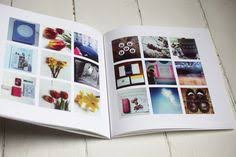
Image result for photobook layout

A photobook is a book in which photographs make a significant contribution to the overall content, they can also include texts and have an overrunning narrative.

Examples:

Image result for photobook layout double page spread
Image result for photobook blurb


Research a photo-book (select one you have looked at previously in your project) and describe what story/ narrative the book is telling – its subject-matter, genre, style, approach etc.

The book is about people in Iceland who believe in Fairies and elves. They tell their kids not to throw stones because it could hit an elf. Stylized as an old fairy tale book.

2. Who is the photographer? Why did he/she make it? (intentions/ reasons) Who is it for? (audience) How was it received? (any press, awards, legacy etc.)

Bego Anton- Born in Spain. Specialized in unusual documentary photography. The book was made to see if there was magic in Iceland and to document the people who believe and live there.

“Antón’s book pursues a courageous and empathetic mission: not only does it value a culture rich in imagination, it is also a humble reminder of respect and indulgence. Most importantly, though, it allows for a special kind of encounter – with an ability that most of us used to have, but have lost along the way. Enchantment.” – Sabrina MandaniciCollector Daily

“The book is full of beautiful details… friezes of manuscripts, dragons, an unfolding ancient map and marvelous typographical signs that we suppose are secret messages of the creatures that populate these lands. Everything is alive, Bego Anton tells us, if we know how to discover it… when closing the book we cannot stop thinking about looking for the elves near us.” – Gabriela Cendoya, Photobook collector (translated from Spanish)

“Even if you are a total skeptic for fairies, unicorns, and water sprites, recognizing the complexity of nature encourages an appreciation for its processes that we often can’t see.” – Allison MeierHyperallergic

Book in hand: how does it feel? Smell, sniff the paper.

The paper feels rough, it isn’t glossy. Faint new book smell, bit dusty.

Paper and ink: use of different paper/ textures/ colour or B&W or both.

All of the paper texture is the same, like an old book. The images are in colour, a few are in black and white.

Format, size and orientation: portraiture/ landscape/ square/ A5, A4, A3 / number of pages.

A5 size, portrait but some of the pages are a double page spread landscape.

Binding, soft/hard cover. image wrap/dust jacket. saddle stitch/swiss binding/ Japanese stab-binding/ leperello

Hard cover binding

Cover: linen/ card. graphic/ printed image. embossed/ debossed. letterpress/ silkscreen/hot-stamping.

There’s a hot stamp of a unicorn on the front of the book. The lettering is also hot stamped.

Title: literal or poetic / relevant or intriguing.

Both, it’s literal in the people’s beliefs but also poetic and metaphorical.

Narrative: what is the story/ subject-matter. How is it told?

It’s the story about Icelandic people’s beliefs. It told with a combination of landscapes, close up and portraits along with fairy stories that the photography was told whilst she was there.

Structure and architecture: how design/ repeating motifs/ or specific features develops a concept or construct a narrative.

There this recurring motif in the text where it’s written in white and embossed so it’s almost invisible like these elves the photographer is looking for.

Design and layout: image size on pages/ single page, double-spread/ images/ grid, fold- outs/ inserts.

There are double page spreads. some images are sized like Polaroids. There’s a fold out map at the very end.

Editing and sequencing: selection of images/ juxtaposition of photographs/ editing process.Images and text: are they linked? Introduction/ essay/ statement by artists or others.  Use of captions (if any.)

The text is linked to the images. It talks about the beliefs and the environment which the images also represent.


Shoot 3

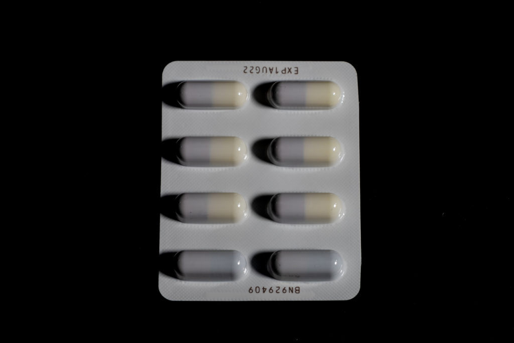
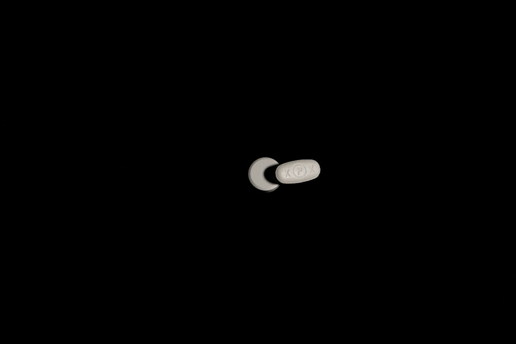
Third shoot final images:

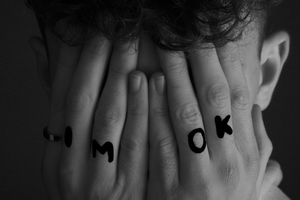
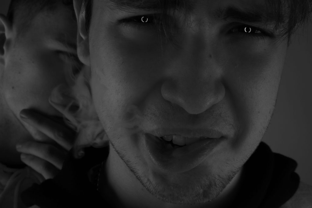
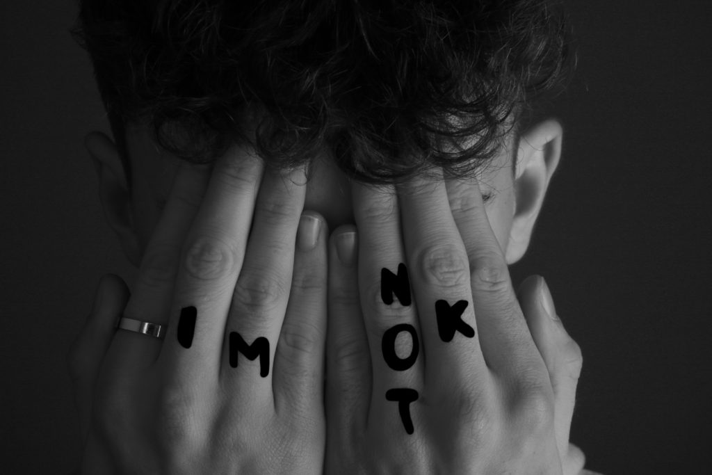
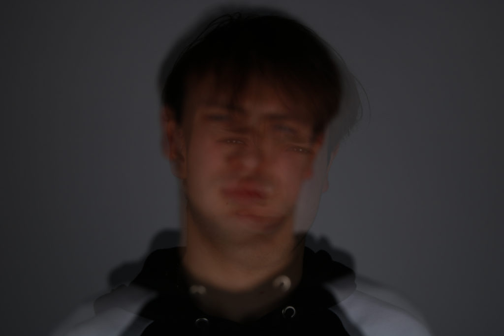
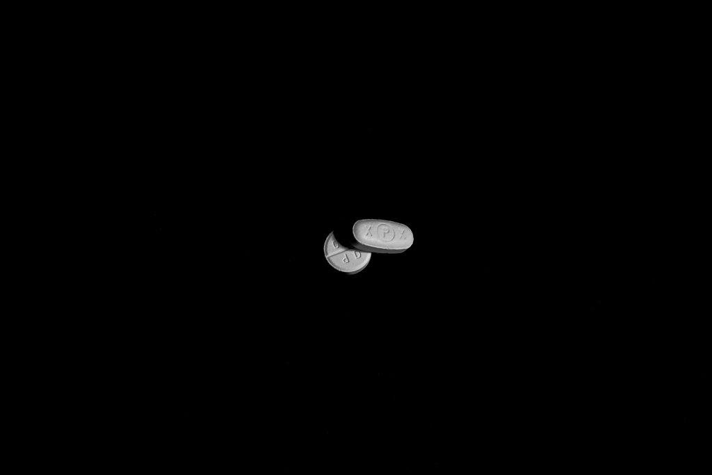
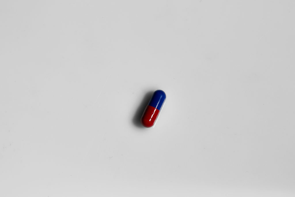
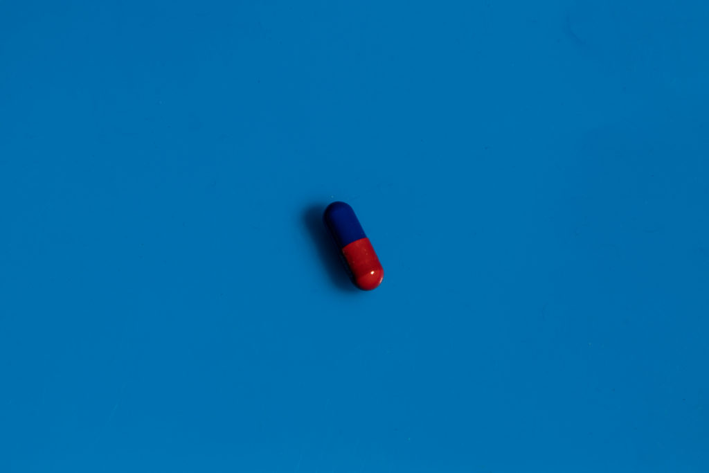
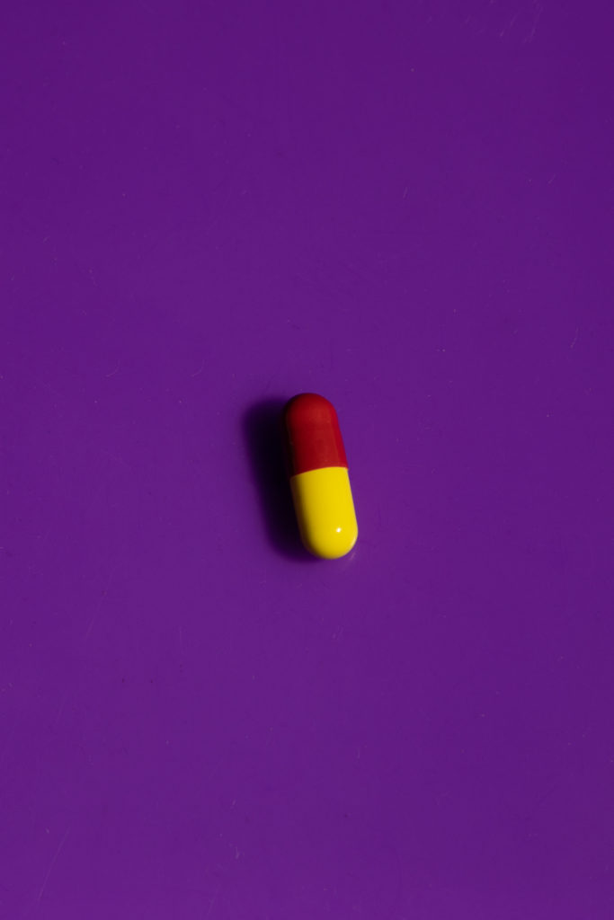
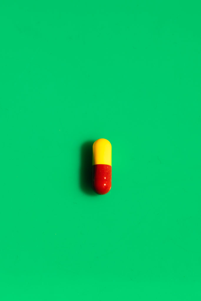
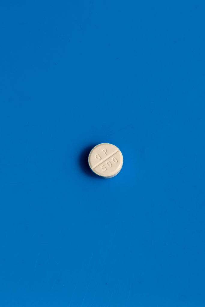
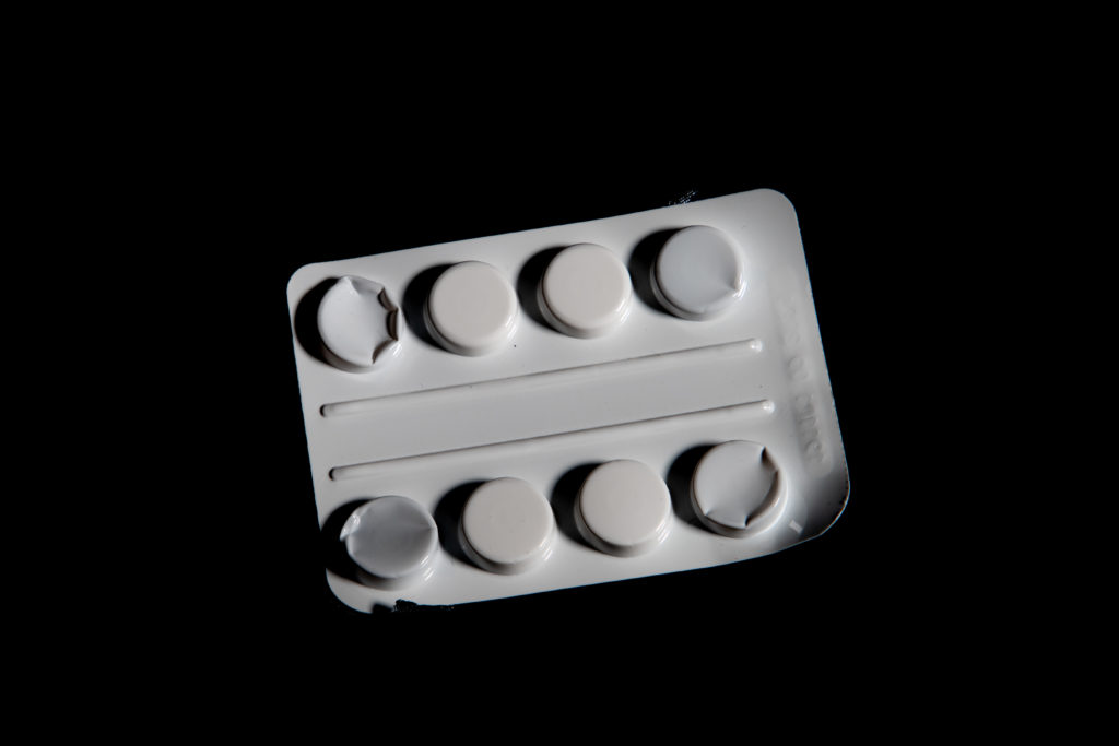
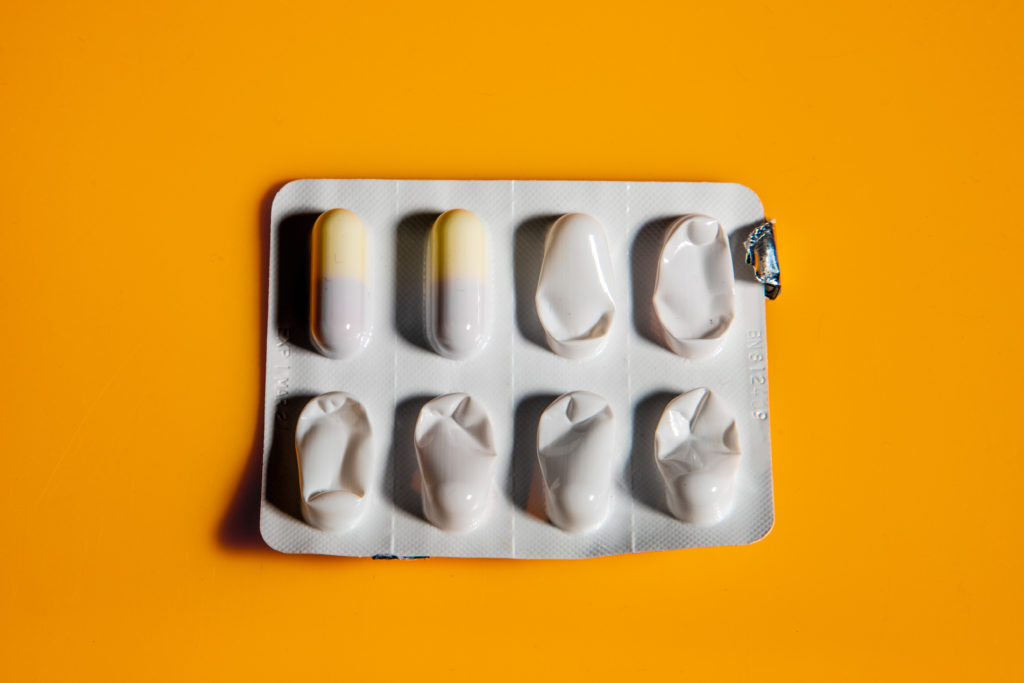
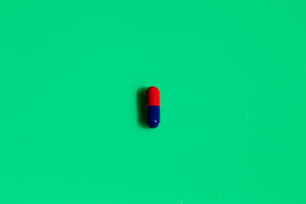
For my third and final shoot I wanted to make sure to capture both a brighter and more clinical feel to my images. I originally intended to for this shoot to show the more clinical side of mental health, but found images turned out best when focusing on the bright and attractive colours that are used within medicine in general. Therefore many of my final outcomes use bright colours and high contrast to show the visual appeal of medication. I also wanted a lot of these images from this shoot to contrast many of my other images taken in previous shoots. By using high key lighting, bright colours and over-saturation, I found that this contrast in images definitely befitted my final product of the photobook.

Personal Investigation – Photobooks – Post 2 (Themes and Layouts)

Double page spread layouts:

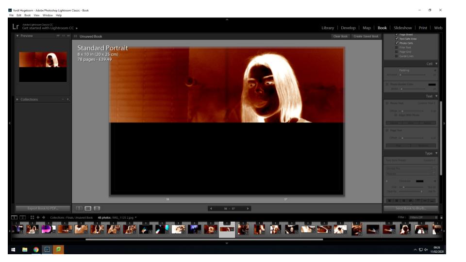
This full bleed double page spread allows the viewer to see every detail of the image. It is a bold layout which enhances the power of the image.

A horizontal half double page spread is a good way to frame a more rectangular image. I have decided to have the image take up the entire top half of the double page spread to draw attention to the subject in this image.

This optical double page spread only contains an image on the right hand side, but due to the structure of the photo and the very left hand side trailing off into darkness, the empty black page on the left almost seems to be a continuation of the image on the right.

Single photo layouts:

This single photo layouts is composed of a small square image on a single page of a double page spread. This layout appears several times throughout the book as a series of more abstract images among the more clear portraits or still life imagery.

This single photo layout is a more simplistic one, involving only one image adjacent to the top or bottom of the left or right page. The stand alone image draws all focus to this image.

Multiple photo layouts:

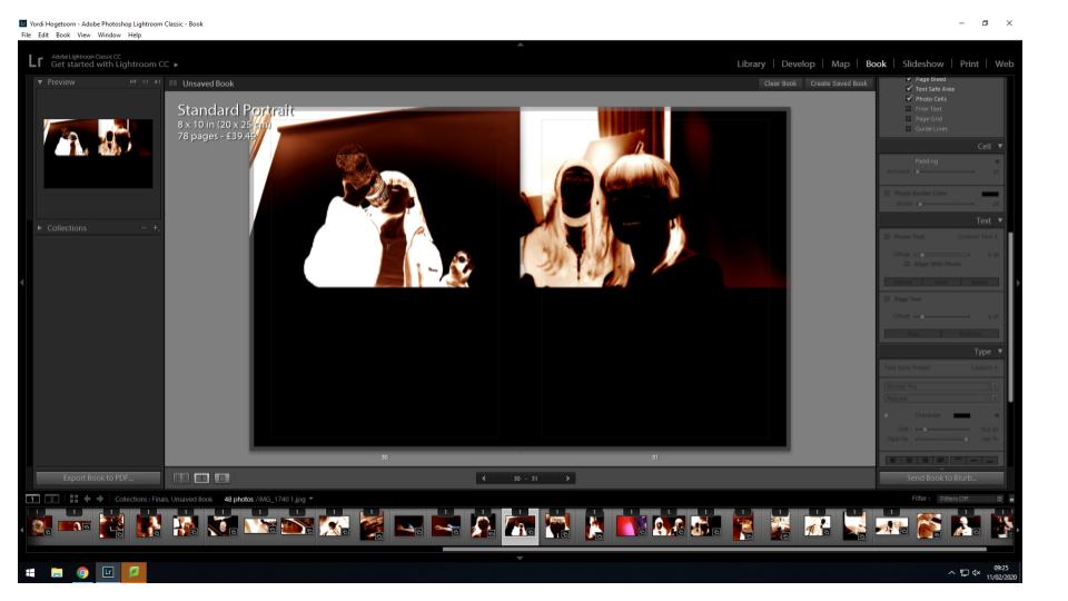
This layout involves two images adjacent at the top of both pages in a double page spread. This layout helps to link two compositions together and allows the viewer to see the relationship between the images.

This layout involves a full bleed image on one page and a smaller image with borders around it on the other. This layouts allows the two images to be viewed together but both in their own ways. The busier photo is the larger one to allow the viewer to see everything in the photo while the complimentary portrait is smaller as it is more simplistic.

making my book

Materials:

Card for cover

Thick white paper for main pages

Parchment paper for sticking images onto and poems

Linen for spine

Thread for sewed binding

Embossed label for title

Narrative:

Begins with personal archival images from childhood that have been hand edited and manipulated

Followed by newer images that reflect from an innocent mind to a corrupt mind

All images portraits majority are self portraits

Poems:

For each image there is a written passage whether it be two words or a ballad, they aid the narrative and reinforce my ideas of identity.