Essay Draft; Image Analysis 2:

Francesca Woodman: 606

https://www.bjp-online.com/2016/01/on-being-an-angel-francesca-woodman-foam-amsterdam/

https://www.studiointernational.com/index.php/francesca-woodman-on-being-an-angel-review-foam-amsterdam

https://www.telegraph.co.uk/culture/art/art-news/9279676/Blurred-genius-the-photographs-of-Francesca-Woodman.html

Francesca Woodman, On Being an Angel

Famous for her self portraits, Francesca Woodman preferred to work alone, but there’s more to her images than a representation of herself. At only age 22, Woodman threw herself out of a window in New York. This leaves her images forever tainted, in the sense it’s difficult to view them without wondering whether they’re a prediction of Woodman’s fate. In 1977, Woodman worked on ‘On Being An Angel’ while staying in Rome. The title in itself suggests a surreal approach to self portrait as the word ‘angel’ suggests the presence of a higher celestial being. While it is possible that the title could indicate that Woodman believes herself to be this celestial being, it is more likely that this refers to the faith, love, hope, strength and intelligence that angels often symbolize. However, this is a clear juxtaposition to certain extent. The images are in the black and white, mirroring the aesthetic of Woodman’s other works while also showing a darker undertone that suggests that Woodman sees herself as more of a misunderstood angel. It was not secret that Woodman was struggling with the lack of success and recognition her images were receiving. It had been clear to those close to her that her images were some of the best, so why didn’t others see that? One such image from ‘On Being An Angel,’ shows Woodman in a derelict building, her preferred location to shoot in, with two white sheets behind her as she leaps up in front of them as if flying. It is obvious that the sheet represents her angel wings and the image as whole suggests that Woodman wishes to take flight, to escape perhaps. Another striking feature present in this series is Woodman’s often completely bare chest. She has her breast thrust out, however, this is not by any means sexual. She had previously explored her body in several of her other works and had grown comfortable with it. Woodman wanted to show a certain rawness and maybe even innocence to the images one would find when thinking about angels. As for the idea of flying, Woodman has also previously referenced the theme of weightlessness in some of her other works taking in Rome. It seems perhaps that woodman was toying with the typical idea of angels taking flight while also thinking about how she might like to do the same. The reasoning behind this, some would suggest, comes down to her death. In 1981, Woodman threw herself out of a window in New York. The similarity between her chosen method to end her life and the images of flying is astounding. An article in The Telegraph suggests that Woodman’s images are ‘…coloured by her suicide.’ However, I find myself disagreeing with this to an extent. Is it really plausible that Woodman had been predicting her end since age thirteen? Of course not. She was simply just a girl that was doing what she loved while exploring and learning more about herself and where she fitted in the world. On the other hand, I think that some of her work during the last few years of her life may have had some kind of warning to it. Some of the images Woodman took in Rhode Island between 1975 and 1978 are captioned with almost foreboding messages. For example, one image is captioned, ‘I stopped playing the piano.’ Assuming Woodman stopping playing through lack of interest could suggest the beginning of her depression as the early signs of such mental illness often includes a sudden lack of interest or enjoyment of activities that may have even been a person’s favourite thing to do.
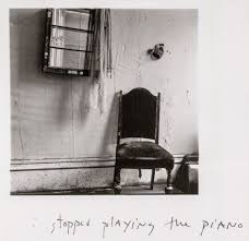
Francesca Woodman, I stopped playing the piano

Essay Draft; Image Analysis 1:

Mary Ellen Mark; Ward 81: 360

35mm, 200 rolls of film, 4,800 images.

http://www.maryellenmark.com/text/magazines/american%20photographer/911T-000-001.html

https://www.maryellenmark.com/text/books/ward_81/text001_ward81.html

Mary Ellen Mark, 300B-011-005

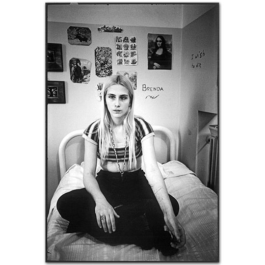
In 1975 while photographing on the set of ‘One Flew Over The Cuckoo’s Nest’, Mary Ellen Mark was given the opportunity to talk with the patients of Oregon State Hospital’s Ward 81. She returned a year later with writer, Karen Folger Jacobs. The pair spent 36 days on the ward. While know for her documentary style projects that have a clear narrative, Mark took a slightly different approach to how she presented her images from the ward. In an interview with American Photographer about her time on Ward 81, Mark said, “Instead of the 1-2-3-4 of a picture story, I was interested in doing pictures that would stand alone.” This is to perhaps represent the isolation of each patient, while also giving them a sense of individuality that they may not get on the ward. Ward 81 consists of a series of images that give an insight into the side of mental illness that people had never seen before in the 1970s. Jacobs wrote ‘At first glance, they could be almost any group of women in any institutional lounge or day room,’ and for the most part that was probably true. The lock ’em mentality of 70’s America was the main reason many of the women of Ward 81 were where they were and once they were institutionalized it was hard to introduce them back into society without seeing them return to the ward not long after. This is perhaps one of the reasons why Mark wanted to spend so much time with the patients while photographing them. She had always thought it vital to build a relationship with the people in her images so she could understand them. The image titled ‘300B-011-005’, perfectly captures the idea behind the project. It shows a girl sat on her bed. At first glance she could be considered a normal teenage girl with clothes that show more skin than her parents would like and posters and pictures above her bed that show the things she likes. That’s what you’re supposed to see first. However, you soon notice the cuts on her arms and the phrase ‘I wish to die,’ written on the wall.

Photobook Design

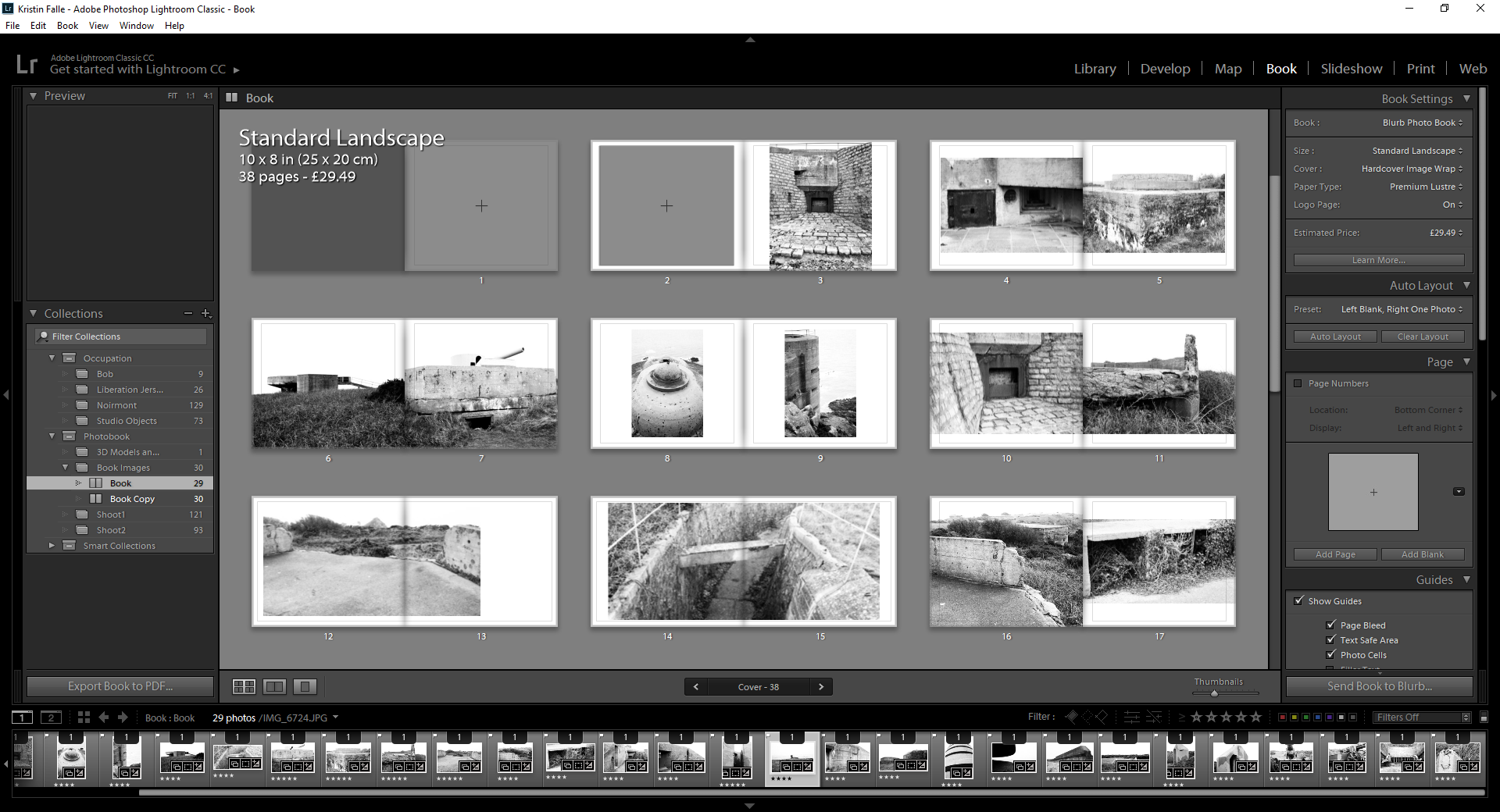
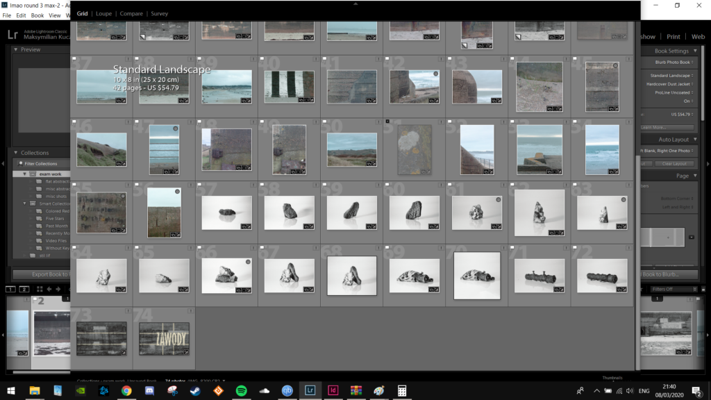
Above are the initial images I have picked to be in my photobook. I have decided to make my images all black and white with high contrast options up. I have placed them in quite a random order initially and have tried to use different formatting options for the images on the pages to see how different images work with different formatting options on the pages.

I have decided to put similar imagery together in a sequence and use the more dominant images on the right side as full bleed images to show this. I have also made the images on the left side smaller within a page, this is so that these images don’t take away from the other better images. I have also added a black background around this one to create a definitive edge to each image, because the image on the right may look like it bleeds onto the left due to the amount of white within the sky and the image on the left with the white in the sky too. I have also added the black background to contrast and make the black within the center of the other image stand out more.
I have found 3D scans of different bunkers around Jersey. So I am going to use some of these within my photobook so I can get a clear view of them within my work rather than just showing the outside architectural view.

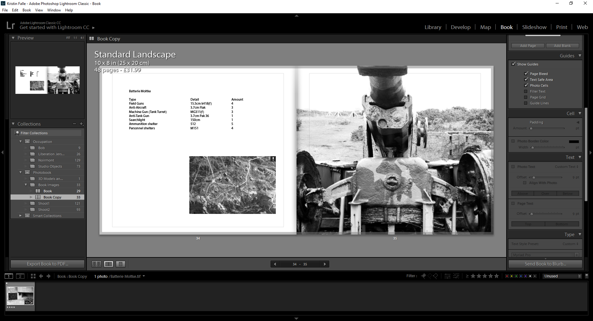
I have now added information about the different equipment that was used at Batterie Lothringen. I have also added a map to show where it was and where each weapon within the area was. I have done this to add more information within my photobook, which I have taken a more architectural view with than previously planned.

I have then done similar with Batterie Moltke. Which is the other main area I took images for this photobook.

I have started grouping images that are similarly shaped or work well together. Such as these which both have lots of sharp and straight edges.

Personal Study – final Outcomes

This post presents my final outcomes for this personal investigation. Included below, not in any particular order, is every piece that I managed to produce for my study. I am satisfied with the final outcomes since it fulfils my desire to experiment with as many different techniques and methods as possible, both traditional and digital. Every outcome has helped me explore my mixed identity and the different cultures I have been exposed to during childhood. Ultimately, I wanted to investigate memories, displacement and identity through the use of archival imagery as well as different mediums in order to uncover my family story. Creating these pieces has helped me self reflect upon what I have left behind while shifting countries as well as remembering those moments.

The three images above are inspired by Claudia Ruiz Gustafson. To begin the narrative for my photo-book, I created collages that depict the family from both my mother’s and father’s side. The first image showcases the family from my mother’s side, all sat on the living room sofa staring directly at the camera. In order to create a collage, I scanned a colourful Peruvian fabric to be displayed as the background. This sends a clear message to the viewers that my mother comes from South America due to the textile art presented. This composition is inspired by Claudia who combines archival images with fabric in order to uncover her family’s personal story. Peru is the country with the longest tradition of textile production, going back over 10,000 years. They dyed alpaca fiber and wove it into specific patterns and shapes, representing the areas and the family the weaver was from. Peruvian textiles mainly consist of vibrant colours and striking designs. The second image juxtaposes with the first collage because now I am presenting the family on my father’s side. I wanted to display an image similar to the first composition where all family members are present. This photo depicts his family eating dinner in their house located in Mojácar, a place that they regularly visited during the holidays. My Grandparents now live there permanently since they reached retirement. In order to showcase where they are originally from, I decided to attach a British stamp in the right corner. The third digital collage tells the story of when my father moved to Peru. Since my father is a geography teacher, he takes the opportunity to go travelling whenever he can. Through applying to jobs in different countries, he ended up in Peru which is where he met my mother Isabel. The two images showcase the culture in Peru and the different locations he visited once he arrived. The photograph below depicts my father visiting Machu Picchu for the first time, an iconic landmark in Peru. On the right side is another piece of Peruvian fabric I decided to incorporated into my digital collages.

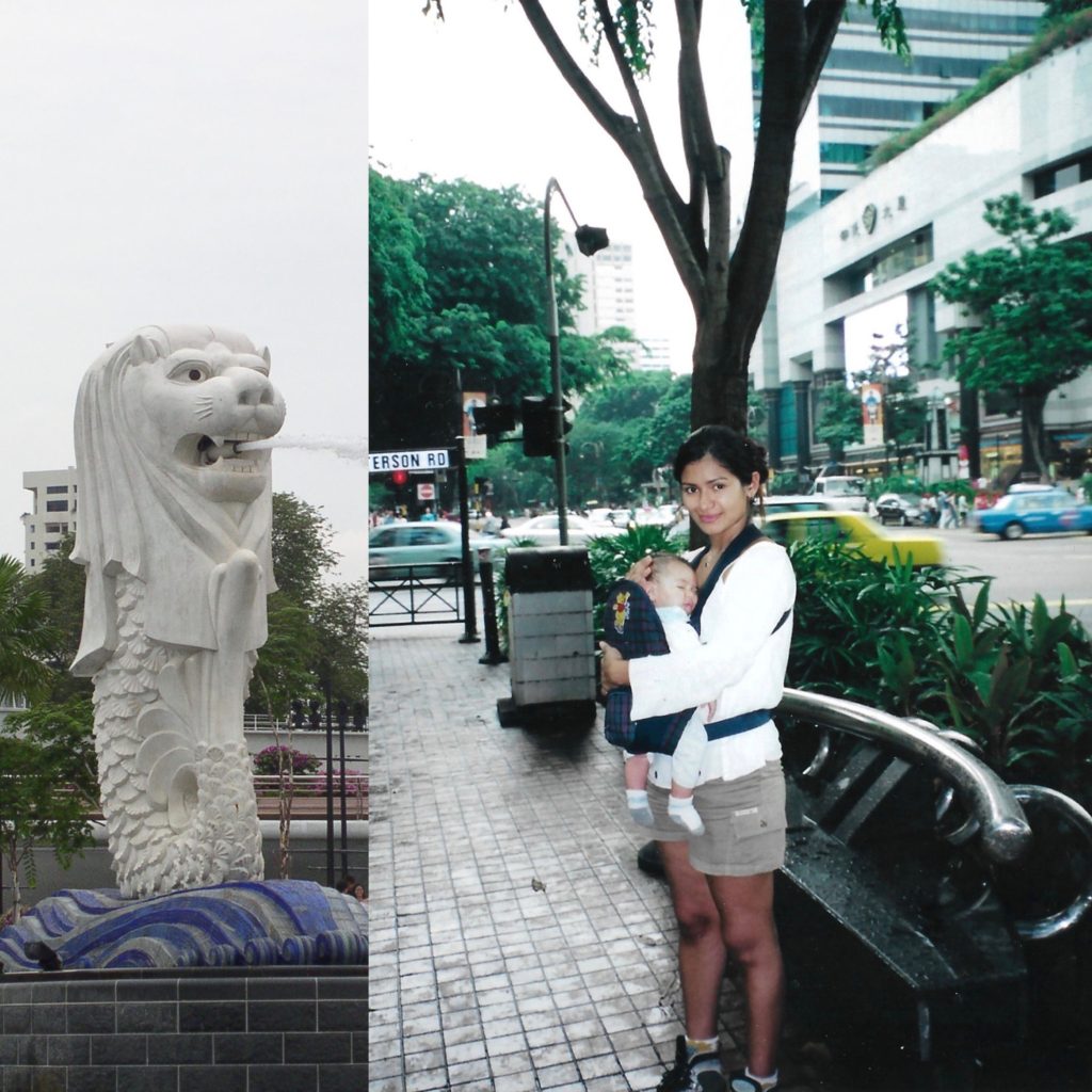
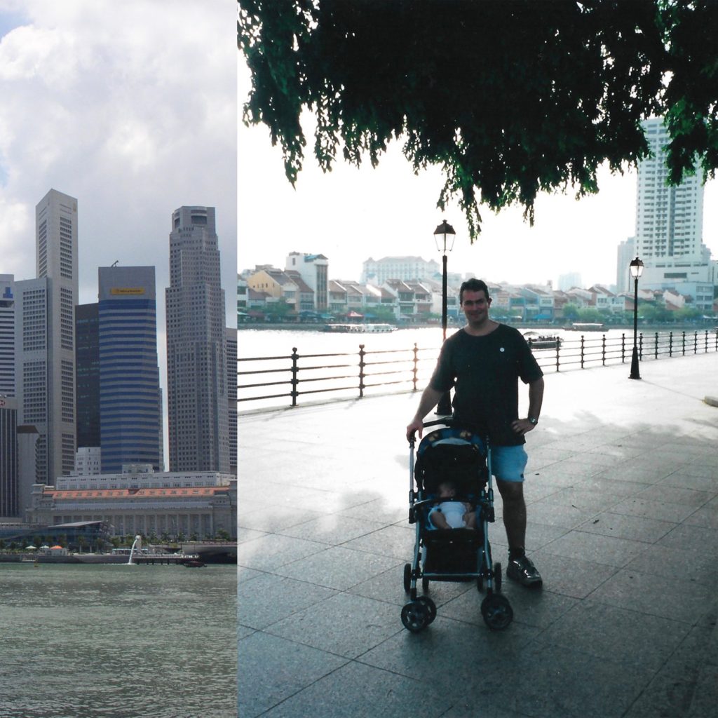
The two digital collages are also inspired by Claudia and depict the time when my family decided to move over to Singapore. I scanned two separate images and decided to combine them together through Photoshop. The archival images on the right display my mother and father looking after me as a baby. On the left side of each collage, I decided to combine the photographs with an iconic landmark from Singapore.

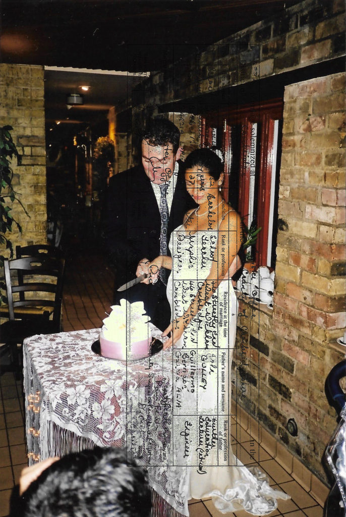
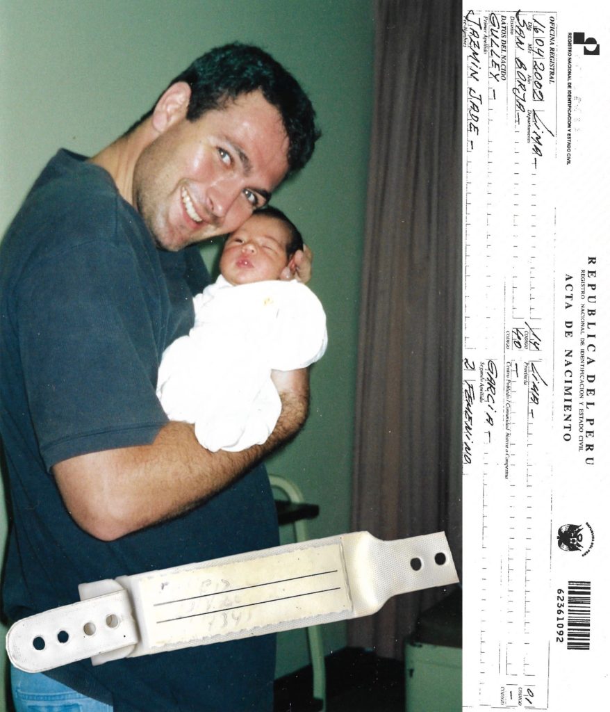
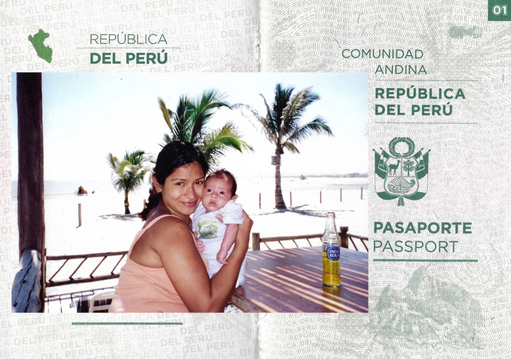
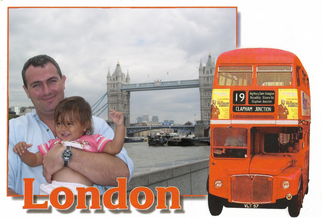
The following outcomes are also inspired by Claudia Ruiz Gustafson. I have created digital compositions which incorporate archival documents. The first image depicts a snapshot of my parent’s wedding and layered on top using blending mode lighten is their marriage certificate. The second image displays the day I was born. The right side contains my birth certificate and layered on top of the archival image is the band I had around my wrist in the hospital. The third image also incorporates an important document which is my mother’s Peruvian passport. Layered on top is an archival image which depicts the first few months we spent in Peru before we shifted countries. The fourth collage was created with a London postcard. London is a place we regularly visit because a few of our family members live there. I created this through Photoshop by erasing all the unnecessary space within the rectangular frame and replacing it with an archival image which depicts me and my father in front of London Bridge.

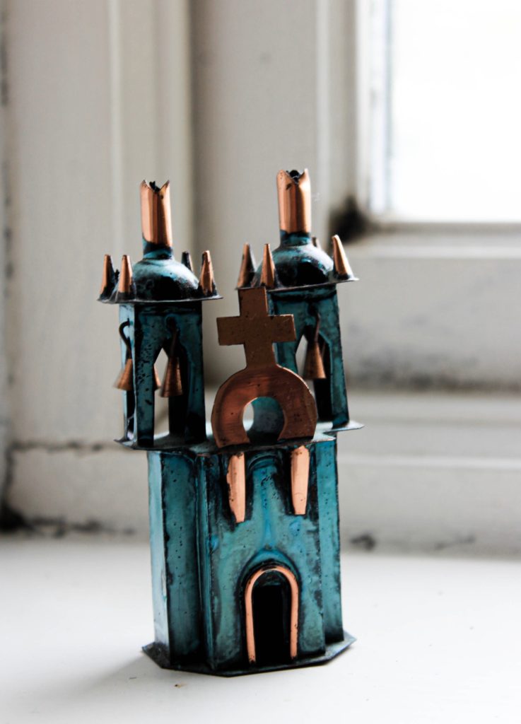
The three photographs above are current photos that I have captured in order to juxtapose with the archival collages. Claudia Ruiz Gustafson does this in her series Historias Fragmentadas to document and contrast different time periods. The first two images were taken in the same location in my house to display them as souvenirs. The first image depicts a handmade copper and bronze Ayacucho Church sculpture. I decided to photograph this sculpture because my mother’s family side are Christians and they regularly attend church.  It is also displayed as a metaphor “hearing the wedding bells ring” as a sign of the upcoming marriage between my parents. The second image is also a souvenir from Peru and depicts three people closely bonded through textile. This represents me and my parents strong connection together as well as our connection to Peru since its where my mother and I were born and where my mother and father met. The third image depicts a current photograph of my mother’s hand wearing her wedding ring. 

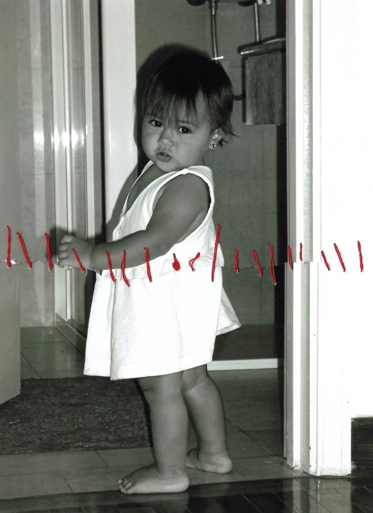
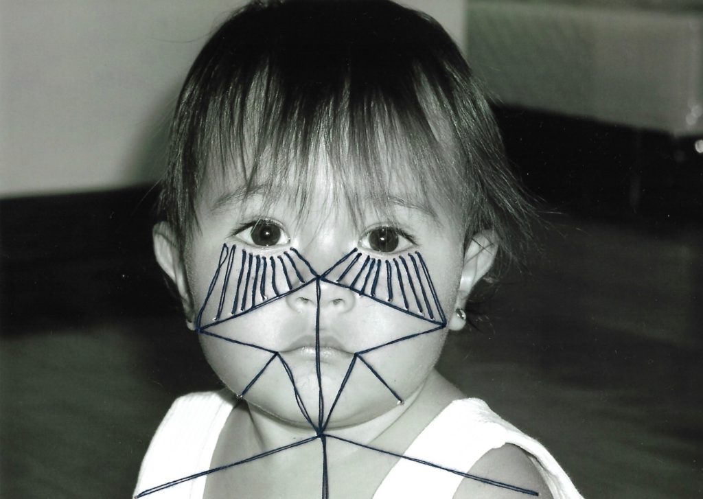
For these photo-manipulations, I used thread for my archival images to be sewn over with geometric patterns. I recreated the abstract aspect of Annegret Soltau’s work by joining facial features together with thread. In order not to destroy the original image, I photocopied all the photographs. I specifically chose a photograph which had a close up of my face in order to see the patterns through line. I think these photo manipulations were a success as I managed to recreate Annegret Soltau photomontages with my own archival images. I think this photo manipulation portrays the idea of identity, specifically questioning personal identity on an abstract scale. I liked the symbolism behind her work and wanted to incorporate that into my own work. I wanted the thread to act as a metaphor for the displacement in my life. the thread showcases that movement doesn’t necessarily mean freedom. Although constant movement can be exciting it doesn’t allow you to settle down in one place. It’s restricting in the way that you feel out of place, a sense of not feeling like you belong at “home”. 

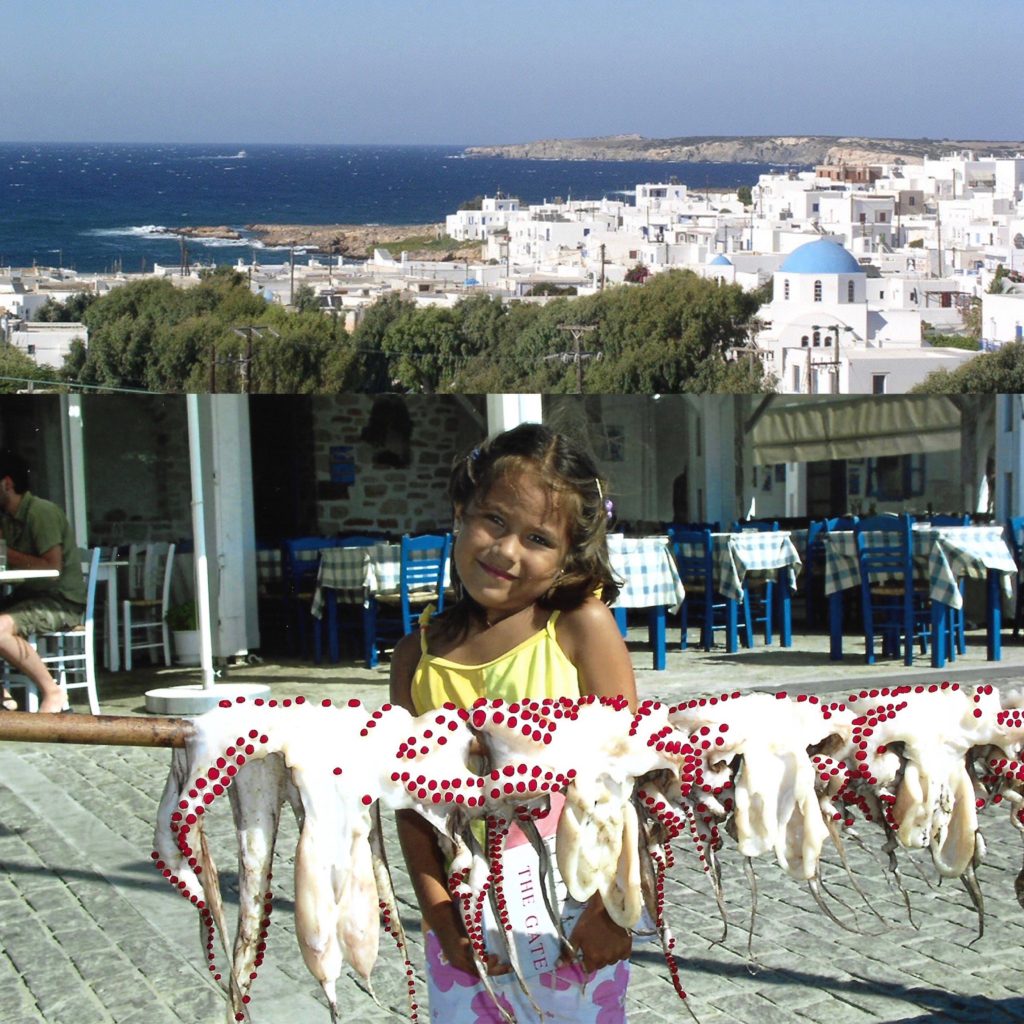
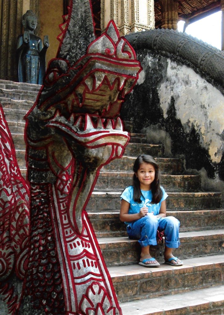
These collages are influenced by Carolle Benitah as well as Claudia Ruiz Gustafson. They depict countries where I used to live or places where I have visited during childhood. I have replicated Benitah’s series Photo Souvenirs by reworking old family snapshots. I have mainly used red graphic ink pen in order to draw illustrations on top of the images. I created these red marks as a metaphor for leaving my traces behind in each country.

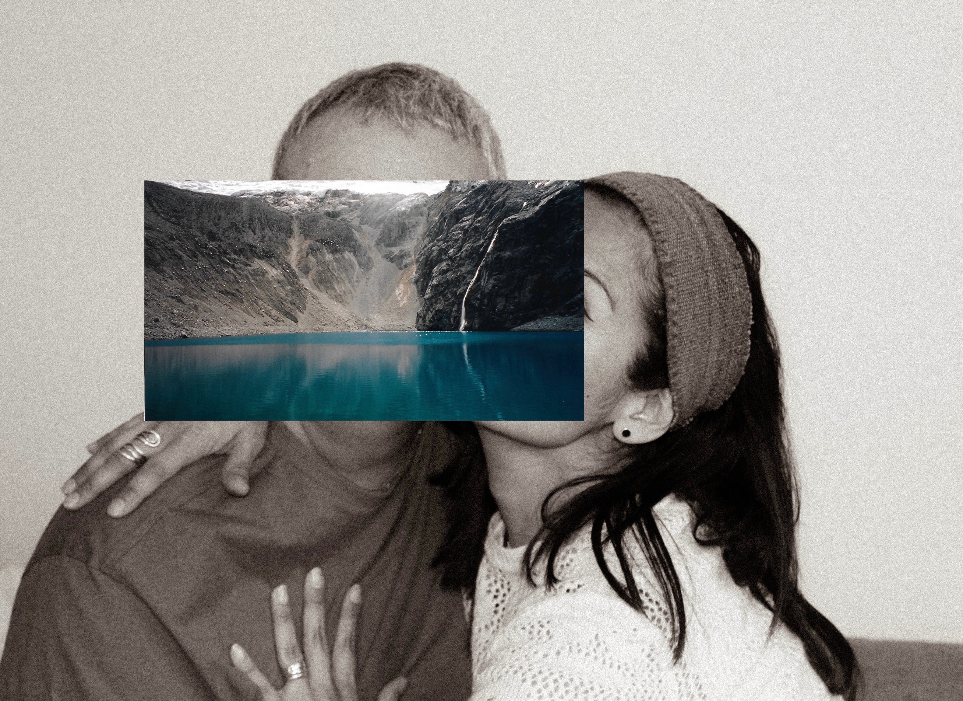
These photo montages of my parents are inspired by John Stezaker who overlays images. I have recreated Stezaker famous series called Mask where he fuses sitters with natural landscapes or architecture in order to create a new outcome. I chose to recreate John Stezaker’s collages because I like the concept of hiding facial features of subjects. I photographed my parents together and used archival images from Peru to layer on top of their faces. These photographs were taken on their first trip together around Peru as a couple. I captured portraits of my parents since when I think of “home” I associate it with them since I haven’t had a long term house or place I have lived at. I chose to have the portraits in black and white in order to contrast with the colourful archival image concealing their faces. The landscape images on the foreground take the place of facial features beneath.

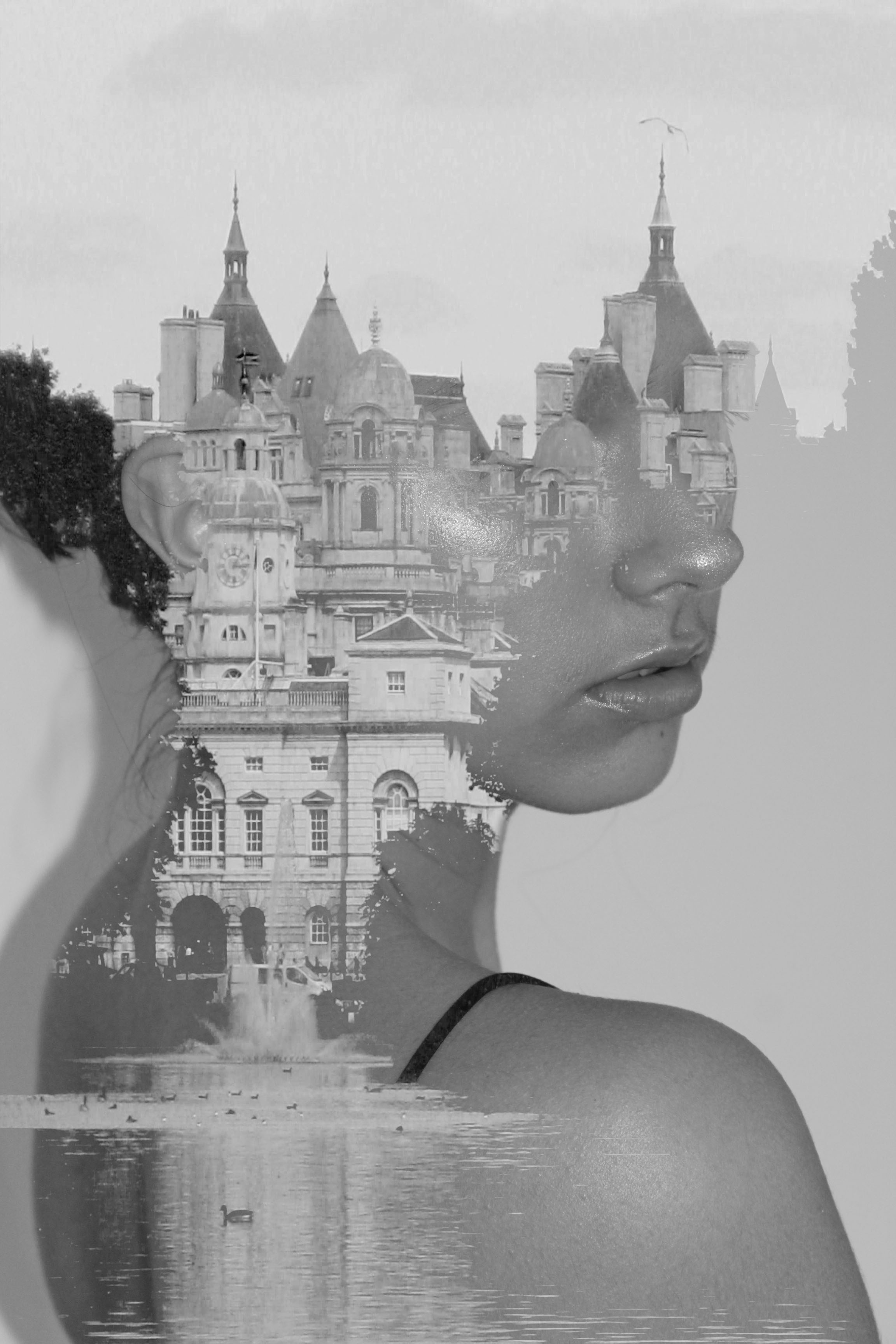
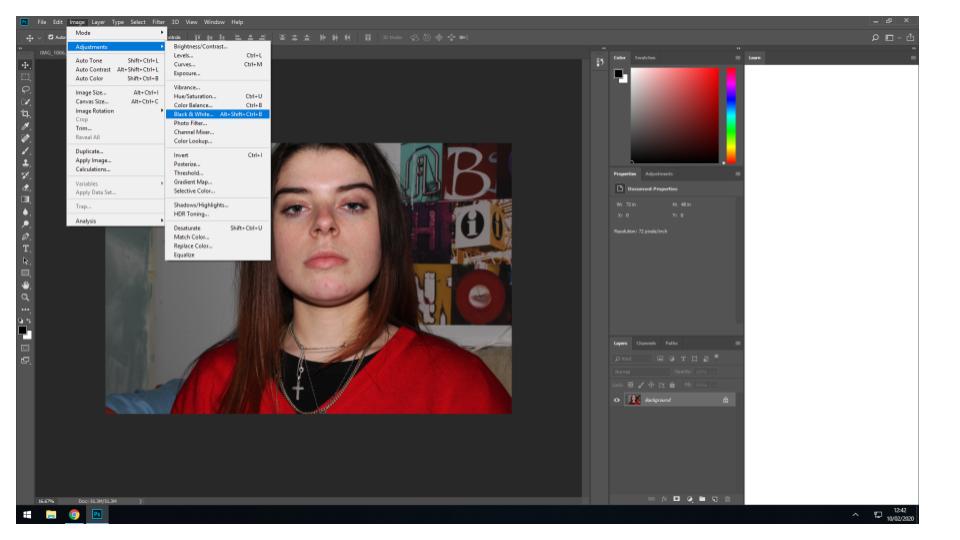
Similar to Claudia Ruiz Gustafson, I have continued my exploration of my cultural identity by creating photomontages which merges self portraits from present time with archival images to exhibit how my cultural identity has shaped me as an individual. I created these double exposures on Photoshop to be able to blend my self portraits with archival images that my parents have captured from Peru and England. The self portraits are head shots so I could focus on altering the area around the head. I captured the self portraits with a white backdrop behind me in order to have a cleaner background when doing a double exposed portrait. In order to create these digital collages, I opened two images on Photoshop: a self portrait and the image I intend to blend myself with. I then converted both images into black and white so the colour of my skin and the image blend together through tone. Having the image placed on top of the portrait, I used the blending mode lighten so some areas are transparent while others remain the same. To complete the edit, I adjust the contrast and exposure on both images to obtain a result where the human face is mixed with landscape or architecture. I would say that these final outcomes are a success because the digital collages create a “mysterious world, halfway between dream and reality”. I have enjoyed creating these illusions through photo manipulation techniques because it’s a creative way of making photo montages instead of physically altering the image.

Possible Essays Questions

occupation/liberation – Compare how Simmons and Bright explore social-political ideas in their work?

How do Simmons and Bright express their social-political opinions about women in society in their work?

How have social-political opinions influenced the work of Simmons and Bright?

How have social-political opinions influenced my work and the work of Simmons and Bright?

Photo Book Specification

Narrative: What is your story?
Describe in:

  • 3 words

Lifestyle, Relationship and Personality

  • A sentence

Exploring my Grandparents lifestyle, based on their upbringing, occupation and relationship with each other as well as other family members.

  • A paragraphs

My photographic book looks at exploring the occupation of Ron Welling and Margret Welling’s lifestyle through portraits and objects. Being brought up in the 1940’s means their lifestyle is very different to mine. Traditionally, they were raised to believe that the husband has to provide for the family, as the wife stays at home as a house wife. On top of this, religion has impacted their lifestyle and the way in which they structure their days and has been apart of their life since a young age. My Granddad worked in the financial industry, after moving to Jersey in the year of 1984, and managed to make his fortune out of this industry, due to his hard work he not only managed to provide as the only financial support for his family, but also has provided a luxury retirement for himself and his wife which has clearly influenced their lifestyle.

Design: Consider the following

  • How you want your book to look and feel

I want my cover to be a hard back, suggesting an official book with official information like a hard back dictionary, the information in a dictionary can not be changed like my Grandparents lifestyle, suggesting a reliable source for their lifestyle, The book will feel smooth and the image wrap cover will allow this to be achieved, creating an overall nice book to hold. As it is a book about family the book will look like a coffee table book which are often found in open areas of homes, these coffee table books often are family albums. Therefore, my subtle cover will allow the coffee table ideology to be achieved.

  • Paper and ink

Due to my photographs sticking to a documentary style, I want the books to clearly depict reality and so I have decided to use matte paper. I also believe that having my main subject being my Grandad, who is an authoritative figure, the matte paper will conceptually present this as well as making the pages look like an important document showing his work life, it will also complement my black and white imagery.

  • Format, size and orientation

My book will be 20 x 25cm standard portrait, due to the majority of my imagery being portraits allowing for the full frame to clearly be presented and making clearer emphasis on my portrait photographs, allowing the conceptual representation to clearly be illustrated within my book.

  • Binding and cover

For my cover I am wanting to use an image warp, of one of my top interior imagery. The photograph is of a window looking out onto their garden, the curtains either side suggests the ideology of stage curtains and the window is the narrative about to be told, making this an effective image to use as it is their interior suggesting their lifestyle. With regards to binding I will have a saddle stitch which I took inspiration from Sam Harris’ book as I believe the subtle stitch will suit my narrative.

  • Title 

Retirement

Mr Ronald Welling and Mrs M Welling

  • Structure and architecture

I want the structure of my photo book to maintain a simplistic theme, in order to not distract viewers from reality and the narrative trying to be portrayed. The photographs will be matched in a sense of whats happening in the frame, colour and texture in order to display the narrative of my Grandparents lifestyle. The double page spread will illustrate the key element of my Grandparents lifestyle, as well as having key portraits on a single page on the right with nothing on the left to emphasise the frame and conceptually what is happening. The photographs will be in a chronological order to display portraits, family event and then interior to clearly present a clear understanding of my narrative.

  • Design and layout

I will mainly use single page spreads for my portraits, with having nothing on the left to allow the main focus to be on the portrait suggesting an element of my Grandparents lifestyle. With archival imagery I will use two on a page and if I want a comparison I will use two images to a page. I will use more double page spreads rather than 3/4 page spreads to allow maximum effect on my imagery. I do not intend to having any inserts with texts, as I want the main focus to be on my imagery.

  • Editing and sequencing

The first photograph of my book will be a portrait of my Grandad on the right side of the double page, to illustrate the idea that he is the authoritative and main figure of the family. The next two pages will have a picture of my Grandma on the left hand side, making this artistic decision emphasise how my Grandma is more submissive as when you look at a photo book you look on the right hand side then the left, so she is less likely to be looked at. The last image will also be a portrait of my Grandad allow the sense of authority to be the closing statement of my book.

  • Images and text

I do not to add texts to my photographs as I believe that it will influence interpretations of my Grandparents lifestyle, which leads to an unreliable source of depicting their lifestyle.

Personal Investigation – Photobooks – Post 4 (Final Layout)

Final layout of photo book:

Front Cover:

For the front cover of my photo book I selected the only ‘in colour’, mostly unedited image incorporated into the book. The cover contrasts with the images inside, yet the themes bright colours in the cover are reflected in the images and the relationship between the blue and red follows on with the concept of the different coloured, more abtract full bleed image throughout the book. I have selected the title ‘Understated’ as an oxymoron to the actual images, as they are bold and overstated. The term understated relates to the content of the book as the theme throughout is simple, abstracted portraits and still life images depicting how me and my friends go through life together, and the ideas and concepts that bring us together.

Main Images:

The main layout inside the book is stark, bright images on black paper to enhance the compositions. There are a combination of double page spreads, single photos and two photos on a double page spread, which each work to frame and marry together the key concepts and ideas of the book and the photos.

Dividing Images:

An addition theme to my photo book is the incorporation of a series of linked, colour contrasting full bleed images throughout the book. This helps break up the colour scheme of the book and adds a different perspective to the images.