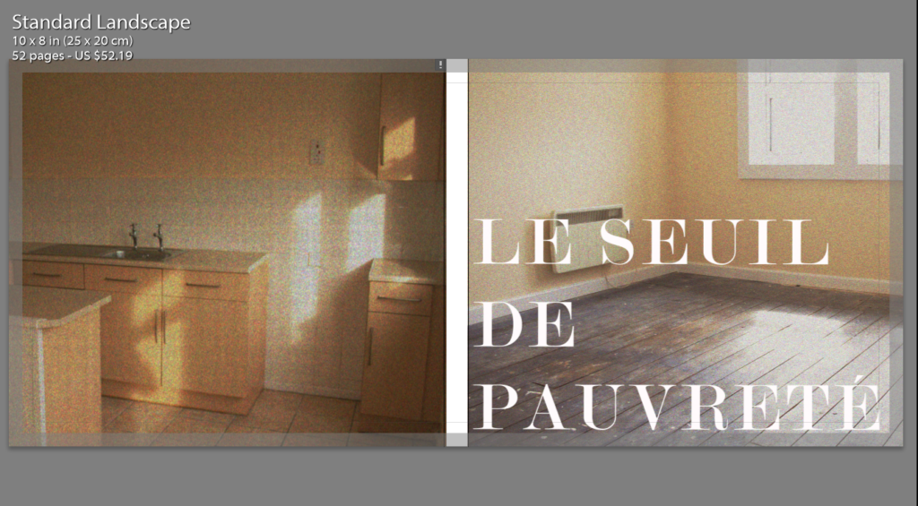
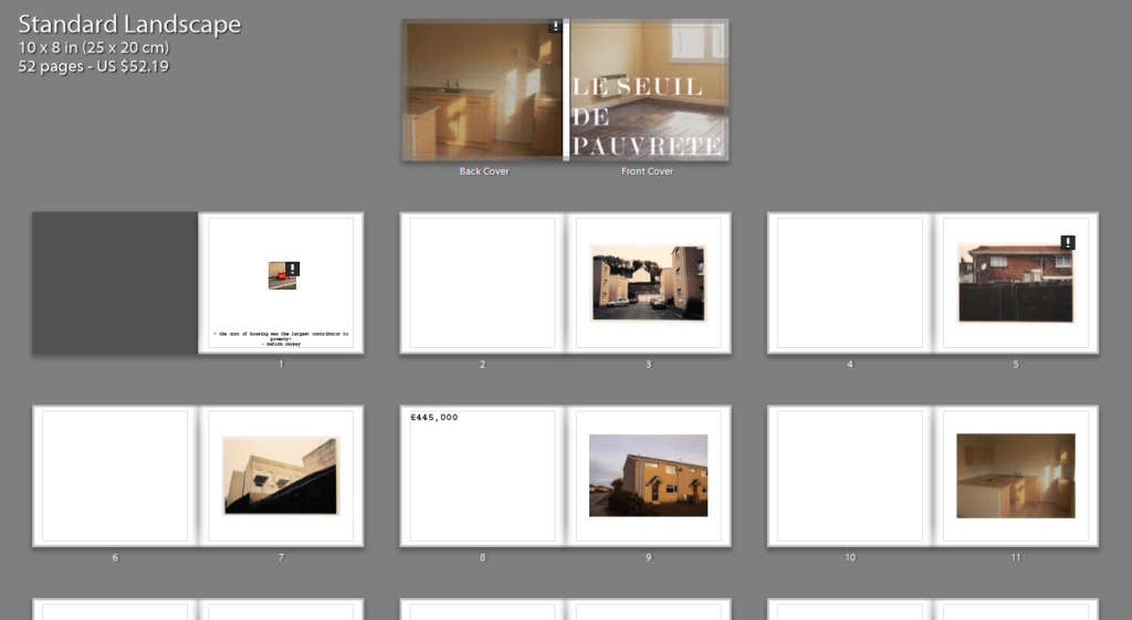
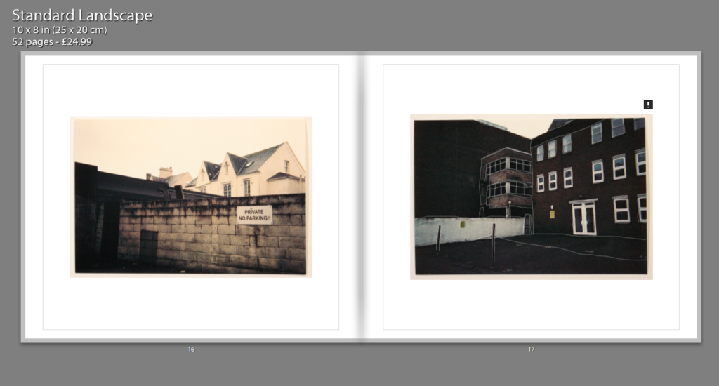
EXAMPLES OF LAYOUT:
LAYOUT IDEAS/CONCEPTS:
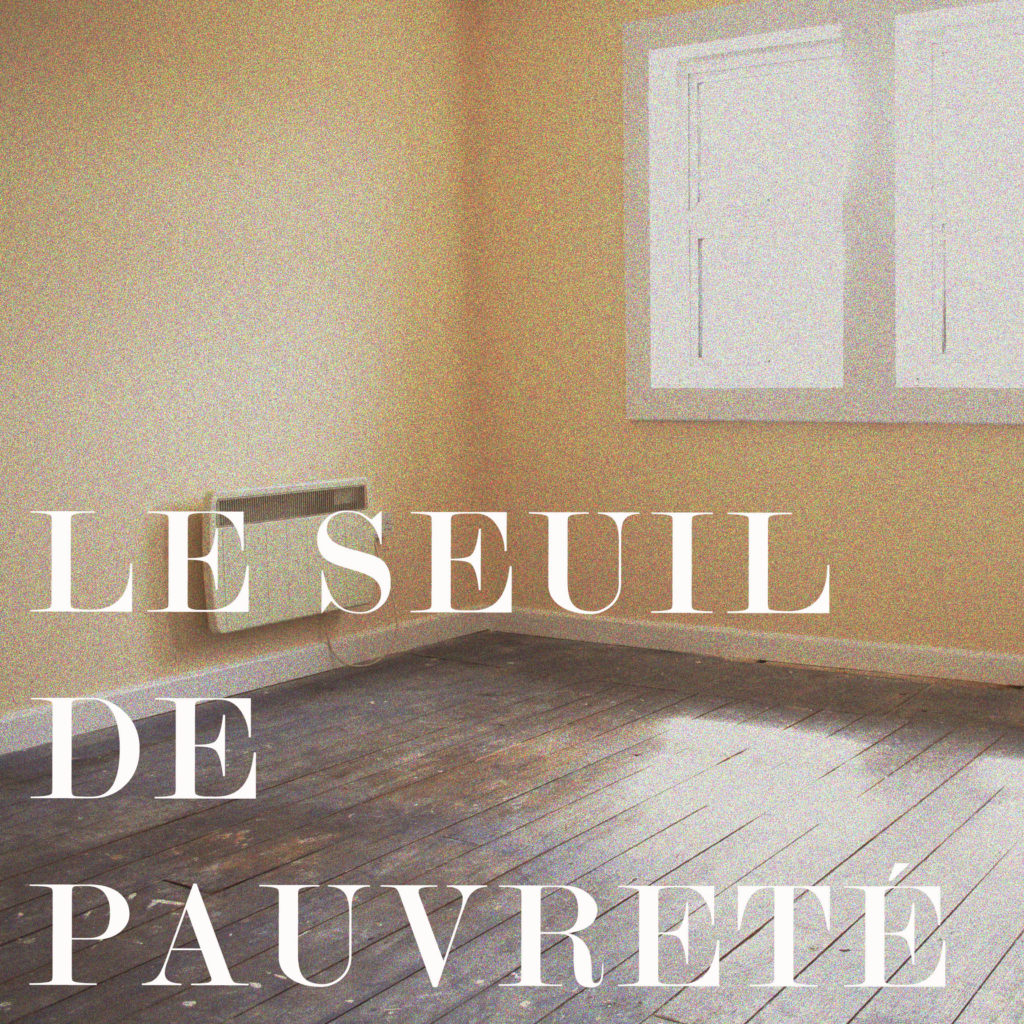
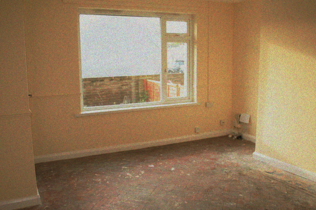
In terms of the layout of my photo book, I was aiming to keep the inside fairly simplistic and plain to harmonize well with the subtle imagery which goes inside it. My choice of front cover was deliberately the most simple and subtle images as I felt this was important when adding text onto the image for a front cover. The images both tie in well together due to the small light rays coming in horizontally through the window and casting beams within the room. They tie in well together due to their settings, composition and light. For my front cover, I also chose to keep the title in white as this emphasizes the sophisticated style of the images and keeping in within the color scheme. The back cover is very much similar, being very profound and uncomplicated in nature. Both of these images had been edited in order to add noise and increase the contrast to make them fit in better with the film imagery which can be seen within the other images.

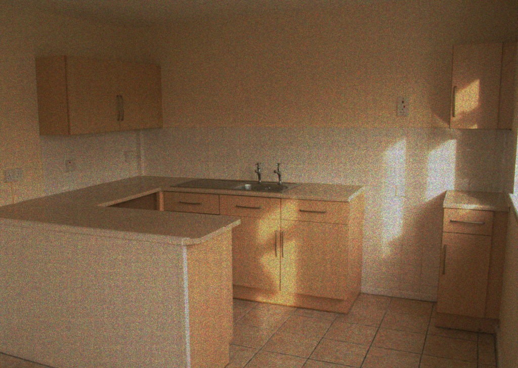
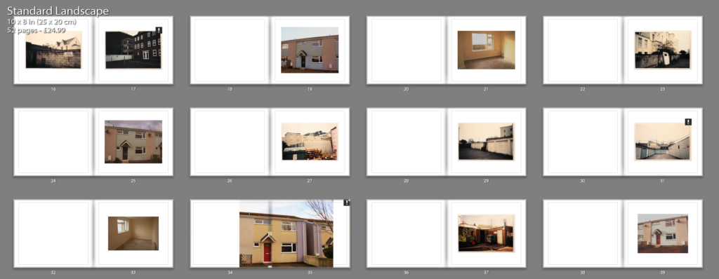
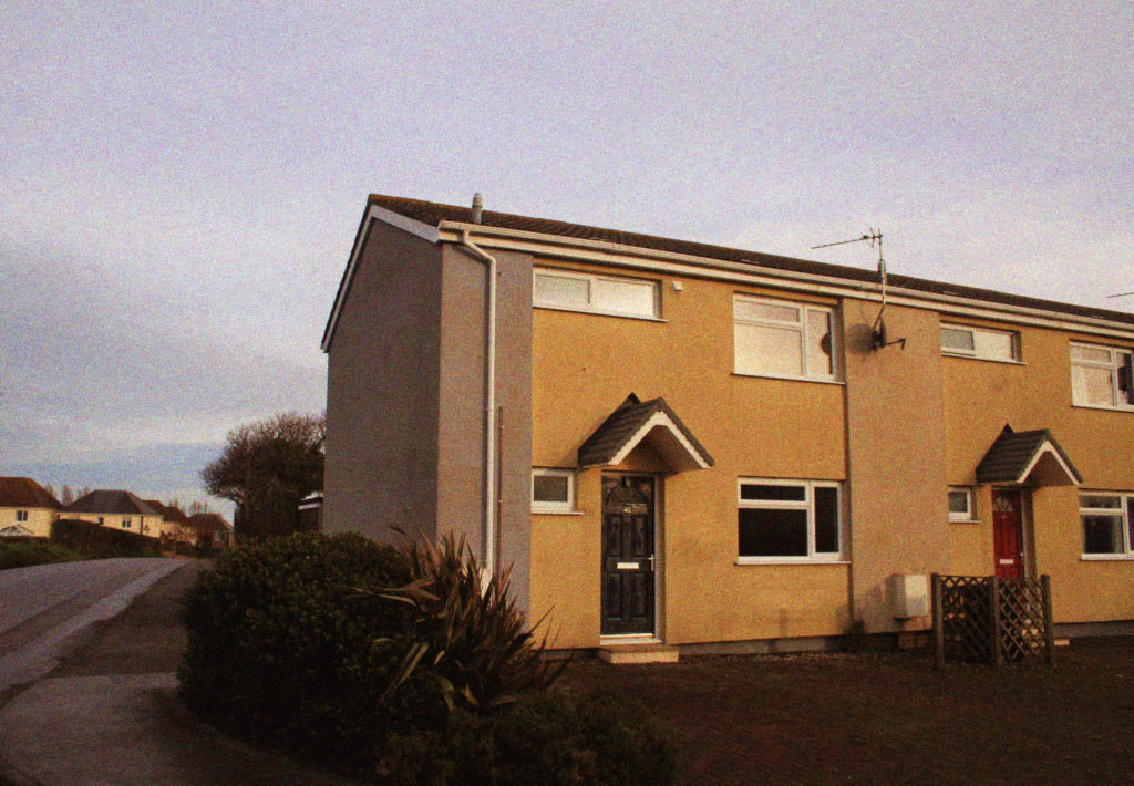
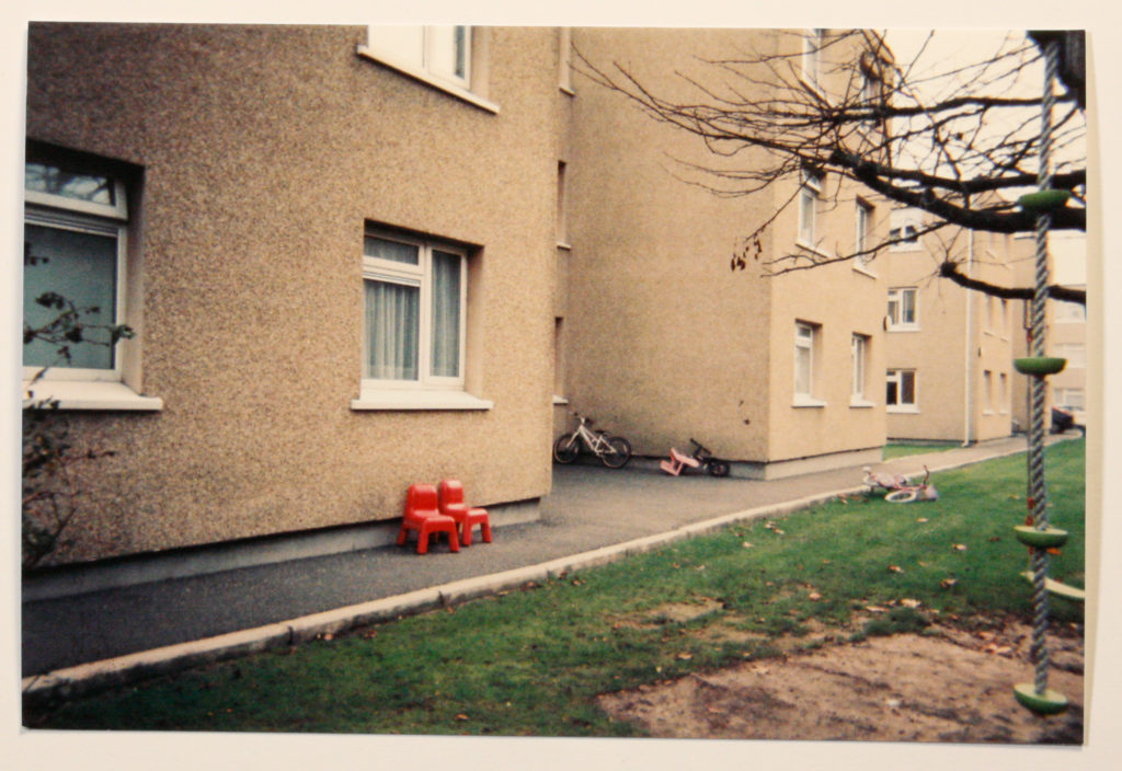
As for the inside layout of my book, there is a combination of both single and double page spreads which again goes well within the simplistic layout and stylistic features of the front cover. There is a also a combination of both film and digital imagery which has been manipulated in order to look film-like by adding noise and increasing the tones of red and yellow within the images to make them warmer. As a start, I will be including my film images and adding a padding of 100 in order to make them sit central within the image, adding this padding I feel stylistically fits with the flow of the book and provides a point of continuity.
EXAMPLES OF IMAGES I WILL BE INCLUDING:
In terms of the selection process for my book, I took the approach of ‘does this fit the massage I am wanting to portray?’, in the sense that does it showcase an inequality in the Jersey housing market, between the price of the properties versus what the condition of these homes is actually like. Stylistically I also consider weather these images fit well together and if there is a flow to the narrative. The images combine a good range of the prospectus of the state of St.Helier, social housing and also the interior of these homes. The three aspects which I was hoping to capture from the very start. Taking a documentary photography approach to this subject, my work IS following the conventions of realism. The idea that picture knowledge could be universal relates to what is known in philosophy as the ‘realist’ approach. Realism is the idea that a photograph of an object or a person bears a close relationship to that object or person. There is a link between the object or person photographed, and the photograph. The photograph, in other words, is a trace of something real. Because it was necessary for the object or person to be present at the moment of photographic recording, it can also be said that there is a link between the photograph and the events, objects, people, etc., it depicts. Examining the work of Nick Hedges, there is a clear link between my own personal study and the depictions which I aim to imitate in terms of its contextual aspects and intent. I will be comparing two works from Nick Hedges, from the exhibition ‘Make Life Worth Living’, It was commissioned by Shelter, a charity working against homelessness to raise consciousness about the poor living conditions many Britons experience. The photographs were taken between 1968 and 1972 and are an intimate glimpse in to the human cost of poor housing.

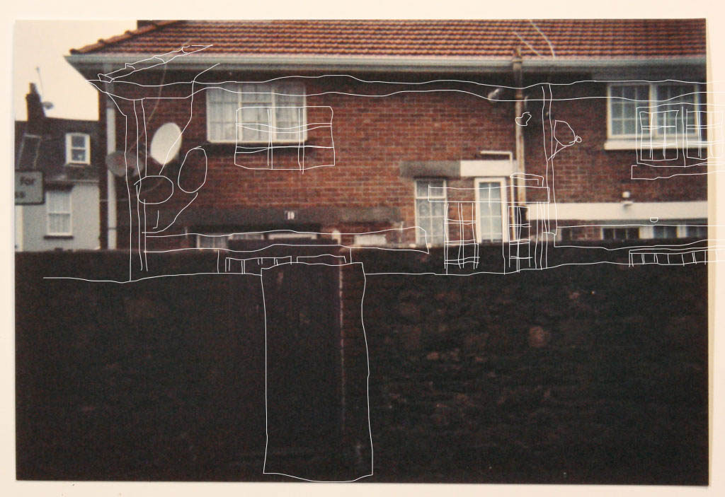
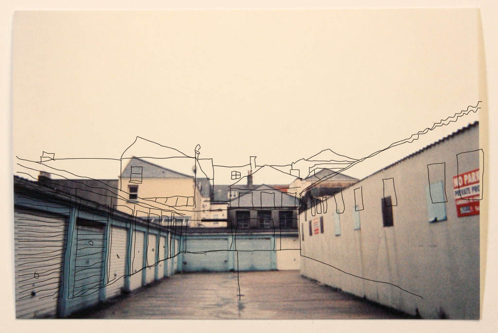
FINISHED LAYOUT SO FAR:
