EXAMPLES OF EFFECTIVE LAYOUT:
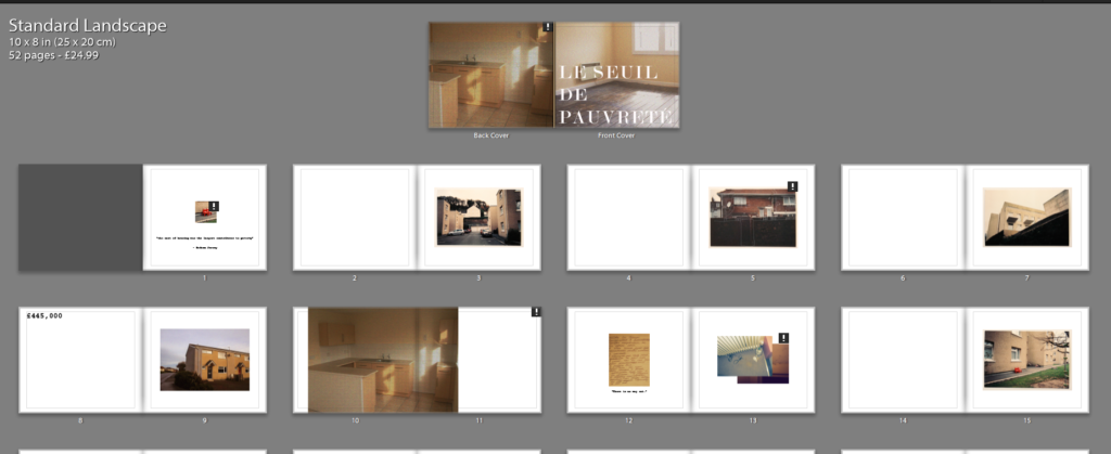
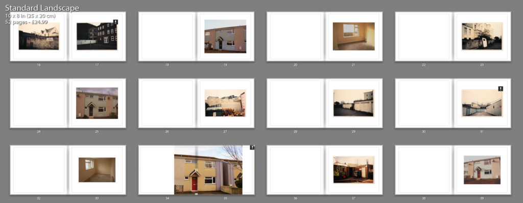
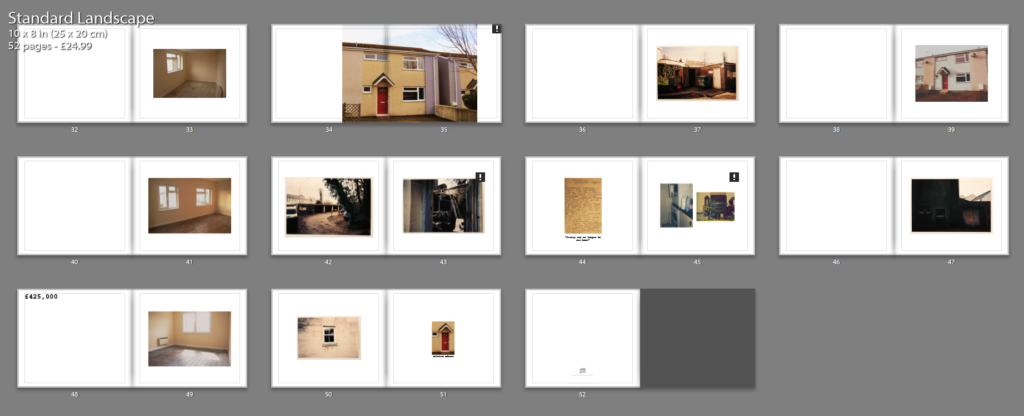
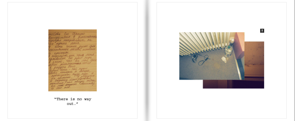
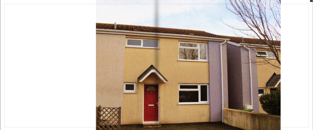
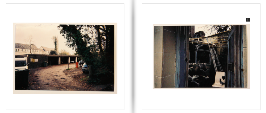
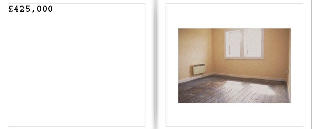
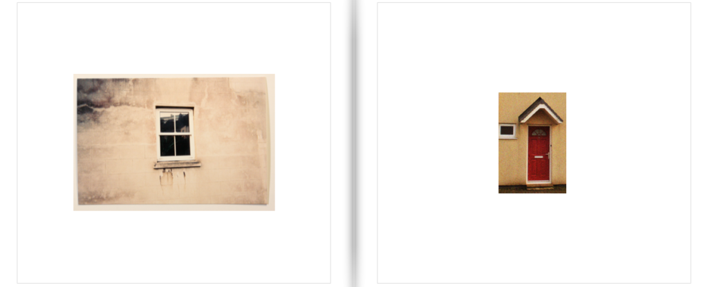
Below I have included examples of effective layout which showcases a wide variety of different layouts within my book. Within one of my spreads I have included a hand written letter from one of my family friends’ which describes their reality of living in Jersey. It is written in Russian therefore I decided to include a small translated quote on the bottom from this text, reading “There is no way out.” I felt as though this was a very poignant quote which fit in well with the personal narrative which I was trying to include within my book. With my image making, I am much less focused on the pictorial aesthetics but rather just a documentation which clearly reflects the inequity between housing prices and the property conditions. Further, this investigation led me to posit as a prospect buyer, yet my intent was purely image taking, which lead to my work being rather up front and raw, simply taking an image as it first appears. It was also unsuitable for me to take images which appeared as close ups of possessions as I had to take in mind the privacy aspect of the people who live here, and their lives being all on display for people to see as they enter. I felt this property was a good representation of my statement as in an image we can see one of the allocated bedrooms being used as a storage room, demonstrating how small and cramped conditions “low-priced” properties such as these can have. Much like Andium Homes, the exterior of this building is much more reminiscent of 1990’s Russian cubism with the minimal architectural features. Not only taking into account the housing conditions, this property is located near Springfield Stadiums which is socially considered as a rather dingy and hopeless area to live in due to the concentration of social housing and migrant communities.
OVERALL LAYOUT:
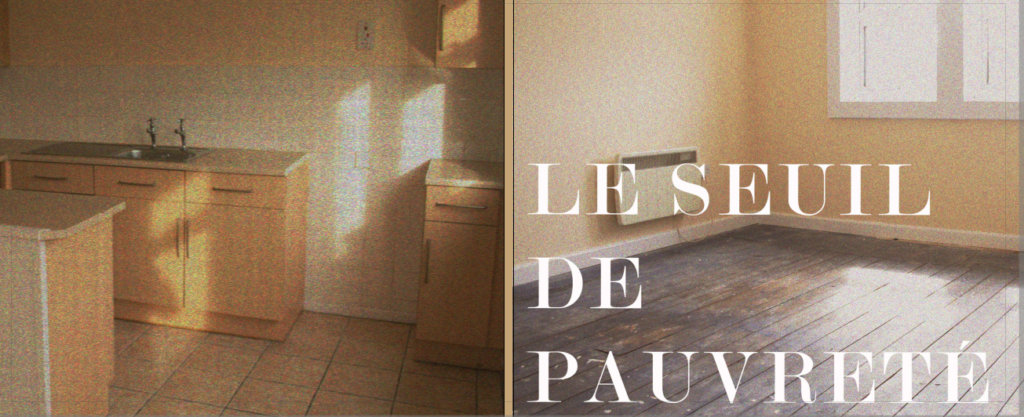
As a final layout I fell as though it is very effective and clearly conveys all the different aspects of the housing market well. Through my own image taking I was able to see see the ways in which not even government subsidised agencies are able to provide housing which is truly low cost and appropriate for a low-income family. Taking a documentary style approach to my image making, I was able to produce images which in many ways appear sterile and routine, appearing like that of an estate agent. My work I feel has effectively captured the same underlying message as Nick Hedges in the sense that neither or are able to provide citizens with appropriate living standards, weather that be of a lack of government support or over-privatisation of the housing market, both situations put ordinary civilians at a risk for homelessness. These complicated themes were captured within the images which I took in a simplistic and subtle manner.
