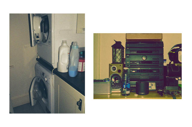
- WHERE: Within my personal study, I will be focusing on 3 main areas of study , personal, external and internal. The persona aspect of my project I will be looking at my own personal journey and the ways in which my family has occupied Jersey, capturing images of my own home. The external aspect of my project will be focusing on the exterior aesthetic o low cost housing within Jersey. Lastly the interior aspect of my project will done within empty properties, arranging viewings with estate agents in order to do so.
- WHEN: in order to capture the exterior photo shoots, I will be attempting to capture them during more gloomy and overcast days as I feel this will add to the themes associated with the topic at hand which is all about control and institutional discrimination.
- WHO: My project will be focusing less on people but rather places, I will be using documentary style photography in order to carry out my shoots, focusing on the state of the housing market and the truth of affordable housing.
- WHY: The topic at hand is personal to both me and a large population of Jersey. Immigrants, young people and the elderly, making it almost out of reach to buy or rent property which lives up to suitable standards.
- HOW: I will be using a mixture of both film and digital photography in order to carry out my photo shoots. A theme which I also want to convey through my work photography as it will be linking to the impacts of trauma and childhood.
- In order to approach my personal study, I will be focusing on three main concepts, the housing crisis, nostalgia and control. A topic which I am highly interested in and willing to explore is the housing crisis which affects a large population of Jersey, not only the immigrants but young people and the elderly all face institutional discrimination which makes it extremely difficult to get on the property ladder or be able to find suitable housing in Jersey. There is an extreme lack of affordable housing for low income families and young people alike, who start out on a low-income, earning minimum wage at the start of their careers. With the use of film, an older method of photography, I am hoping to capture images that capture a nostalgic and reminiscing feel. The fuzziness and grain which can be captured using this flash provokes ideas of the old and outdated.
SUCCESFUL OUTCOMES:
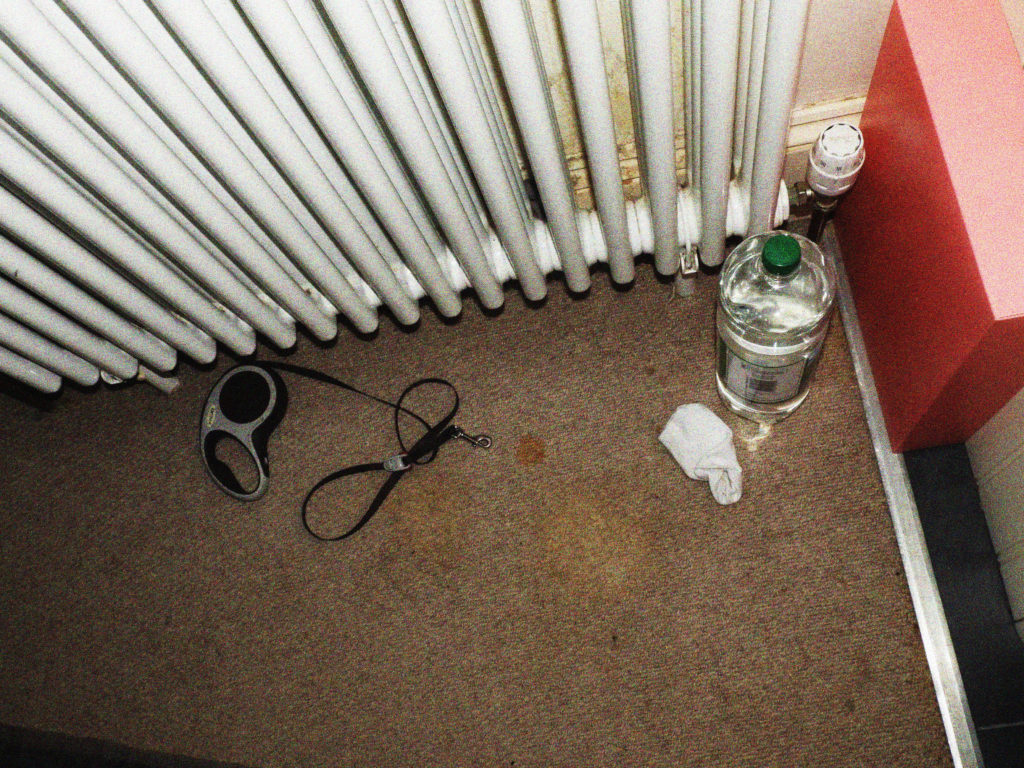

CRITICAL ANALYSIS:
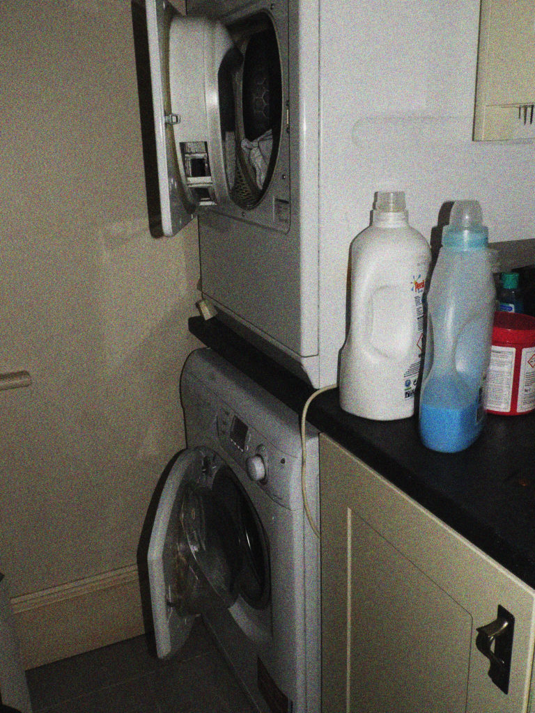
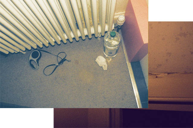
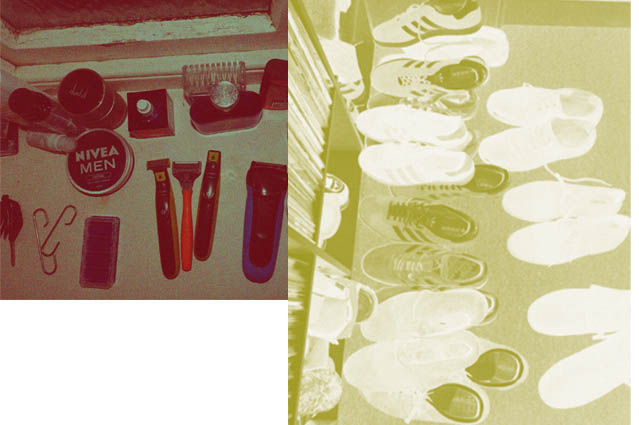
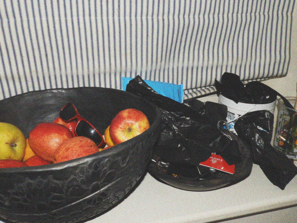
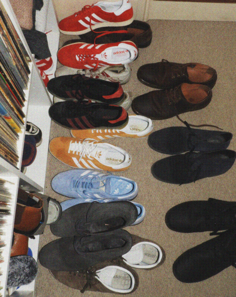
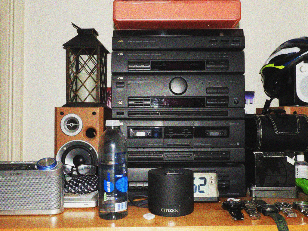
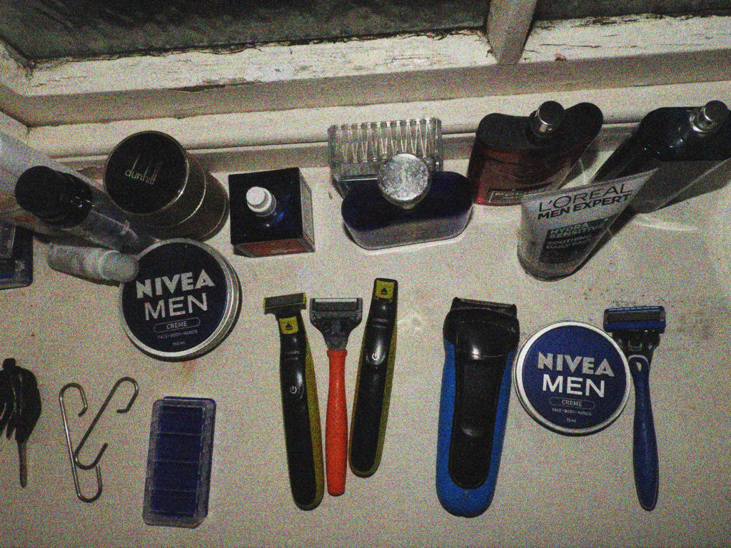
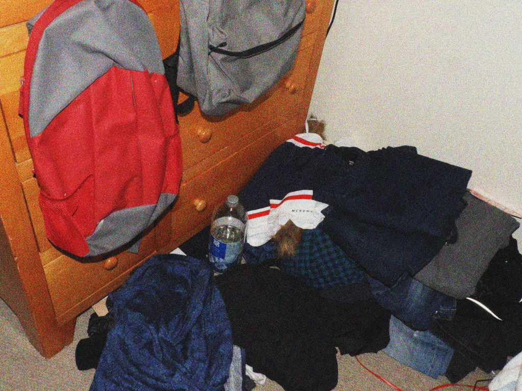
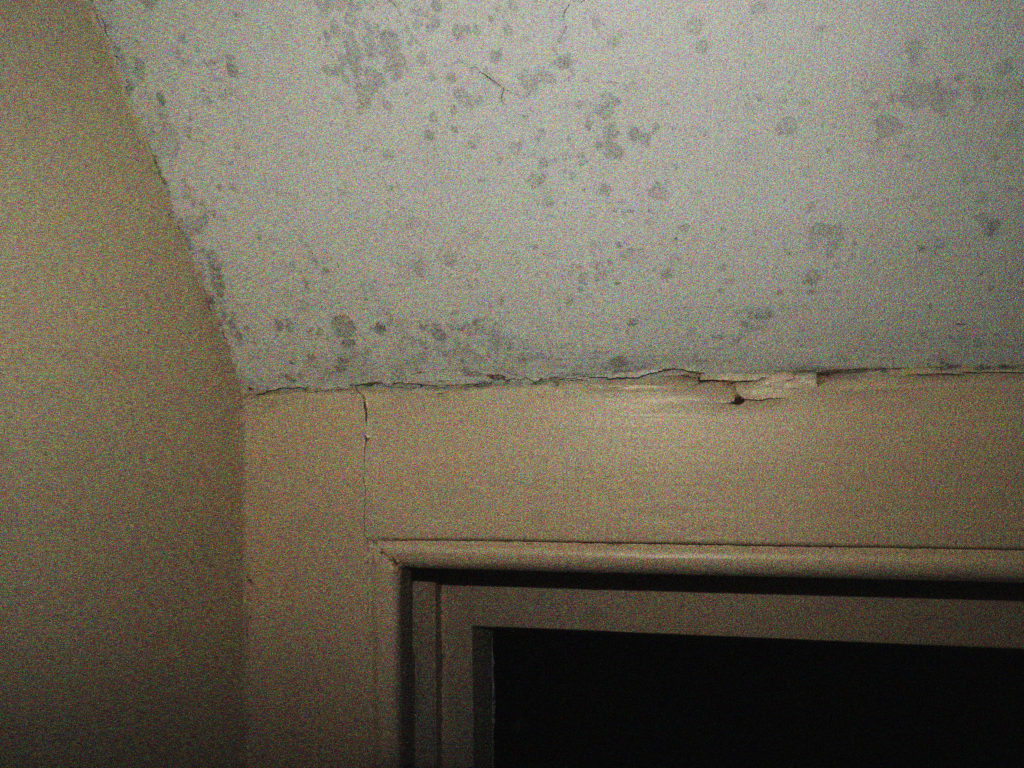
Aesthetically focusing on this image, there are few aspects which make it a conventionally “good” image, my project is very much looking at the contextualization and stories of the people who live in this housing, in this specific photo shoot I have focus on the property of one of my family friends who is also Latvian, capturing the small details of their home, and the very mundane life style. The depiction of these various aspects of their home is important as the depiction of the mold on the walls was a big concern which they expressed to me, becoming much more than a simple inconvenience in their life but more a health hazard. I decided to capture small details of their home such as their personal possessions as I thought this was a good chance for me to be able to add some personal insights into people’s lives who live close to the poverty line. With my image making, I am much less focused on the pictorial aesthetics but rather just a documentation which clearly reflects the inequity between housing prices and the property conditions. Further, this investigation led me to posit as a prospect buyer, yet my intent was purely image taking, which lead to my work being rather up front and raw, simply taking an image as it first appears. Not only taking into account the housing conditions, this property is located near Springfield Stadiums which is socially considered as a rather dingy and hopeless area to live in due to the concentration of social housing and migrant communities.
EDITING PROCESS:
In order to create images which had more aesthetic integrity, I decided to create some edits which the images which I previously took, adding colored overlays in order to do this. Taking different gradients, adding these to the images and decreasing the opacity in order to be able to see the image below the overlay. I also experimented with the layout of these images, making some of them overlap and cross over as I felt this gave some variation and would be a good addition to my photo book which included a lot of simple layout styles.
