
After having looked a several photo-book ideas I have decided to experiment with a few different design layouts.
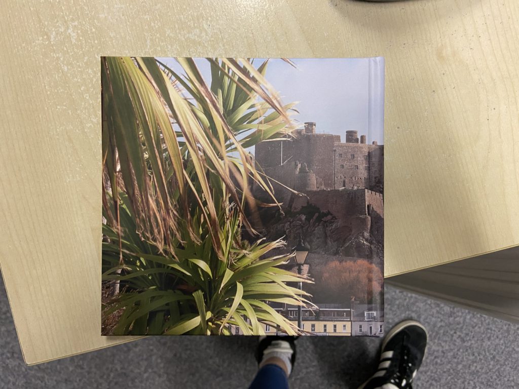
I began designing my book as landscape but then decided that actually I wanted to have a book that was smaller. I changed the size of the book to square with en example of the size I am aiming for below:
I would like to have my phonebook asteticaly pleasing. What I mean by this is that I want my book to have a narrative that makes sense without the viewers knowing the story line. I have also decided to name my book “Closed Cases…” The reasoning behind this is that I am going to translate it into Portuguese. Both my parents are Portuguese so I thought it was only right to add elements of my culture as well as theirs. “Closed Cases” in Portuguese translates to “Casos Encerrados…” The reason my book is being named this is because to me, and to both my parents their relationship is over and they will most likely never get back together. As harsh as it may sound I have become okay with the reality of this and have grown to accept this.
In terms of my design lay out I wanted to have a variation of size in the images. I wanted to also have images that made sense together, one balancing the other out. Some images are going to be kept smaller and I might also have a page of writing in Portuguese, like a quote and names of places that were and will always be significant to me and my family.
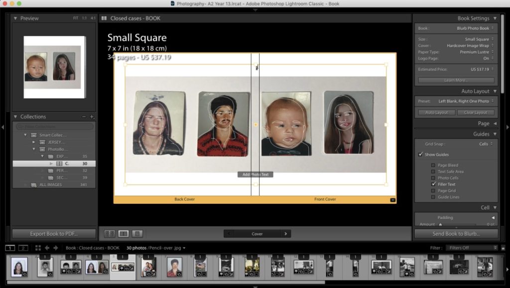
The above screenshot is going to be my front cover. I have chosen to use this image as it is one of the only pictures we have as a 4. I also used an app called ‘Pics Art’ to create the white pencil overlay effect. As I am exploring childhood as part of my project it adds that childlike feel to the book. I am still continuing to add images and edit them in order to fit the sequence I am trying to portray.
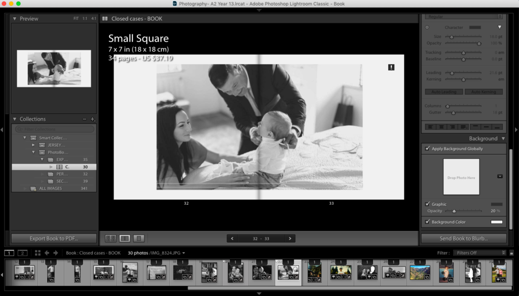
This is an image I have chosen to put towards the end of my photo book. I am choosing to place this here as it is symbolising the end to my dads first family and the beginning of his new family.
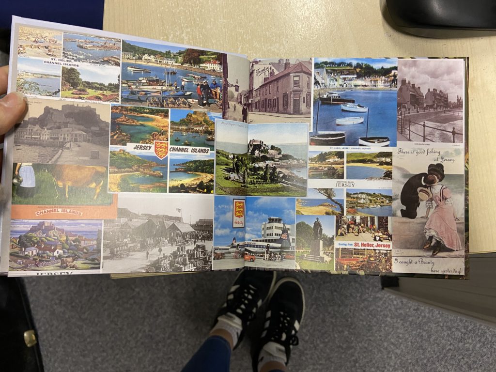
Another thing that I have experimented with in my phonebook is the colour of the background.

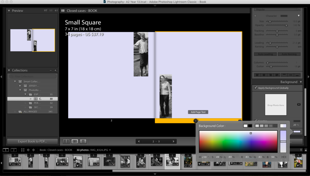
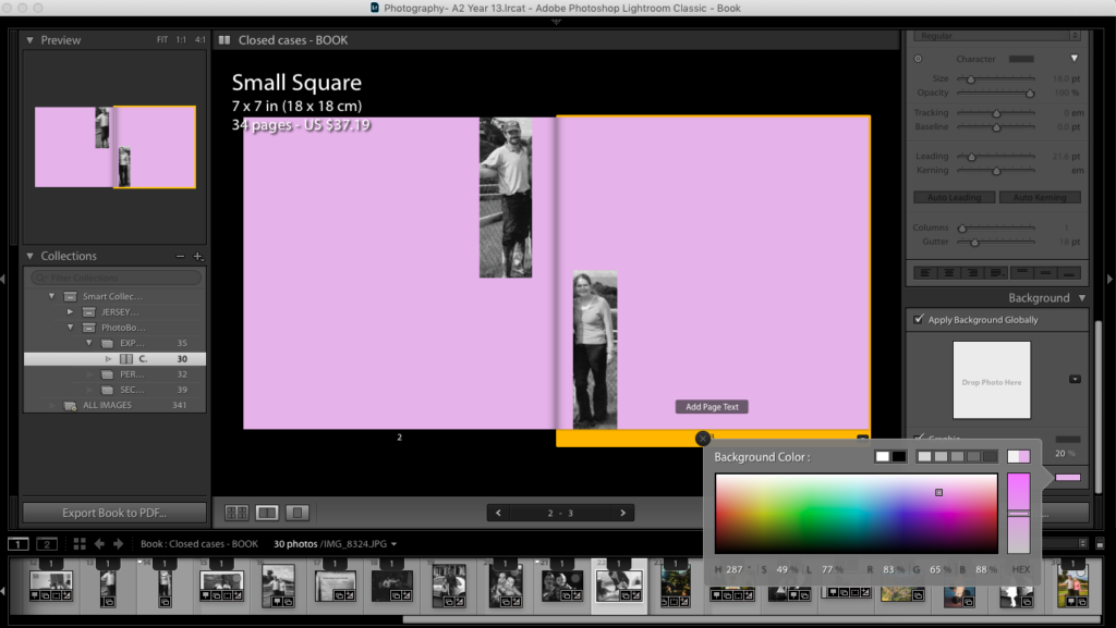
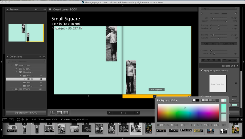
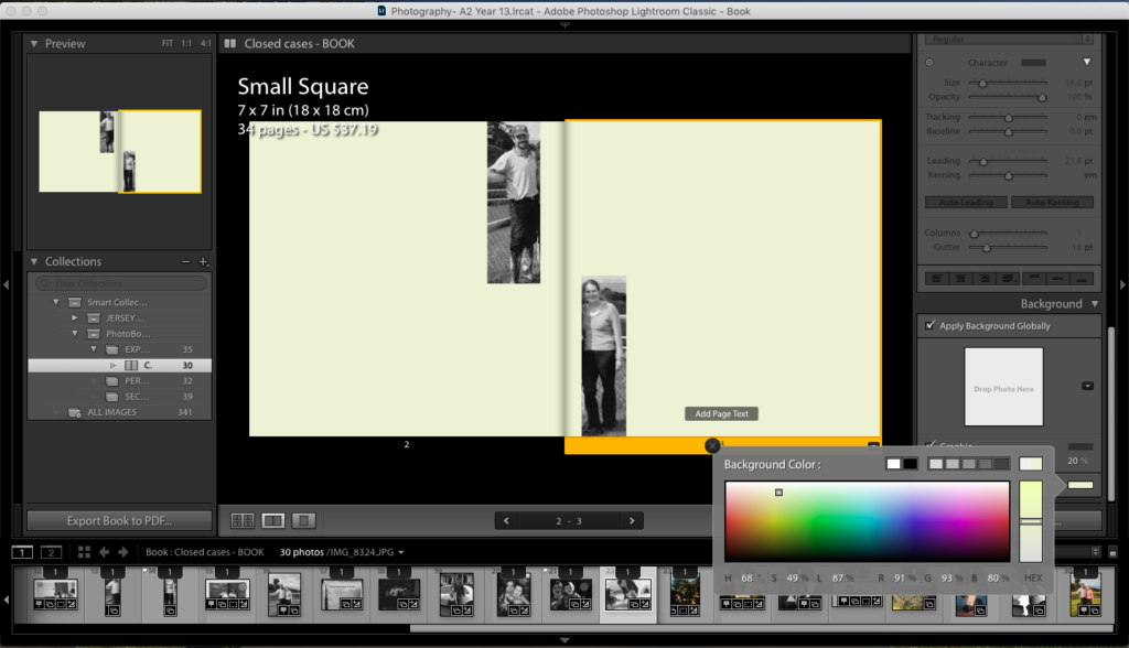
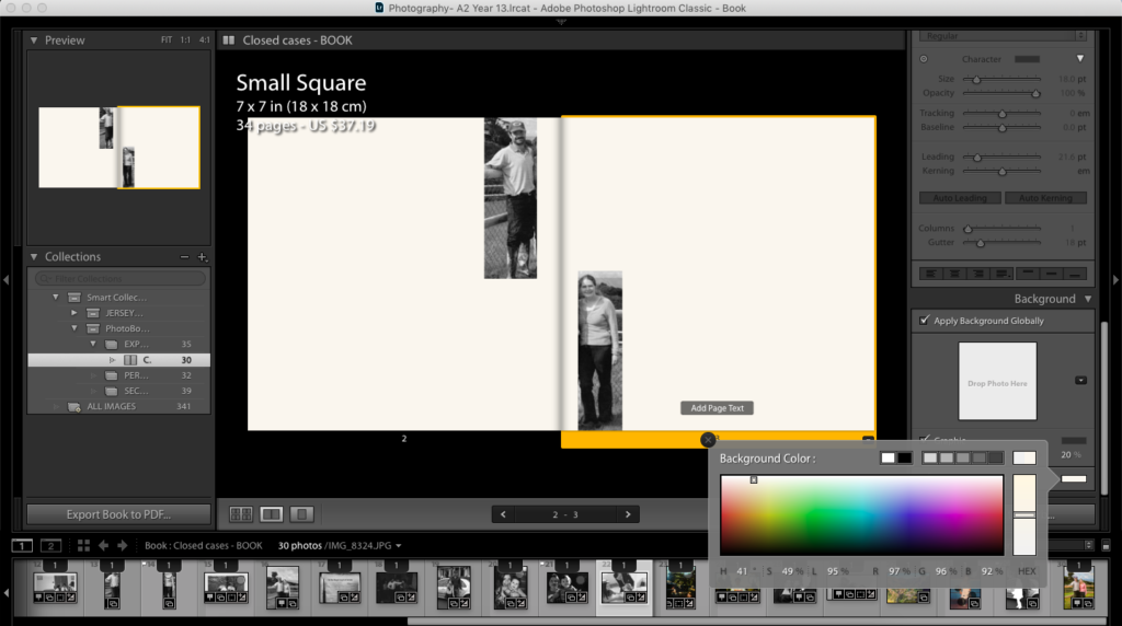
I didn’t want to experiment with really harsh, dark colours as I feel like It takes the attention away from the actual focus of the photo, being my parents. Most of the images I have chosen to use are either in black and white or the colours are too dull therefore having dark colours would over power the book completely.
THE LAYOUT ON THIS BLOG WILL NOT BE MY FINAL VERSION OF THE PHOTO BOOK.