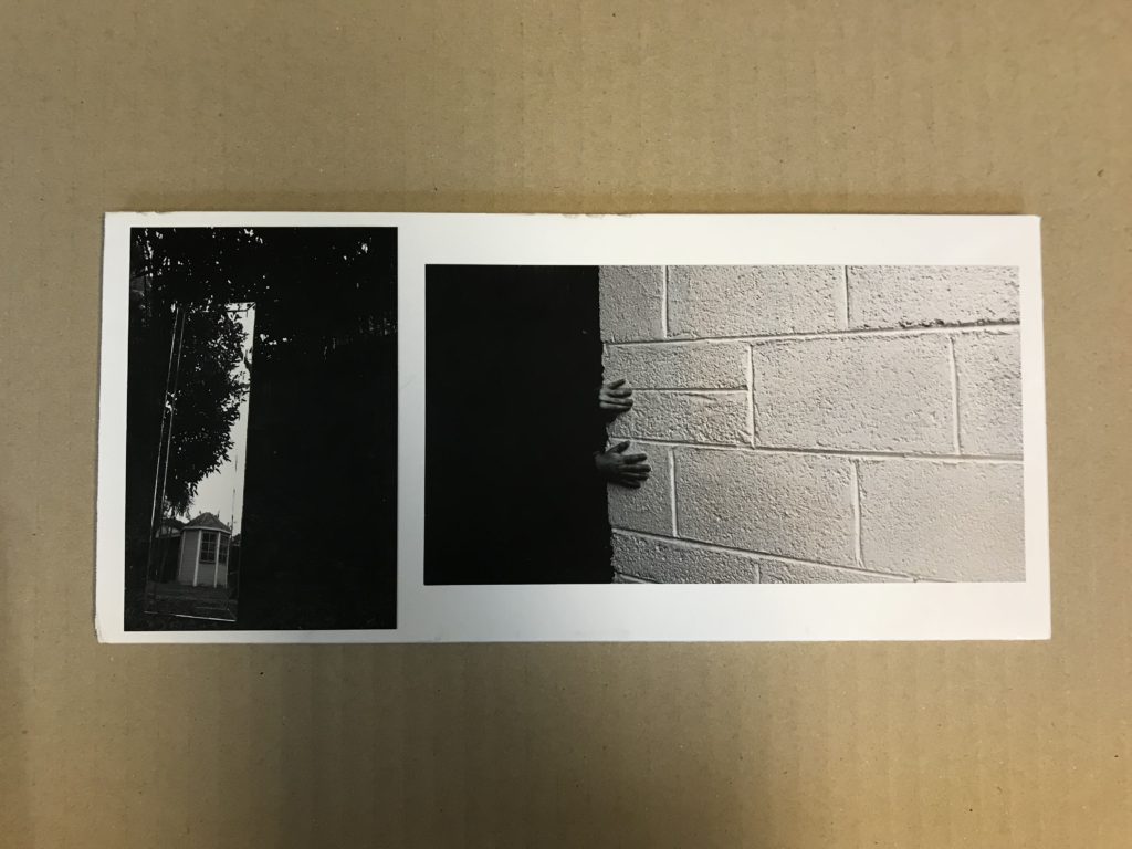
My first final piece includes three A4 images from my photobook, two of trees and one of bloody hands. I turned them landscape and cut individual mounts into black card for the display. The black background worked better than white and added more contrast. I chose a colour photo to break up the dull feel but the blood also adds to the darkness. The repetiton of the tree acts like a preview to my book as it starts, ends and has a tree half way through it.

My second print is an A3 of one of my favourite images from the photobook. Similarly to my first display I created a window mount with black card as a background, which works well with my black and white theme. I wanted this image to be on it’s own as I felt it may have over powered my other photos as it’s very striking.

For my third piece I used two A5 images, one of a mirror in my garden and the other of my brothers hands on wall. I chose trimmed my images with strimmer to get rid of the white borders then sprayed them and placed them on a white foam border I had cut to size with a knife. I was planning on them being exactly A5 but because of cropping the mirror was smaller so I had to rearrange my inital idea.

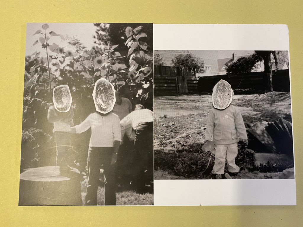
For my final piece I used two A5 images, both are archive prints with fingerprints stuck over the faces. After trimming them, I set them out to resemble the layout of a page in my photobook. I cut white foam board to fit the images and stuck them on as seen below.

