Text is an important part of my photo-book as my images were telling a story. The photographs tell a narrative themselves however I felt it important to include the written stories I was telling to make more sense for the viewer and to help the narrative of the book flow.
Narrative Text
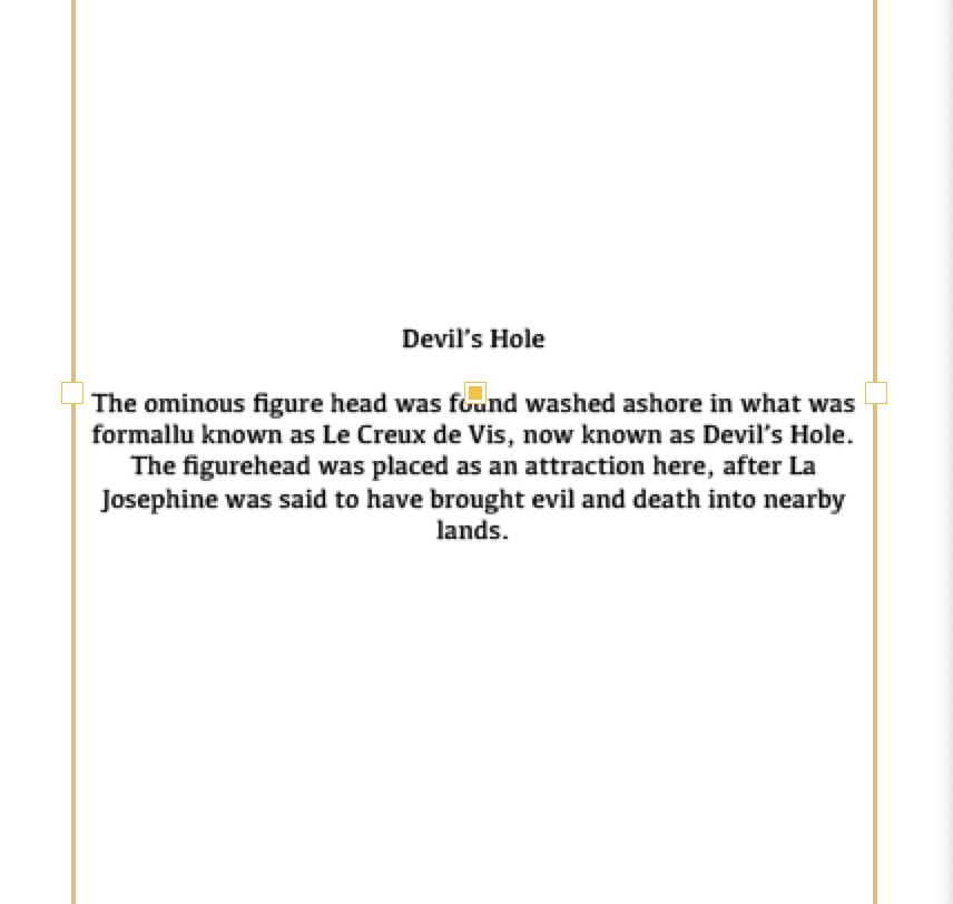
I began with the narrative text, experimenting with the placing and the images I was going ton put the text to. I put each story down into 3 paragraphs or miniature stories each. I found this work best as a sequence and then wanted to keep each story the same to help with the flow of the book. I also had to trial and experiment with putting the text at the top, bottom and centre of the page. I personally found that in the centre worked best as my images were mainly centred that I was using so it worked on the adjacent page to have the text in a symmetrical position. I placed a subheading at the beginning of each paragraph as I felt this looked better but also gave some context towards the stories and what was going to be told to come.
I began experimenting with the size of text as well as its compression, I started with size 15.4 text and moved it down to the main body of text being size 11 with the heading being size 12, this worked best as in industry production this is the regular size text would be and it won’t look overly large and too big on the A4 size paper that I have. I also began to add a buffer to my text boxes, making the lines shorter but adding the text onto more lines, this worked better than having all of my text stretched out it made it look more clean and put together and neater than having it stretched out, this also helped with the centring of the text on the page.
Essay Text
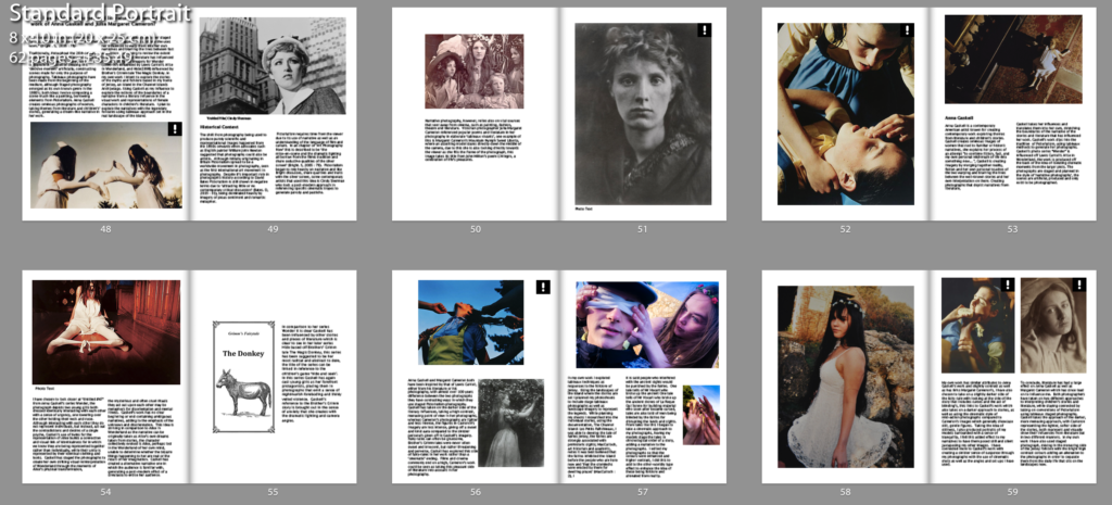
I personally chose to add my essay into the end of my photo-book as I felt this was an added touch to finish of the whole personal investigation together. I chose to stick to some similar layouts throughout as I felt it looked better with consistency rather than changing it every single page. I tried to make each spread round off and finish in a good place so to make sense and to help the flow, using the size 11 text I felt this was the best size for large bodies of text and then further used size 10 for the image labels and captions so that the did not begin to get too bulky or take up too much room compared to the main large body of text.


