
Initial Design Process:
In the initial stages of my photo book design I wanted to ensure I maintained simplicity whilst making the narrative of my Grandparents lifestyle clearly presented. I started by experimenting with the sequencing of my imagery, combing interior and exterior with my portraits, trying to form a relationship between the two to create meaning to illustrate the lifestyle of my Grandparents. I decided to have two portraits or archives and then add an interior and or exterior to have a ‘break from the action’ to change the pace of the book. Although I liked the way in which it looked, I felt the sequencing of my photographs was not the clearest way of presenting my intended narrative, thus making me further explore the way in which I could sequence my photographs. In addition, in this first section of the book I wanted to include archival imagery which allowed a comparison between the past and present lifestyle to portray how their lifestyle has changed or stayed the same, thus emphasising how the time period they were brought up in has influenced their lifestyle. I felt this sequencing of archival imagery amongst present portraits was an affective way of showcasing my intended narrative and allowed a sense of flow within the book itself, therefore I am going to keep these archival images in this position of the sequence due to the reasons stated above. Due to the interior and exterior photographs not ‘fitting in’ well with this particular moment of my book I decided to move them into a new section, allowing for further experimentation.
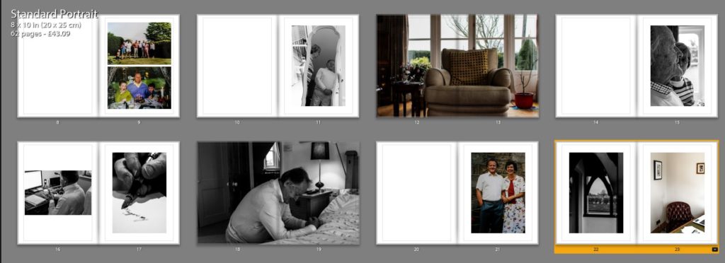
Second Design:
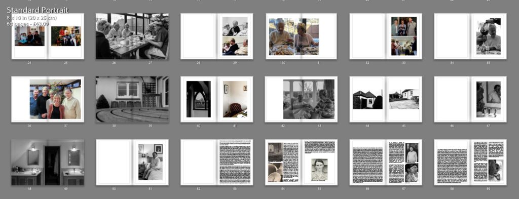
Taking from the experimentation of my first design I took what went well and things needed to be changed to produce my second design. As mentioned in my book specification I wanted the book to start and end with a strong portrait of my Grandad as I felt it was a clear way of presenting my narrative at the beginning of the book, as well as using a similar portrait at the end to clarify and support the narrative, allowing the book to finish in a conclusive way. I then mainly had portrait and archival imagery in the first section, as this is what worked in my initial design. Occasionally, I did decided to implement 3/4 and double page spreads of interior and exterior to give a break from the action and present my narrative in a new light, however I did not over do this like in my first design. Moving onto the next section of my photo book I wanted to showcase the interaction of their lifestyle with mine at a family event, and so decided to utilise the photographs from Christmas. I occasionally added more archival imagery of family events in order to show the change in interaction of both lifestyles. Within this section I tended to stick with using single, 3/4 and double page spreads in order to show the interaction of lifestyles. I believe the way in which I sequenced these photographs was successful as it allows the narrative to flow, presenting a new way of looking at their lifestyle, with looking at aspects of religious events and how it impacts them. Moving onto the next section I wanted to use my interior and exterior images, as I believe these photographs are a clear way of presenting their lifestyle as well as them being some of my strongest outcomes. The sequencing of these images was kept simplistic, as I tended to show these photographs and then on the following page would be a portrait, to support the conceptual understanding of the location and my Grandparents relationship with it. In this version I decided to layout my essay within the book, I tended to have a combination of full page of text and the use of columns, to break up the chunk of text, making it seem more manageable, thus making viewers more likely to read the essay. To evaluate this design, I believe the overall sequence clearly presents my intended narrative of the occupation of lifestyle on my Grandparents, and flows smoothly with each image being an asset of presenting my intended narrative.
Fine Tuning My Design:
After the second design I am happy with the sequencing of my photographs in order to show my intended narrative. I decided to focus on fine tuning some of my spreads to make the photographs more effective in presenting my narrative, as well as improving the overall aesthetic of my photo book. A few of these artistic decision can be seen below, in order to show my experimentation in my design, as well as my decision making and thought process.
In my first fine tuning of my design I looked at the way in which I presented my double page spreads. For the most part I had a white boarder around the photograph, so it did not fill the whole page, I did this as it allowed the whole photograph to be showcased without anything being cut out, thus making my imagery more reliable in depicting reality. However, after consideration I felt that I was not achieving maximum impact of the photographs and so decided to get rid of the white boarder and have the photograph fill up the whole page. This meant that elements of the photograph was cut out, however I believe it allowed the sequence to flow a lot smoother as well as the photograph to have maximum impact on the side of story telling. The ‘cutting’ of the photograph was not highly impactful, as it did not cut out the main focus point of the chair it only cut out a slight part of the background, thus we were not loosing useful information, making this decision more affective. I decided to do this for my other double page spreads, in order to make all double pages look the same, in the sense to maintain my overall aesthetic. The old and new design are showcased below.

Old Spread 
New Spread
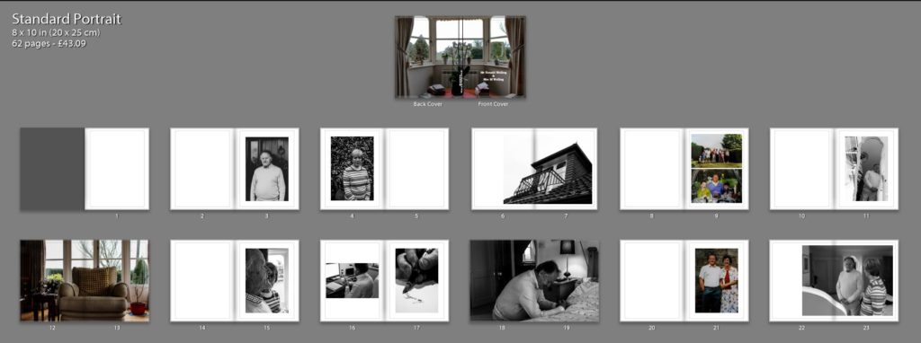
The next fine tuning I wanted to focus on was the title page, this is because it is the first thing a viewer will see, thus I wanted it to be high effective and clear in depicting what is within the book. After consideration I decided upon the title ‘Mr Ronald Welling & Mrs M Welling’, I chose this as I felt it clearly presented what the narrative is about and conceptually begins to present my Grandad authority. Using the picture of the windowsill was a good artistic decision as the simplicity and inactive frame allows a sense of tranquil to be presented, suggesting an ameliorative and calm lifestyle. I wanted the text in white in the bottom left corner as I felt it was the most subtle place to have the text, emphasising the sense of calm. Initially I decided to use the typography of ‘Candara’ as I liked the way in which the letters were structured. However, after time and consideration I felt this effectiveness fell and so I decided to change the font to ‘Bookman Old Style’. This fonts structure reminded me of an envelope or address on an important letter. In a way it also reminds me of my Grandad’s writing, and therefore these two reasonings made this decision affective as it suggest the business side of my Grandad, due to the formal representations it holds.

Old Spread 
New Spread
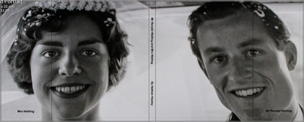
I then experimented with a different cover design using a photograph which more explicitly outlines the narrative of my book. I decided to use the archival imagery of my Grandparents wedding. I decided to change the front cover to a dust jacket, which has allowed this photograph to wrap around the book. The front cover holds my Grandad and the back cover holds my Grandma, suggesting the idea of my Grandad’s authority and my Grandma being the backbone of him in essence. Using the crop tool I accurately cropped the photograph so the dust jacket would fold on the same point of each of their eye, and on the fold in I placed their name ‘Mr Ronald Welling’ and ‘Mrs Welling’. Sticking to the title as stated above supports the idea of authority. In this design I decided to again experiment with text font and changed it to a more bold font which makes the title stand out a lot clearer. Personally, I much prefer this design as I feel it gets straight to the point and clearly presents my underlying theme and narrative. Therefore, I have decided to change my front cover to this design, as well as the text font.
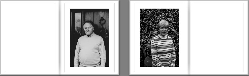
My next piece of fine tuning was to do with the sequencing of my photographs in order to emphasises the authoritative conceptual representation of my Grandad. Initially, I had one portrait on each side so that they are next to each other, in order to emphasise relationship of the two subject, however I felt this was not sustained as much as the authority of my Grandad, and so decided to change the sequencing. The first image you see in the book is my Walker Evans inspired photograph of my Grandad on the right hand side, as the right is the page to which viewers first look at. Turning the page my Grandma is placed on the left page, as we do not immediately look on that side of the book, thus suggesting authority of my Grandad and the submissiveness of my Grandma, thus helping to portray my intended narrative.
Evaluation:
To evaluate, I believe I have been able to successfully sequence my photographs in order to present my intended narrative. Through experimentation, I have been able to see the layouts which are most successful, allowing the photographs to have maximum impact and flow nicely in order to showcase the underlying theme of lifestyle. In addition, I have been able to articulate my thought process and decision making as to why I have decided to sequence the photographs in a particular order and why I have chosen that page spread. The development of my photo book has been a long process and so I only showcased the major and most important changes, as well as details on each section and what its meant to showcase and suggest. From now to the final product, it is likely more minor changes will be made and will be discussed in my final photo book layout blog post.