Book in hand: how does it feel? Smell, sniff the paper:
Cover is a bit rough, smells like paper and brand new book smell.
Paper and ink: use of different paper/ textures/ colour or B&W or both:
There is a lot of different textured paper such as normal brown paper, premium lustre and net to strengthen spine of book all colours, also black and white.
Format, size and orientation: portraiture/ landscape/ square/ A5, A4, A3 / number of pages: Portraiture, roughly 100 pages.
Binding, soft/hard cover. image wrap/dust jacket. saddle stitch/Swiss binding/ Japanese stab-binding/ leperello: Flat bind with a hard cover and a image wrap.
Title: literal or poetic / relevant or intriguing: Literal as he is documenting a part of his life by taking pictures.
Narrative: what is the story/ subject-matter. How is it told? : ” I have this desire to sum up my life in the form of a story. My parents killed themselves, one after the other, in the winter of 1998. My mother’s depression led her to take her own life, and my father followed her nine days later. Having suddenly a closer relationship with death at just 21 years of age, I decided to write down the things I saw around me, as they were, and to capture in photographs the emotions I would only be able to feel then and there. I was alone in the house we had all lived in as a family. I had almost completely lost sight of the point in living. But even so, I kept on living.” https://www.photobookstore.co.uk/photobook-picture-of-my-life-_signed%5E.html Told by picture of him and his family, and pictures of the paintings his father did. Also included letters and translations of those letters. Is in chronological order.
Design and layout: image size on pages/ single page, double-spread/ images/ grid, fold- outs/ inserts: Different every page, single and double page spreads with pages with writing on them, photos on top of photos.
Images and text: are they linked? Introduction/ essay/ statement by artists or others. Use of captions (if any): Letters linked with images, chronological order, at the end of the book there is a short statement from the photographer saying thank you.
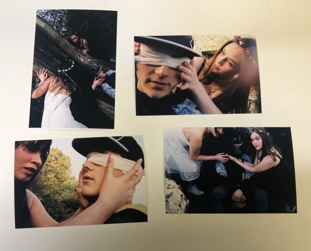
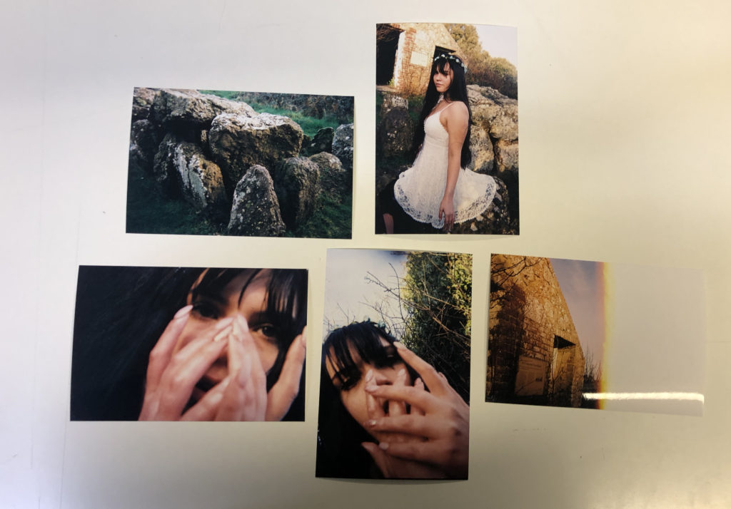
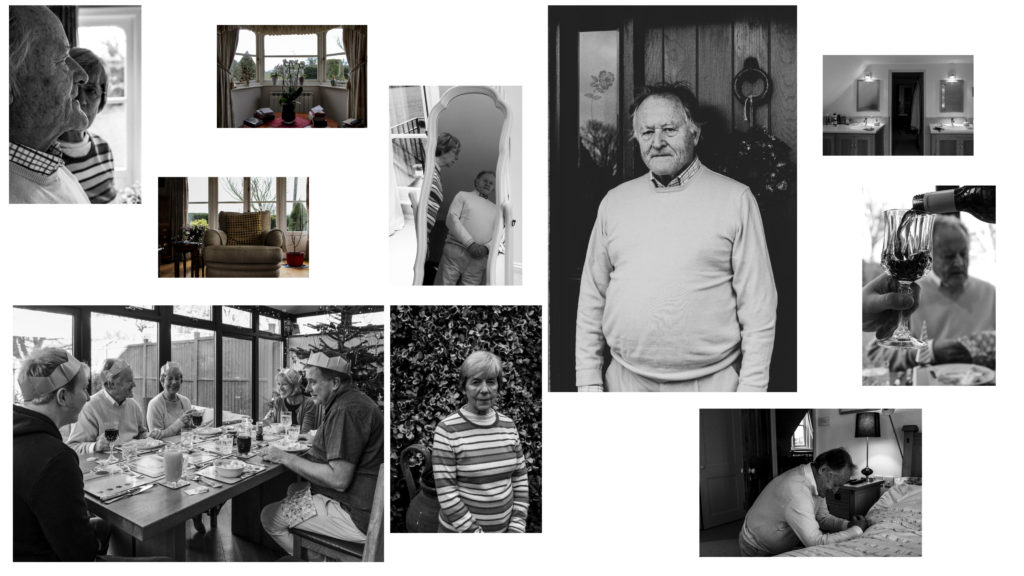
When developing the narrative of the photobook I began to do this with the physical prints of photographs that I had as I found it more useful to be able to move them and discard them in front of me physically, beginning with all of the photographs in front of me I went through the photographs and grouped them together based on situations and tells, the action photographs, scene setting and others, once I had them grouped I began to be able to build a narrative, moving from creating and setting the area, and developing a sense of character, using the photographs of just the girls themselves, showing them interacting with the scenery. I further moved onto the ‘action’ photographs, showing the contents of the story, ones with the hands across the males face and the crowding ones, this then would allow me to lead onto a ‘resolution’, using the more ominous photographs towards the end, the slightly out of focus and also the half exposed landscape photographs.
This act of laying the photographs helped me to develop this narrative, below I have my final groupings of a narrative in a ‘beginning, middle and end’ style as to help my design process. In Lightroom I will now be able to narrow down my photographs further however I have been able to create a starting base for myself to see what works in the photobook and the actual layout.
In using the old expired film there was a chance that they could come out completely empty giving me no outcomes and this is what happened in this instance. So I will be going back to the areas where I took my images with a new roll of black and white film that is actually new and in date.
The new film I will be using is ilford super 400 35mm. This film is a fast film known for being a sharp blank and white film with fine grain and a wide tonal range. It also is a true black and white film that can be developed with normal c41 colour film meaning that I can get it developed locally and quickly.
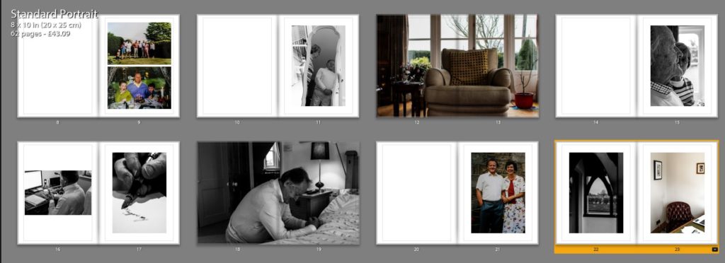
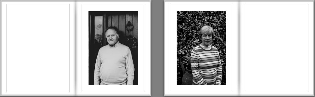
For my first three layouts I wanted to explore typologies and how putting photographs in a triptych and diptych format in order to portray the narrative of the occupation of my Grandparents lifestyle. I decided to use the portraits which have emotional value and suggest important part of my Grandparents lifestyle as the first triptych. These photographs are being printed as A4 photographs and will be displayed with a 4cm gap between each photograph and will be either stuck onto foam board or put in a window mount on white card, as I believe white compliments the photographs the best. For my next triptych layout I printed out four landscape photographs of the interior of my Grandparents house, two in colour and one in black and white. The images are being printed as A5, and will be displayed in a similar format, 4cm gap between each photograph and displayed vertically. My final out come using typologies is a diptych which is a portrait of my Grandad and one of my Grandma. I printed one out as an A4 and one as an A5, the size difference of both will reinforce the ideology of power within family structure and how my Grandad has the most dominance. I will display the two images next to each other as a window mount or on white foam board with a 4cm gap between each photograph. These designs can be viewed below, as I created a layout of them using photoshop.
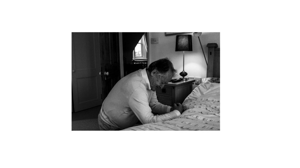
The next two display ideas are singular photographs, which would not work as a typology, and so I have deiced to display them on their own. The first photograph is of my family sat around a table at Christmas, showing the interaction of my lifestyle with my Grandparents lifestyle at a religious event. The photograph will be printed on A3 paper and displayed on white foam board. Below is a photograph of my Grandad praying, conceptually representing intimacy and the idea of religion on his lifestyle. The photograph is being printed as an A4 photograph as will displayed in the same way as the A3 photograph of my family. These full bleed photograph displays are visible below.
To show further experimentation and thought into the displaying of my photographs, I decided to create an eclectic display of all the outcomes. The chaotic design suggests that their lifestyle isn’t simple and has its ups and downs, and conceptually clearly presents my intended narrative. Personally, I really like the way in which this looks and will look at creating this on a large piece of foam board when the prints arrive, the design may change due to the size of the photographs, however I do want to see what this would look like with the real images and how impactful the narrative it displays is.
In the initial stages of my photo book design I wanted to ensure I maintained simplicity whilst making the narrative of my Grandparents lifestyle clearly presented. I started by experimenting with the sequencing of my imagery, combing interior and exterior with my portraits, trying to form a relationship between the two to create meaning to illustrate the lifestyle of my Grandparents. I decided to have two portraits or archives and then add an interior and or exterior to have a ‘break from the action’ to change the pace of the book. Although I liked the way in which it looked, I felt the sequencing of my photographs was not the clearest way of presenting my intended narrative, thus making me further explore the way in which I could sequence my photographs. In addition, in this first section of the book I wanted to include archival imagery which allowed a comparison between the past and present lifestyle to portray how their lifestyle has changed or stayed the same, thus emphasising how the time period they were brought up in has influenced their lifestyle. I felt this sequencing of archival imagery amongst present portraits was an affective way of showcasing my intended narrative and allowed a sense of flow within the book itself, therefore I am going to keep these archival images in this position of the sequence due to the reasons stated above. Due to the interior and exterior photographs not ‘fitting in’ well with this particular moment of my book I decided to move them into a new section, allowing for further experimentation.
Second Design:
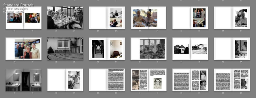
Taking from the experimentation of my first design I took what went well and things needed to be changed to produce my second design. As mentioned in my book specification I wanted the book to start and end with a strong portrait of my Grandad as I felt it was a clear way of presenting my narrative at the beginning of the book, as well as using a similar portrait at the end to clarify and support the narrative, allowing the book to finish in a conclusive way. I then mainly had portrait and archival imagery in the first section, as this is what worked in my initial design. Occasionally, I did decided to implement 3/4 and double page spreads of interior and exterior to give a break from the action and present my narrative in a new light, however I did not over do this like in my first design. Moving onto the next section of my photo book I wanted to showcase the interaction of their lifestyle with mine at a family event, and so decided to utilise the photographs from Christmas. I occasionally added more archival imagery of family events in order to show the change in interaction of both lifestyles. Within this section I tended to stick with using single, 3/4 and double page spreads in order to show the interaction of lifestyles. I believe the way in which I sequenced these photographs was successful as it allows the narrative to flow, presenting a new way of looking at their lifestyle, with looking at aspects of religious events and how it impacts them. Moving onto the next section I wanted to use my interior and exterior images, as I believe these photographs are a clear way of presenting their lifestyle as well as them being some of my strongest outcomes. The sequencing of these images was kept simplistic, as I tended to show these photographs and then on the following page would be a portrait, to support the conceptual understanding of the location and my Grandparents relationship with it. In this version I decided to layout my essay within the book, I tended to have a combination of full page of text and the use of columns, to break up the chunk of text, making it seem more manageable, thus making viewers more likely to read the essay. To evaluate this design, I believe the overall sequence clearly presents my intended narrative of the occupation of lifestyle on my Grandparents, and flows smoothly with each image being an asset of presenting my intended narrative.
Fine Tuning My Design:
After the second design I am happy with the sequencing of my photographs in order to show my intended narrative. I decided to focus on fine tuning some of my spreads to make the photographs more effective in presenting my narrative, as well as improving the overall aesthetic of my photo book. A few of these artistic decision can be seen below, in order to show my experimentation in my design, as well as my decision making and thought process.
In my first fine tuning of my design I looked at the way in which I presented my double page spreads. For the most part I had a white boarder around the photograph, so it did not fill the whole page, I did this as it allowed the whole photograph to be showcased without anything being cut out, thus making my imagery more reliable in depicting reality. However, after consideration I felt that I was not achieving maximum impact of the photographs and so decided to get rid of the white boarder and have the photograph fill up the whole page. This meant that elements of the photograph was cut out, however I believe it allowed the sequence to flow a lot smoother as well as the photograph to have maximum impact on the side of story telling. The ‘cutting’ of the photograph was not highly impactful, as it did not cut out the main focus point of the chair it only cut out a slight part of the background, thus we were not loosing useful information, making this decision more affective. I decided to do this for my other double page spreads, in order to make all double pages look the same, in the sense to maintain my overall aesthetic. The old and new design are showcased below.
Old Spread
New Spread
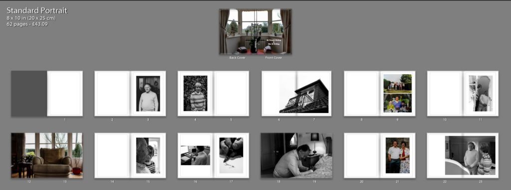
The next fine tuning I wanted to focus on was the title page, this is because it is the first thing a viewer will see, thus I wanted it to be high effective and clear in depicting what is within the book. After consideration I decided upon the title ‘Mr Ronald Welling & Mrs M Welling’, I chose this as I felt it clearly presented what the narrative is about and conceptually begins to present my Grandad authority. Using the picture of the windowsill was a good artistic decision as the simplicity and inactive frame allows a sense of tranquil to be presented, suggesting an ameliorative and calm lifestyle. I wanted the text in white in the bottom left corner as I felt it was the most subtle place to have the text, emphasising the sense of calm. Initially I decided to use the typography of ‘Candara’ as I liked the way in which the letters were structured. However, after time and consideration I felt this effectiveness fell and so I decided to change the font to ‘Bookman Old Style’. This fonts structure reminded me of an envelope or address on an important letter. In a way it also reminds me of my Grandad’s writing, and therefore these two reasonings made this decision affective as it suggest the business side of my Grandad, due to the formal representations it holds.
Old Spread
New Spread
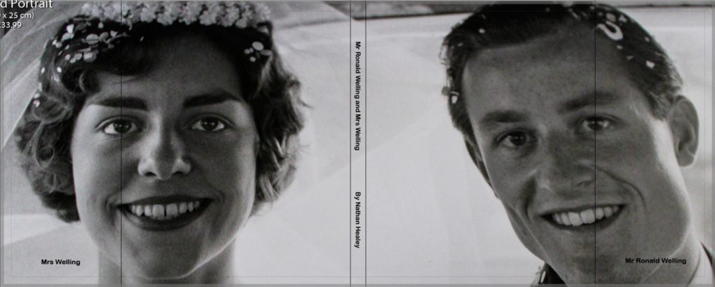
I then experimented with a different cover design using a photograph which more explicitly outlines the narrative of my book. I decided to use the archival imagery of my Grandparents wedding. I decided to change the front cover to a dust jacket, which has allowed this photograph to wrap around the book. The front cover holds my Grandad and the back cover holds my Grandma, suggesting the idea of my Grandad’s authority and my Grandma being the backbone of him in essence. Using the crop tool I accurately cropped the photograph so the dust jacket would fold on the same point of each of their eye, and on the fold in I placed their name ‘Mr Ronald Welling’ and ‘Mrs Welling’. Sticking to the title as stated above supports the idea of authority. In this design I decided to again experiment with text font and changed it to a more bold font which makes the title stand out a lot clearer. Personally, I much prefer this design as I feel it gets straight to the point and clearly presents my underlying theme and narrative. Therefore, I have decided to change my front cover to this design, as well as the text font.
My next piece of fine tuning was to do with the sequencing of my photographs in order to emphasises the authoritative conceptual representation of my Grandad. Initially, I had one portrait on each side so that they are next to each other, in order to emphasise relationship of the two subject, however I felt this was not sustained as much as the authority of my Grandad, and so decided to change the sequencing. The first image you see in the book is my Walker Evans inspired photograph of my Grandad on the right hand side, as the right is the page to which viewers first look at. Turning the page my Grandma is placed on the left page, as we do not immediately look on that side of the book, thus suggesting authority of my Grandad and the submissiveness of my Grandma, thus helping to portray my intended narrative.
Evaluation:
To evaluate, I believe I have been able to successfully sequence my photographs in order to present my intended narrative. Through experimentation, I have been able to see the layouts which are most successful, allowing the photographs to have maximum impact and flow nicely in order to showcase the underlying theme of lifestyle. In addition, I have been able to articulate my thought process and decision making as to why I have decided to sequence the photographs in a particular order and why I have chosen that page spread. The development of my photo book has been a long process and so I only showcased the major and most important changes, as well as details on each section and what its meant to showcase and suggest. From now to the final product, it is likely more minor changes will be made and will be discussed in my final photo book layout blog post.
For me, photography is a way to express perhaps more negative emotions in a non-judgmental medium. Perhaps people interpret the meaning in the wrong way, but the act of capturing the image gives a sense of control over the emotion behind it. That’s part of the reason that I wanted to explore mental illness via photography. After struggling with depression and anxiety in the past and at the time not really having a way to express how I was feeling, I wanted to explore and remember past emotions to educate others on mental illness, while additionally finding a new way for me to cope in the future. I am particularly fascinated by the work of Francesca Woodman. The young photographer was herself suffering from depression and her images are often seen to reflect this as a result of her suicide. The images are very surreal and feel almost dream-like. While now related to her suicide, Woodman’s images were an exploration of her own identity and gender, often showing a lack of the former by obscuring the subject’s face. Individuality is important when it comes to mental illness; no one experiences it in quite the same way. Woodman expresses her illness in a way that is very personal to her and it’s interesting to gather an understanding of someone else’s experiences. However, I also wanted to see how people, who have never experienced severe mental illness, view mental illness. Mary Ellen Mark spent 36 days inside Oregon State Hospital on Ward 81. Mark was tasked with photographing the ward’s occupants along with journalist, Karen Jacobs who wrote a piece on their experience. Mark was primarily a photo journalist, however her Ward 81 project was a follow up to meeting the patients while photographing for 1975’s ‘One Flew Over the Cuckoo’s Nest.’ In contrast to Woodman’s images, Mark gives a more realistic view of mental illness by photographing what she observed.
Historical context (Surrealism/Documentary): 56
In 1924, poet Andre Breton introduced a surrealist approach to art. Breton sourced his ideas from Freudian explanations of the unconscious, giving the movement a dream-like feel to it. Breton believed that artists should take an unfiltered approach to their work, taking down everything from their unconscious thoughts. He published his ideas his ‘Manifesto of Surrealism,’
Francesca Woodman: 606
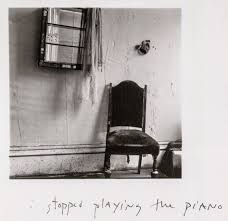
Famous for her self portraits, Francesca Woodman preferred to work alone, but there’s more to her images than a representation of herself. At only age 22, Woodman threw herself out of a window in New York. This leaves her images forever tainted, in the sense it’s difficult to view them without wondering whether they’re a prediction of Woodman’s fate. In 1977, Woodman worked on ‘On Being An Angel’ while staying in Rome. The title in itself suggests a surreal approach to self portrait as the word ‘angel’ suggests the presence of a higher celestial being. While it is possible that the title could indicate that Woodman believes herself to be this celestial being, it is more likely that this refers to the faith, love, hope, strength and intelligence that angels often symbolize. However, this is a clear juxtaposition to certain extent. The images are in the black and white, mirroring the aesthetic of Woodman’s other works while also showing a darker undertone that suggests that Woodman sees herself as more of a misunderstood angel. It was not secret that Woodman was struggling with the lack of success and recognition her images were receiving. It had been clear to those close to her that her images were some of the best, so why didn’t others see that? One such image from ‘On Being An Angel,’ shows Woodman in a derelict building, her preferred location to shoot in, with two white sheets behind her as she leaps up in front of them as if flying. It is obvious that the sheet represents her angel wings and the image as whole suggests that Woodman wishes to take flight, to escape perhaps. Another striking feature present in this series is Woodman’s often completely bare chest. She has her breasts thrust out, however, this is not by any means sexual. She had previously explored her body in several of her other works and had grown comfortable with it. Woodman wanted to show a certain rawness and maybe even innocence that one would find when thinking about angels. As for the idea of flying, Woodman has also previously referenced the theme of weightlessness in some of her other works taken in Rome. It seems perhaps that woodman was toying with the typical idea of angels taking flight while also thinking about how she might like to do the same. The reasoning behind this, some would suggest, comes down to her death. In 1981, Woodman threw herself out of a window in New York. The similarity between her chosen method to end her life and the images of flying is astounding. An article in The Telegraph suggests that Woodman’s images are ‘…coloured by her suicide.’ However, I find myself disagreeing with this to an extent. Is it really plausible that Woodman had been predicting her end since age thirteen? Of course not. She was simply just a girl that was doing what she loved while exploring and learning more about herself and where she fitted in the world. On the other hand, I think that some of her work during the last few years of her life may have had some kind of warning to it. Some of the images Woodman took in Rhode Island between 1975 and 1978 are captioned with almost foreboding messages. For example, one image is captioned, ‘I stopped playing the piano.’ Assuming Woodman stopping playing through lack of interest could suggest the beginning of her depression as the early signs of such mental illness often includes a sudden lack of interest or enjoyment of activities that may have even been a person’s favourite thing to do.
Mary Ellen Mark: 360
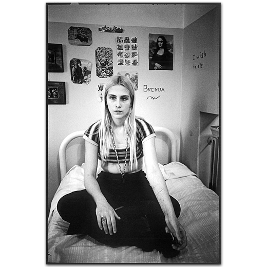
In 1975 while photographing on the set of ‘One Flew Over The Cuckoo’s Nest’, Mary Ellen Mark was given the opportunity to talk with the patients of Oregon State Hospital’s Ward 81. She returned a year later with writer, Karen Folger Jacobs. The pair spent 36 days on the ward. While know for her documentary style projects that have a clear narrative, Mark took a slightly different approach to how she presented her images from the ward. In an interview with American Photographer about her time on Ward 81, Mark said, ‘Instead of the 1-2-3-4 of a picture story, I was interested in doing pictures that would stand alone.’ This is to perhaps represent the isolation of each patient, while also giving them a sense of individuality that they may not get on the ward. Ward 81 consists of a series of images that give an insight into the side of mental illness that people had never seen before in the 1970s. Jacobs wrote ‘At first glance, they could be almost any group of women in any institutional lounge or day room,’ (Folger Jacobs 1979) and for the most part that was probably true. The lock ’em mentality of 70’s America was the main reason many of the women of Ward 81 were where they were and once they were institutionalised it was hard to introduce them back into society without seeing them return to the ward not long after. This is perhaps one of the reasons why Mark wanted to spend so much time with the patients while photographing them. She had always thought it vital to build a relationship with the people in her images so she could understand them. The image titled ‘300B-011-005’, perfectly captures the idea behind the project. It shows a girl sat on her bed. At first glance she could be considered a normal teenage girl with clothes that show more skin than her parents would like and posters and pictures above her bed that show the things she likes. That’s what you’re supposed to see first. However, you soon notice the cuts on her arms and the phrase ‘I wish to die,’ written on the wall.
Conclusion: 179
To conclude, both Francesca Woodman and Mary Ellen Mark show a deep understanding of mental illness as demonstrated by their image. Woodman, while originally exploring identity has come to draw people to her work with her tragic story, but has continued to keep people interested whether that be by instigating theories on how her images relate to her death, her clear exploration of gender, identity and feminism or simply the darker, gothic surrealism displayed in every image. She demonstrates, for me, the thoughts and feeling behind depression and clearly used her creativity to give herself a release while giving the impression that she knew what was happening to her was not her fault. In comparison, Mark gives a meaningful insight into the women of Ward 81 by allowing herself to really get to know them and understand them on a personal level without tainting her opinion with their mental illness. Her book tells the story of those 36 days by showing all aspects of daily life without censorship. This results in Mark presenting the women as just that, women.
Famous for her self portraits, Francesca Woodman preferred to work alone, but there’s more to her images than a representation of herself. At only age 22, Woodman threw herself out of a window in New York. This leaves her images forever tainted, in the sense it’s difficult to view them without wondering whether they’re a prediction of Woodman’s fate. In 1977, Woodman worked on ‘On Being An Angel’ while staying in Rome. The title in itself suggests a surreal approach to self portrait as the word ‘angel’ suggests the presence of a higher celestial being. While it is possible that the title could indicate that Woodman believes herself to be this celestial being, it is more likely that this refers to the faith, love, hope, strength and intelligence that angels often symbolize. However, this is a clear juxtaposition to certain extent. The images are in the black and white, mirroring the aesthetic of Woodman’s other works while also showing a darker undertone that suggests that Woodman sees herself as more of a misunderstood angel. It was not secret that Woodman was struggling with the lack of success and recognition her images were receiving. It had been clear to those close to her that her images were some of the best, so why didn’t others see that? One such image from ‘On Being An Angel,’ shows Woodman in a derelict building, her preferred location to shoot in, with two white sheets behind her as she leaps up in front of them as if flying. It is obvious that the sheet represents her angel wings and the image as whole suggests that Woodman wishes to take flight, to escape perhaps. Another striking feature present in this series is Woodman’s often completely bare chest. She has her breast thrust out, however, this is not by any means sexual. She had previously explored her body in several of her other works and had grown comfortable with it. Woodman wanted to show a certain rawness and maybe even innocence to the images one would find when thinking about angels. As for the idea of flying, Woodman has also previously referenced the theme of weightlessness in some of her other works taking in Rome. It seems perhaps that woodman was toying with the typical idea of angels taking flight while also thinking about how she might like to do the same. The reasoning behind this, some would suggest, comes down to her death. In 1981, Woodman threw herself out of a window in New York. The similarity between her chosen method to end her life and the images of flying is astounding. An article in The Telegraph suggests that Woodman’s images are ‘…coloured by her suicide.’ However, I find myself disagreeing with this to an extent. Is it really plausible that Woodman had been predicting her end since age thirteen? Of course not. She was simply just a girl that was doing what she loved while exploring and learning more about herself and where she fitted in the world. On the other hand, I think that some of her work during the last few years of her life may have had some kind of warning to it. Some of the images Woodman took in Rhode Island between 1975 and 1978 are captioned with almost foreboding messages. For example, one image is captioned, ‘I stopped playing the piano.’ Assuming Woodman stopping playing through lack of interest could suggest the beginning of her depression as the early signs of such mental illness often includes a sudden lack of interest or enjoyment of activities that may have even been a person’s favourite thing to do.
In 1975 while photographing on the set of ‘One Flew Over The Cuckoo’s Nest’, Mary Ellen Mark was given the opportunity to talk with the patients of Oregon State Hospital’s Ward 81. She returned a year later with writer, Karen Folger Jacobs. The pair spent 36 days on the ward. While know for her documentary style projects that have a clear narrative, Mark took a slightly different approach to how she presented her images from the ward. In an interview with American Photographer about her time on Ward 81, Mark said, “Instead of the 1-2-3-4 of a picture story, I was interested in doing pictures that would stand alone.” This is to perhaps represent the isolation of each patient, while also giving them a sense of individuality that they may not get on the ward. Ward 81 consists of a series of images that give an insight into the side of mental illness that people had never seen before in the 1970s. Jacobs wrote ‘At first glance, they could be almost any group of women in any institutional lounge or day room,’ and for the most part that was probably true. The lock ’em mentality of 70’s America was the main reason many of the women of Ward 81 were where they were and once they were institutionalized it was hard to introduce them back into society without seeing them return to the ward not long after. This is perhaps one of the reasons why Mark wanted to spend so much time with the patients while photographing them. She had always thought it vital to build a relationship with the people in her images so she could understand them. The image titled ‘300B-011-005’, perfectly captures the idea behind the project. It shows a girl sat on her bed. At first glance she could be considered a normal teenage girl with clothes that show more skin than her parents would like and posters and pictures above her bed that show the things she likes. That’s what you’re supposed to see first. However, you soon notice the cuts on her arms and the phrase ‘I wish to die,’ written on the wall.
Above are the initial images I have picked to be in my photobook. I have decided to make my images all black and white with high contrast options up. I have placed them in quite a random order initially and have tried to use different formatting options for the images on the pages to see how different images work with different formatting options on the pages.
I have decided to put similar imagery together in a sequence and use the more dominant images on the right side as full bleed images to show this. I have also made the images on the left side smaller within a page, this is so that these images don’t take away from the other better images. I have also added a black background around this one to create a definitive edge to each image, because the image on the right may look like it bleeds onto the left due to the amount of white within the sky and the image on the left with the white in the sky too. I have also added the black background to contrast and make the black within the center of the other image stand out more.
I have found 3D scans of different bunkers around Jersey. So I am going to use some of these within my photobook so I can get a clear view of them within my work rather than just showing the outside architectural view.
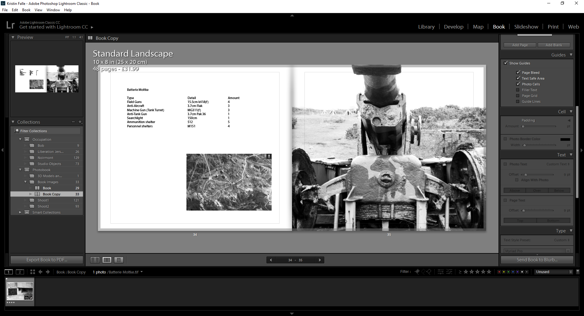
I have now added information about the different equipment that was used at Batterie Lothringen. I have also added a map to show where it was and where each weapon within the area was. I have done this to add more information within my photobook, which I have taken a more architectural view with than previously planned.
I have then done similar with Batterie Moltke. Which is the other main area I took images for this photobook.
I have started grouping images that are similarly shaped or work well together. Such as these which both have lots of sharp and straight edges.