Final Print 1:
For my first final print I wanted to utilise the eclectic layout to illustrate my Grandparents lifestyle. After consideration I decided I did not want to use all of the photographs as I felt, that it became to chaotic and took away from my intended narrative. I decided to use the three interior images and the two photographs inspired by LaToya Ruby Frazier as I felt these images complimented each other to convey the ideology of lifestyle, authority and luxury. I decided to come away from the ‘randomly spread out’ idea and made it all lined up and straight in order to show more structure within their lifestyle. Personally, I really like the way the images compliment each other as they follow a similar simplistic composition, as well as conveying my narrative for the project.

Final Piece 2:
Using these two images almost juxtapose one another, however I believe it informs us a lot about my Grandad. They both hold the ideology of spirituality, the top image shows red wine which suggests the last supper and a common drink had within church services as it represents Jesus’ blood. Additionally, the photograph below is an image of intimacy showing my Grandad reaching out and praying to god. Placing these two images together clearly represents the ideology of spirituality, and therefore making it a successful outcome.

Final Piece 3:
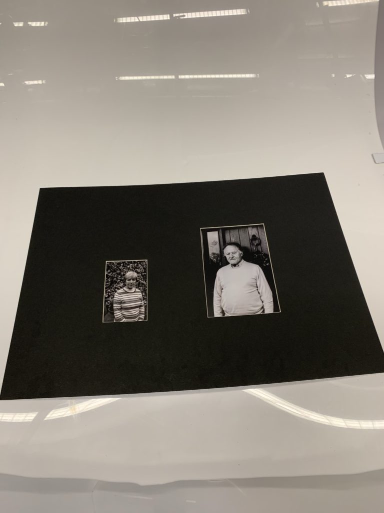
In my third final outcome I selected the two portraits, one of my Grandma and the other of my Grandad inspired by Walker Evans. I chose to use a window mount to illustrate the ideology of authority and family structure and hierarchy, as the portrait of my Grandad is larger in size, thus implying the conceptual representation. I really like the way in which they compliment each other through a similar composition as Walker Evans, as it suggests a relationship with the outdoors and their home, which showcases lifestyle. I believe this outcome is strong and clearly shows my narrative, thus making it successful.

Final Outcome 4:
For my last final outcome I chose to frame the A3 photograph of my families interaction with my Grandparents during a religious period in time, Christmas. The image is displayed in a black window mount, and holds an ameliorative atmosphere, as it explains how the two different lifestyles compliment one another. The photograph alone is structurally quite busy, thus making it effective on its own, as the monochrome composition allows detail and structure to be emphasised, reinforcing the happiness shown on the subjects faces. Personally, I really like this design as I feel it clearly illustrates the meaning of family as well as informing viewers about my intended narrative.

Evaluation:
To evaluate, I believe I have successfully selected some of my strongest imagery from the project in order to display my intended narrative within the project. I have creatively experimented with ways in which I could display my photographs, with showing a variety of methods, window mounts and stuck on foam board. The simplicity of the display allows the authenticity of my photographs to be up held. I have shown my ability to place ‘like’ photographs together in order for them to compliment and almost hold a mini narrative of their own which adds to my overall narrative. Therefore, I have successfully displayed my photographs, as well as being satisfied with my outcomes.
