For my first three layouts I wanted to explore typologies and how putting photographs in a triptych and diptych format in order to portray the narrative of the occupation of my Grandparents lifestyle. I decided to use the portraits which have emotional value and suggest important part of my Grandparents lifestyle as the first triptych. These photographs are being printed as A4 photographs and will be displayed with a 4cm gap between each photograph and will be either stuck onto foam board or put in a window mount on white card, as I believe white compliments the photographs the best. For my next triptych layout I printed out four landscape photographs of the interior of my Grandparents house, two in colour and one in black and white. The images are being printed as A5, and will be displayed in a similar format, 4cm gap between each photograph and displayed vertically. My final out come using typologies is a diptych which is a portrait of my Grandad and one of my Grandma. I printed one out as an A4 and one as an A5, the size difference of both will reinforce the ideology of power within family structure and how my Grandad has the most dominance. I will display the two images next to each other as a window mount or on white foam board with a 4cm gap between each photograph. These designs can be viewed below, as I created a layout of them using photoshop.


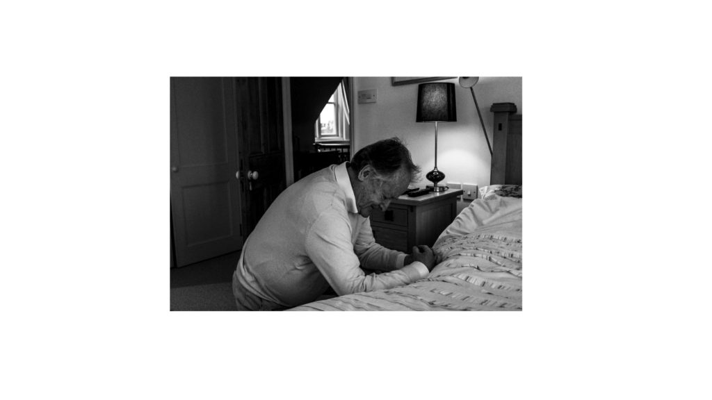
The next two display ideas are singular photographs, which would not work as a typology, and so I have deiced to display them on their own. The first photograph is of my family sat around a table at Christmas, showing the interaction of my lifestyle with my Grandparents lifestyle at a religious event. The photograph will be printed on A3 paper and displayed on white foam board. Below is a photograph of my Grandad praying, conceptually representing intimacy and the idea of religion on his lifestyle. The photograph is being printed as an A4 photograph as will displayed in the same way as the A3 photograph of my family. These full bleed photograph displays are visible below.


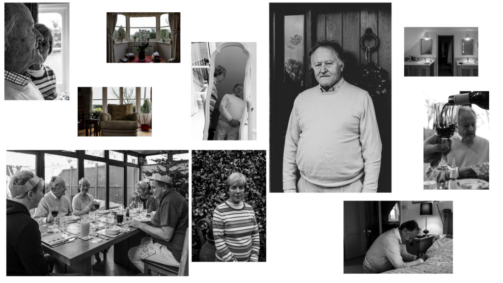
To show further experimentation and thought into the displaying of my photographs, I decided to create an eclectic display of all the outcomes. The chaotic design suggests that their lifestyle isn’t simple and has its ups and downs, and conceptually clearly presents my intended narrative. Personally, I really like the way in which this looks and will look at creating this on a large piece of foam board when the prints arrive, the design may change due to the size of the photographs, however I do want to see what this would look like with the real images and how impactful the narrative it displays is.

