Double page spread layouts:

This full bleed double page spread allows the viewer to see every detail of the image. It is a bold layout which enhances the power of the image.

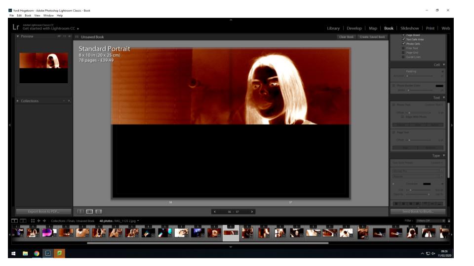
A horizontal half double page spread is a good way to frame a more rectangular image. I have decided to have the image take up the entire top half of the double page spread to draw attention to the subject in this image.

This optical double page spread only contains an image on the right hand side, but due to the structure of the photo and the very left hand side trailing off into darkness, the empty black page on the left almost seems to be a continuation of the image on the right.
Single photo layouts:

This single photo layouts is composed of a small square image on a single page of a double page spread. This layout appears several times throughout the book as a series of more abstract images among the more clear portraits or still life imagery.

This single photo layout is a more simplistic one, involving only one image adjacent to the top or bottom of the left or right page. The stand alone image draws all focus to this image.
Multiple photo layouts:

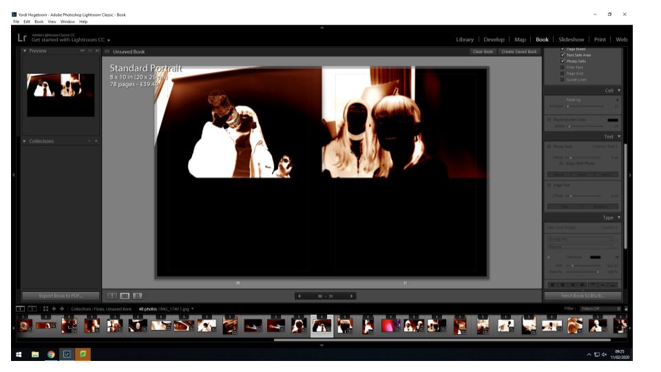
This layout involves two images adjacent at the top of both pages in a double page spread. This layout helps to link two compositions together and allows the viewer to see the relationship between the images.

This layout involves a full bleed image on one page and a smaller image with borders around it on the other. This layouts allows the two images to be viewed together but both in their own ways. The busier photo is the larger one to allow the viewer to see everything in the photo while the complimentary portrait is smaller as it is more simplistic.
