
I selected a range of images to be printed and mounted using a range of different framing and mounting techniques. For this part of the exam, I decided to print images that I felt would work best as a collection, and would be most effective when individually framed. Below are the images which I will be framing once printed:

The images were printed in a range of A4, A3 and A5, which I selected based on the details of the image, and which images I felt would be the most eye-catching to the viewer of the selection.
I will be using a series of framing techniques in order to present these printed images. I will be using:
- Foam board
- Window mounts
- Different methods of standing the image up vertically
I have printed 6 photos, and will be physically framing them in a way that best presents the images.
The final results from the framing can be seen below:
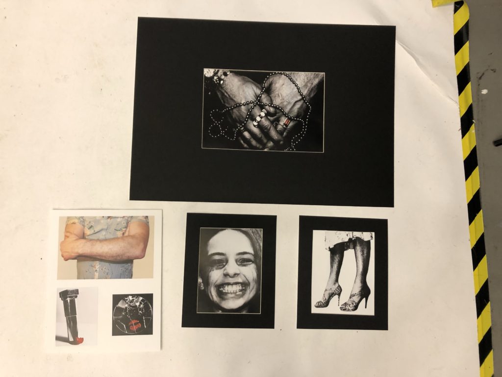
I decided to wind mount 3 of my images, and stuck the remaining 3 onto foam board. I did this because I believed that some of the images suited a black background more, and I believed that the darker large images would sit we’ll with the small white outline of the window mount. I also believed that the 3 images I mounted on foam board worked well together as a group, and so I mounted them together.
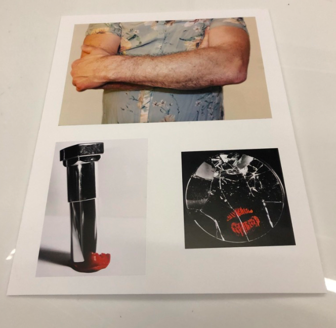
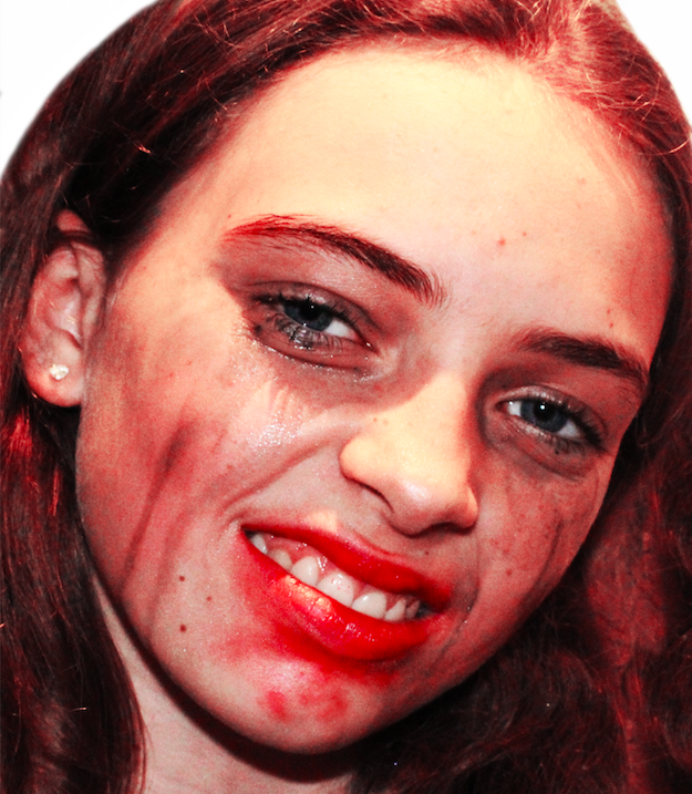
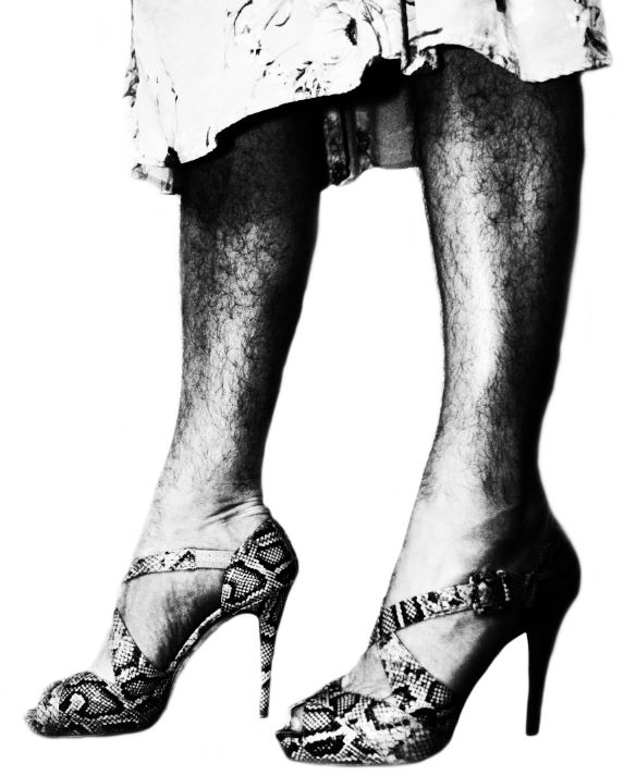
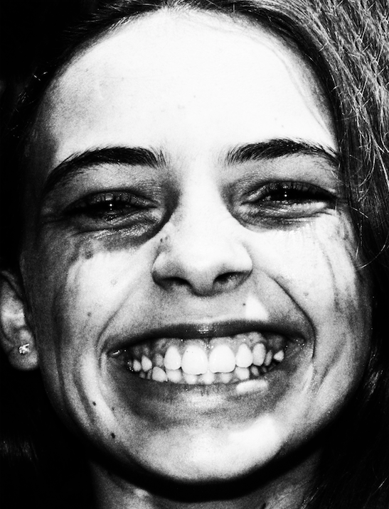
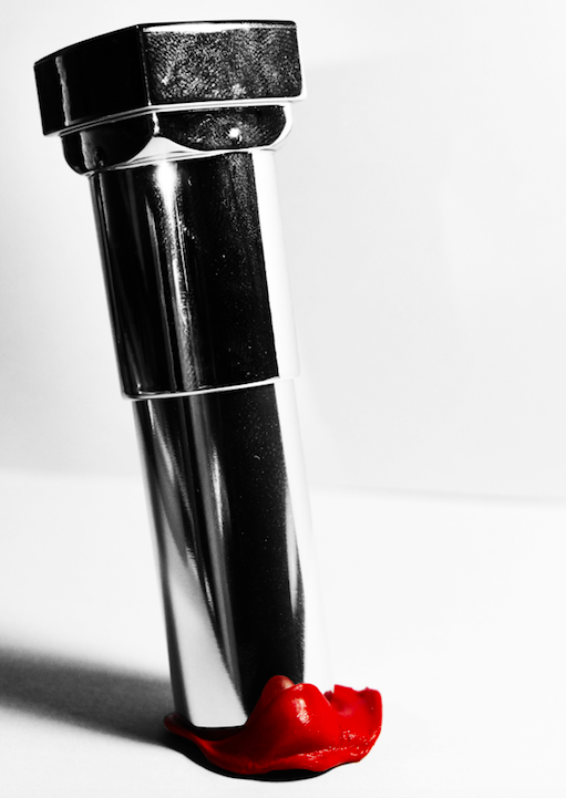
For this piece, I decided to use the above 3 images in a group, as I believed that their colour schemes fit together well, and the red tones of the lower 2 images worked well with the bright white of the foam board. I also believed that the more soft, warmer colours of the top image worked in contrast with the more harsh, bold images below, therefore I grouped these images together to make the final piece. I also believe that these images work together conceptually, as each image reflects an example of rebelling against gender stereotypes, with the top image being a reflection of rebelling against conforming to stereotypical masculine roles, and the bottom 2 images showing a rejection of traditional feminine beauty standards. I believe that together, these image symbolise a break from traditional gender roles, and give a powerful message of empowerment to the individual rather than gender conformity. I believe the lack of dark background places all attention on the images themselves, and helps form them to work together, rather than stand out separate, in order to give the above mentioned meaning.
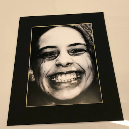
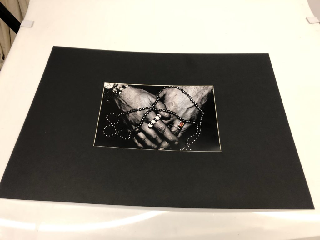
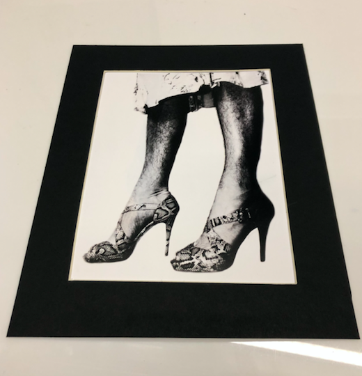
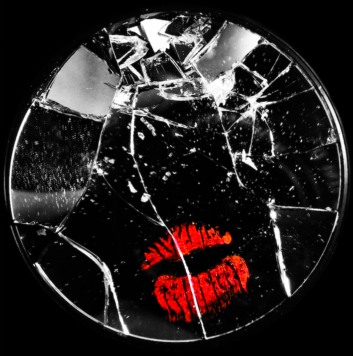
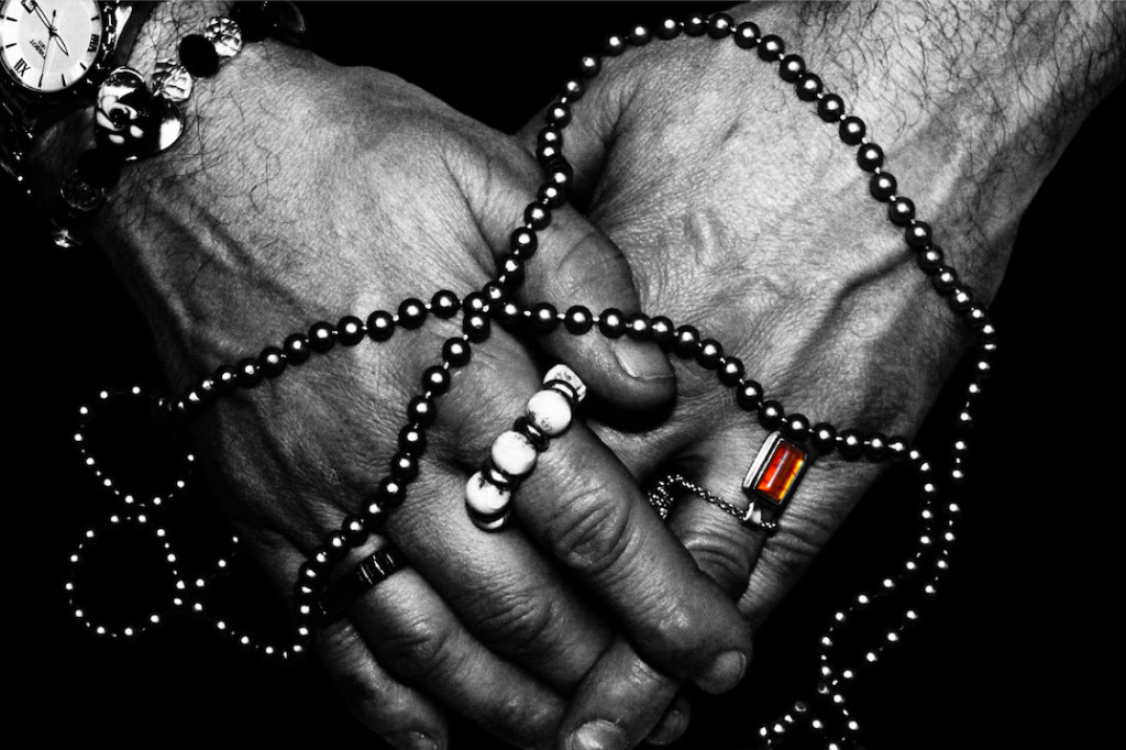
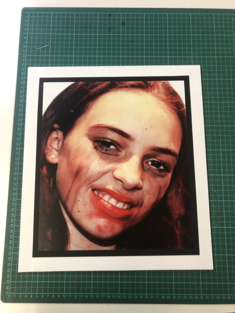
For the above images, I decided to use window mounts. I did this because I believed that the rich blacks of the image would be better emphasised using a boarder that was also black, while the white bordering of the window mount could act to stop the viewer from loosing focus when processing the detail in the image (the white outline acted as a way to contain the image). I presented each image individually as I believe that each image is strong and bold enough to work on its own, and presenting them in a series of group would retract from their individual detail and meaning. I used a 4cm barber around 2 of my images, and for the largest image (A3) I used a much larger boarder. I did this to separate the level of detail in the large image and to provide the viewer with some breathing room around the image, while at the same time placing maximum focus on the image itself due to the lack of detail around the edge of the image. I feel like such a large boarder helps to draw attention to the detail within the image, which I believe reflects the struggles of feeling trapped when being forced to conform to a gender role that doesn’t fit the individual, while at the same time feeling freed when allowed to experience more feminine aspects in private. To conclude, I feel like this image works well on a large window mount, and I believe that it draws maximum attention to the detail and meaning within the image.